What Font Does Inception Use?
Christopher Nolan’s Inception announces itself with a title as immovable as the films’s folding cities — thick, weighty, planted on the page like a concrete slab. If you are looking for the exact Inception font, the truthful starting point is that it is custom title lettering, not a downloadable typeface. But the heavy, monumental effect comes from a clear category, and free fonts get you close. Here is the breakdown.
What font is the Inception logo?
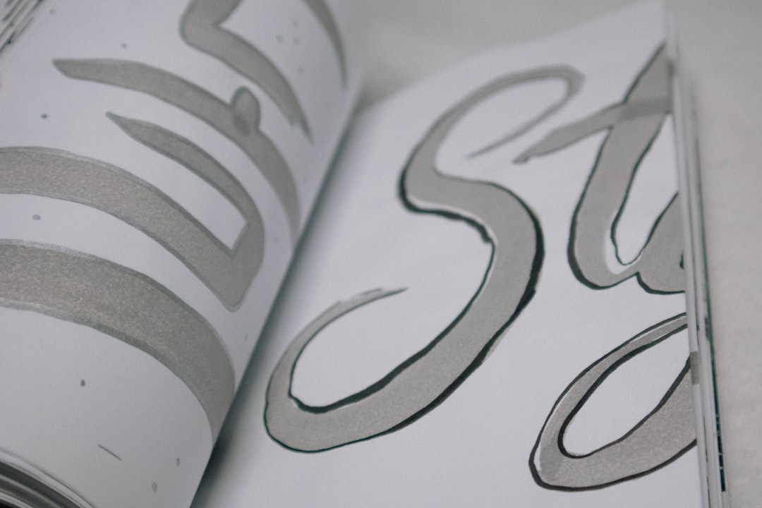
The Inception wordmark is bespoke title design built for the campaign. It reads as a heavy, bold sans-serif — thick uniform strokes, tight spacing, and a solid, blocky presence that feels architectural rather than decorative. The weight is the whole identity: the letters are dense enough to feel like mass, like something with gravity and structural force.
No studio has named an exact typeface, and the proportions have been refined by hand for the logo, so treat any specific attribution as an informed observation rather than a confirmed spec. What is reliable is the genre: this is heavy geometric/grotesque display type, the kind used to project weight, certainty, and inevitability.
What typeface is used in the Inception film?
It helps to separate the layers of type around Inception, because they serve different roles:
- The title wordmark — the heavy, bold custom logo. This is what people mean by the “Inception font.”
- Poster and billing type — credits and dates run in a clean neutral sans so the dense title remains dominant.
- On-screen titles — Nolan’s films favor restrained, classic title type; the in-film treatment is sober, reinforcing the cool, cerebral mood.
So the practical target for recreating the look is the heavyweight wordmark. Nail the mass and the tight spacing and the rest falls into place. One practical note: do not let the weight collapse legibility. The strongest heavy logos keep the counters — the enclosed spaces inside letters like “e” and “o” — open enough to breathe, so the word still reads instantly even at maximum density. Tighten the tracking, but protect those internal gaps.
Free fonts that look like the Inception font
You cannot download the real logo, but the heavy-display effect is easy to approximate. The key is a thick, near-monolinear sans — geometric for a cleaner read, grotesque for a sturdier one — set tight and bold:
- Archivo Black (Google Fonts) — a heavy grotesque with strong, even weight; a reliable workhorse for this look.
- Montserrat Black (Google Fonts) — geometric and dense; great for a clean, monumental wordmark.
- Anton (Google Fonts) — ultra-bold and slightly condensed; maximum impact in a tight footprint.
- Inter at its heaviest weight — a modern grotesque that stays crisp at large sizes.
- Oswald (Google Fonts) — for a more compressed, vertical take on the same heavy feel.
| Use case | Inception uses | Free alternative |
|---|---|---|
| Main title / hero word | Heavy custom bold sans, tight spacing | Archivo Black or Montserrat Black |
| Maximum-impact variant | Dense blocky forms | Anton |
| Subtitle / tagline | Neutral sans | Inter, Work Sans |
| Body / credits | Restrained sans | Source Sans 3 |
Why does Inception use this kind of type?
Heavy type communicates certainty and force. For a film about implanting an unshakable idea — and about dream architecture with real physical weight — a thick, immovable wordmark performs the theme. The density reads as something solid and permanent, fitting a story obsessed with what feels real versus what is constructed.
The blocky, architectural forms also echo the film’s signature imagery of folding streets and impossible structures. Bold geometric type feels engineered and built, not drawn. That said, heavy weight alone is not the only way to suggest scale; compare it with the opposite tactic in our breakdown of the Interstellar title lettering, which uses thin, widely spaced type to imply vastness rather than mass. Same goal, opposite means.
If you are interested in how a single dense wordmark can anchor an entire campaign, our roundup of famous brand fonts shows the same heavyweight strategy at work across studios and consumer brands.
Can I use the Inception font for my own project?
Keep two ideas separate. The Inception logo is a protected brand asset — the styled title functions as a trademark for the film. Reproducing the actual wordmark, or a fan copy of it, on merchandise, posters, or anything implying an official tie is a trademark problem, distinct from font copyright. Do not do it.
What is completely fair: use a free heavy face like Archivo Black or Anton to evoke the same monolithic, weighty atmosphere in your own original design. That aesthetic — thick, bold, architectural display type — is owned by no one, which is exactly why so many thrillers and tech brands reach for it without stepping on each other. Just verify the specific license of any font you pick; the Google Fonts options above are open for commercial use, but always confirm before relying on them in paid work. For how trademark layers on top of plain font licensing, read our font licensing guide first.
Frequently Asked Questions
What is the exact font used in the Inception logo?
There is no publicly confirmed name. The Inception title is custom, heavy display lettering made for the campaign. Any download claiming to be “the official Inception font” is a fan recreation, so treat it as an informed approximation rather than a verified studio specification.
Is there a free Inception font I can download?
Not the real one, but close substitutes are free. Archivo Black, Montserrat Black, and Anton on Google Fonts all reproduce the heavy, monolithic look when set tight and large. Confirm each font’s license before using it in commercial projects.
What style of font is the Inception title?
It is a heavy, bold geometric or grotesque sans-serif — thick uniform strokes, tight spacing, and a blocky, architectural presence. The weight is the point: it reads as mass and permanence, matching the film’s themes of solid structure and unshakable ideas.
Can I use an Inception-style font commercially?
You can use a generic heavy sans commercially if its license allows it. You cannot legally reproduce the actual Inception wordmark on products, since that styled title is a trademark of the film. Build your own original heavyweight lettering to capture the feel instead.


