What Font Does Pearl Jam Use?
If you’re chasing the pearl jam font, the band doesn’t ride on one typeface. Their most recognizable mark is the “stickman” figure, a custom illustrated emblem, and the band name itself is usually set in hand-built, weathered lettering that shifts from record to record. The common thread is a raw, grunge-era aesthetic: imperfect, textured, anti-polish. This guide pulls the emblem apart from the wordmark, walks through how the type changes per album, and points you to free fonts that nail the rough, distressed feel.
What font is the Pearl Jam logo?
The stickman logo is an emblem, not type, a simple, scrawled human figure with arms raised. Because it’s custom artwork, it isn’t a font you can install; fan recreations float around online, but they’re recreations, not the official asset. Treat any “exact font” claim as an informed observation, not a confirmed spec.
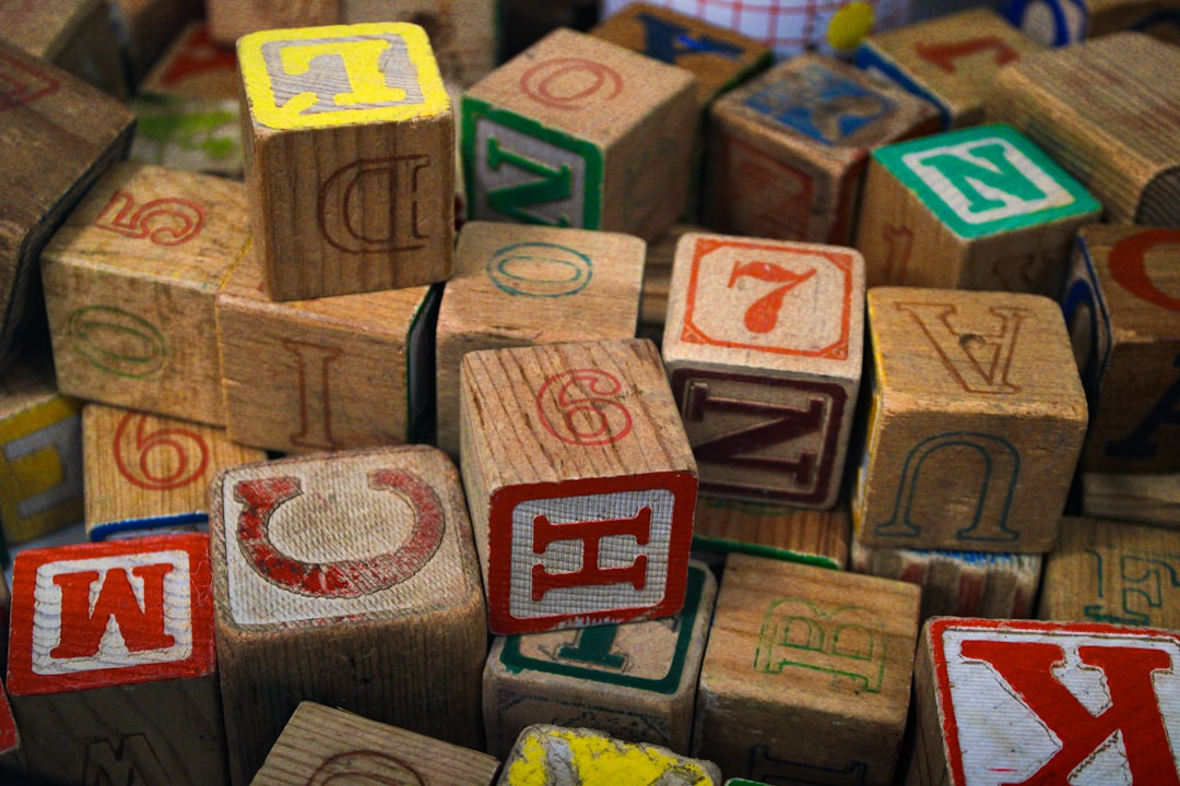
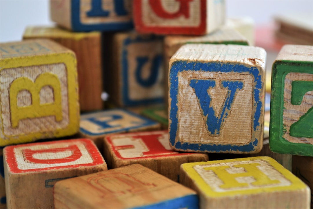
The band-name wordmark is custom lettering too, often rough, hand-drawn, or distressed to fit the grunge era it came from. Across most releases it reads like a weathered hand or a beaten-up display face: uneven strokes, texture, and a deliberately unpolished feel. Designers rebuilding it tend to start from a rough handwriting or distressed font and rough up the edges further by hand.
What fonts does Pearl Jam use on album covers?
Pearl Jam covers vary their typography to match each record’s mood, which is why no single font covers the catalog:
- Rough hand-lettering on the rawer, early grunge-era records, scrawled and imperfect.
- Distressed or weathered display type on others, with texture and wear baked into the letterforms.
- Fully custom, art-directed titles drawn to fit each cover’s photography or artwork rather than set from a font library.
So “the Pearl Jam font” is really a family of rough, textured choices unified by a grunge sensibility. This per-album variation is normal for veteran rock bands, you’ll notice the same era-by-era logic in how other acts handle their wordmarks, including the heavy, dark approach behind the Future font.
Free fonts that look like the Pearl Jam font
You can’t grab the band’s stickman emblem or custom wordmark, but free fonts get the rough grunge feel convincingly. Aim for texture, irregularity, and a hand-made quality:
| Use case | Pearl Jam uses | Free alternative |
|---|---|---|
| Scrawled hand-lettering | Rough custom hand | Rock Salt |
| Distressed typewriter feel | Weathered display type | Special Elite |
| Marker-style title | Bold rough hand | Permanent Marker |
| Grungy slab impact | Heavy textured lettering | Rye or a free distressed grunge font |
All of these are free under open licenses and fine for commercial work. To sell the look, add texture, set the type slightly uneven, distress the edges, and avoid anything too clean. Pearl Jam typography is about wear and imperfection. A useful exercise: set the same word in Rock Salt and Special Elite side by side and judge which roughness feels closest to the era you’re chasing, the difference between hand-scrawl and worn type is exactly what separates one grunge wordmark from another. For more on weathered, era-specific lettering, browse our roundup of vintage fonts.
Why does Pearl Jam use this kind of type?
Rough, distressed type matches the music: raw guitars, unvarnished vocals, and a band that has always pushed back against polish and commercialism. Imperfect letterforms signal authenticity, they look hand-made, not corporate, which is exactly the message grunge was built on. The stickman emblem adds a second layer: a simple, scrawled mark that feels personal rather than designed.
There’s a practical side too. A rough wordmark and a simple stick figure both survive being printed on cheap merch, screened onto shirts, or photocopied onto flyers, the textures actually improve when reproduced imperfectly. That durability suits a band whose visual world was always more basement than boardroom. The roughness is a feature, not a flaw: where a polished corporate wordmark would feel out of place on a bootleg shirt or a hand-stapled flyer, a distressed, hand-built mark belongs there completely, and it carries the band’s anti-commercial stance in its very texture.
The stickman is worth studying as strategy. By giving the band a compact, instantly recognizable figure alongside the wordmark, Pearl Jam gained a flexible mark that can stand in where the full name would be too small or too busy, much like a sports badge. That two-part system, emblem plus wordmark, is a hallmark of mature band branding, and it keeps the identity coherent even as individual covers experiment with different lettering. If you’re building your own act’s identity, pairing a simple standalone mark with a name treatment is a smart move worth borrowing.
Can I use the Pearl Jam font for my own project?
Mind the line between brand and font. The stickman emblem and the Pearl Jam name are protected, you can’t use them to brand your own band, merch, or products, or to imply any official connection. That’s trademark and copyright, separate from font licensing entirely.
The free fonts above (Rock Salt, Special Elite, Permanent Marker, Rye) are yours to use commercially under their licenses. Setting your own project name in a rough, distressed face that feels Pearl-Jam-adjacent is perfectly fine; copying their wordmark or redrawing the stickman to pass off as official is not, and recreating the emblem for sale would invite a trademark claim even if you redrew it yourself. See our font licensing guide for how those rights differ. If you want a related grunge-era flavor, compare it with the Sublime font and its sun emblem.
Frequently Asked Questions
What is the Pearl Jam stickman logo?
It’s a custom illustrated emblem, a simple scrawled human figure with arms raised, not a typeface. Because it’s artwork, you can’t download it as a font. Fan recreations exist online, but they’re unofficial interpretations rather than the genuine, licensed band asset.
What font is closest to the Pearl Jam wordmark?
A rough hand or distressed display face is closest. Free options like Rock Salt, Special Elite, or Permanent Marker capture the weathered, hand-made character of the band’s lettering. Set them slightly uneven and distress the edges further to push the resemblance toward the genuine grunge feel.
Does Pearl Jam use the same font on every album?
No. The band varies its custom wordmarks per album, from scrawled hand-lettering to distressed weathered type. Pick the specific record whose vibe you want to echo rather than expecting one consistent font across their discography, the roughness is the constant, not the exact lettering.
Can I sell merch with a Pearl Jam-style font?
You can use the free look-alike fonts commercially, but you can’t use the band’s name, the stickman emblem, or their wordmark, those are trademarked. Create your own distinct name in a similar rough distressed font and keep it clearly separate from the band to avoid any implied endorsement.