What Font Does Batman: Arkham Use?
Search for the batman arkham font and you are after the brooding, weathered lettering on Batman: Arkham Asylum, Arkham City, Arkham Origins, and Arkham Knight. The mark feels carved from cracked stone — heavy, gothic, scratched, and a little menacing. It is custom artwork rather than a font you can install, but the gothic-plus-grunge recipe is easy to reproduce with free type. Here is exactly how.
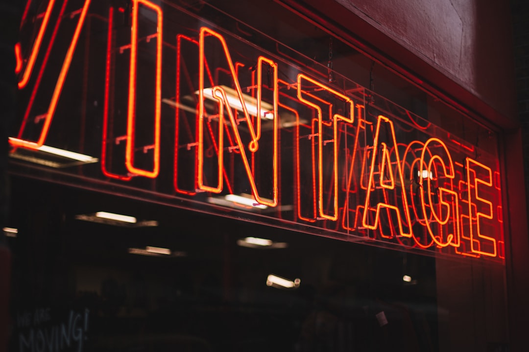
What font is the Batman: Arkham logo?
The Arkham logo is a bespoke wordmark commissioned for the franchise. The “ARKHAM” line is the workhorse: tall, condensed caps with a gothic, almost institutional severity, then beaten up with cracks, erosion, and grime so it reads like aged signage from a crumbling asylum. “BATMAN” usually sits above in tighter, equally distressed caps.
Two design forces are at play. First, a gothic/blackletter influence supplies the dread and the comic-horror heritage Batman has carried since the 1940s. Second, a heavy texturing pass — scratches, chips, uneven inking — turns clean letterforms into something that feels physically damaged. No public specimen names a single retail source font, so any “it’s exactly X” claim is guesswork. Treat it as an informed observation, not a confirmed spec: the honest description is “custom gothic display with a distressed overlay.”
The texturing is doing as much work as the letterforms themselves. Even a fairly neutral condensed cap, once chipped, eroded, and given uneven inking, starts to feel like a sign that has weathered decades inside a decaying asylum. That is why the distress layer is so important to reproduce: the underlying skeleton may be relatively restrained, but the grime is what supplies the menace. Across the four games the mark shifts subtly — Asylum, City, Origins, and Knight each adjust the weathering and color — while keeping that gothic-plus-grunge formula intact.
What typeface does Batman: Arkham use in-game (UI/menus)?
The in-game interface drops the theatrics for readability. Combat prompts, gadget menus, Riddler-trophy counters, and subtitles all use a clean, condensed sans-serif so information stays legible during fast, dark-toned gameplay. Headers and mission titles get heavier weights — sometimes lightly stylized — while the brooding gothic lettering is reserved for branding moments like the title card and loading screens.
That separation is deliberate: a gothic display would be exhausting to read across a HUD, so the menus stay quiet while the logo carries the mood. Blackletter in particular is notoriously hard to read at body sizes — its dense, ornamental strokes blur together — so reserving it for the title card is a legibility necessity, not just a stylistic flourish. The interface instead leans on a condensed sans that survives the games’ dark, high-contrast environments and stays clear during fast combat.
If you are rebuilding the aesthetic, mirror that split: gothic for the hero moment, clean sans for everything you actually have to read. For more on choosing brooding display faces, our guide to the best gothic fonts covers blackletter and distressed options that fit this exact tone.
Free fonts that look like the Batman: Arkham font
To recreate the Arkham feel, combine two layers: a gothic or condensed bold base, then a distress treatment. These free fonts give you the base:
- UnifrakturCook (Google Fonts) — a readable blackletter for the gothic-horror edge.
- Cinzel (Google Fonts) — engraved, monumental caps that read like carved stone before you add grunge.
- Oswald or Anton — heavy condensed sans bases for the “ARKHAM” line if you want institutional severity over blackletter.
- A free grunge/distress overlay font or texture to chip and erode the edges.
| Use case | Batman: Arkham uses | Free alternative |
|---|---|---|
| Gothic mood line | Custom gothic display | UnifrakturCook (blackletter) |
| Carved-stone caps | Heavy condensed caps | Cinzel |
| Distress / grunge layer | Custom texture overlay | Free distressed display + texture |
| In-game UI / menus | Clean condensed sans | Oswald or Inter |
Why does Batman: Arkham use this kind of type?
Tone is everything in Arkham. Rocksteady built a grim, gothic Gotham steeped in decay, madness, and dread, and the logo has to set that mood before a single frame of gameplay. Gothic letterforms instantly summon horror, history, and menace, while the distressed texture says “this place is broken and dangerous.” Clean modern type would undercut the entire fantasy.
Gothic type also taps a long visual tradition that audiences read instantly: cathedrals, horror posters, heavy-metal album art, and old legal proclamations all use blackletter to signal weight, age, and gravity. Borrowing that vocabulary lets the Arkham logo feel mythic and serious from the first glance, framing Batman as a grim gothic legend rather than a colorful superhero. The distress then drags that gravity into decay, which is exactly the asylum-and-ruined-city setting the games inhabit.
The custom approach also protects the brand: a unique, trademark-able mark cannot be lifted into a rival project, and it keeps the four-game series visually unified. It is the polar opposite design language from the bright, kinetic comic energy of the Marvel’s Spider-Man logo font — same medium, opposite mood, both custom for the same strategic reasons.
Can I use the Batman: Arkham font for my own project?
Separate the two layers in your head. The actual wordmark — plus Batman, Arkham, and the associated likenesses — is owned and trademarked by Warner Bros. and DC. You cannot use it commercially, and even fan use risks takedowns when it implies official endorsement. A look-alike built from free gothic and grunge fonts is generally fine for personal projects, provided you honor each font’s license and do not recreate the protected logo closely.
Before publishing anything, verify the terms of every font and texture you layer in. Our font licensing guide explains desktop, web, and embedding rights so a free face does not quietly violate its EULA. Build something gothic and weathered that evokes the mood — never trace the trademarked mark itself.
Frequently Asked Questions
Is the Batman: Arkham font free to download?
No. The logo is custom, trademarked artwork owned by Warner Bros. and DC, so there is no official font file. You can only approximate it by combining free gothic faces like UnifrakturCook or Cinzel with a distressed grunge overlay under their own licenses.
What font is used on the Arkham Knight cover?
Arkham Knight uses the same custom gothic, distressed wordmark family as the rest of the series, tuned for that title. It is bespoke lettering rather than a named retail typeface, so any single-font attribution should be read as an informed guess, not a confirmed source.
What is the closest free font to the Arkham logo?
For the blackletter mood, UnifrakturCook is closest; for the carved-stone caps, Cinzel works well. In both cases you will need to add a free distress or grunge texture on top to match the eroded, damaged edges of the original mark.
Can I use a gothic Batman-style font commercially?
You can use free gothic and grunge fonts commercially if their licenses allow it, but you cannot use the actual trademarked Arkham wordmark or anything imitating it closely enough to imply official endorsement. Always check the trademark in addition to the font license.


