What Font Does Luigi’s Mansion Use?
People search for the Luigi’s Mansion font because the logo perfectly captures a tricky tone: spooky but never scary, haunted but still cute. That spooky-cute balance is hard to find in a single off-the-shelf font, which is why the question keeps coming up. The honest answer: the wordmark is custom lettering, so there is no official font file. Below we explain what the logo is, what the games use for menus, and the closest free alternatives.
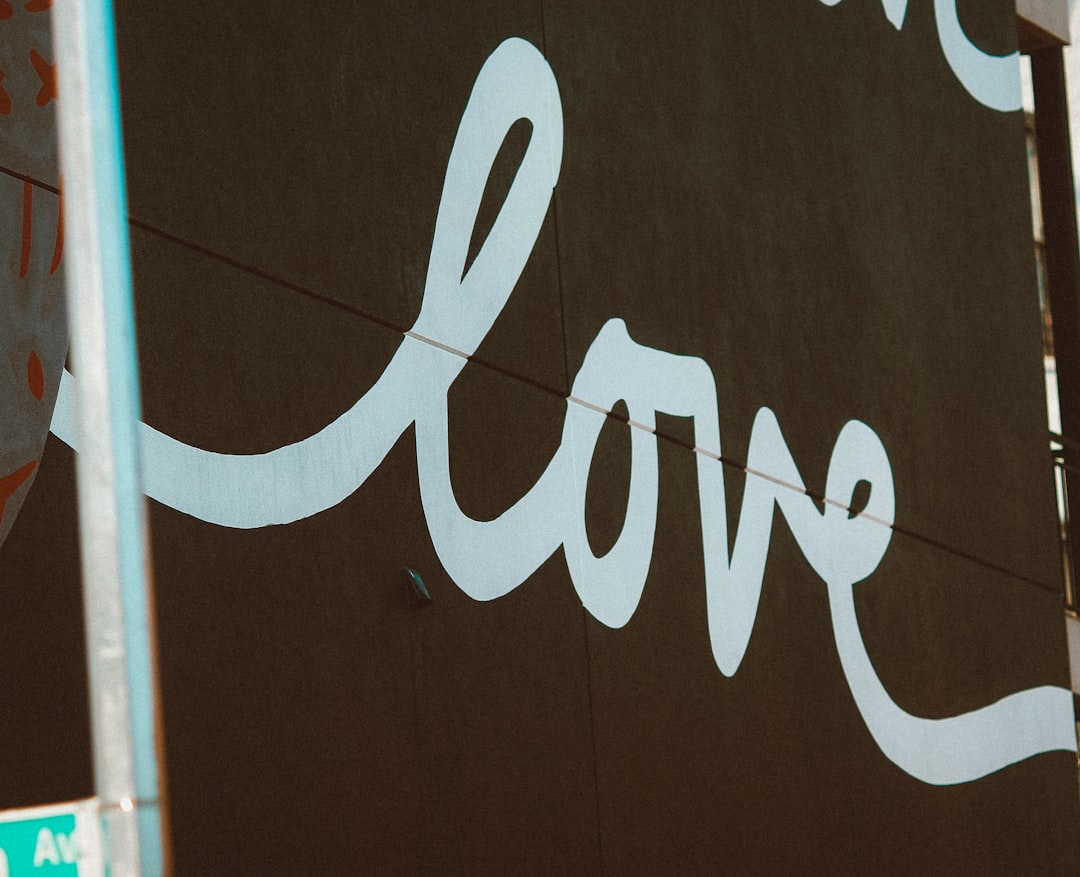
What font is the Luigi’s Mansion logo?
The Luigi’s Mansion logo is custom lettering rather than a typeface you can install. The wordmark uses rounded, slightly uneven letterforms with melting or dripping bottoms, often finished with a green glow, ghostly highlights, or a slimy sheen. That drippy, playful-horror styling is hand-built to land the series’ signature mood: a haunted mansion that is more charming than terrifying.
You will find fans suggesting specific commercial “Halloween” or drippy display fonts as the source, but those are silhouette approximations, not confirmed origins. Treat any exact-font claim as an informed observation, not a confirmed spec. The accurate takeaway: the title is bespoke art, so recreating it means choosing a similar drippy display and adding your own spooky finish.
What typeface does Luigi’s Mansion use in-game (UI/menus)?
In-game menus, item descriptions, and HUD text are chosen for readability, not for the dripping flair of the logo. Like most Nintendo titles, Luigi’s Mansion uses clean, friendly sans-serif type for interface elements so players can read objectives and ghost-catching tips clearly on screen. The drippy wordmark stays on the title and box art; the working text inside stays neutral and legible.
Nintendo has not published an official type spec for the UI, so the exact in-game family is not documented publicly. Treat the “clean friendly sans for menus” description as a practitioner read of how the games present, not a confirmed font name. If you are recreating a Luigi’s Mansion interface, a soft, slightly rounded sans with good bold weights will feel right at home.
Free fonts that look like the Luigi’s Mansion font
You cannot reuse the trademarked wordmark, but you can capture the spooky-cute mood with free display fonts plus a drippy effect. For more themed type ideas, see our roundup of the best gaming fonts. The table maps each use case to a free option.
| Use case | Luigi’s Mansion uses | Free alternative |
|---|---|---|
| Logo / title | Custom drippy spooky-cute lettering | A playful horror / drippy display (e.g. Creepster, Nosifer, Eater) |
| Subheadings | Lighter playful weight | Fredoka or Baloo 2 |
| UI / menus | Clean friendly sans | Mukta, Nunito, or Source Sans 3 |
| Body text | Neutral readable sans | Open Sans or Noto Sans |
To sell the haunted feel, add a green outer glow, drippy “slime” extensions under the letters, and a soft inner highlight so the type looks slick and ghostly. That treatment evokes Luigi’s Mansion far more than the bare font. If you enjoy character-driven Nintendo wordmarks, our look at the F-Zero futuristic logo font covers another custom Nintendo title style.
Why does Luigi’s Mansion use this kind of type?
The lettering is carefully calibrated. Luigi’s Mansion is a family-friendly ghost-hunting adventure, so the brand needs type that signals “haunted” without scaring younger players away. Drippy, melting edges read as spooky and Halloween-ish; rounded, bouncy base shapes keep it cute and approachable. The green glow ties directly to the games’ ghostly color palette and the Poltergust gadget aesthetic.
- Spooky cue: melting, dripping edges feel haunted and Halloween-themed.
- Cute balance: rounded forms keep it friendly for all ages.
- Atmosphere: green glow matches the ghostly mansion palette.
- Shelf legibility: bold base shapes stay readable at thumbnail size.
A custom wordmark lets Nintendo hit that exact spooky-cute midpoint, which a single stock horror font usually overshoots into “too scary.” This is the trap most fan recreations fall into: they grab the goriest dripping font they can find, crank up the blood-red, and lose the charm entirely. The trick is restraint, keep the base letters round and friendly, make the drips gentle rather than violent, and let a soft green glow do the haunting. That balance is what separates a Luigi’s Mansion look from a generic horror flyer. It is a genuinely useful design principle beyond this one game: when you want something to feel spooky but welcoming, restraint in the scary elements almost always reads better than piling them on, and a friendly base shape carries far more of the mood than people expect.
Can I use the Luigi’s Mansion font for my own project?
The Luigi’s Mansion wordmark is a trademark of Nintendo, so you should not reuse it for your own branding, merchandise, or anything implying affiliation. Because the logo is custom artwork rather than a released typeface, this is a trademark and copyright matter, not a font-license one.
What you can do is design an original title with a free drippy display font and your own glow-and-slime treatment, which is perfect for Halloween projects. Always confirm the font’s license permits your use, especially for commercial or client work, since many free fonts restrict logos or embedding. Our font licensing guide explains exactly what to check. Use an open-license font (SIL OFL) and create lettering inspired by, not copied from, the Luigi’s Mansion style.
Frequently Asked Questions
Is the Luigi’s Mansion font free to download?
No. The Luigi’s Mansion logo is custom lettering, not a released font, so there is no official free download. You can reproduce the spooky-cute feel with free drippy display fonts like Creepster or Eater plus a green glow, but the trademarked wordmark itself is not available to install or reuse directly.
What font is closest to the Luigi’s Mansion logo?
A playful horror or drippy display gets you closest. Try Creepster, Nosifer, or Eater, then add a green glow and melting extensions under the letters. None match exactly, since the logo is bespoke, but they capture the haunted-yet-cute silhouette of the Luigi’s Mansion wordmark for fan work and Halloween designs.
Does every Luigi’s Mansion game use the same font?
The wordmark style is consistent, spooky-cute and drippy, but glow, color, and finishing shift between entries to suit each game’s art. Treat it as one evolving custom brand rather than a fixed font file. The in-game UI fonts can also differ across the GameCube, 3DS, and Switch titles since they are chosen separately.
Can I use a Luigi’s Mansion look-alike font commercially?
Only if the look-alike font’s license allows commercial use, so check first. Even with a permissive font, avoid recreating the exact trademarked wordmark for products or branding. Build original drippy lettering inspired by the style instead, and review our font licensing guide before using any font in paid or client projects.


