What Font Does Dave the Diver Use?
Looking for the exact dave the diver font? There’s no official one to install, which is typical for game logos. The Dave the Diver wordmark is custom artwork — bouncy, chunky, pixel-tinged letters that perfectly suit the game’s blend of retro charm and modern polish. That playful, undersea vibe is easy to recreate, and with a few free, properly licensed fonts you can get the same lighthearted look.
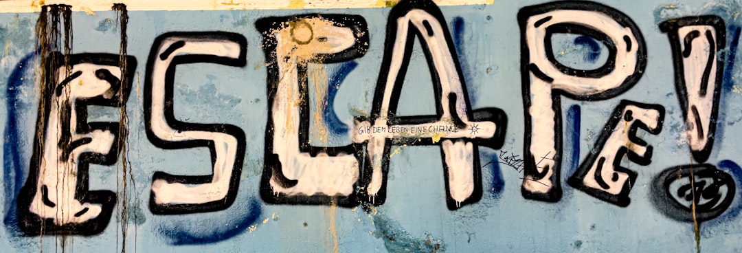
What font is the Dave the Diver logo?
The Dave the Diver logo is custom-drawn lettering rather than a stock font. It leans into a fun, chunky, pixel-flavored style that nods to retro arcade and 8-bit games while staying clean and contemporary — a fitting match for a title that mixes nostalgic pixel-art fish with a slick, modern restaurant-management loop. The letters feel friendly, rounded, and full of personality.
Because it’s a logo, there’s no official font file to download. Free sites may list a “Dave the Diver font,” but those are fan recreations approximating the look. They can work for personal mockups, but treat any claim that they’re “the official font” as an informed observation, not a confirmed spec. The genuine wordmark is brand artwork owned by the developer.
The logo’s charm comes from a clever bit of tension. Dave the Diver mixes genuinely retro pixel-art creatures with a modern, high-production-value game underneath, and the wordmark mirrors that blend — it nods to chunky 8-bit lettering without looking crude or dated. Achieving that “retro but polished” feel takes deliberate hand-work: softening hard pixel corners, balancing weights, and adding just enough bounce so the type reads as fun rather than nostalgic for its own sake. That intentional warmth is exactly what a stock pixel font won’t give you out of the box.
What typeface does Dave the Diver use in-game (UI/menus)?
In-game type is a separate choice from the logo. Dave the Diver’s interface mixes pixel-styled type for retro flavor with cleaner, rounded sans-serif type for menus, dialogue, and the restaurant-management screens, keeping everything readable and friendly. The combination supports the game’s playful tone without sacrificing the clarity its busy management systems require.
Developers rarely publish their exact UI fonts, so any specific name you see online is best treated as a guess. For your own project in this style, the takeaway is to combine a true pixel font for headers and retro accents with a soft, rounded sans for the functional text — playful up top, legible everywhere else.
This is especially important in a game as text-heavy as Dave the Diver, which juggles a diving loop, a sushi-restaurant management sim, recipes, upgrades, and dialogue. Pure pixel fonts become genuinely hard to read at the small sizes and long strings those systems demand. Reserving the pixel styling for scores, headers, and short labels — while letting a clean rounded sans carry menus and conversation — keeps the retro personality intact without exhausting the player’s eyes. It’s a balance worth studying for any cozy-but-busy game design.
Free fonts that look like the Dave the Diver font
You can capture the Dave the Diver feel with free typefaces by matching each role. Look for pixel fonts, playful rounded display faces, and a friendly sans for body copy.
| Use case | Dave the Diver uses | Free alternative |
|---|---|---|
| Main logo / title | Custom pixel-flavored lettering | Press Start 2P (8-bit pixel display) |
| Retro accents / scores | Pixel-styled type | Silkscreen (crisp pixel font) |
| Playful headers | Chunky rounded display | Fredoka (rounded, friendly) |
| Menus / dialogue / body | Clean rounded sans-serif | Nunito |
For an instantly retro headline, Press Start 2P is the go-to free pixel font, while Silkscreen offers a tighter, cleaner pixel option for scores and labels. Pair either with a rounded face like Fredoka or Nunito to keep the friendly, approachable warmth the game is known for. Always confirm each font’s license before commercial use — our font licensing guide covers what to check.
Why does Dave the Diver use this kind of type?
The typography sets the tone immediately. Fun, pixel-flavored letters signal nostalgia, accessibility, and humor — telling you this is a lighthearted, charming experience rather than a serious simulation. The retro pixel nod ties directly to the game’s adorable pixel-art sea life, while the rounded, friendly shapes reinforce its welcoming, easygoing personality.
The custom approach also makes business sense. A distinctive wordmark can be trademarked and protected, staying recognizable across updates, merchandise, and spin-offs. A stock font can’t deliver that ownership or that precisely tuned playfulness. For more examples of expressive game branding, browse our roundup of the best gaming fonts.
Can I use the Dave the Diver font for my own project?
Not the official wordmark. It’s protected brand artwork, and reproducing it commercially — even via a fan-made font version — risks trademark issues. The professional route is to pick a legitimately licensed pixel or rounded font and create original lettering in the same playful spirit.
- For personal/fan use: a free recreation is generally fine for non-commercial mockups, subject to the uploader’s terms.
- For commercial work: use a licensed font like Press Start 2P or Fredoka and design your own letters.
- For client projects: evoke the fun, aquatic feel without copying the trademarked mark.
If this playful, retro register appeals to you, you’ll also enjoy the rugged adventure styling of the Tomb Raider font and the minimal sci-fi look behind the Cocoon game font.
Frequently Asked Questions
Is the Dave the Diver font free to download?
No official Dave the Diver font is available to download. The logo is custom brand lettering owned by the developer. Free “Dave the Diver” fonts are fan recreations — usable for personal mockups, but not licensed copies of the real wordmark, so avoid them for commercial work.
What font is closest to the Dave the Diver logo?
For the pixel-flavored title feel, the free font Press Start 2P is the closest easy match, with Silkscreen as a cleaner alternative. Pair either with a rounded face like Fredoka or Nunito to capture the playful, friendly warmth of the game’s branding.
What font does Dave the Diver use in its menus?
The game mixes pixel-styled type for retro flavor with cleaner rounded sans-serif type for menus, dialogue, and management screens to stay readable. The exact typeface isn’t officially documented, so treat any specific name you find online as an informed guess rather than a confirmed fact.
Can I use a Dave the Diver-style font commercially?
You can use a licensed look-alike commercially, but never reproduce the trademarked wordmark. Pick a pixel or rounded font with clear commercial terms, confirm the license, and design original lettering inspired by — not copied from — the Dave the Diver brand’s playful aesthetic.


