What Font Does Zodiac Use?
Quick disambiguation before we start: this guide is about the zodiac movie font from the 2007 David Fincher film Zodiac — the true-crime procedural about the Bay Area serial killer — not the astrology/star-sign symbols people sometimes mean by “zodiac.” If you landed here looking for horoscope glyphs, this is the wrong page. If you want the typography from the movie poster and titles, read on.
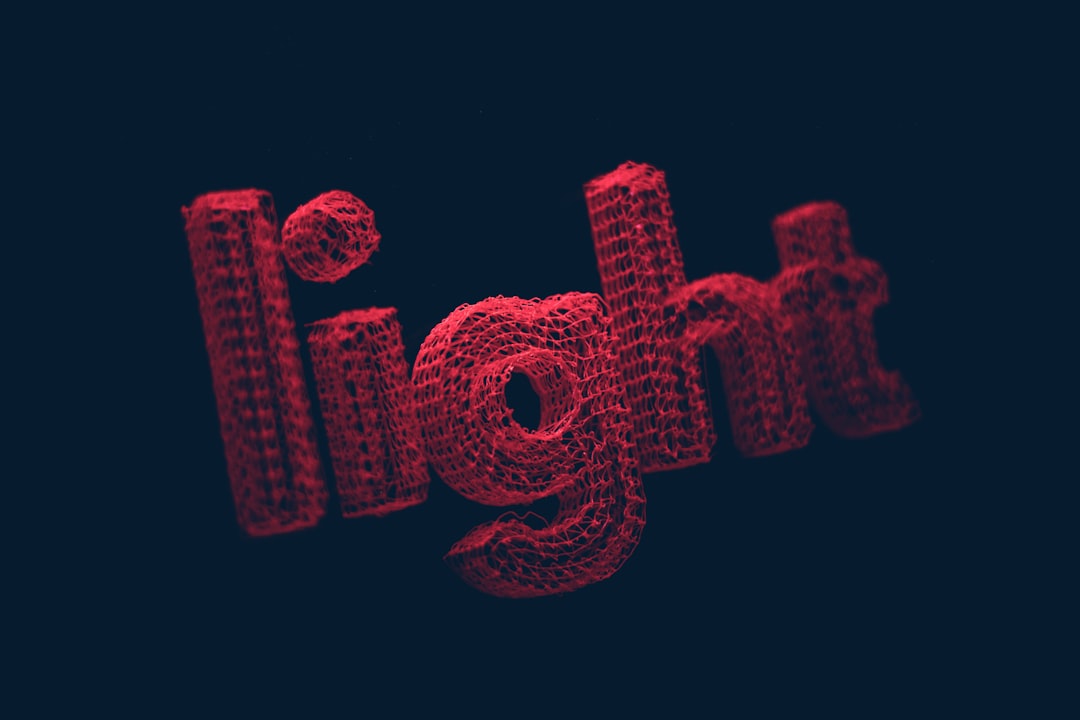
What font is the Zodiac logo?
The Zodiac logo is custom lettering built to evoke a specific era. The film is set largely in late-1960s and 1970s San Francisco, and the wordmark reflects that: period-correct display type with the slightly heavy, grounded character of early-’70s newspaper headlines and movie advertising. It feels like it was clipped from a 1971 broadsheet — which is exactly the intent.
Because it was tailored for the movie, no single off-the-shelf font matches it perfectly. The look is a blend of period display structure and subtle customization. Recreating it is less about finding one magic file and more about choosing the right decade’s typographic vocabulary, then dialing in weight and spacing.
It is worth naming the trap here, because “Zodiac” is a heavily searched word for the wrong reasons. Plenty of results for a “zodiac font” point to astrology dingbat sets full of star-sign glyphs, which have nothing to do with this film. If your goal is the movie’s identity, ignore those entirely and focus on period serifs and newspaper display type. The film’s wordmark is about a place and a year — late-’60s and early-’70s San Francisco — not about symbols. Keeping that distinction clear will save you from downloading the wrong category of font.
What typeface is used in the film?
Throughout Zodiac, the typography is obsessively period-accurate — newspaper mastheads, typed letters, police reports, the killer’s ciphers. Fincher is famous for control, and the type design supports the film’s documentary realism. The on-screen text is meant to feel authentic to 1969–1971, so it leans on serif newspaper faces and utilitarian typewriter type rather than anything modern.
That commitment to period type is the whole identity of the film visually. For a sense of how the same director took a colder, more contemporary approach later, compare the stark wordmark in our Gone Girl font guide — different decade, different mood, same obsessive precision.
Free fonts that look like the Zodiac font
To capture the 1970s procedural feel, reach for period serifs, newspaper-style faces, and worn typewriter type. The goal is authenticity to the era, so favor faces with a grounded, slightly mechanical character over anything sleek and modern. These are starting points, not exact matches.
- Old Standard TT — a free serif with a classic, printed-page feel for headlines and body copy.
- Domine — a sturdy free serif that reads well at display size with a newspaper-like weight.
- Special Elite — a battered typewriter face perfect for the letters, reports, and ciphers.
- Oswald — a condensed sans that approximates compact mid-century advertising headlines.
| Use case | Zodiac uses | Free alternative |
|---|---|---|
| Logo / poster wordmark | Custom 1970s display lettering | Domine or Old Standard TT |
| Newspaper headlines | Period serif display | Old Standard TT |
| Typed letters / reports | Period typewriter type | Special Elite |
| Compact ad headlines | Condensed display | Oswald |
Why does Zodiac use this kind of type?
The period type is a realism engine. Zodiac is built on meticulous research and the texture of actual case documents, so the typography has to feel genuinely of its time. A modern font anywhere on screen would break the spell. By committing to 1970s display and typewriter faces, the design makes the whole film feel like recovered evidence rather than a dramatization.
For designers, the lesson is that type can set a date as precisely as a costume or a car. When you need a project to read as a specific decade — a documentary, a retro brand, a period-piece poster — choosing era-correct fonts does enormous narrative work with very little effort. Authenticity beats novelty here.
If you are chasing the early-1970s feel specifically, a few details separate convincing period work from generic “old-looking” design. Tracking tended to be tighter, color palettes were muted and slightly warm rather than saturated, and headline serifs carried a sturdy, ink-heavy weight built for newsprint. Avoid anything that reads as digital-clean or hyper-modern in its curves. A subtle print texture, a touch of registration imperfection, and restrained kerning will do more to sell the decade than picking a single “1970s font” ever could. Zodiac succeeds because every layer agrees on the same year, not because one element shouts it.
Can I use the Zodiac font for my own project?
You cannot use the actual logo artwork — it belongs to a trademarked film and reproducing it commercially is risky. But the 1970s period look is entirely open. Building a similar identity from licensed or free period faces is normal practice, and the era’s typography is well represented in free libraries.
Before any commercial use, confirm each font’s license — some free faces are personal-use only. Our font licensing guide covers the essentials. For a deeper bench of era-correct type, the best vintage fonts collection is exactly the right resource. And if you want another Fincher reference point, the hand-scratched approach in our Se7en font guide shows a wildly different way the same director handles title typography.
Frequently Asked Questions
Is the Zodiac movie font the same as zodiac sign symbols?
No. This page is about the typography from David Fincher’s 2007 film Zodiac, not astrology glyphs. The movie’s wordmark is custom 1970s-style lettering, whereas zodiac sign symbols are Unicode characters or dingbat sets. If you need star-sign glyphs, search for a zodiac symbol font instead.
Is there an official Zodiac movie font to download?
No. The 2007 film’s logo is custom period artwork created for the production and was never released as a commercial typeface. Any download labeled the official Zodiac font is a fan-made approximation, so treat it as inspiration rather than the genuine movie lettering.
What free font looks most like the Zodiac poster?
Domine and Old Standard TT are the closest free starting points for the 1970s newspaper-display feel, while Special Elite nails the typed letters and reports. Adjusting weight and spacing toward a heavier, grounded look pushes them closer to the period character of the original wordmark.
Can I use a Zodiac-style font commercially?
You can use a period look-alike font commercially if that font’s license permits it, but you cannot reproduce the actual movie logo, which is protected studio artwork. Always verify the specific font’s commercial terms before using it, especially with free faces that may be personal-use only.


