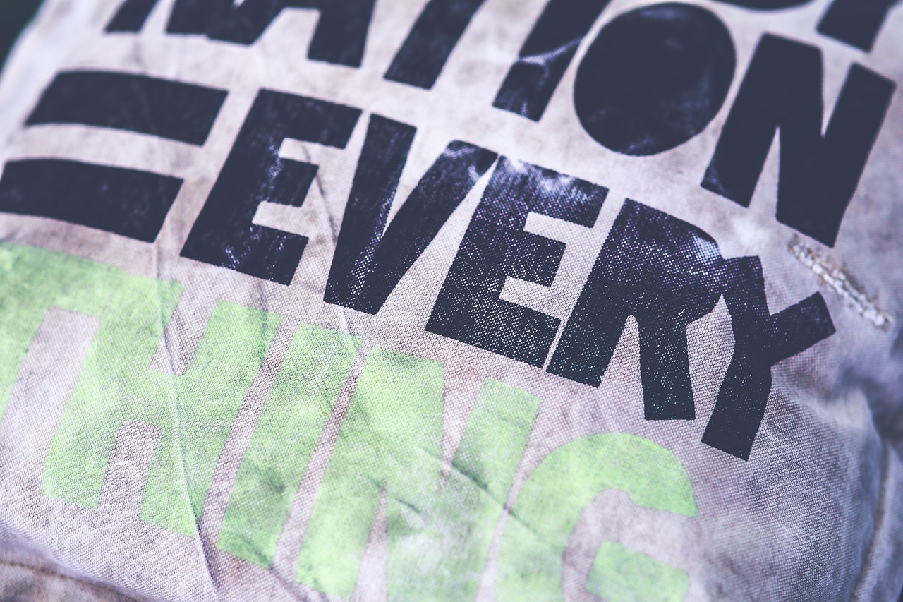
What Font Does the Philadelphia Eagles Use?
If you are searching for the Philadelphia Eagles font, you most likely want to match the eagle-wing logo lettering, the bold “EAGLES” wordmark, or the midnight-green jersey numbers. The honest answer is that none of these is a font you can download and type. The Eagles’ identity combines custom artwork with league-standard jersey type. This guide explains what each element really is and points you to free fonts that get you convincingly close while staying clear of protected trademarks.
What font is the Philadelphia Eagles logo?
The team’s primary mark is the stylized eagle-wing emblem introduced in 1996, paired with a custom wordmark. The logo itself is illustrative artwork, not type at all. The accompanying “EAGLES” and “PHILADELPHIA EAGLES” lettering is custom-drawn, with proportions, terminals, and spacing designed specifically for the brand.
That wordmark reads as a heavy, condensed block with a forward, aggressive feel, but it is bespoke artwork rather than a retail typeface. If a source claims a single named font “is” the Eagles logo font, treat that as an informed observation, not a confirmed spec. The most accurate statement is that the wordmark belongs to the family of heavy, condensed American athletic lettering and was custom-tuned for the team, then trademarked.
What font does the Philadelphia Eagles use on jerseys (names & numbers)?
On the field, the numerals and player names use the heavy block style standard across the NFL. The league specifies number height and stroke proportions for legibility, so Eagles numbers share their underlying anatomy with numerals on many other teams. They are produced as applied twill or heat-press artwork rather than typed from a font.
The traits that define the Eagles jersey look are:
- Thick, even strokes with no thin-to-thick contrast.
- Squared corners with only slight softening.
- Tall, upright proportions that keep double digits readable.
- White or silver numerals against the distinctive midnight-green jersey.
This shared block-letter heritage runs through many sports identities, a theme we explore in our roundup of famous brand fonts.
Free fonts that look like the Philadelphia Eagles font
Because the real marks are custom, your target is a strong look-alike rather than an exact copy. The free options below are matched to each use case. Octin College and Goodtimes are dependable starting points for athletic blocks, with condensed gothics handling the wordmark feel.
| Use case | Eagles uses | Free alternative |
|---|---|---|
| Wordmark / “EAGLES” lettering | Custom heavy condensed block (trademarked) | A free heavy condensed block display face |
| Jersey numbers | NFL-standard block numerals | Octin College or a free varsity block set |
| Jersey nameplate | Heavy block, all caps | Goodtimes or a free condensed gothic |
| Eagle-wing emblem | Custom illustrative artwork | Recreate by hand; no font equivalent exists |
Confirm each font’s license before any commercial use. Many “free” fonts are free only for personal projects, and our font licensing guide explains exactly what is allowed.
Why does the Philadelphia Eagles use this kind of type?
The heavy block style is a legibility decision. Numbers must read from the upper deck and on broadcast, which rewards thick strokes, open counters, and high contrast against the jersey. The condensed, forward-leaning wordmark also projects speed and aggression, matching the team’s modern eagle-wing identity and its passionate fan base.
Custom artwork brings a further benefit: trademark protection. A bespoke wing emblem and wordmark can be defended against unauthorized use in a way a generic font cannot, which is essential for licensed merchandise. The same reasoning shapes other classic marks, like the Chicago Bears font, which also relies on custom lettering.
There is also a consistency argument worth understanding if you design sports graphics. When a team owns its lettering, it controls the exact curve of every terminal, the spacing between letters, and how the mark holds up from a tiny avatar to a giant end-zone painting. A retail font can be updated by its foundry or render slightly differently across sizes and software, introducing drift the brand cannot tolerate. Owning the artwork gives the Eagles a single source of truth for every helmet decal, jersey patch, stadium sign, and broadcast graphic. The practical takeaway for designers is that the “feel” you want comes as much from disciplined spacing and weight as from any single typeface, so spend your effort tuning those details rather than chasing one perfect download.
Can I use the Philadelphia Eagles font for my own project?
For private, non-commercial use, such as a fan graphic for your own wall, a look-alike font carries little risk. But the Eagles name, eagle-wing emblem, wordmark, and midnight-green trade dress are protected trademarks owned by the team and the NFL. You cannot legally sell merchandise or market a product using those marks or close imitations without a license.
The safe approach is to use a freely licensed look-alike for the typographic feel, avoid copying the actual logo, and never imply official endorsement. For commercial work, verify both the font license and any trademark exposure. For a related block-lettered identity, see our Kansas City Chiefs font guide.
If you are building a fan piece and want it to feel authentic, focus on three things rather than the font alone: get the proportions of the numerals right, use the distinctive midnight-green base with white or silver numerals, and keep the lettering heavy and slightly condensed. Those cues do more to sell the Eagles look than any single typeface, and they keep your work firmly in look-alike territory rather than copying protected artwork. When in doubt about a commercial project, a quick check of the font license and a clear “unofficial” disclaimer will save you a great deal of trouble later.
Frequently Asked Questions
Is the Eagles wordmark from a real font?
No. The “EAGLES” lettering is custom-drawn artwork created for the team, not a retail typeface. The eagle-wing emblem is illustration, not type at all. Any font that looks close is an approximation, so treat any specific font claim as an informed observation rather than the confirmed source.
What font are the Eagles jersey numbers?
The numbers use a heavy block numeral style following NFL standards for height and stroke weight. They are applied as artwork rather than typed from a font, so free varsity or college block faces like Octin College are the closest practical match for fan designs and mockups.
Can I download the exact Eagles font for free?
No exact download exists, because the wordmark is custom, trademarked artwork. You can download free look-alike fonts that capture the heavy condensed block feel, but details will differ. Always check each font’s license before using it in any commercial project.
Is it legal to sell merchandise using an Eagles look-alike font?
The font alone may be acceptable, but combining it with the Eagles name, wing logo, or midnight-green colors to sell merchandise infringes team and NFL trademarks. Selling such items without a license is not legal. Keep any commercial project clearly unofficial and avoid the protected marks entirely.


