What Font Does The Punisher Use?
If you searched for the punisher font, you probably want one of two things: the iconic elongated skull that Frank Castle wears on his chest, or the blocky, military stencil lettering that often spells out the name on covers and posters. Neither is a font you can simply download. Like most Marvel hero logos, the Punisher identity is bespoke logo design, hand-built and re-tuned across decades of comics, films, and television. Below we break down both elements, explain where the look comes from, and point you to free and paid look-alikes that capture the same brutal energy.
What font is the Punisher logo?
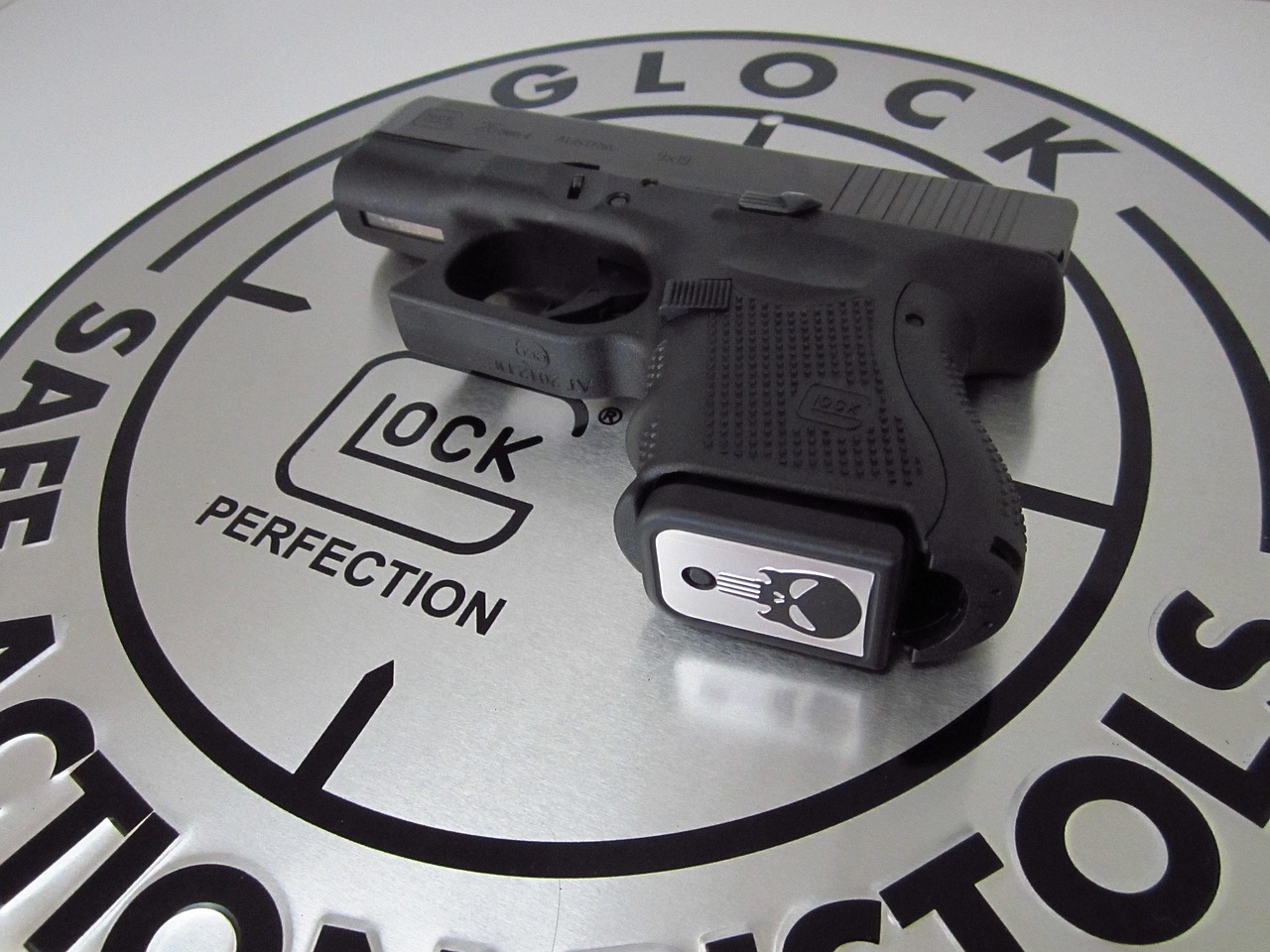
The core Punisher mark is the skull emblem: an elongated white skull with long jagged teeth, the character’s chest symbol since 1974. That skull is the heart of the brand, and it is custom artwork, not a glyph pulled from any released typeface. Its stretched proportions and the dripping teeth are specific to the Punisher and have been redrawn many times across eras.
The wordmark, when present, leans on heavy stencil or military capitals to reinforce Frank Castle’s combat-veteran background. People often compare it to a stencil display or a slab-serif army face, and that comparison is fair as a visual shorthand. But it is a comparison, not a source. If a site tells you the Punisher logo “is set in” a named font, treat that as an informed observation, not a confirmed spec. The mark was drawn as artwork; any resemblance to a commercial stencil face is convergence, not licensing.
- The skull emblem: custom, elongated illustration with long jagged teeth.
- The wordmark: heavy stencil or military capitals, also custom-drawn per era.
- The finish: roughened, weathered edges that no plain font supplies on its own.
What typeface is used in the Punisher films and comics?
Across the comics, the Punisher’s logos have ranged from clean 1970s capitals to grittier modern stencil treatments, but none was a single licensed font carried over wholesale. Cover artists and logo designers tuned each version to the era, with the skull as the constant anchor.
The films (2004, 2008’s War Zone) and the Netflix series (2017 onward) leaned into stark, weathered, military-flavored title treatments to match Frank Castle’s one-man-war tone. Those titles can resemble a heavy stencil or condensed military sans, but they are textured, tracked, and finished as artwork. So when you ask about the Punisher “font,” remember there are really several custom systems in play across comics, film, and television.
Free fonts that look like the Punisher font
You cannot legally download the real marks, but you can get strikingly close with free and affordable look-alikes. The trick is to match the right element: use a heavy stencil display for the lettering and accept that the skull emblem itself is illustration, not a typeable character. If you are weighing free against paid options, our font licensing guide explains what each license actually permits.
| Use case | The Punisher uses | Free alternative |
|---|---|---|
| The skull emblem | Custom elongated skull artwork | No font matches; rebuild as a graphic or use a free skull dingbat |
| Military wordmark | Custom heavy stencil capitals | A free stencil display such as Saira Stencil One or Black Ops One |
| Weathered combat feel | Custom roughened finish | A free distressed stencil like Stardos Stencil plus a grunge overlay |
For more in this dark superhero-logo genre, our roundup of the best gothic fonts is a strong starting point for that heavy, ominous feel. If you enjoyed this breakdown, the Daredevil font guide covers a fellow street-level Marvel vigilante, and the Wolverine font article looks at another gritty, aggressive Marvel mark.
Why does The Punisher use this kind of type?
Menace is the whole point. The Punisher is a heavily armed vigilante and former Marine waging a war on crime, so his branding needs to feel military, brutal, and cold. A stark skull and heavy stencil capitals telegraph combat, death, and ruthless intent before you read a single word. Soft, friendly type would completely miss the character.
There is also a practical reason Marvel commissions custom lettering instead of licensing a font: durability and ownership. A bespoke mark can be trademarked and protected, it scales from a small chest emblem to a streaming title card, and it never disappears when a foundry changes its license terms. That is why the Punisher skull has stayed custom artwork throughout the character’s history. It also keeps the symbol flexible: the skull can be rendered stark and clean on a comic cover or weathered and battle-scarred on a streaming title card, while the wordmark shifts between sharp military stencil and grittier distressed capitals. A fixed commercial font could never carry that range, which is why the skull and its lettering remain bespoke artwork tuned to each era.
Can I use the Punisher font for my own project?
Not the real thing. The Punisher name, the skull emblem, and the associated logo treatments are protected trademarks of Marvel. Recreating them for merchandise, a logo, or anything implying affiliation is a legal problem, even if you rebuild the letters yourself. Trademark protection covers the mark regardless of which font you used to approximate it.
What you can do is design in the same spirit. Pair a heavy stencil display with a weathered texture and a stark monochrome palette, and you will evoke that one-man-war energy for fan art, a personal mockup, or a non-commercial tribute, without copying the protected skull or marks. Just keep it clearly your own and avoid anything that suggests official endorsement. For commercial work, confirm each chosen font’s license first.
Frequently Asked Questions
Is the Punisher font a real downloadable font?
No. The skull emblem and the heavy stencil wordmark are custom-drawn logo artwork owned by Marvel. They were never released as a commercial typeface, so any download claiming to be “the Punisher font” is a fan-made look-alike, not the genuine article that appears on the comics or screen.
Is the Punisher skull a font character?
No. The elongated skull emblem is illustration, not a typeable glyph. Some fonts include skull dingbats, but none reproduce the Punisher’s exact stretched shape and long jagged teeth, which are drawn by hand as artwork rather than generated from any font file.
What font looks most like the Punisher wordmark?
A heavy military stencil gets you closest. Free options like Black Ops One, Saira Stencil One, or Stardos Stencil share the blocky, combat-ready character. They will not be pixel-perfect, but for personal mockups and fan art they capture the Punisher’s military feel convincingly.
Can I use a Punisher look-alike font commercially?
You can use a free or licensed stencil face commercially if its own license allows it, but you cannot sell anything using the actual Punisher marks or skull or implying Marvel affiliation. Check the typeface’s license terms, and keep your design distinct from the trademarked Punisher identity.


