What Font Does The Evil Within Use?
From Resident Evil creator Shinji Mikami, The Evil Within wears its survival-horror pedigree in its lettering. So what does the Evil Within font actually use? The honest answer is that the logo is custom, distressed display art rather than a downloadable font. Below we separate the trademarked wordmark from the in-game type and point you to free fonts that capture the gritty, visceral mood.
What font is The Evil Within logo?
The logo is bespoke artwork built for the franchise by Bethesda and Tango Gameworks rather than a stock font dropped into a layout. The base is a sturdy capital letterform that is then distressed, eroded, and roughed up to feel visceral and unclean. We have not seen the publisher release a named source typeface, so treat any single-font claim as an informed observation, not a confirmed spec.
The defining traits are heavy distress, gritty edges, and a worn, almost diseased texture that matches the game’s twisted, body-horror imagery. The skeleton underneath is fairly conventional; the horror is in the surface treatment.
This is a pattern you will notice across the genre, and it holds here too: the base letterform is a solid, readable capital, and all the dread is applied on top as texture. That is reassuring for anyone recreating the look, because it means you are not hunting for some obscure typeface. You are looking for a strong display base plus a convincing grunge workflow. The series spans the original game and its sequel, and while the exact treatment differs between titles, the distressed-capitals approach is the consistent brand signature that ties them together.
What typeface does The Evil Within use in-game (UI/menus)?
In-game type is more restrained than the logo. Menus, subtitles, and HUD elements use clean, legible sans-serif fonts so prompts, ammo counts, and objectives stay readable during frantic encounters. The distressed logo lettering does not carry into the interface, which prioritizes function. This split is standard for the genre: atmospheric, roughed-up titles paired with clear, modern UI type. The horror lives in the world and the art direction, not in the menus, which need to disappear so you can react.
Because the game mixes scarce resources with sudden, brutal encounters, the UI has to communicate fast and without ambiguity. You are often making split-second decisions about whether to fight, sneak, or run, and a cluttered or stylized interface would get players killed. So the type is workmanlike on purpose. The upgrade and crafting screens, where you spend gel to improve your abilities, similarly favor clarity so the numbers read at a glance. None of this carries the diseased texture of the logo, and that contrast, ugly title against clean menus, is itself a deliberate design rhythm.
Free fonts that look like The Evil Within font
Recreate the mood with a distressed or eroded display plus added grit and grain. The base font supplies the form; the texture supplies the dread.
| Use case | The Evil Within uses | Free alternative |
|---|---|---|
| Main logo / title | Custom distressed display lettering | A distressed or eroded display face plus a grunge/grain texture overlay |
| Taglines / chapter cards | Roughed-up bold caps | A heavy free display with a light distress filter |
| UI / menus | Clean readable sans | A neutral free sans such as Inter or Roboto |
| Body / documents | System sans | Any legible free sans-serif |
A dependable workflow: set the title in a heavy distressed display, rasterize it, then layer a high-resolution grunge or grain texture in a clipping mask, vary the opacity so some letters look more eaten away than others, and finish with a slight desaturation so the whole mark feels grimy rather than clean. Uneven distress reads as organic decay, which is the look you want. For more options suited to horror and gaming projects, see our roundup of the best gaming fonts.
Why does The Evil Within use this kind of type?
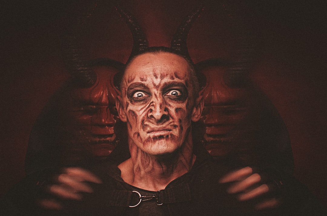
The distress is thematic. The Evil Within is built around a fractured, decaying mindscape full of body horror, so a clean wordmark would feel wrong. Roughing up the letters signals corruption, disease, and instability before play begins. The gritty texture mirrors the rusted, bloodstained environments and the game’s signature unsettling imagery.
- Corruption: distressed letters mirror the decaying, unstable world.
- Body horror: gritty texture echoes the visceral, fleshy imagery.
- Weight: heavy caps feel oppressive and serious.
- Restraint: clean UI type keeps gameplay readable under pressure.
The treatment also signals lineage. With Resident Evil’s creator at the helm, The Evil Within positions itself as a return to classic, punishing survival horror, and a roughed-up, serious wordmark reads as a deliberate rejection of slick, action-forward branding. The grit is a promise: this game intends to make you uncomfortable, and the logo says so before the first cutscene plays.
Can I use The Evil Within font for my own project?
The logo is a trademarked wordmark owned by Bethesda, so it is off-limits for commercial use, and copying it closely is legally risky. You can build your own original distressed treatment using a free or licensed display font plus your own grit textures, which lands in the same territory without lifting the mark. Always confirm the license on any font before publishing; our font licensing guide covers desktop, web, and commercial use. For neighboring horror styles, compare our Silent Hill font and Dead Space font breakdowns.
Frequently Asked Questions
Is The Evil Within font available to download?
No. The logo is custom distressed lettering, not a retail typeface, so there is no official file. Any “Evil Within font” online is a look-alike. To recreate it, start from a distressed or eroded display and add grain and grit textures in an image editor.
What font is closest to The Evil Within logo?
A distressed or eroded display face gives you the roughed-up base, after which you add a grunge texture overlay. The exact glyph skeleton matters less than the heavy distress, so prioritize a strong display and lean into the grit and grain treatment.
What font does The Evil Within use for its menus?
The interface uses clean, legible sans-serif type so prompts, ammo, and objectives stay readable during combat. Free alternatives like Inter or Roboto match that functional feel. The distressed logo style does not appear in the UI, which is deliberately modern and restrained.
Does The Evil Within use the same font in both games?
Both entries share the distressed, visceral logo approach as a consistent brand cue, though the exact texture and treatment differ between titles. In-game UI fonts also stay in the clean, legible sans-serif family across the series, keeping menus readable while the logo carries the horror identity.


