What Font Does Puss in Boots Use?
The Puss in Boots font matches its hero — a dashing, sword-fighting cat — with ornate, swashbuckling letterforms full of flourishes, a touch of Spanish flair, and the bold, theatrical presence of a swashbuckler’s title card. As with virtually every film title, the lettering is a custom-drawn wordmark created for DreamWorks rather than a font you can install. Below we break down the logo, why it leans into ornate swash type, and the free look-alikes that get you closest. Treat the specific comparisons here as informed observations, not a confirmed studio spec.
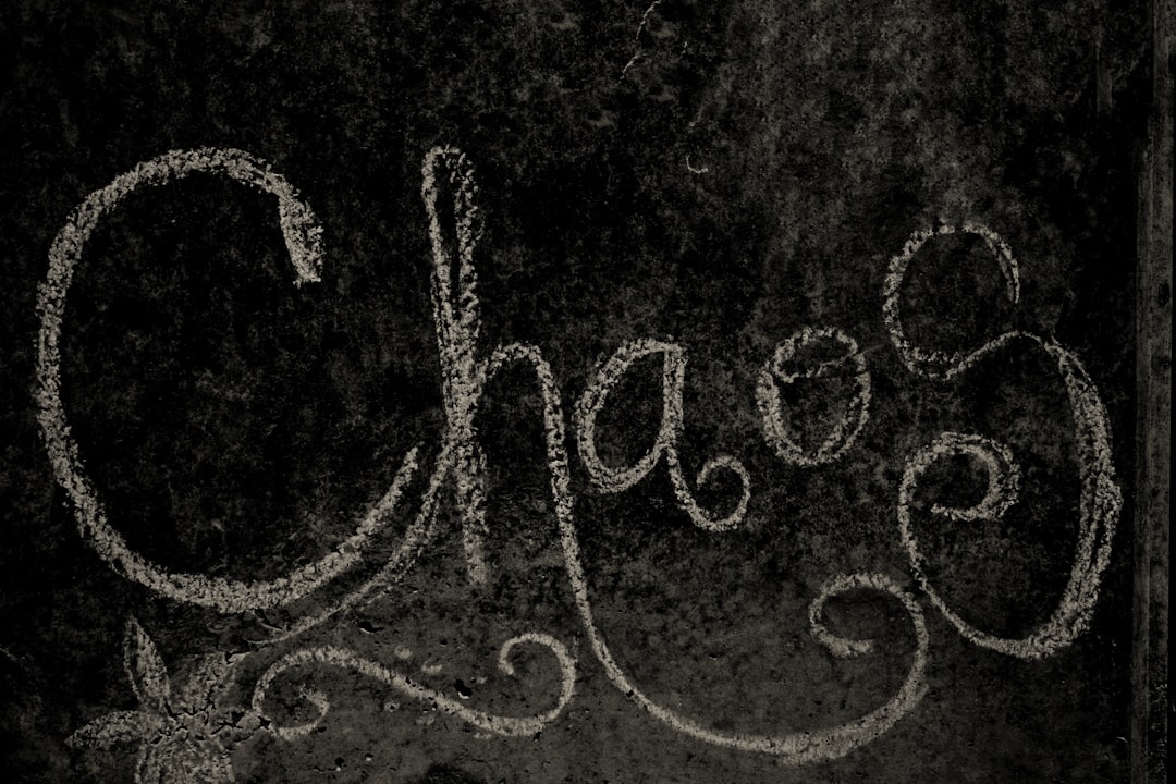
What font is the Puss in Boots logo?
The Puss in Boots logo is a custom ornate swash display — decorative letterforms with dramatic, sweeping swashes and a bold, adventurous serif character. The flourishes evoke the cape, the sword, and the Spanish-Andalusian setting of the films, giving the title a theatrical, storybook swagger. The forms are confident and a little flamboyant, exactly like the character. It is decorative artwork, individually drawn, and a registered trademark of the franchise. There is no downloadable “Puss in Boots” font; what you see is illustration with custom swashes, not type set from a single typeface.
What typeface is used in the film?
Across the films and marketing, DreamWorks pairs that swashy title with cleaner supporting type for credits, taglines, and body copy — neutral serifs and sans-serifs that recede so the ornate logo carries the personality. The flourished headline is the star; everything around it stays calm. Because the main title is bespoke, the only honest description is “a custom ornate swash display with a swashbuckling, Spanish flavor,” and any licensed font appears only in the surrounding text. If you are matching the franchise, put your effort into the flourished headline and keep secondary type plain.
It helps to separate how the logo is made from how it is used. The swash-laden title on posters and in trailers is a single piece of finished artwork — drawn, flourished, and refined once — while the captions, credits, and legal text in the same campaign are set live from ordinary licensed fonts. That distinction is why you can convincingly evoke Puss in Boots with a free ornate face for your headline and a calm serif for the rest: you are recreating the impression of the logo, not the file itself, and no off-the-shelf font will match the bespoke wordmark exactly.
Free fonts that look like the Puss in Boots font
You cannot use the trademarked wordmark, but several free fonts capture the same ornate, swashbuckling, Spanish-flavored energy. Match the role: an ornate swash or bold decorative serif for the headline, a clean face for everything else.
| Use case | Puss in Boots uses | Free alternative |
|---|---|---|
| Title / logo look | Custom ornate swash display | Berkshire Swash (free) |
| Flourished swash headline | Dramatic sweeping swashes | Yeseva One (free) |
| Bold adventurous serif | Theatrical decorative serif | Cinzel Decorative (free) |
| Supporting body text | Neutral serif | EB Garamond (free) |
An ornate swash face like Berkshire Swash is a strong free starting point — it brings the sweeping flourishes the logo relies on. For a bolder, more theatrical serif, Cinzel Decorative adds carved, classical drama, and Yeseva One offers elegant high-contrast curves. Pair your headline with a quiet serif like EB Garamond for body copy. Always confirm commercial rights before shipping; our font licensing guide walks through exactly what to check.
Why does Puss in Boots use this kind of type?
The ornate swash logo does instant character-building. Dramatic flourishes and bold serifs feel theatrical and adventurous, matching a swashbuckling sword-fighter; the decorative swashes evoke capes, blades, and old-world romance; and the Spanish flavor ties the title to the films’ Andalusian setting and Antonio Banderas’s voice. A plain modern font would strip away all that charm. The type tells you this is a dashing fairytale adventure before the first scene. This is why swashbuckling and storybook titles so often reach for ornate swash and decorative serif display faces. For more famous logo breakdowns, see our hub on famous brand fonts.
How to recreate the Puss in Boots look
To echo the swashbuckling feel without copying the wordmark, lead with flourish. Start from an ornate swash face like Berkshire Swash or a bold decorative serif, set the headline large, and let a few key letters extend dramatic swashes — a sweeping tail off the first or last letter mimics the flick of a sword or the sweep of a cape. Keep the contrast high and the serifs sharp; that theatrical, old-world drama is what separates a swashbuckler’s title from an ordinary serif headline. A warm palette of deep red, black, and gold evokes Spanish leather and candlelight.
Then let everything else stay restrained. The flourished headline is the star, so pair it with a quiet serif like EB Garamond for body copy, captions, and taglines, with comfortable spacing. One ornate display plus one calm serif is the entire system; a second decorative font would fight the swashes and dilute the storybook elegance. If you want extra carved drama for a subtitle or crest, reserve a face like Cinzel Decorative for that single accent rather than the whole layout.
Can I use the Puss in Boots font for my own project?
Not the actual logo. The Puss in Boots wordmark is bespoke, trademarked artwork tied to a major franchise, so recreating it for your own branding risks copyright and trademark problems. What you can do is build a similar swashbuckling mood with a properly licensed ornate font — pick a free option above, verify its license, and letter your own headline rather than copying the film’s. If you like bold, character-driven movie titles, see our sibling breakdowns on the Kung Fu Panda font and the Megamind font.
Frequently Asked Questions
What font does Puss in Boots use in its logo?
It uses a custom ornate swash display — decorative letters with dramatic swashes and a bold, adventurous serif feel that carries a Spanish, swashbuckling flavor. The wordmark is bespoke artwork drawn for the DreamWorks films and trademarked, so it is not a single downloadable font.
Is there a free Puss in Boots font?
Not the exact logo, but free ornate swash and decorative serif fonts get close. Berkshire Swash and Cinzel Decorative capture the flourished, theatrical energy. Always verify each font’s license before commercial use, since some free fonts are personal-use only.
What kind of font is the Puss in Boots title?
It is an ornate swash display face — decorative, flourished lettering rather than body type. It uses sweeping swashes and a bold adventurous serif character with a Spanish flavor, which gives the title its swashbuckling, storybook, sword-and-cape feel that suits the hero.
Can I download the Puss in Boots font?
No. The title is custom illustrated artwork and a registered trademark, so there is no official file to download. Any “Puss in Boots font” on a free-font site is an unofficial imitation. Use a licensed ornate swash font and letter your own headline instead.


