What Font Does Sing Use?
Quick disambiguation before we dive in: this article is about the sing movie font — the title treatment from Illumination’s 2016 animated musical about a singing-competition theater run by an optimistic koala — not the everyday verb “sing.” The film’s wordmark is all showbiz: bright, sparkly, and built to feel like a theater marquee lit up for opening night. Below we break down what the lettering really is, why it looks the way it does, and which free fonts get you closest if you want that stage-light energy for your own project.
What font is the Sing logo?
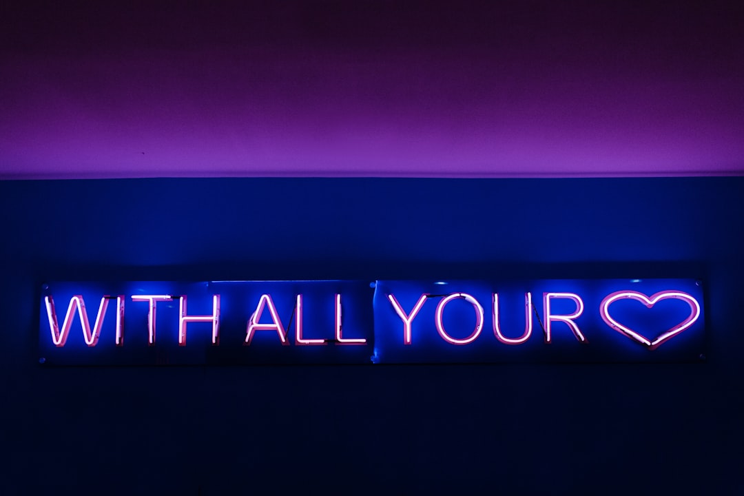
The Sing logo is custom lettering, not a font you can buy and type with. The wordmark uses bold, confident letterforms styled to evoke a lit-up marquee — think strong strokes, a polished finish, and sparkle or glow effects layered on to sell the showbiz fantasy. It is designed to look like a sign you would see above a stage, not like body text.
Because the title was drawn specifically for the film, no single downloadable file will match it exactly. Designers often name a bold display face as the nearest off-the-shelf relative, but you should treat any precise font name as an informed observation rather than a confirmed spec. The traits that actually matter are the bold weight, the marquee styling, and the sparkly, theatrical finish layered on top.
What typeface is used in the film?
Across Sing and its sequel’s marketing, the branding leans on the same bold, showbiz logic. The main title uses the sparkly custom marquee wordmark, while supporting text — credits, taglines, on-screen signage — usually switches to cleaner, more neutral sans-serifs so the bright, busy animation stays readable.
This is the standard animated-feature setup: one expressive, hand-built display face carries the personality of the title, and a quieter workhorse sans handles anything that just needs to be legible. So when people ask what typeface is used in the film, the real answer is that the memorable part — the glowing marquee logo — is custom, and the readable supporting text is something plainer behind the scenes.
The lighting and sparkle effects matter as much as the letter shapes here. The Sing wordmark is almost always paired with glow, sparkle, or stage-light treatments that turn ordinary bold letters into a marquee. If you reproduce the letterforms but skip the lighting effects, you lose most of the showbiz feeling, because the glow is doing as much branding work as the type itself.
Free fonts that look like the Sing font
You cannot download the exact logo, but a bold display face with a showbiz feel gets you convincingly close — especially once you add glow and sparkle. Match the weight and theatrical attitude first, then layer the lighting. Here are free starting points:
| Use case | Sing uses | Free alternative |
|---|---|---|
| Main marquee title wordmark | Bold custom showbiz display | Bungee or Bungee Inline |
| Sparkly stage-light lettering | Strong strokes with glow effects | Monoton or Megrim |
| Bold theatrical tagline | Confident, showy caps | Titan One or Anton |
| Clean supporting / body text | Neutral sans for legibility | Inter or Nunito |
For the closest feel, set your chosen bold face large, then add glow, sparkle, and bulb-light effects to mimic a marquee. The Sing look comes from the theatrical lighting as much as the letters — so the post-processing matters as much as the font choice. If you want a softer, gentler Illumination tone instead, our breakdown of the Secret Life of Pets font covers the rounder, warmer side of the studio’s style.
Why does Sing use this kind of type?
The typography sells the premise: a feel-good musical about a singing competition. Sparkly marquee lettering instantly says “showbiz, stage, spotlight” — it puts you in a theater before the first note plays. Bold theatrical type is doing tone-setting and genre-signaling at the same time.
Bold display also survives shrinking and reprinting. A title that lands on posters, soundtrack covers, toys, and tiny streaming thumbnails has to stay punchy at every size, and heavy strokes with strong lighting effects hold up far better than thin or delicate type. For a wider look at how franchises build instantly recognizable wordmarks, see our guide to famous brand fonts.
There is a consistency payoff, too. Because the same marquee styling carries across the original film, its sequel, and the soundtrack-driven merchandise, the glowing wordmark becomes shorthand for the whole feel-good musical world — you read “showbiz” before you read the title. That is the advantage of a custom-lit treatment over plain type: the lighting and the letters together become the brand. If you are recreating the look for your own project, settle on one bold base face, one glow color, and one bulb-light pattern, then reuse them consistently so every piece reads like it belongs on the same marquee.
Can I use the Sing font for my own project?
You cannot download an official “Sing font,” and the logo, name, and characters are protected trademarks, so reproducing the wordmark for merch, thumbnails, or anything implying an official tie-in is off-limits. What you can do is build something original in the same showbiz spirit using a free bold display face plus your own lighting effects.
If your project is commercial, confirm the license on whatever font you pick first — our font licensing guide explains desktop, web, and merchandise rights in plain language. To see how another Illumination title handles a bold, playful brief, compare our look at the Despicable Me font.
Frequently Asked Questions
Is this about the movie Sing or the verb?
This page is about Sing, the 2016 Illumination animated musical with the singing-competition plot, not the everyday verb “sing.” The film’s title uses a custom sparkly, marquee-style logo, which is what most people mean when they search for the Sing movie font.
Does Sing use a real downloadable font?
No. The Sing logo is custom lettering drawn for the film, not a retail typeface you can buy. Designers approximate it with bold showbiz display fonts, but any exact match is an informed observation rather than a confirmed spec. The defining traits are bold weight and sparkly marquee styling.
What font is closest to the Sing logo?
Free bold display faces like Bungee, Bungee Inline, and Monoton get you close, especially once you add glow and bulb-light effects to mimic a marquee. None match the official wordmark exactly, but they capture the same bold, sparkly, theatrical personality that defines the title.
Can I use a look-alike font commercially?
You can use free look-alike display fonts for original work, but never reproduce the Sing name, logo, or characters. Always confirm the specific font’s commercial license before publishing or selling, since some free fonts restrict merchandise, embedding, or resale use.


