What Font Does Arifureta Use?
If you have searched for the exact arifureta font, you have probably found a lot of guesses and no real download. That is expected. The title treatment for Arifureta: From Commonplace to World’s Strongest is a bespoke logo made for the anime and its light-novel and manga branding. It is bold, heavy, and dark, matching a series about an ordinary student who is dropped into a brutal labyrinth and rebuilds himself into something ruthless. Below we separate the custom wordmark from the free fonts that capture its strength, and we explain how to use them legally in your own dark-isekai designs.
What font is the Arifureta logo?
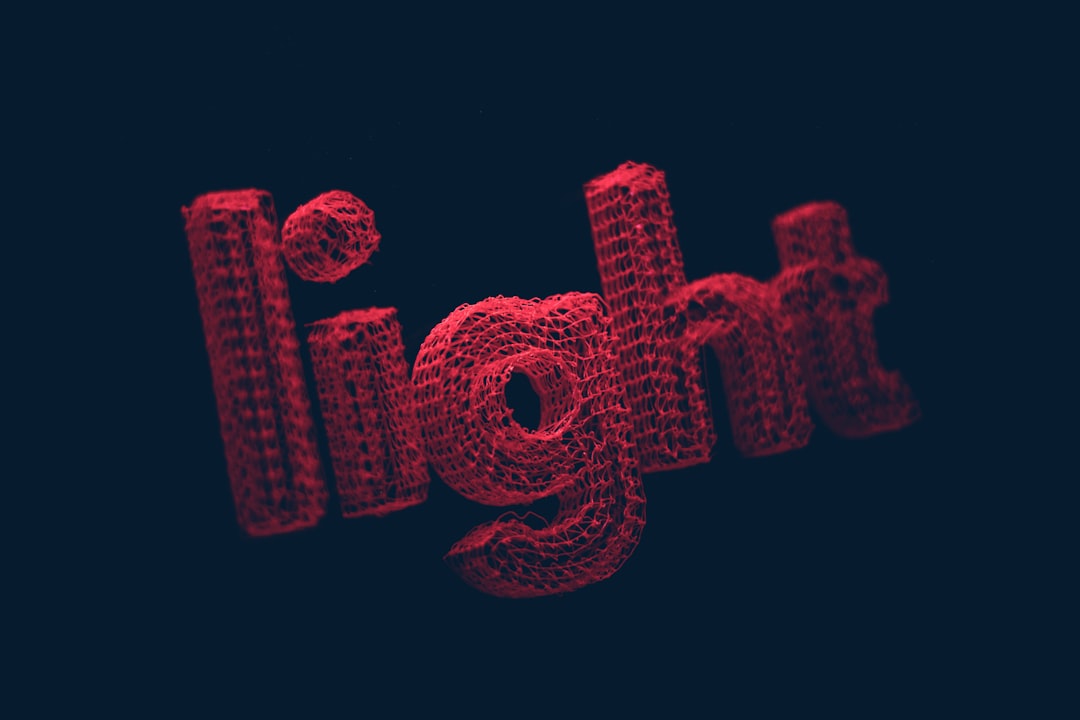
The Arifureta logo is a custom wordmark, not a retail typeface. Anime title logos are almost always lettered or modified by a designer for the production committee, so the exact shapes do not correspond to any font you can purchase. The Arifureta logo shows clear custom traits: heavy, dominant strokes; sharp, slightly aggressive terminals; and tightly controlled spacing tuned by hand so the title reads as one solid, powerful block rather than a row of typed characters.
What we can describe confidently is the category. The wordmark sits in the heavy bold display family, with enough weight to feel forceful and enough edge to feel dangerous, matching the show’s transformation-through-suffering premise. If someone names a single font as “the” Arifureta font, treat that as an informed observation, not a confirmed spec. The honest framing is stylistic: a heavy, bold display with sharpened, dark-fantasy detailing rather than any one downloadable face.
What typeface is used in the anime?
The anime’s typography works on two levels. The headline level is the custom dark-isekai logo, used on key art, the title card, and promotional materials. The functional level is the supporting text: episode titles, status-screen and skill flavor text, and subtitles. For the Japanese broadcast these use standard gothic and mincho families chosen by the studio, while English releases use the localization team’s own subtitle fonts, which are unrelated to the logo.
For designers, the lesson is that the Arifureta identity lives almost entirely in the bold logo, not the body text. When you build something Arifureta-inspired, invest in the headline and keep supporting copy clean. A heavy display face in the title plus a neutral serif or sans for everything else reproduces the show’s forceful mood without overwhelming the layout or hurting readability.
There is a practical reason the production splits the work this way. A heavy condensed display face is built to dominate at large sizes, but it becomes tiring and hard to read in body copy, so it is reserved for the title where its impact does the most good. When you recreate the look, resist the urge to set everything in the boldest face you have. Let the headline shout and let the supporting text speak normally, and the contrast will make the title feel even more powerful by comparison.
Free fonts that look like the Arifureta font
Since the real logo is custom, the practical move is to pair a free, heavy display face for headlines with a calmer body font. The options below are widely available, but licenses vary, so confirm each one before publishing. Here is a use-case mapping:
| Use case | Arifureta uses | Free alternative |
|---|---|---|
| Main title / logo | Bold custom dark-isekai display | Oswald (Bold) or Teko |
| Sharp / aggressive accent | Sharpened, edged terminals | Saira Stencil One |
| Heavy condensed headline | Dominant, tightly packed strokes | Anton |
| Body / subtitle text | Studio gothic & mincho | Inter |
A reliable recipe: set the headline in Anton for maximum weight and impact, tighten the tracking so it reads as one solid emblem, and run body copy in Inter for clean readability. That combination delivers the forceful dark-isekai personality without touching the trademarked wordmark. If you want a slightly taller, more condensed feel, swap the headline to Teko or Oswald in a heavy weight for a sharper silhouette.
- Anton — ultra-heavy condensed sans, ideal for a powerful headline.
- Oswald — versatile condensed sans with strong bold weights.
- Teko — tall, narrow display sans for a dramatic, edged title.
- Inter — clean, neutral sans that keeps body copy readable.
Why does Arifureta use this kind of type?
Type signals the emotional register. Arifureta is a dark-isekai power fantasy: the protagonist is betrayed, broken in a monster-filled abyss, and reforged into someone strong and merciless. A heavy, bold display logo communicates that arc instantly. The weight says “overwhelming power,” and the sharp, edged terminals add the danger and ruthlessness that separate this from a cozy adventure.
Heavy bold display type carries strong associations with action, strength, and intensity, which is exactly what a strongest-in-the-world isekai wants to project. That is why this style recurs across action and gaming branding. If you are exploring bold, impactful display type for that kind of work, our roundup of the best gaming fonts is a useful companion, since many action-RPG logos lean on the same heavy display energy.
Can I use the Arifureta font for my own project?
You should not copy the actual logo. The Arifureta wordmark is a custom asset owned by the franchise rights holders, and the title is protected. Using it on merchandise or any commercial product, or in a way that implies official endorsement, is a legal risk. For fan art and transformative work, recreate the bold feel with the licensed free alternatives above rather than tracing the original logo.
Free fonts still carry terms. “Free for personal use” does not always mean free for commercial use, and some faces require attribution. Read each EULA before you publish or sell anything. Our font licensing guide explains desktop, web, and commercial licensing in plain language. If dark isekai is your genre, you may also like our breakdowns of the grimdark Goblin Slayer font and the redemption-arc Banished Hero font.
Frequently Asked Questions
Is the Arifureta font free to download?
No. The title is a custom logo, so there is no official font file to download. You can recreate the look with free heavy display faces like Anton or Oswald, but confirm each font’s license before any commercial use, since terms differ between releases.
What font is closest to the Arifureta logo?
For a heavy, powerful headline, Anton is the closest free match, with Teko and Oswald offering a taller, sharper silhouette. None are exact, since the wordmark was custom-drawn for the franchise, so treat any match as an informed observation.
Can I use these fonts commercially?
Often yes, but verify first. Many heavy display sans faces allow commercial use, while others restrict it to personal projects or require attribution. Always read the specific EULA and review a font licensing guide before selling work that includes them.
Why does Arifureta look so bold and dark?
The bold logo mirrors the story’s dark-isekai power fantasy. Heavy weight signals overwhelming strength and the sharp, edged terminals signal ruthlessness, so the typography prepares viewers for the protagonist’s brutal transformation before the first episode begins.


