What Font Does Chicken Run Use?
Aardman’s 2000 stop-motion hit turned a poultry farm breakout into a beloved comedy, and the Chicken Run font on its poster carries a lot of that energetic, mischievous spirit. People searching for it usually want to recreate that bold, fun, escape-movie title for a party invite, a film-night poster, or a craft project. Below we separate what the logo actually is, what we can reasonably say about it, and which free fonts get you closest without touching anything trademarked.
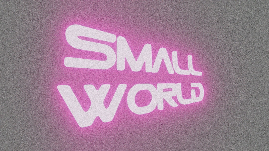
What font is the Chicken Run logo?
The Chicken Run title is best understood as a custom wordmark drawn or assembled specifically for the film’s marketing, not a single off-the-shelf font. That is the norm for major animated comedies: a lettering artist starts from a heavy display shape, then adjusts proportions, spacing, and individual letters so the title sits perfectly on the key art and feels lively. Because of that, no downloadable font will be a pixel-perfect match.
What we can describe honestly is the character of the lettering. It leans bold, rounded at the corners, and energetic, with a sense of movement that mirrors the film’s frantic escape plot. Nothing here is delicate or formal; the mood is fun and a little chaotic. If you see a site claiming an exact font name for the logo, treat that as an informed observation, not a confirmed spec, unless it is sourced from the studio or the designer.
What typeface is used in the film?
Inside the film and across its supporting materials, the typography stays cheerful and uncomplicated. Credits and incidental on-screen text in family animation typically use clean, friendly sans-serifs so nothing distracts from the characters and gags. The poster title is the showpiece; everything else is supporting cast.
This matters if you are trying to recreate the look. You do not need an exotic face for body text. A rounded, approachable sans for headings and a quiet humanist sans for captions will feel right immediately. If you enjoy this kind of breakdown, our companion piece on the Wallace and Gromit font covers another Aardman title with a warmer, hand-crafted personality.
Free fonts that look like the Chicken Run font
You cannot legally download the actual custom logo, but you can get remarkably close with free, open-licensed fonts. The trick is matching the mood: bold, rounded, unmistakably playful. Here are reliable free substitutes:
- Fredoka — a chunky, rounded display sans with a friendly, bouncy feel; ideal for the title word itself.
- Bungee — heavy and energetic, great when you want the caper drama dialled up.
- Baloo 2 — soft, weighty, and approachable for big headlines.
- Nunito — a gentle, rounded sans for captions and supporting text.
- Chango — a bold slab-ish display that adds a sturdy, comic punch.
| Use case | Chicken Run uses | Free alternative |
|---|---|---|
| Main title | Custom bold playful wordmark | Fredoka / Bungee |
| Subtitle / tagline | Cheerful supporting type | Baloo 2 |
| Captions & credits | Clean friendly text | Nunito |
| Decorative accent | Hand-tuned lettering | Chango |
Why does Chicken Run use this kind of type?
Typography sets emotional expectations before a single frame plays. A bold, rounded display signals fun, energy, and adventure, exactly the register a comic escape caper wants. Had the poster used a thin elegant serif, the film would have read as serious or refined; a stiff geometric sans would have felt cold. The chosen chunky, playful lettering says “lively, funny, full of movement,” which is precisely the Chicken Run promise.
There is also a strong family-animation logic at work. Aardman comedies trade on warmth and slapstick, and the type mirrors that: confident, friendly, and unmistakably for everyone. This is a recurring lesson in film branding, and you can see related thinking in our roundup of famous brand fonts, where bold shapes are used to grab attention instantly.
It is worth noting how the lettering plays against the stop-motion visuals. The hen heroes are made of soft, rounded clay, full of dents and thumbprints, and a thin, brittle typeface would have clashed with that tactile texture. By choosing fat, rounded forms with generous internal spaces, the designers gave the title the same hand-made, squeezable quality as the characters. That harmony between type and craft is exactly what makes a film logo feel inevitable rather than bolted on, and it is the single most useful thing to copy when you build your own version: match the weight and roundness of your letters to the texture of the thing you are promoting.
Can I use the Chicken Run font for my own project?
For personal, non-commercial fun, recreating the vibe with a free display font is completely fine. What you must not do is copy the trademarked wordmark, the exact logo lockup, or the key-art layout for anything commercial, because that crosses into trademark and copyright territory tied to the film’s rights holders.
To get a convincing result without the original file, start with a heavy weight of your chosen look-alike, tighten the letter spacing slightly so the words feel packed and energetic, then add a subtle outline or drop shadow to give the title a poster-like lift. A gentle rotation on one or two letters can suggest the tumbling, mid-escape movement of the original without copying it. These are stylistic choices anyone can make, and they keep your work clearly distinct from the trademarked logo while still reading as bold and fun.
The safe path is simple: choose a freely licensed look-alike such as Fredoka or Bungee, then add your own spacing and styling. Before you publish anything public-facing, confirm the licence permits your use. Our font licensing guide walks through the difference between personal, commercial, and embedding rights so you stay on solid ground. If you want a contrasting reference point, the breakdown of the Flushed Away font shows how another bold Aardman adventure title is handled.
Frequently Asked Questions
Is the Chicken Run font free to download?
No. The title is a custom-drawn wordmark, not a released font, so there is no official file to download. You can, however, reproduce the bold, playful feel for free using open-licensed display fonts like Fredoka or Bungee.
What kind of font is the Chicken Run logo?
It reads as a bold, rounded, energetic display style with a fun, slightly chaotic character. Treat that as an informed observation rather than a confirmed typeface name, since the logo was hand-tuned for the poster rather than set in a single off-the-shelf font.
Which free font looks most like Chicken Run?
Fredoka is the closest easy win for the chunky, rounded feel. If you want more impact and drama, Bungee pushes the energy further, while Baloo 2 keeps big headlines soft and friendly at larger sizes.
Can I use a Chicken Run look-alike commercially?
You can use a freely licensed look-alike font commercially if its licence allows, but you cannot reuse the actual logo, exact lettering, or poster layout. Always confirm the specific font licence, and review our font licensing guide before publishing.


