Lora Font Pairing: 12 Best Combinations for Web & Editorial
The right Lora font pairing turns a good design into a refined one. Lora is one of the most widely used serif typefaces on Google Fonts, and for good reason. Designed by Cyreal in 2011, it blends contemporary structure with calligraphic roots, producing warm brushed curves that feel approachable without sacrificing editorial authority. Its moderate stroke contrast and generous proportions make it comfortable to read at body sizes while still carrying enough personality to hold its own in headings.
That dual capability is precisely what makes pairing with Lora so rewarding and so easy to get wrong. Because Lora can serve as both a heading and body typeface, the companion you choose needs to establish a clear role division. The strongest pairings introduce contrast through geometric precision, condensed proportions, or monospaced rhythm, letting Lora’s organic warmth do what it does best.
In this guide, I have assembled 12 of the best Lora font pairings, organized by category. Each combination includes the reasoning behind it, the ideal use case, and the specific font weights to use. The first three pairings include CSS snippets ready to drop into your stylesheet. Whether you are building an editorial site, a brand identity, or a documentation platform, there is a Lora Google font pairing here that fits your project.
Why Lora Works So Well in Font Pairings
Before diving into specific combinations, it helps to understand what makes Lora such an adaptable partner in typographic systems.
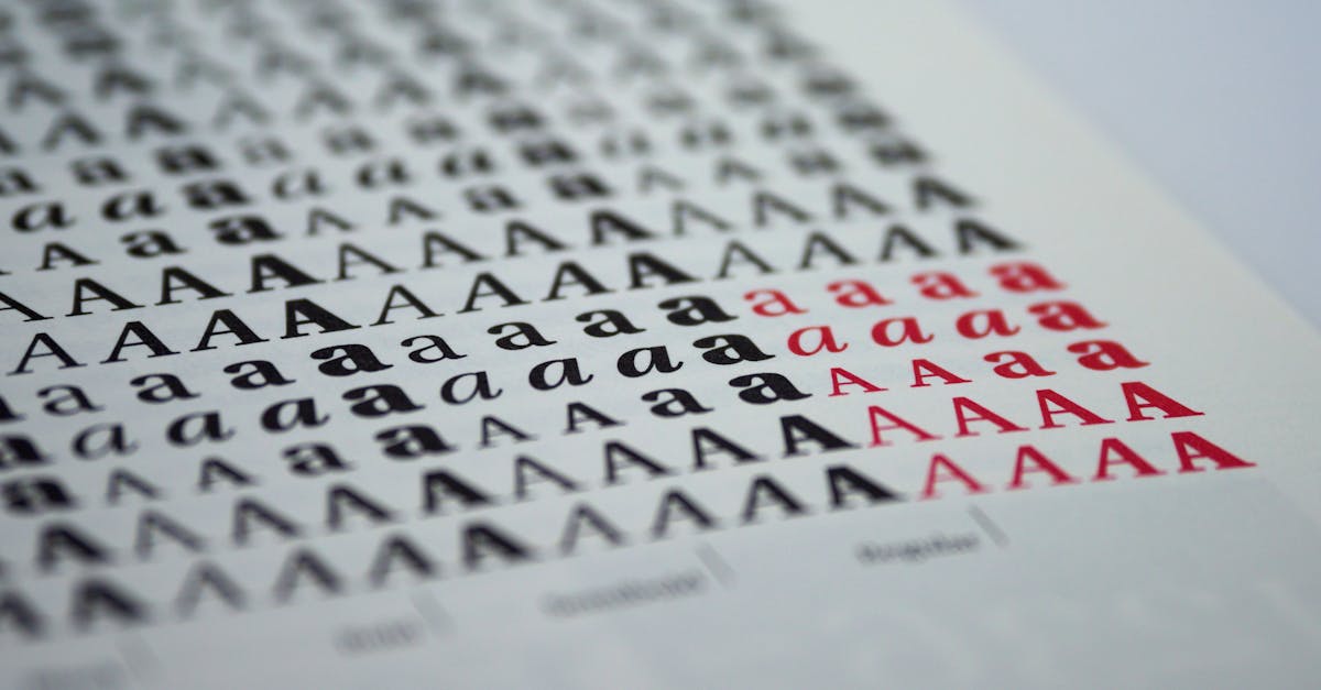
Lora belongs to the transitional serif classification but carries visible calligraphic DNA. Its letter terminals curve with a hand-drawn quality that distinguishes it from more rigid serifs like Times New Roman or Source Serif. The italic cuts are particularly expressive, with swash-like forms that add genuine elegance to pull quotes and highlighted passages. Lora ships with four weights (Regular 400, Medium 500, SemiBold 600, Bold 700) in both upright and italic, giving you enough range to build a complete hierarchy within a single family.
On the technical side, Lora was optimized for screen rendering from the start. Its x-height is generous, its counters are open, and its stroke contrast is moderate enough to hold up at 14px body text on low-resolution displays. These qualities make it one of the most reliable Google Fonts serifs for long-form reading. For a deeper look at the typeface itself, see our Lora font review.
Key Principles for Pairing with Lora
- Contrast in structure, harmony in proportion. Lora’s calligraphic warmth pairs best with fonts that offer structural contrast. Geometric and grotesque sans-serifs work better than humanist ones, which can feel too similar in spirit. At the same time, matching x-heights keeps the pairing feeling cohesive.
- Let Lora handle the body. While Lora works at heading sizes, its greatest strength is sustained readability. In most pairings, assign Lora to body text and let a bolder or more condensed typeface take the headings.
- Respect weight balance. Lora Regular (400) has a sturdy visual presence on screen. Heading fonts need to be set at SemiBold (600) or heavier to maintain clear hierarchy above Lora’s body text.
- Use the italics. Lora’s italic is one of its defining features. Any pairing that ignores it misses an opportunity. Use Lora Italic for blockquotes, captions, and emphasis to inject personality without adding another font file.
Lora + Sans-Serif Heading Pairings
Sans-serif headings with Lora body text is the most natural configuration. The geometric or grotesque precision of a sans-serif heading creates immediate visual contrast against Lora’s organic curves, establishing hierarchy without effort. These are the fonts that go with Lora most reliably across contexts.
1. Montserrat + Lora
Why it works: Montserrat is a geometric sans-serif with even stroke widths and a wide, confident stance. Against Lora’s calligraphic softness, it reads as clean and authoritative. The contrast between Montserrat’s mechanical precision and Lora’s brushed terminals is immediate, creating a pairing that feels both modern and literary. Both fonts share a generous x-height, so they align naturally at adjacent sizes without awkward visual jumps.
Best for: Editorial blogs, lifestyle magazines, content marketing sites, and boutique e-commerce.
Recommended weights:
- Headings: Montserrat Bold (700) or SemiBold (600)
- Body: Lora Regular (400)
- Emphasis: Lora Italic (400i) for pull quotes and captions
CSS snippet:
@import url('https://fonts.googleapis.com/css2?family=Lora:ital,wght@0,400;0,700;1,400&family=Montserrat:wght@600;700&display=swap');

h1, h2, h3 {
  font-family: 'Montserrat', sans-serif;
  font-weight: 700;
  letter-spacing: -0.01em;
}
body, p {
  font-family: 'Lora', serif;
  font-weight: 400;
  line-height: 1.75;
}
blockquote {
  font-family: 'Lora', serif;
  font-style: italic;
}
2. Inter + Lora
Why it works: Inter was built for user interfaces, with a tall x-height, open apertures, and meticulous spacing optimized for screens. Those same qualities make it an outstanding heading companion for Lora. Where Lora brings warmth and editorial credibility to body text, Inter delivers clarity and precision in headings. The pairing strikes an ideal balance between approachable and functional, which is why it has become one of the most popular Lora combinations in web design.
Best for: SaaS marketing sites, documentation platforms, content-driven web apps, and newsletters.
Recommended weights:
- Headings: Inter SemiBold (600) or Bold (700)
- Body: Lora Regular (400)
- UI labels: Inter Medium (500)
CSS snippet:
@import url('https://fonts.googleapis.com/css2?family=Inter:wght@500;600;700&family=Lora:ital,wght@0,400;0,700;1,400&display=swap');

h1, h2, h3 {
  font-family: 'Inter', sans-serif;
  font-weight: 600;
}
body, p {
  font-family: 'Lora', serif;
  font-weight: 400;
  line-height: 1.7;
}
.ui-label, nav {
  font-family: 'Inter', sans-serif;
  font-weight: 500;
  font-size: 0.875rem;
}
3. Poppins + Lora
Why it works: Poppins is a geometric sans-serif with perfectly circular letter bowls and a friendly, open personality. Its rounded geometry provides a striking counterpoint to Lora’s angular serifs and calligraphic movement. The pairing feels warm on both sides of the equation, which makes it particularly effective for brands that want to appear accessible and inviting without sacrificing sophistication.
Best for: Wellness brands, food blogs, education platforms, and non-profit organizations.
Recommended weights:
- Headings: Poppins SemiBold (600) or Bold (700)
- Body: Lora Regular (400)
- Subheadings: Poppins Medium (500)
CSS snippet:
@import url('https://fonts.googleapis.com/css2?family=Lora:ital,wght@0,400;0,700;1,400&family=Poppins:wght@500;600;700&display=swap');

h1, h2, h3 {
  font-family: 'Poppins', sans-serif;
  font-weight: 600;
}
h4, h5, h6 {
  font-family: 'Poppins', sans-serif;
  font-weight: 500;
}
body, p {
  font-family: 'Lora', serif;
  font-weight: 400;
  line-height: 1.75;
}
4. Raleway + Lora
Why it works: Raleway is an elegant geometric sans-serif with distinctive letterforms, particularly its lowercase w and capital W. Its thinner strokes at lighter weights give headings a refined, editorial quality that complements Lora’s body text without competing for attention. This is a pairing for designers who want sophistication without the high-contrast drama of a display serif.
Best for: Fashion editorial, architecture portfolios, art galleries, and luxury hospitality websites.
Recommended weights:
- Headings: Raleway SemiBold (600) or Bold (700)
- Body: Lora Regular (400)
- Navigation: Raleway Medium (500) with letter-spacing: 0.05em
5. Open Sans + Lora
Why it works: Open Sans is the quintessential neutral sans-serif. Its humanist construction and open letterforms create a clean, unobtrusive heading layer above Lora’s body text. This pairing is deliberately safe, and that is its advantage. It works across industries, devices, and reading contexts without creating friction or making a strong stylistic statement that might not age well.
Best for: Corporate blogs, government websites, healthcare portals, and multi-author publications where consistency matters more than personality.
Recommended weights:
- Headings: Open Sans Bold (700)
- Body: Lora Regular (400)
- Captions: Open Sans Regular (400) at smaller sizes
6. Roboto + Lora
Why it works: Roboto combines mechanical skeleton with largely geometric forms and open curves, a dual nature that mirrors Lora’s own blend of structure and warmth. As Android’s system font, Roboto carries an inherent familiarity that reduces cognitive friction for mobile users. Pairing it with Lora produces a reading experience that feels native on mobile while retaining the editorial character that makes long-form content engaging.
Best for: Android-first products, news aggregators, mobile reading apps, and content management dashboards.
Recommended weights:
- Headings: Roboto Bold (700) or Medium (500)
- Body: Lora Regular (400)
- System text: Roboto Regular (400) for buttons and navigation
Lora + Display Heading Pairings
Display typefaces push pairings into more expressive territory. These combinations use condensed, geometric, or otherwise distinctive heading fonts that make a strong visual impression at large sizes, while Lora carries the body text with its dependable readability.
7. Oswald + Lora
Why it works: Oswald is a condensed gothic sans-serif that packs maximum impact into tight horizontal spaces. Its tall, narrow letterforms are the structural opposite of Lora’s open, spreading serif shapes. That width contrast alone creates a powerful hierarchy. Oswald demands attention in headlines while Lora eases the reader into the body text with its familiar calligraphic warmth. This is one of the most dynamic Lora font pairings available on Google Fonts.
Best for: News websites, sports editorial, promotional landing pages, and bold startup homepages.
Recommended weights:
- Headings: Oswald Bold (700) in uppercase with letter-spacing: 0.03em
- Body: Lora Regular (400)
- Subheadings: Oswald Medium (500) in sentence case
8. Space Grotesk + Lora
Why it works: Space Grotesk is a proportional sans-serif derived from Space Mono, carrying a subtle technical quality in its letter construction. Its slightly quirky geometry, visible in characters like the single-storey lowercase a and the squared-off curves, provides a contemporary counterpoint to Lora’s traditional serif warmth. The pairing reads as modern and thoughtful, appealing to audiences who value design literacy.
Best for: Design studios, creative agencies, tech product marketing, and innovation-focused editorial content.
Recommended weights:
- Headings: Space Grotesk Bold (700) or SemiBold (600)
- Body: Lora Regular (400)
- Code-adjacent labels: Space Grotesk Medium (500)
Lora + Serif Companion Pairing
Pairing two serifs requires the most careful handling. The key is choosing a companion with a fundamentally different personality so the two typefaces occupy distinct visual roles rather than blurring together. For a broader overview of how font pairing principles work across serif families, see our dedicated guide.
9. Playfair Display + Lora
Why it works: Playfair Display is a high-contrast didone-inspired serif designed for large sizes. Its dramatic thick-thin strokes, sharp unbracketed serifs, and vertical stress create a look that is worlds apart from Lora’s moderate contrast and calligraphic movement. Using Playfair Display for headings and Lora for body text produces a serif-on-serif pairing with genuine hierarchy, because the two typefaces differ in exactly the ways that matter: contrast ratio, serif construction, and stroke axis. This is a pairing for projects that want to stay entirely within the serif world without sacrificing visual interest.
Best for: Literary magazines, book review sites, wine and spirits brands, high-end hospitality, and wedding invitations.
Recommended weights:
- Display headings: Playfair Display Bold (700) at 32px+
- Subheadings: Lora Bold (700)
- Body: Lora Regular (400) with line-height 1.75
- Pull quotes: Playfair Display Italic (400i) at larger sizes
Lora + Monospace Pairings
Monospace companions give Lora an unexpected edge. The fixed-width rhythm of a monospaced font creates a textural contrast that is more pronounced than even the sharpest sans-serif. These pairings work particularly well for technical content, developer-focused brands, and designs that want to project precision alongside Lora’s editorial warmth.
10. Fira Code + Lora
Why it works: Fira Code is a monospaced font with programming ligatures, designed by Nikita Prokopov. When used for headings or accent text alongside Lora body copy, the mechanical regularity of its fixed-width characters creates a sharp visual break. The pairing signals a blend of technical rigor and literary craft, which resonates strongly with audiences in developer tooling, technical writing, and data journalism.
Best for: Developer blogs, technical documentation, data journalism sites, and code-adjacent marketing.
Recommended weights:
- Headings or code blocks: Fira Code Regular (400) or Medium (500)
- Body: Lora Regular (400)
- Inline code: Fira Code Regular (400) at a slightly reduced size
11. IBM Plex Mono + Lora
Why it works: IBM Plex Mono carries the design language of the IBM brand, clean, purposeful, and quietly authoritative. Its monospaced rhythm provides the same textural contrast as Fira Code but with a more corporate and polished sensibility. Paired with Lora, it produces a reading experience that feels simultaneously rigorous and approachable, which is ideal for technical content aimed at non-developer audiences.
Best for: Enterprise documentation, research reports, fintech platforms, and data-driven editorial sites.
Recommended weights:
- Headings or metadata: IBM Plex Mono SemiBold (600)
- Body: Lora Regular (400)
- Tables and data labels: IBM Plex Mono Regular (400)
12. Source Code Pro + Lora
Why it works: Source Code Pro, designed by Paul Hunt at Adobe, is a monospaced companion to the Source family. Its clean, slightly rounded letterforms are less austere than many monospaced alternatives, which helps it sit comfortably alongside Lora’s warmth without creating a jarring tonal shift. This pairing is the gentlest of the three monospace options, making it suitable for projects where the monospace element should complement rather than dominate.
Best for: Open-source project sites, API documentation, tech startup blogs, and tutorial platforms.
Recommended weights:
- Headings or accent text: Source Code Pro Medium (500) or SemiBold (600)
- Body: Lora Regular (400)
- Code blocks: Source Code Pro Regular (400)
Tips for Optimizing Lora Font Pairings on the Web
Loading two font families with multiple weights impacts page performance. Here are practical steps to keep your Lora combinations fast without sacrificing typographic quality:
- Load only what you use. Two weights per family is usually sufficient for most projects. For Lora, Regular (400) and Bold (700) cover body text and emphasis. Add Italic (400i) only if your design uses pull quotes or highlighted passages.
- Use font-display: swap. This ensures text remains visible while fonts load, preventing the flash of invisible text that hurts both user experience and Core Web Vitals scores.
- Consider variable fonts. Lora is available as a variable font on Google Fonts, allowing a single file to serve all weights and styles. The variable file is typically smaller than loading three separate static weight files.
- Self-host for speed. Downloading Lora and your companion font from Google Fonts and serving them from your own domain eliminates an extra DNS lookup. Tools like google-webfonts-helper automate the process.
- Subset aggressively. If your site serves only Latin-script languages, strip Cyrillic and Vietnamese character sets from the font files. This can reduce file sizes by 40-60%.
How to Choose the Right Lora Font Pairing
Twelve options is a good number to work from, but narrowing down to one requires matching the pairing to your specific context. Here is a framework for deciding:
- Match the pairing to your content type. Long-form editorial content rewards the sans-serif heading pairings (1-6), where Lora’s body text readability is the primary asset. Brand-forward and high-impact designs benefit from display pairings (7-8) or the serif-on-serif Playfair combination (9). Technical content is best served by monospace companions (10-12).
- Consider your audience expectations. Professional and corporate audiences respond well to Lora with Inter or Open Sans. Creative and design-literate audiences appreciate Space Grotesk or Fira Code. Traditional and luxury audiences expect Playfair Display or Raleway.
- Test at production sizes. Set up your two shortlisted pairings at the actual sizes, line heights, and screen widths you will use. A pairing that looks refined in a Figma mockup at 48px may feel off at 16px on a phone.
- Check the italic. If your content uses emphasized text, blockquotes, or citations frequently, test how the pairing looks when Lora Italic is in play. Some heading fonts sit more comfortably alongside Lora’s expressive italics than others.
For more guidance on how to evaluate and select font pairings across typeface families, our comprehensive pairing guide covers the underlying principles in detail. You can also explore our curated list of the best Google Fonts to discover more candidates worth testing alongside Lora. And if you want to ground your choices in solid fundamentals, our guide on what is typography covers the principles that make all good pairings work.
Frequently Asked Questions
What is the best sans-serif to pair with Lora?
Montserrat and Inter are the strongest all-purpose sans-serif companions for Lora. Montserrat offers geometric contrast and visual confidence in headings, while Inter provides a cleaner, more UI-oriented alternative. Both share a similar x-height with Lora, which keeps the pairing harmonious. For a more detailed look at each, see our Montserrat font guide and Inter font guide.
Can Lora be used for headings instead of body text?
Yes, Lora works as a heading typeface, particularly at Bold (700) weight. However, its calligraphic warmth and moderate contrast are optimized for sustained reading at body sizes, which is where it truly excels. If you use Lora for headings, pair it with a clean sans-serif body font like Inter or Open Sans to maintain readability in longer passages. Most designers find the reverse configuration, sans-serif headings with Lora body, produces stronger results.
Is Lora a good font for long-form content?
Lora is one of the best serif fonts on Google Fonts for long-form reading. Its generous x-height, open counters, and moderate stroke contrast were all designed with screen readability as a priority. Set at 16-18px with a line height of 1.7 to 1.8, Lora remains comfortable even over several thousand words. Its calligraphic personality also adds just enough visual interest to keep the reading experience from feeling flat.
How does Lora compare to other Google Fonts serifs like Merriweather or Source Serif?
Lora, Merriweather, and Source Serif Pro are all excellent body text serifs, but they occupy different aesthetic positions. Merriweather has a sturdier, more slab-like character with larger serifs, making it slightly more assertive on screen. Source Serif Pro is more rational and restrained, fitting formal or corporate contexts. Lora sits between the two, offering warmth through its calligraphic roots without the weight of Merriweather or the neutrality of Source Serif. Your choice depends on tone: warm and literary favors Lora, solid and dependable favors Merriweather, clean and professional favors Source Serif Pro. For a broader comparison, browse our best Google Fonts roundup.


