What Font Does Ben and Jerrys Use?
If you are trying to match the ben and jerrys font for a fan poster, a party invite, or a retro-styled project, you have probably discovered there is no single off-the-shelf typeface that nails it. The short version: the famous chunky Ben & Jerry’s wordmark is custom-drawn brand lettering, not a released font, so there is no file called “Ben and Jerrys” to install. This guide breaks down what the wordmark actually is, why it looks so deliberately handmade, and which free fonts get you closest without touching the trademark.
What font is the Ben and Jerrys logo?
The Ben & Jerry’s logo is a wordmark: hand-drawn, bouncy, slightly uneven letters that look painted rather than typed. The characters are heavy and rounded with playful imperfections — varying weights, tilted baselines, and that loose, almost folksy quality that signals “made by people, not a factory.” It belongs to the funky, hand-lettered display category, the kind of warm, irreverent style long associated with the brand’s Vermont, counterculture roots.
Because this is bespoke artwork tied to decades of brand history, no major foundry sells it as a retail typeface, and the company has not published a public type spec. Anyone claiming a precise source font should be read skeptically. The honest framing: treat the Ben & Jerry’s wordmark as custom hand-lettering, not a confirmed commercial font. Any file labeled “Ben and Jerrys font” online is a fan recreation or a look-alike.
What typeface does Ben and Jerrys use in branding?
Beyond the primary logo, Ben & Jerry’s packaging and marketing lean on friendly, rounded display faces and clean sans-serifs for flavor names, taglines, and nutrition panels. The supporting type is chosen for a warm, approachable tone and high shelf legibility rather than a single signature face, and it shifts with campaigns, pint refreshes, and region.
- Primary wordmark: custom hand-drawn, chunky, slightly wobbly lettering with a playful, painted feel.
- Supporting type: rounded display and clean sans-serifs for flavor names, claims, and small print.
- Tone: warm, quirky, and human — the imperfections are the point, signaling craft over corporate polish.
The brand’s identity really lives in that hand-built wordmark; everything around it stays loud, colorful, and friendly. For more brand-by-brand breakdowns, see our roundup of famous brand fonts.
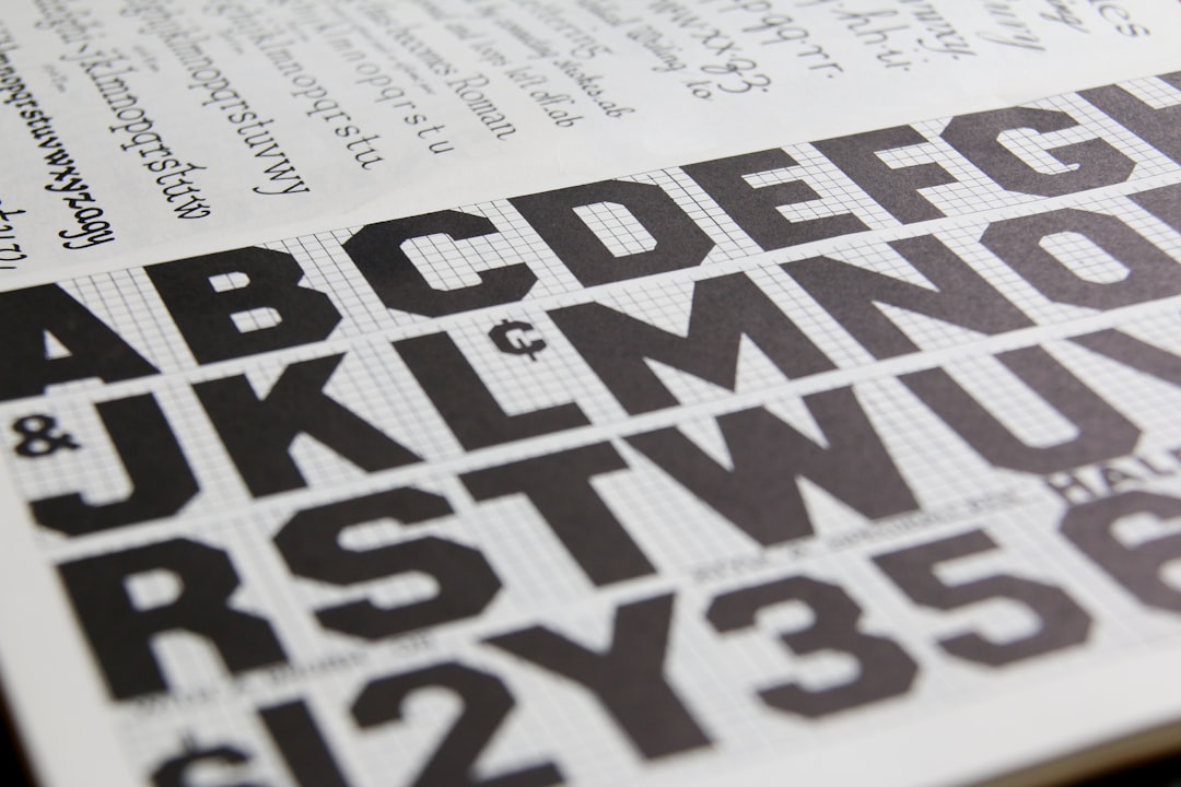
Free fonts that look like the Ben and Jerrys font
You cannot legally lift the trademarked wordmark, but you can capture its chunky, hand-painted vibe with free, openly licensed fonts. The table pairs each part of the look with a free alternative you can actually download and use under its own license.
| Use case | Ben and Jerrys uses | Free alternative |
|---|---|---|
| Logo / display | Custom chunky hand-drawn wordmark | Lilita One or Bungee |
| Flavor names | Friendly rounded display | Fredoka or Baloo 2 |
| Body / supporting | Clean legible sans | Nunito or Poppins |
Lilita One is the single best starting point: it is heavy, rounded, and friendly, so it shares the Ben & Jerry’s sense of fat, cheerful letters. To push it closer, nudge individual letters off a perfectly straight baseline and add a tiny rotation here and there so the line looks hand-placed rather than mechanically typed. If you want even more character, Bungee brings a bold signage punch, while Fredoka and Baloo 2 give you softer, friendlier rounding for flavor names and sub-headings. A slight texture or a hand-painted brush effect over the letters can sell the small-batch, made-by-people feel without going anywhere near the real trademark.
Why does Ben and Jerrys use this kind of type?
Hand-drawn, imperfect lettering does specific brand work. It signals authenticity and craft — a small-batch, made-with-care impression that fits a company built on a quirky, socially conscious identity. Where a slick geometric font would read as corporate, the wobbly wordmark feels human and approachable, which is exactly the personality the brand has cultivated for decades.
There is also a recognition argument. A distinctive, hand-painted wordmark is instantly identifiable on a crowded freezer shelf, where pints compete with bright lids and bold flavor photography. The loose style has stayed remarkably consistent over the years, which compounds that recognition — shoppers know the playful shape before they read the words. And because hand-lettering is hard to imitate exactly, the custom mark quietly protects the brand from copycats.
Compare this with other ice-cream brands and you will notice how different the strategy is. The premium serif on the Häagen-Dazs wordmark chases elegance and luxury, while Ben & Jerry’s leans into warmth, humor, and handmade charm.
Can I use the Ben and Jerrys font for my own project?
For the actual logo: no. The Ben & Jerry’s wordmark is a registered trademark and part of the company’s protected brand identity. Copying it, or using a near-identical recreation in a way that suggests affiliation, can create legal exposure — this is about trademark, not just fonts. Even if someone posts a “Ben and Jerrys font” file online, that file is at best an unofficial recreation and is not licensed for commercial use.
What you can do is use a legitimately licensed free display font (like the options above) to build your own original wordmark with a similar hand-made mood. That keeps you on solid ground. Before you ship anything commercial, confirm the license on whatever font you pick — our font licensing guide walks through desktop, web, and embedding rights so you do not get caught out.
Frequently Asked Questions
Is the Ben and Jerrys font free to download?
No. The Ben & Jerry’s wordmark is custom hand-drawn brand lettering, not a released font, so there is no official free download. Any file labeled “Ben and Jerrys font” online is an unofficial recreation. Use a free font like Lilita One or Fredoka to get a similar look legally, and check its license first.
What font is closest to the Ben and Jerrys logo?
A heavy, rounded, friendly display font comes closest. Lilita One and Bungee, both free on Google Fonts, capture the chunky, playful weight of the wordmark. Set them bold, then nudge letters slightly off the baseline to mimic the hand-painted, slightly uneven feel.
Is the Ben and Jerrys logo a real typeface?
Treat it as custom hand-lettering, not a commercial typeface. The company has never published a public type specification, so the exact origin is unconfirmed — an informed observation, not a documented fact. The safest description is bespoke chunky, hand-drawn brand lettering.
Can I use a Ben and Jerrys-style font commercially?
You can use a free look-alike font commercially if its license allows it, but you cannot reproduce the trademarked Ben & Jerry’s logo or wordmark on products you sell. Style your own text in a free hand-drawn-feel display font instead of copying the brand mark, and check both the font license and trademark rules first.


