Best Fonts for Logos: 25+ Designer Picks for Every Brand Style
The font you choose for a logo determines how a brand is perceived before anyone reads a single word. Typography carries tone, personality, and credibility in ways that colour and layout alone cannot match. A rounded sans-serif signals approachability. A high-contrast serif whispers luxury. A hand-lettered script suggests craft and intimacy. Getting this decision right is one of the most consequential choices in the entire brand design process.
The best fonts for logos share a handful of qualities: they remain legible at every size, they carry a distinct personality without relying on gimmicks, and they age well as trends shift around them. This guide organises 25+ proven typography choices by category — serif, sans-serif, geometric, display, and script — so you can find the right starting point for any brand identity. Whether you are designing a wordmark, lettermark, or combination logo, the typeface you select will do much of the heavy lifting.
What Makes a Good Logo Font
Before exploring specific recommendations, it helps to understand the criteria that separate a strong logo font from a poor one. Not every well-designed typeface works in a logo context. Body text workhorses like Times New Roman or Arial may be perfectly functional for documents, but they lack the distinctiveness a logo demands.
Here are five qualities to evaluate when choosing a font for logo design.
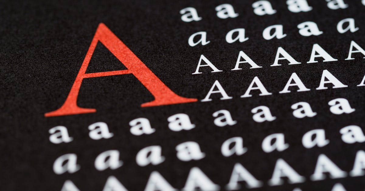
Legibility at all sizes. A logo appears on everything from a sixteen-pixel favicon to a three-metre billboard. The font must remain readable and recognisable across that entire range. Fonts with very thin strokes, tight spacing, or intricate details often fall apart at small sizes. Test your shortlisted fonts at both extremes before committing.
Distinctive character. A logo font needs enough visual personality to be memorable without being so eccentric that it distracts. Look for typefaces with at least one or two distinguishing features — an unusual letter shape, a distinctive weight distribution, or a characteristic curve — that help the logo stand out in a competitive landscape.
Appropriate personality. Every typeface carries cultural and emotional associations. A playful rounded sans-serif would undermine a law firm’s credibility, just as a stiff formal serif would feel wrong for a children’s clothing brand. Match the font’s inherent personality to the brand’s positioning and audience.
Simplicity over complexity. The most enduring logos tend toward simplicity. Fonts with excessive ornamentation, swashes, or decorative elements may look impressive in isolation but create visual noise when reduced to logo scale. Clean, well-drawn letterforms almost always outperform busy ones.
Scalability from favicon to billboard. This goes beyond legibility. The font should maintain its visual weight, spacing, and overall impression across sizes. Some fonts that look elegant at large sizes feel spindly when shrunk, while others that work at small sizes appear clunky when enlarged. The best logo fonts hold their character across the full range.
Best Serif Fonts for Logos
Serif fonts bring heritage, authority, and sophistication to a logo. They are the natural choice for brands in luxury goods, publishing, fashion, finance, and any category where tradition and trust are selling points. The best serif fonts for logos tend to have moderate to high stroke contrast and refined proportions that photograph well and reproduce cleanly. For a deeper look at the category, see our guide to the best serif fonts across all use cases.
Garamond
Garamond has been a cornerstone of European typography since the sixteenth century, and its enduring elegance makes it one of the best fonts for logo design in the luxury and editorial space. The gentle bracketed serifs, moderate x-height, and organic stroke rhythm give it a warmth that more mechanical serifs lack. Brands that want to project heritage without stuffiness gravitate toward Garamond.
Adobe Garamond Pro and EB Garamond are the most widely used digital versions. The lowercase letters have a distinctive old-style character that works particularly well in wordmark logos for publishers, wineries, and high-end hospitality brands.
Bodoni
Bodoni is the definition of high contrast. Its razor-thin serifs meet dramatically thick vertical strokes, creating a visual tension that reads as bold and confident. Fashion brands have long claimed Bodoni as their own — Vogue’s masthead is the most famous example — and the font remains a go-to choice for any brand that wants to project glamour and editorial polish.
The extreme stroke contrast does present a scalability challenge. At very small sizes, those hairline serifs can disappear. For logo applications, Bodoni works best when the brand will primarily appear at medium to large sizes, or when a slightly heavier weight is chosen to preserve detail at small scales.
Didot
Didot shares Bodoni’s high-contrast DNA but carries a distinctly French sensibility. The letterforms are slightly more elongated and the overall texture is more refined. Where Bodoni feels assertive, Didot feels poised. It is a staple of luxury brand typography and works beautifully for fashion, beauty, and lifestyle logos.
Like Bodoni, Didot demands careful sizing decisions. The font is most effective in logos that will appear primarily in digital and print contexts where size can be controlled, rather than in signage or packaging where small reproductions are unavoidable.
Playfair Display
Playfair Display brings the high-contrast serif aesthetic to the open-source world. Designed by Claus Eggers Sorensen and available through Google Fonts, it draws on the tradition of Baskerville and Didot while adding a contemporary warmth. The letterforms have generous proportions and a slightly more relaxed personality than their historical predecessors.
For designers working with limited budgets, Playfair Display is one of the strongest free options for logo typography. It pairs well with clean sans-serifs and holds up reasonably well across sizes, though the bolder weights perform better at small scales.
Freight Display
Freight Display, designed by Joshua Darden, is a contemporary serif with old-style roots and modern proportions. It has a distinctive personality that feels both warm and sophisticated — less formal than Didot, more refined than a typical text serif. The letter shapes have subtle quirks that give logos built on Freight a distinctive character without resorting to novelty.
Freight is a commercial font available through several distributors, and it has become a favourite among brand designers for its versatility. The family includes text and display optical sizes, making it useful beyond the logo itself.
Noe Display
Noe Display is a high-contrast serif designed by Lauri Toikka at Schick Toikka. It has a distinctly modern interpretation of the Didone tradition, with slightly softened details and a generous width that gives it more presence than many of its peers. The italic cuts are particularly elegant, making Noe Display a strong candidate for logos that use italic or oblique styling.
Noe has gained significant popularity in editorial and brand design over the past decade, and its distinctive character makes it recognisable without being overused.
Best Sans-Serif Fonts for Logos
Sans-serif fonts dominate modern logo design, and for good reason. Their clean lines, even stroke weights, and unadorned letterforms project clarity and modernity. Tech companies, startups, consumer brands, and lifestyle companies have all embraced sans-serif logos as the default for contemporary brand identity. The best sans-serif fonts for logos balance neutrality with just enough character to be memorable.
Futura
Futura, designed by Paul Renner in 1927, is one of the most iconic typefaces in design history and remains one of the most reliable choices for logo typography. Its geometric construction — based on circles, triangles, and squares — gives it a timeless, forward-looking quality. The font is confident without being aggressive, modern without being trendy.
Supreme, Volkswagen, FedEx, and countless other brands have built their visual identities on Futura. The font works across virtually every industry, though it is particularly effective for brands that want to project innovation, precision, and clarity. Futura Bold is a perennial favourite for wordmark logos.
Helvetica
Helvetica is the most widely used typeface in the world, and its neutrality is both its greatest strength and its primary limitation as a logo font. Designed by Max Miedinger in 1957, Helvetica presents information without imposing a strong personality. This makes it effective for brands where the name and content should do the talking — American Apparel, Jeep, Panasonic, and BMW all use Helvetica or close variants.
The risk with Helvetica is blending in. Because it is so ubiquitous, logos set in Helvetica need to find distinction through spacing, weight, colour, or an accompanying symbol. Helvetica Neue offers more weight options and refined spacing for contemporary use.
Proxima Nova
Proxima Nova, designed by Mark Simonson, bridges the gap between geometric precision and humanist warmth. Its letterforms are based on geometric shapes but softened with subtle curves and open apertures that make it feel more approachable than a pure geometric sans. This balance has made it enormously popular in digital brand design.
BuzzFeed, Mashable, and Typekit (now Adobe Fonts) are among the brands that have used Proxima Nova in their identities. The font works exceptionally well for tech companies, media brands, and any business that wants to feel modern and accessible.
Montserrat
Montserrat is a free geometric sans-serif designed by Julieta Ulanovsky and available through Google Fonts. It was inspired by the signage of the Montserrat neighbourhood in Buenos Aires and carries an urban, contemporary personality. The font has become one of the most popular free alternatives for logo design, with clean proportions and a broad range of weights.
Montserrat works well for startups and small businesses that need a professional-looking wordmark without a font licensing budget. The bolder weights are particularly strong for logos, though the font’s ubiquity in free templates means designers should consider customising letterforms to add distinction.
Inter
Inter, designed by Rasmus Andersson, was built specifically for screen interfaces. Its tall x-height, open apertures, and carefully tuned spacing make it exceptionally legible on digital displays. For brands that exist primarily in digital environments — SaaS products, apps, digital services — Inter is a strong and increasingly popular logo font choice.
The font is open-source and available through Google Fonts. Its clean, slightly technical personality makes it suitable for technology companies, developer tools, and digital-first brands. The variable font version offers precise weight control for fine-tuning logo typography.
Gotham
Gotham, designed by Tobias Frere-Jones, was inspired by the architectural lettering of mid-twentieth-century New York City. It has a broad, sturdy character that conveys reliability and optimism. The font gained widespread recognition through its use in the 2008 Obama presidential campaign and has since become a standard in brand design across industries.
Gotham works well for brands that want to feel grounded, trustworthy, and distinctly American. Its wide proportions give logos a substantial presence, and the extensive weight range allows precise control over visual impact.
Circular
Circular, designed by Laurenz Brunner for Lineto, is a geometric sans-serif with a warm, friendly personality. Spotify adopted it as their brand typeface, and the font has since become a favourite among tech companies and consumer brands. Its perfectly round letter shapes feel contemporary and approachable without being childish.
Circular is a premium commercial font, and its licensing costs reflect its quality. For brands willing to invest, it offers a distinctive geometric personality that feels more refined than its free alternatives.
Best Geometric Fonts for Logos
Geometric fonts overlap with the sans-serif category but deserve separate attention because their mathematical construction gives them a particular character that suits specific brand contexts. These typefaces are built on pure geometric shapes — circles, squares, and triangles — and the resulting letterforms feel precise, rational, and forward-looking. They are popular with startups, technology companies, and minimalist brands. For more options, see our full guide to geometric fonts.
Avenir
Avenir, designed by Adrian Frutiger in 1988, is a geometric sans-serif that softens the rigidity of pure geometry with humanist touches. Frutiger described it as his finest work, and many designers agree. The font has a balance and sophistication that makes it suitable for both display and text use — a rare quality in geometric typefaces.
Avenir Next, the updated version with additional weights and improved screen rendering, is the preferred choice for contemporary logo work. Its refined personality makes it a strong alternative to Futura for brands that want geometric clarity without the historical associations.
Century Gothic
Century Gothic is a geometric sans-serif based on the proportions of Futura but with a cleaner, more even stroke weight. Its wide, open letterforms have a light, airy quality that works well for brands in wellness, beauty, and lifestyle categories. The font is widely available as a system font, which makes it a practical choice for brands with limited design budgets.
The very wide letter spacing and large counters that give Century Gothic its distinctive character can be a disadvantage in logo design, where economy of space matters. It works best in short brand names where the generous proportions have room to breathe.
Brandon Grotesque
Brandon Grotesque, designed by Hannes von Dohren, is a geometric sans-serif with a warm, slightly vintage personality. Its letterforms are rooted in the geometric typefaces of the 1920s and 1930s but updated with contemporary proportions and details. The result is a font that feels modern with a nod to design history.
Brandon Grotesque has become extremely popular in brand design, particularly for food, retail, and lifestyle brands. The light and thin weights are especially elegant for logo use, and the font pairs well with both serif and sans-serif secondary typefaces.
Gilroy
Gilroy is a modern geometric sans-serif designed by Radomir Tinkov. It offers a substantial family with ten weights and matching italics, giving designers plenty of flexibility. The letterforms are clean and contemporary, with a slightly narrower proportion than many geometric fonts, which makes it efficient for longer brand names.
Gilroy has gained traction among startup and technology brands for its polished, no-nonsense personality. Two weights — Light and ExtraBold — are available for free, making it accessible for early-stage brands that may upgrade to the full family later.
Best Display Fonts for Logos
Display fonts are designed for large-scale use and high visual impact. They tend to have stronger personalities than text fonts, with exaggerated proportions, heavier weights, or distinctive stylistic details. In logo design, display fonts work well for brands that want to command attention and project confidence. They are less versatile than sans-serifs or serifs, but when the brand personality calls for boldness, a display font delivers.
Cooper Black
Cooper Black, designed by Oswald Bruce Cooper in 1922, is one of the most recognisable display typefaces ever created. Its ultra-bold, rounded letterforms have a friendly, retro warmth that has made it a favourite for food brands, entertainment companies, and any brand with a playful personality. The font experienced a major revival in the 2010s and remains popular with brands seeking a vintage-meets-contemporary feel.
Cooper Black works best for brands that can lean into its strong personality. It is not a neutral choice — it carries unmistakable associations with warmth, nostalgia, and approachability.
Bebas Neue
Bebas Neue is a free condensed sans-serif display font that has become one of the most widely used typefaces in digital design. Its tall, narrow proportions and uniform stroke weight give it a bold, architectural quality that works well in headlines and logos. The all-caps design is inherently strong and confident.
For logo use, Bebas Neue works best in uppercase wordmarks where vertical emphasis is desired. It is particularly effective for fitness, sports, fashion, and media brands. The font is available through Google Fonts and is free for commercial use.
Abril Fatface
Abril Fatface is a display serif inspired by the heavy titling faces of nineteenth-century advertising. It has extreme stroke contrast — thick verticals paired with delicate hairline serifs — that gives it a dramatic, editorial quality. The font bridges the gap between serif tradition and display impact.
Abril Fatface is free through Google Fonts and works well for brands in fashion, publishing, food, and lifestyle categories. Its strong personality makes it memorable, but the extreme contrast means it should be used at larger sizes where the thin strokes remain visible.
Oswald
Oswald is a condensed sans-serif originally designed by Vernon Adams and available through Google Fonts. It was created as a reworking of the classic “Alternate Gothic” style, updated for digital screens. The font has a strong, no-nonsense personality with clean lines and tight proportions.
Oswald is popular for logos in news, media, sports, and industrial sectors. Its condensed proportions make it efficient for longer brand names, and the range of available weights provides flexibility in how much visual weight the logo carries.
Best Handwritten and Script Fonts for Logos
Script and handwritten fonts bring a personal, human quality to logo design that no other category can match. They suggest craftsmanship, intimacy, and individuality. These fonts work particularly well for personal brands, artisan businesses, wedding-related companies, beauty brands, and lifestyle labels. The key challenge with script fonts in logos is legibility — many script typefaces prioritise style over readability, which can undermine the logo’s primary function.
Pacifico
Pacifico is a free brush script inspired by the surf culture of 1950s America. Its connected, flowing letterforms have a casual, upbeat personality that works well for food, beverage, and lifestyle brands. The font is available through Google Fonts and has become one of the most popular script options for digital design.
Pacifico’s strong personality limits its range, but within the right brand context — beach bars, smoothie shops, casual restaurants, outdoor brands — it performs well. The letterforms are legible for a script font, which is a significant practical advantage.
Satisfy
Satisfy is a flowing script font with a mid-century American feel. Its connected letterforms have more formality than Pacifico but remain approachable and warm. The font works for brands in hospitality, beauty, and lifestyle categories where a touch of elegance is desired without the stuffiness of a formal script.
Available free through Google Fonts, Satisfy offers a good balance of personality and legibility. It reads well at medium to large sizes but can become difficult to parse at very small scales, so it is best suited for logos that will primarily appear at display sizes.
Northwell
Northwell is a premium brush script with a natural, hand-painted quality. Its irregular baseline and varying stroke width give it an authenticity that more polished scripts lack. The font feels artisan and personal — qualities that align well with handmade goods, independent retailers, photographers, and creative professionals.
Northwell is a commercial font and should be licensed appropriately for logo use. Its rough, organic character makes it a distinctive choice that stands apart from the smoother scripts that dominate the free font landscape.
Playlist
Playlist is a brush-style script font that comes in three variants: Script, Caps, and Ornament. This versatility makes it particularly useful for logo design, where different elements of the brand name might benefit from different treatments. The script variant has a lively, energetic quality, while the caps variant offers a more structured alternative.
Playlist works well for creative agencies, lifestyle brands, fashion labels, and any business that wants to project artistic energy. The ornament set provides decorative elements that can enhance the logo without requiring separate illustration.
Custom vs Existing Fonts for Logos
One of the most important decisions in logo typography is whether to use an existing typeface or commission custom lettering. Both approaches have legitimate advantages, and the right choice depends on the brand’s budget, timeline, competitive landscape, and long-term ambitions.
When an existing font works. For most brands, a well-chosen existing typeface — possibly with minor customisations to individual letterforms — is the practical and effective choice. Existing fonts have been tested across contexts, refined through multiple versions, and proven through real-world use. They also come with complete character sets, which matters if the brand operates in multiple languages or needs supporting text in the same typeface.
When custom lettering is worth the investment. Major consumer brands often commission custom typefaces to ensure absolute uniqueness and to avoid the risk of competitors using the same font. Apple, Google, Netflix, and Airbnb have all invested in custom type families. Custom lettering also allows the designer to optimise every curve and proportion for the specific brand name, which an off-the-shelf font cannot do.
Licensing considerations. Any font used in a logo must be properly licensed for that purpose. Many font licences cover desktop use and web embedding but require a separate or extended licence for logo use, trademarking, or merchandise. Before finalising your logo font, verify that the licence permits trademark registration and commercial application across all intended media. Free fonts under the SIL Open Font Licence generally permit logo use, but always verify the specific terms.
A middle path — and often the most practical one — involves selecting an existing font and then modifying key letterforms to create something semi-custom. This approach gives the brand distinction without the cost and timeline of a fully bespoke typeface. Many well-known logos are modified versions of existing fonts rather than wholly original designs.
Font Pairing in Logos
While most logos use a single typeface, some brands employ two fonts within their logo system — typically one for the brand name and another for a tagline, descriptor, or secondary line. Getting this pairing right is essential because the two typefaces need to feel harmonious without being so similar that their coexistence seems pointless. For a broader look at combining typefaces, see our guide to font pairing.
Contrast, not conflict. The most effective logo font pairings create clear visual contrast between the two typefaces. A common approach pairs a serif brand name with a sans-serif tagline, or vice versa. The contrast helps establish visual hierarchy — the brand name reads first, the supporting text reads second — while the shared proportions and weight create unity.
Match the visual weight. Even when the two fonts come from different categories, they should share a similar visual density. A heavy bold serif paired with an ultralight sans-serif creates an imbalance that makes the logo feel unstable. Aim for comparable visual weight, adjusting point size and tracking as needed to achieve equilibrium.
Limit to two fonts maximum. A logo is not a poster. Using more than two typefaces introduces visual complexity that undermines the clarity and memorability a logo needs. If your logo system requires more typographic variety, achieve it through weight and size variations within a single family rather than adding more fonts.
Test in context. Font pairings that look balanced in a design file can fall apart when applied to real-world surfaces. Test your paired logo on business cards, social media avatars, email signatures, and signage mockups before finalising. The pairing should work at every scale and in every context where the logo will appear.
Frequently Asked Questions
What is the best font for a logo?
There is no single best font for all logos. The right choice depends on the brand’s personality, industry, audience, and visual goals. That said, certain fonts appear consistently in professional logo design. Futura, Helvetica, Garamond, and Gotham are among the most widely used across industries because they balance distinctiveness with versatility. Start by defining your brand personality, then select a typeface whose inherent character aligns with that positioning.
Should I use a free font for my logo?
Free fonts can work well for logos, provided you choose carefully. Fonts like Montserrat, Inter, Playfair Display, and Bebas Neue are professionally designed and available at no cost through Google Fonts. The main risk is ubiquity — popular free fonts appear in thousands of other projects, which can make your logo feel less distinctive. If budget is a constraint, consider using a free font as a starting point and modifying key letterforms to add uniqueness.
How many fonts should a logo have?
One font is ideal for most logos. A single typeface keeps the design clean, memorable, and scalable. If your logo includes a tagline or descriptor, you may use a second font for that element, but two is the maximum. Adding more typefaces introduces complexity that works against the simplicity and instant recognition a logo needs.
Do I need a custom font for my logo?
Most brands do not need a fully custom typeface. A well-chosen existing font — possibly with minor modifications to specific letterforms — serves the majority of logos effectively. Custom type becomes valuable when a brand operates at a scale where uniqueness is a competitive necessity, when the brand name contains letterforms that benefit from bespoke design, or when the budget and timeline support the investment. Custom typeface commissions typically start at several thousand pounds and can take months to complete.
Can I trademark a logo that uses an existing font?
In most jurisdictions, you can trademark a logo that uses an existing font, provided the font licence permits it. The trademark protects the specific arrangement — the word, the font choice, the spacing, the colours, and any accompanying graphic elements — as a unified design, not the font itself. Always verify that your font licence explicitly allows trademark registration, as some licences restrict this use. Fonts released under the SIL Open Font Licence generally permit logo and trademark use without additional licensing.


