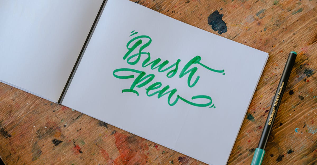
Brush Lettering for Beginners: A Complete Guide
Brush lettering is the art of creating letters using brush pens, where pressure variation produces thick downstrokes and thin upstrokes. It sits at the intersection of calligraphy and hand lettering, borrowing the expressive stroke quality of the former and the creative freedom of the latter. The result is letterforms that feel organic, rhythmic, and full of personality — qualities that no typed font can replicate.
What makes brush lettering so appealing to beginners is its accessibility. You need one brush pen and a sheet of smooth paper to start. There are no ink bottles to manage, no nibs to clean, no complicated setup. Yet the skill ceiling is remarkably high. Experienced brush letterers produce work that ranges from refined wedding calligraphy to bold signage to expressive editorial illustration. This guide walks through everything you need to go from your first wobbly stroke to confident, fluid letterforms.
We will cover the tools, the foundational strokes, the alphabet, the most common mistakes, how to move from individual letters to complete words and compositions, the major stylistic approaches, and how to bring your brush lettering into the digital world. Whether you want to letter quotes for your wall, design logos, or simply develop a meditative creative practice, the path starts here.
What Is Brush Lettering?
Brush lettering is a specific method of forming letters using a brush-tipped pen. The defining characteristic is pressure sensitivity: pressing down on the brush tip spreads the bristles or felt tip, creating a thick stroke. Lifting pressure narrows the tip to a point, creating a thin stroke. This interplay between thick and thin — known as stroke contrast — gives brush lettering its distinctive visual rhythm.
It is worth distinguishing brush lettering from two closely related disciplines. Calligraphy is rules-based writing that follows established scripts with specific stroke orders, letter proportions, and historical conventions. Copperplate, Italic, and Spencerian are calligraphic scripts with centuries of tradition behind them. Brush lettering borrows the thick-thin stroke principle from calligraphy but relaxes the rigid rules. You are not replicating a historical script — you are developing your own letterforms using pressure variation as a tool.
Hand lettering is the broader umbrella term for any drawn or constructed letterform. A hand letterer might sketch block letters with a pencil, outline them, and fill them in — no brush required. Brush lettering is a subset of hand lettering: it is specifically the practice of using a brush pen (or brush) to write letters in a single, flowing motion rather than constructing them through multiple drawn strokes. The letters are written, not drawn, but with a tool that adds expressive stroke variation.
In practical terms, brush lettering combines the speed and flow of calligraphy with the creative license of hand lettering. You write fluidly, but you are free to bounce baselines, exaggerate flourishes, vary letter sizes, and develop a personal style without worrying about whether your Copperplate “e” has the historically correct loop proportions.
Essential Tools for Brush Lettering
Getting started requires minimal investment, but choosing the right tools makes a significant difference in how quickly you develop control. Here is what you need and what to look for.
Small-Tip Brush Pens
Small-tip brush pens are the best starting point for beginners. The smaller tip is easier to control, and the strokes are naturally more precise. Two pens dominate this category:
- Tombow Fudenosuke (hard tip): The most recommended first brush pen, and for good reason. The firm felt tip responds to pressure but does not flex wildly, making it forgiving for beginners still developing their pressure control. It comes in hard and soft tip versions — start with the hard tip. The barrel is thin and comfortable, similar to a standard pen. Available in black and a limited color range.
- Pentel Sign Pen Brush Tip: Slightly more flexible than the Fudenosuke, with a true brush-like feel. It produces beautiful thin upstrokes and rewards developing skill. The ink flow is consistent, and the pen is widely available and affordable. A strong second pen to try once you have some comfort with the Fudenosuke.
Large-Tip Brush Pens
Once you have developed basic control with small-tip pens, large-tip brush pens open up bolder, more dramatic lettering. They demand more control but produce more expressive results:
- Tombow Dual Brush Pens: A flexible, large brush tip on one end and a fine tip on the other. The brush end produces dramatic stroke contrast and is excellent for large-scale lettering, practicing bounce techniques, and color blending. Available in 108 colors. The water-based ink blends well but bleeds on thin or textured paper.
- Ecoline Brush Pens: Liquid watercolor ink in a brush pen format. These produce rich, vibrant strokes with beautiful color saturation. The tips are moderately flexible and offer good control for their size. They are particularly popular for colorful lettering compositions and artwork where color intensity matters.
Paper
Paper matters more in brush lettering than most beginners realize. The wrong paper will destroy your brush pen tips and make your strokes look ragged regardless of your technique.
Smooth marker paper is ideal. Brands like Rhodia, HP Premium Choice LaserJet, and Canson Marker paper have smooth, coated surfaces that allow the brush tip to glide without catching on paper fibers. This preserves your pen tips and produces clean, crisp strokes. Standard copy paper works in a pinch for practice, but textured paper, watercolor paper, and most sketchbook paper will fray your brush tips and produce fuzzy lines. If you are serious about practice, invest in a pad of marker paper — your pens will last significantly longer.
Practice Sheets and Guidelines
Printed guidelines help maintain consistent letter height and slant while you are learning. You can download brush lettering practice sheets online or create your own with a ruler. The key measurements are a baseline (where letters sit), an x-height line (the top of lowercase letters like “a” and “o”), an ascender line (for tall letters like “b” and “h”), and a descender line (for letters that drop below the baseline like “g” and “p”). Placing a guideline sheet under your marker paper — which is typically translucent — lets you practice with consistent proportions without drawing lines on every sheet.
Basic Strokes: The Foundation of Every Letter
The single most important piece of advice in brush lettering is this: do not start with letters. Start with strokes. Every letter in the brush lettering alphabet is constructed from a handful of fundamental strokes. If you master these strokes individually, letters assemble themselves naturally. If you skip strokes and jump straight to writing words, you will develop inconsistencies that become harder to correct over time.
Practice each stroke slowly and deliberately. Speed comes later. Focus on smooth, controlled movements and consistent pressure transitions.
The Downstroke
The downstroke is the thick stroke, and it is the simplest to learn. Place your pen on the paper and apply full pressure while drawing straight down. The goal is a consistent, even width from top to bottom, with clean edges and no wobble. Practice columns of downstrokes, keeping them parallel and evenly spaced. This stroke trains your hand to maintain steady pressure.
The Upstroke
The upstroke is the thin stroke. Starting at the bottom, draw upward with minimal pressure — just enough for the pen tip to touch the paper. The line should be as thin as your pen can produce. This is harder than it sounds, because the natural tendency is to press too hard. Your hand wants to grip and push. Train it to float. Practice columns of upstrokes next to your downstrokes, comparing the contrast between thick and thin.
The Overturn
The overturn combines a thin upstroke that curves over the top and transitions into a thick downstroke. Start thin at the bottom left, curve up and over, and gradually increase pressure as you come down the right side. The transition from thin to thick should be smooth and gradual, not abrupt. This stroke appears in letters like “n,” “m,” and “h.”
The Underturn
The underturn is the reverse: a thick downstroke that curves at the bottom and transitions into a thin upstroke. Start thick at the top, draw down, curve at the bottom, and gradually release pressure as you move up. This stroke appears in letters like “u,” “a,” and “i.” The transition zone at the bottom of the curve is the most challenging part — practice making it seamless.
The Compound Curve
The compound curve combines an overturn and an underturn into a single continuous stroke. Thin upstroke, curving into a thick downstroke, curving into a thin upstroke again. It looks like a smooth “n” shape and is essentially the stroke that forms letters like “n,” “m,” “v,” and “w.” Mastering the compound curve means mastering both pressure transitions in a single motion.
The Oval
The oval is the curved shape that forms letters like “o,” “a,” “d,” “g,” and “q.” Start at the top with a thin connector stroke, curve down and to the left with increasing pressure (thick downstroke on the left side), curve through the bottom, and release pressure as you come up the right side (thin upstroke). The oval should be smooth and symmetrical, with the thickest point on the left side and the thinnest on the right. This is typically the most difficult basic stroke because it requires continuous pressure changes through a curved path.
How Long to Drill Basics
There is no fixed timeline, but a reasonable approach is to spend at least two weeks — ideally three to four — practicing only these basic strokes before moving to letters. Fifteen to twenty minutes per day is more effective than occasional hour-long sessions. Fill pages with each stroke. When your strokes look consistent across an entire page — same width, same curve, same transitions — you are ready to move on. Rushing this stage is the most common reason beginners plateau later.
The Brush Lettering Alphabet
Once your basic strokes are consistent, building the alphabet is a matter of combining those strokes in different sequences. Each letter is not a new shape to memorize — it is a specific combination of strokes you have already practiced. This is why the stroke work matters so much: if your overturns and underturns are solid, your “n” will be solid because it is simply an overturn followed by an underturn.
Lowercase Letters
Start with lowercase letters. They use the basic strokes most directly and are what you will write most frequently. A few principles to keep consistent:
- X-height: All lowercase letters without ascenders or descenders (a, c, e, m, n, o, r, s, u, v, w, x, z) should reach the same height. Inconsistent x-height is the fastest way to make lettering look amateur. Use guidelines.
- Entry strokes: Most lowercase letters begin with a thin upstroke that leads into the first main stroke. Keeping these entry strokes consistent in angle and length gives your lettering a unified feel.
- Exit strokes: Similarly, most letters end with a thin upstroke that either connects to the next letter or trails off. Consistent exit strokes make connecting letters into words much easier.
- Slant: Decide on a consistent slant angle and maintain it across all letters. Most brush lettering uses a slight forward slant (around 55-60 degrees from the baseline), though upright styles work as well. The key is consistency.
Work through the alphabet in groups based on their shared strokes. Letters like “i,” “t,” and “l” share the simple downstroke. Letters like “n,” “m,” and “h” share the overturn. Letters like “a,” “d,” “g,” and “q” share the oval. Practicing in stroke-family groups reinforces the connections between your basic stroke drills and actual letterforms. For a visual reference of letter construction, see our guide to calligraphy letters.
Uppercase Letters
Uppercase letters in brush lettering are more varied and typically more decorative than their lowercase counterparts. They serve as standalone forms — the opening letter of a word or sentence — rather than letters that need to connect fluidly to their neighbors.
A few uppercase considerations:
- Uppercase letters are generally taller than the lowercase ascender line, occupying their own visual space at the start of a word.
- They often incorporate more elaborate entry strokes, loops, and flourishes than lowercase letters.
- The connection between an uppercase letter and the lowercase letter that follows is a transition point that takes practice. The uppercase exit stroke needs to flow naturally into the lowercase entry stroke.
- There is more room for personal style in uppercase letters. Two brush letterers might write very similar lowercase alphabets but dramatically different uppercase forms.
For a full breakdown of both cases with visual guides, our beginner calligraphy alphabet resource covers each letter individually.
Common Mistakes and How to Fix Them
Nearly every beginner encounters the same set of problems. Recognizing these patterns early saves months of frustration.
Applying Too Much Pressure on Upstrokes
This is the most common mistake. Beginners press too hard on upstrokes, producing thick lines where there should be thin ones. The result is letters with minimal stroke contrast that look heavy and muddy. The fix is deliberate practice with upstrokes in isolation. Train your hand to barely touch the paper on upward movements. Some letterers find it helpful to practice upstrokes with the pen held very loosely, almost letting the pen fall out of their hand, to internalize the feeling of light pressure.
Inconsistent Slant
Letters that lean at different angles make even well-formed individual letters look chaotic as a group. The fix is to use slant guidelines — diagonal lines drawn at your chosen angle across your practice sheet. Place these under your marker paper so you have a constant visual reference. Over time, the consistent angle becomes muscle memory and you will no longer need the guidelines.
Rushing Through Practice
Speed is the enemy of brush lettering development. Beginners who write quickly produce sloppy strokes and never develop the muscle control needed for precision. Slow down dramatically. Each stroke should be deliberate and controlled. Speed develops naturally as your muscles learn the movements. Trying to force speed early embeds bad habits that are difficult to unlearn.
Using the Wrong Paper
Practicing on textured, fibrous, or rough paper frays brush pen tips and produces inconsistent strokes. Beginners sometimes blame their technique or their pens when the real problem is the paper. If your strokes look rough or your pen tips are splaying after a few sessions, switch to smooth marker paper immediately. The difference is dramatic.
Gripping Too Tight
A death grip on the pen restricts wrist and finger movement, leading to stiff, mechanical-looking strokes. Brush lettering requires fluid, relaxed motion. Hold the pen firmly enough that it does not slip, but loosely enough that someone could pull it from your hand without much effort. If your hand cramps after a few minutes of practice, you are gripping too tight. Shake out your hand regularly and consciously relax your grip.
Moving the Pen with Fingers Instead of the Arm
Small, finger-driven movements limit your stroke length and produce shaky lines. Larger strokes should come from the forearm and shoulder, with fingers providing fine control for details and pressure changes. Practice making large, sweeping strokes on scrap paper using your whole arm to develop this habit.
From Letters to Words
Writing individual letters is one skill. Combining them into words that look cohesive is another. The transition from practicing letters to writing words involves several new considerations.
Letter Spacing
Consistent spacing between letters is essential for readability. In brush lettering, spacing is optical rather than mechanical — you are aiming for visually even spacing, which means the actual distance between letters varies depending on their shapes. Two round letters (“oo”) need to be placed closer together than a straight and a round letter (“no”) to appear evenly spaced. This takes practice and a trained eye. Squinting at your work or viewing it from a distance helps reveal spacing inconsistencies.
Connecting Strokes
In connected brush lettering styles, the exit stroke of one letter flows into the entry stroke of the next. The connection should be a thin upstroke that maintains the rhythm of the word without looking forced. Not every letter pair connects naturally — sometimes lifting the pen and starting a fresh entry stroke produces a cleaner result than forcing a connection. Learning which connections work and which to skip is part of developing your personal style.
Bounce Lettering
Bounce lettering is a popular brush lettering technique where letters intentionally sit at slightly different heights on the baseline, creating a playful, dynamic rhythm. Instead of all letters resting on a straight baseline, some dip below and some sit higher, giving the word a visual “bounce.” This technique works well for casual, modern styles but should be applied subtly — too much bounce looks chaotic rather than playful. Start with small variations and increase as you develop your eye for what works.
Adding Flourishes
Flourishes are the decorative extensions and loops added to letters, typically on entry strokes, exit strokes, ascenders, and descenders. A well-placed flourish elevates a piece from competent to elegant. A poorly placed flourish looks cluttered and distracting. The rule of thumb: flourishes should enhance readability and visual flow, never compete with it. Start by extending your natural entry and exit strokes into gentle curves, and add more elaborate loops only as your control improves. For more on decorative letter applications, see our exploration of typography art.
Brush Lettering Styles
As you develop control, you will naturally gravitate toward a style that reflects your aesthetic preferences. Three broad stylistic categories dominate the brush lettering world.
Modern Calligraphy Style
This is the most popular brush lettering style, characterized by elegant, flowing letterforms with pronounced thick-thin contrast, a consistent forward slant, and refined connections between letters. It draws heavily from pointed pen calligraphy traditions like Copperplate but loosens the rules. Think wedding invitations, elegant quote prints, and refined branding. The letterforms are controlled, the spacing is deliberate, and the overall impression is polished and sophisticated.
Bold Sign-Painter Style
This style uses heavier pressure overall, producing thicker strokes with less dramatic contrast between thick and thin. The letters are often more upright, the forms more geometric, and the overall feel is punchy and confident. It suits headlines, poster designs, and branding that needs impact over elegance. This style often incorporates elements from traditional sign painting and mid-century lettering traditions.
Casual Hand-Lettered Style
The most relaxed approach, casual brush lettering embraces imperfection as part of its charm. Letters may be inconsistent in size, connections may be loose or absent, and the baseline often bounces freely. The goal is warmth and approachability rather than technical precision. This style is popular for social media content, greeting cards, and lifestyle branding. It looks effortless, though achieving convincing casual lettering actually requires strong foundational skills — you need to know the rules before you can break them effectively.
Each of these styles has digital equivalents in the world of script fonts, which can be helpful reference material when developing your own brush lettering style. Study script fonts to understand letter proportions, connection points, and how different styles handle specific letter combinations.
Digital Brush Lettering
Brush lettering does not have to stay on paper. There are two main paths into the digital world: creating brush lettering directly on a tablet, and digitizing hand-lettered work done on paper.
iPad and Procreate
The Apple Pencil and Procreate app have made digital brush lettering remarkably accessible. Procreate includes pressure-sensitive brush tools that simulate the behavior of physical brush pens, producing thick downstrokes and thin upstrokes just as you would on paper. The advantages of digital brush lettering include unlimited undo, the ability to resize and reposition letters, layer-based workflows for complex compositions, and easy color changes. The disadvantage is that the glass screen feels different from paper, and the learning curve for digital pressure control is separate from the physical skill you have built.
If you are already comfortable with brush lettering on paper, transitioning to Procreate is relatively smooth. Start with a brush that closely mimics your favorite physical brush pen, set up guidelines on a separate layer, and give yourself time to adjust to the surface difference. Many letterers work in both mediums, using paper for practice and ideation and digital for finished, client-ready work.
Digitizing Hand-Lettered Work
The alternative is to create your brush lettering on paper and then bring it into the digital world through scanning or photography. The process involves capturing a high-quality image of your lettering, cleaning up the background and adjusting contrast in image editing software, and converting the result to a vector format if needed for scalable use.
For simple digitization, a high-resolution phone photo in good lighting, followed by contrast adjustments in any image editor, produces serviceable results. For professional work — logos, branding, merchandise — you will want to use vector tracing in software like Adobe Illustrator or one of its alternatives. Vector tracing converts your brush lettering into scalable paths that can be resized to any dimension without quality loss.
Some letterers prefer the hybrid approach: creating the initial lettering on paper for its organic quality, then digitizing and refining the letterforms digitally. This combines the warmth of hand-done work with the precision and flexibility of digital editing.
Building a Practice Routine
Consistent, focused practice matters more than occasional marathons. A sustainable brush lettering practice routine might look like this:
- Daily warm-up (5 minutes): Fill a few rows with basic strokes — downstrokes, upstrokes, overturns, underturns. This warms up your hand and recalibrates your pressure control.
- Focused drill (10-15 minutes): Work on a specific letter, letter combination, or word. Repetition of the same form builds muscle memory faster than jumping between different letters.
- Free practice (5-10 minutes): Write words, phrases, or quotes that interest you. This is where you start applying your skills to real content and develop your style.
Track your progress by dating your practice sheets and reviewing them periodically. Improvement in brush lettering is gradual and often invisible day to day, but comparing work from a month ago to today typically reveals significant progress. This kind of review is motivating and helps you identify specific areas that still need attention.
Resources for Continued Learning
Brush lettering is a skill with deep roots in broader lettering and design traditions. As you advance, expanding your knowledge of related fields strengthens your work. Understanding typography fundamentals improves your sense of letter proportions and spacing. Studying calligraphy fonts gives you reference material for different stylistic approaches. Exploring graphic design principles helps when you begin composing brush lettering into complete layouts and designs.
The most important resource, however, is consistent practice. No tutorial, course, or guide substitutes for the hours spent with pen on paper, training your hand to respond to your eye. Brush lettering rewards patience. The progress is steady, the skill compounds, and the creative possibilities expand with every practice session.
FAQ
Is brush lettering the same as calligraphy?
No, though they share the principle of pressure-based stroke variation. Calligraphy is a rules-based discipline that follows established scripts with specific letter constructions, stroke orders, and historical traditions. Brush lettering borrows the thick-thin stroke technique from calligraphy but applies it more freely, without strict adherence to any particular script. Brush lettering is typically done with brush pens, while traditional calligraphy uses dip pens, flat-edged pens, or pointed nibs. For a deeper exploration of the differences, see our guide on what calligraphy is.
What brush pen should beginners start with?
The Tombow Fudenosuke with a hard tip is the most widely recommended starting pen. Its firm tip provides enough resistance to be forgiving while still responding to pressure changes. It is affordable, widely available, and produces clean, precise strokes at a manageable scale. Once you are comfortable with the Fudenosuke, the Pentel Sign Pen Brush Tip is a good second pen that offers slightly more flexibility. Move to larger brush pens like the Tombow Dual Brush Pen after you have developed reliable pressure control with smaller pens.
How long does it take to learn brush lettering?
With consistent daily practice of 15-20 minutes, most beginners produce letters they are reasonably satisfied with within four to six weeks. Developing a consistent, personal style takes longer — typically three to six months of regular practice. Reaching an advanced level where you can letter confidently in multiple styles, handle complex compositions, and produce professional-quality work generally takes one to two years. These timelines vary based on prior drawing or writing experience, frequency of practice, and individual aptitude. The most important factor is consistency: short daily sessions outperform sporadic long sessions.
Can I do brush lettering on regular paper?
You can, but it is not ideal. Regular copy paper has a texture that creates friction against the brush tip, producing slightly rough strokes and wearing down your pen tips faster. Smooth marker paper (such as Rhodia or HP Premium Choice LaserJet paper) provides a slick surface that lets the brush tip glide, resulting in cleaner strokes and longer pen life. If you must use regular paper for practice, choose the smoothest option available and expect to replace your brush pens more frequently. Never use textured art paper, watercolor paper, or rough sketchbook paper — these will destroy brush pen tips quickly.
Do I need to learn traditional calligraphy before brush lettering?
No. Brush lettering can be learned as a standalone skill without any calligraphy background. That said, studying traditional calligraphy principles — especially stroke order, letter proportions, and the relationship between tool angle and stroke width — will make you a stronger brush letterer. Many accomplished brush letterers have never touched a dip pen, while others came to brush lettering through traditional calligraphy. Both paths are valid. If you are interested in exploring traditional calligraphy alongside brush lettering, our beginner calligraphy alphabet is a good starting point.


