What Font Does Into the Wild Use?
If you have ever paused the poster to identify the into the wild font, you are not alone. Sean Penn’s 2007 drama, in which young idealist Christopher McCandless abandons his possessions and hitchhikes toward the Alaskan wilderness in search of raw, unmediated experience, pairs a rough, handcrafted title with a free-spirited, nature-soaked tone. The lettering is loose and organic, with the personal, hand-drawn character of a note scratched into a journal or carved into bark. It feels rugged and human, matching the film’s wandering, off-the-grid spirit. The letterforms read like handwriting weathered by the open road: irregular, warm, and unmistakably handmade. That rough, handcrafted energy is exactly what makes the title work for a story about leaving the manufactured world behind. Below we break down what the logo most likely is, why the designers leaned this way, and which free fonts get you closest, plus how to assemble a convincing look-alike without infringing on the original.
What font is the Into the Wild logo?
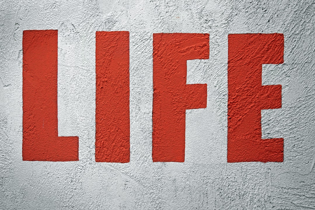
The main title wordmark is best understood as a custom or heavily customized rough handcrafted display rather than a font you can buy under the movie’s name. Studio key-art teams in the late 2000s typically commissioned bespoke lettering or took a hand-drawn face, then adjusted the weight, texture, and individual letterforms so the lockup read organic and personal at poster scale. The Into the Wild wordmark follows that pattern: irregular, hand-built characters with a loose, weathered quality that suits a wandering wilderness drama.
Because the production has never published the exact typeface, anyone claiming a definitive single-font answer is guessing. Title artists drew or refined much of this lettering specifically for the film, adjusting spacing and proportions, so even a close digital lookalike will differ in the details. What we can say with confidence is the category: a display with a rough, handcrafted, natural flavor. That observation is reliable; an exact name is not, so treat font matches here as an informed read rather than a confirmed spec.
What typeface is used in the film?
On screen, the film leans on a warm, hand-touched feel. The opening titles, chapter cards, and credits use loose, organic lettering with a personal character, matching the movie’s free-spirited, nature-driven tone. This choice is deliberate: the story is about shedding the polished modern world, so the type stays rough and human rather than slick or corporate. Nothing feels manufactured or fussy; the lettering carries the same wandering, handmade energy as the journal entries and trail markers, with the most striking treatment reserved for the headline title.
So when people search for the into the wild font, they are usually focused on the rough, handcrafted poster wordmark, since the in-film cards use a related, equally organic style. The poster sits in the hand-drawn display family, and the supporting text leans on clean, readable faces. A fan project usually needs both: a handcrafted display for the title and a calmer companion for body copy, mirroring how the film pairs its loose headline with functional text.
Free fonts that look like the Into the Wild font
You will not find a legal free file literally named after the movie, but several open-license faces capture the rough, handcrafted feel. The table maps each typographic job to a downloadable substitute.
| Use case | Into the Wild uses | Free alternative |
|---|---|---|
| Main title wordmark | Custom rough handcrafted display | Caveat or Amatic SC |
| Poster display accents | Tall hand-drawn display | Amatic SC or Special Elite |
| Journal / typewriter text | Weathered mono character | Special Elite or Caveat |
| Body / supporting text | Clean readable sans | Work Sans or Inter |
For the closest poster match, set Caveat at a large size; its loose, hand-drawn strokes capture the personal, organic feel of the original lockup. If you want a taller, sparser look, Amatic SC brings a thin, condensed handwritten character that reads rustic and light. For a worn, typewritten accent, Special Elite offers an inky, weathered mono flavor, while a clean sans like Work Sans keeps supporting text readable. A useful trick is to set the title in a single handwritten weight, let the baseline wander slightly, and pair it with earthy greens and dusty browns so the type feels as wild and handmade as the film itself, since any finish is art, not type. All of these faces are free on Google Fonts under open licenses, which means you can build the entire lockup at no cost and use it commercially once you confirm each license.
Why does Into the Wild use this kind of type?
The choice is strategic, not accidental. A few reasons this rough, handcrafted approach works for a wilderness drama:
- Human warmth. Loose, hand-drawn letters evoke a personal journal and a life lived by hand.
- Organic freedom. A handcrafted display signals wandering and authenticity rather than polish or whimsy.
- Poster character. Rough, natural type reads as warm and memorable on a marquee.
- Tonal match. The irregular lettering mirrors the film’s off-the-grid, nature-soaked mood.
If you want more background on how studios pick and license these wordmarks, our font licensing guide explains the difference between a custom logo and a retail typeface.
Can I use the Into the Wild font for my own project?
You can absolutely build something in the same spirit, but be careful about what you are copying. The wordmark itself is part of the film’s branding and is protected as a trademark and as artwork; recreating it for commercial use, merchandise, or anything implying an official tie risks legal trouble. Recreating the style with a free, properly licensed handcrafted face is fine.
For a fan poster, mockup, or stylistic homage, pick one of the free alternatives above, confirm its license allows your use, and adjust the spacing to taste. If you enjoy this wandering-survivor mood, you may also like our breakdowns of the rugged The Revenant font and the lone-island Cast Away font. For broader inspiration on classic styling, see our hub of vintage fonts.
Frequently Asked Questions
Is the Into the Wild font free to download?
No font sold or distributed under that name is legitimate, because the title is a custom wordmark. However, free, properly licensed look-alikes such as Caveat, Amatic SC, and Special Elite get you very close to the rough, handcrafted feel without any licensing risk.
What font is closest to the Into the Wild logo?
For the rough handcrafted lockup, Caveat set large is a strong free match, with Amatic SC and Special Elite as good alternatives. None is an exact replica, since the original was custom-drawn, so treat them as informed substitutes.
Why does Into the Wild use a rough handcrafted style?
The film is about leaving the manufactured world for raw wilderness experience. Loose, hand-drawn letters feel personal and organic, echoing journals, trail markers, and a life lived by hand. A slick or corporate font would undercut the spirit, so the designers kept the title rough and handcrafted.
Can I use an Into the Wild-style font commercially?
You can use a free, commercially licensed face like Caveat or Amatic SC for your own work. What you cannot do is reproduce the actual Into the Wild wordmark or imply an official association, since that artwork and name are protected. Always check each free font’s license before commercial use.


