Repetition in Graphic Design: Patterns, Consistency, and Visual Rhythm
Repetition in graphic design is the deliberate reuse of visual elements — colors, shapes, textures, typefaces, spacing — to create unity across a composition or an entire brand system. It is one of the foundational principles of graphic design, and arguably the one most responsible for making designs feel intentional rather than arbitrary. Without repetition, every page, screen, or spread would need to justify its visual choices from scratch. With it, a design language emerges — one that audiences can learn, recognize, and trust.
Repetition operates at every scale. Within a single poster, it might mean using the same weight of line to frame different sections. Across a 200-page annual report, it means maintaining consistent heading styles, margin widths, and color applications from the first page to the last. At the brand level, it means ensuring that a company’s visual identity feels coherent whether someone encounters it on a business card, a billboard, or a mobile app. The principle is simple. Applying it well requires discipline, restraint, and a clear understanding of what should repeat and what should not.
What Is Repetition in Design?
The repetition design principle involves taking a visual element and using it more than once within a design or across a system of designs. The repeated element can be anything: a specific color, a typeface, a shape, a texture, a spatial interval, an image treatment, or even a conceptual motif. The key requirement is consistency. When an element repeats, it signals to the viewer that a relationship exists between the parts where it appears. This is how unity in graphic design is achieved — not by making everything identical, but by establishing threads of visual continuity that hold a composition together.
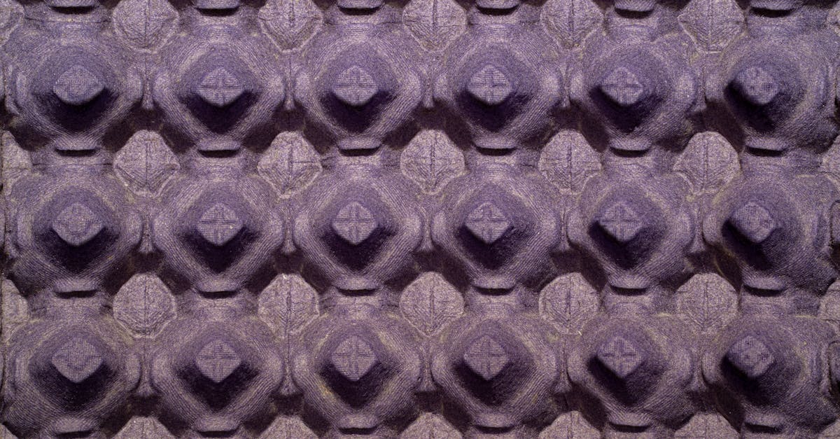
It is worth distinguishing between repetition as a structural principle and pattern as a decorative device. A pattern in graphic design is a specific application of repetition — a motif repeated at regular intervals to fill a surface, often for decorative or textural purposes. Wallpaper patterns, textile prints, and background textures are common examples. Repetition as a design principle is broader. It encompasses patterns but also includes the structural decisions that make a multi-page document feel like a single, unified piece rather than a collection of unrelated pages.
Consider a magazine layout. The body text is set in the same typeface and size on every page. Pull quotes use a consistent style. Page numbers appear in the same position. Section dividers follow the same format. None of these elements form a decorative pattern, but they are all instances of repetition. They create a framework that readers internalize quickly, allowing them to navigate the content without conscious effort. The design becomes invisible — which, in most contexts, is exactly the goal.
Why Repetition Matters
Repetition serves several distinct functions in design, each contributing to the overall effectiveness of visual communication.
Brand Consistency
Brands are built through repeated exposure to consistent visual and verbal cues. When the same logo, color palette, and typographic system appear across every touchpoint, audiences begin to associate those elements with the brand’s identity and values. Repetition is the mechanism that transforms individual design choices into a recognizable brand language. Without it, a brand cannot build the familiarity required for trust and loyalty.
User Navigation
In layouts and interfaces, repetition creates predictability. When headings always look the same, users know where to find section breaks. When buttons share a consistent style, users know what is clickable. Repetition reduces cognitive load by establishing conventions that viewers can rely on. This is especially critical in digital design, where users need to orient themselves quickly across multiple screens and states.
Visual Rhythm
Just as rhythm in music is created through the repetition of beats and phrases, visual rhythm emerges when design elements recur at intervals across a composition. This rhythm gives a design a sense of movement and flow. It guides the eye through the layout and creates a pace — fast when elements repeat quickly, slower when intervals are wider. The relationship between repetition and rhythm connects directly to balance in graphic design, as both principles work together to create compositions that feel stable and considered.
Professional Polish
Inconsistency in design signals carelessness. When heading sizes vary without reason, when colors shift slightly between pages, or when spacing is inconsistent, the result feels unfinished — even if the individual elements are well-designed in isolation. Repetition is what gives a design the feeling of being complete, intentional, and professionally executed. It is often the difference between work that looks like it came from a seasoned designer and work that looks like it came from someone still learning the craft.
Types of Repetition
Not all repetition works the same way. The type of repetition a designer chooses affects the tone, energy, and visual character of the final piece. Understanding the different approaches helps designers make deliberate choices about how much variation to introduce and why.
Exact Repetition
Exact repetition uses the same element in the same way, without variation. A grid of identical icons. A row of evenly spaced dots. A navigation bar that appears identically on every page of a website. This type of repetition creates strong order and predictability. It is well-suited to functional contexts — user interfaces, data tables, wayfinding systems — where consistency aids comprehension. The risk is monotony, which makes exact repetition more appropriate for structural elements than for focal-point design.
Repetition with Variation
This approach repeats a core element while introducing controlled differences. A series of circles that share the same size but use different colors. A set of cards that follow the same layout structure but feature different images and text. The underlying framework repeats; the content within it changes. This is the most common form of repetition in professional design because it balances consistency with visual interest. The viewer recognizes the repeated structure, which creates unity, while the variation keeps the eye engaged.
Alternating Repetition
Alternating repetition cycles between two or more elements in a predictable sequence — ABABAB or ABCABC. Striped patterns are a basic example. In layout design, alternating repetition might mean switching between a text-left/image-right layout and a text-right/image-left layout on successive sections of a landing page. The alternation creates rhythm while the underlying structure (text paired with image, consistent proportions) maintains cohesion.
Progressive Repetition
Progressive repetition involves an element that repeats while gradually changing along one or more dimensions — growing larger, shifting in color, becoming more complex, or rotating incrementally. A series of circles that increase in size from left to right. A gradient that transitions through a sequence of brand colors. This type of repetition creates a strong sense of movement and direction. It is inherently dynamic, making it useful for designs that need to convey progress, growth, or narrative sequence.
Repetition in Branding
Branding is perhaps where repetition delivers its greatest impact. A brand strategy depends on the consistent application of visual elements across every touchpoint — from digital platforms to print collateral to physical environments. Repetition is the mechanism that makes this consistency possible at scale.
Consider the elements that define a brand’s visual identity: a primary and secondary color palette, a typographic system with designated typefaces for headings and body text, a logo and its usage rules, a photographic or illustration style, and a set of spatial conventions for layouts. Each of these elements is designed once and then repeated — hundreds or thousands of times, across years of brand communications. The repetition is what transforms a set of design decisions into a brand that audiences can identify at a glance.
Effective brand repetition requires clear documentation. Brand guidelines exist specifically to codify what repeats and how. They define the exact hex values of brand colors, the precise spacing around a logo, the approved typeface pairings, and the acceptable variations for different contexts. Without this documentation, repetition breaks down as different team members and external partners introduce subtle inconsistencies that compound over time. Reviewing graphic design portfolio examples reveals how strong brands maintain visual cohesion across dozens of applications precisely because their repetition is systematically governed.
The most recognizable brands in the world owe their recognizability to disciplined repetition. Coca-Cola’s script lettering and red palette. Apple’s minimalist product photography and clean sans-serif typography. These brands do not reinvent their visual language for each new campaign. They repeat it — with enough variation to stay fresh, but enough consistency to remain unmistakably themselves.
Repetition in Layout Design
Layout design is where repetition becomes structural. Every multi-page document, every multi-screen application, every website with more than one page relies on repeated layout conventions to create a navigable, coherent experience.
The building blocks of layout repetition include consistent margins, column widths, and gutters established by a grid system. Heading hierarchies that use the same typeface, size, and weight at each level throughout a document. Image treatments — consistent border radii, shadow styles, or aspect ratios — that create visual uniformity even when the image content varies. Whitespace patterns that maintain a consistent rhythm of breathing room between sections.
Alignment and repetition work together closely in layout design. When elements align to the same grid lines across pages, and when that alignment repeats consistently, the layout develops a visual logic that readers absorb intuitively. Similarly, contrast and repetition are complementary — contrast draws attention to what is different, while repetition reinforces what is consistent. A heading that contrasts with body text through size and weight is effective partly because that contrast repeats at every heading instance, training the reader to recognize the hierarchy.
In web design, repetition extends into interaction patterns. Hover states, transition speeds, button styles, form field appearances, and feedback animations should all repeat consistently across an interface. Users build mental models based on these repeated conventions. When a blue button performs one action on one page and a different action on another, the inconsistency undermines trust in the interface. Repetition in interaction design is not just an aesthetic choice — it is a usability requirement.
Print designers rely on master pages and paragraph styles to enforce repetition across long documents. Digital designers use design systems and component libraries. Both approaches serve the same purpose: ensuring that repeated elements remain truly consistent rather than approximately similar. The difference between “close enough” and “exactly consistent” is often the difference between amateur and professional work.
Repetition vs Monotony
The line between effective repetition and dull monotony is thinner than many designers realize. Repetition without any variation produces designs that feel rigid, mechanical, and lifeless. The challenge is knowing what to keep consistent and what to vary — and how much variation is enough to sustain interest without breaking cohesion.
The solution lies in establishing a hierarchy of repetition. Some elements should repeat with absolute consistency: brand colors, logo usage, typographic hierarchy, grid structure. These are the anchors that hold a design system together. Other elements can vary within defined parameters: image content, illustration details, secondary color accents, the specific arrangement of components within a grid. The framework repeats; the content within it breathes.
Scale is another tool for avoiding monotony. Repeating an element at different sizes creates visual interest while maintaining the connection between instances. A circular motif that appears as a small icon, a medium-sized graphic element, and a large background shape is clearly repetitive — but it never feels monotonous because the scale variation keeps it dynamic. This approach connects to visual hierarchy, where size differences guide attention while the repeated shape maintains thematic unity.
Rhythm itself provides a solution. Musical compositions repeat phrases and motifs constantly, yet the best compositions never feel monotonous because the repetition is punctuated by moments of contrast, surprise, and development. Design works the same way. A layout that follows a consistent template for twelve pages can introduce a full-bleed image spread on the thirteenth page without breaking the system — as long as the departure is clearly intentional and the system resumes afterward. The contrast actually reinforces the repetition by making the pattern more noticeable when it returns.
Designers sometimes confuse consistency with rigidity. A well-designed system of repetition is not a cage — it is a framework that provides enough structure for freedom to exist within it. The best design systems are flexible enough to accommodate unexpected content and new contexts while maintaining the visual consistency that makes a brand or publication recognizable. Understanding when and how to introduce variation within a repeated structure is one of the marks of design maturity.
FAQ
What is the difference between repetition and pattern in graphic design?
Pattern is a specific subset of repetition. A pattern is a decorative motif repeated at regular intervals, typically to fill a surface — think wallpaper designs, textile prints, or background textures. Repetition as a design principle is broader. It includes the consistent reuse of any visual element — typefaces, colors, spacing, layout structures — to create unity across a composition or design system. All patterns involve repetition, but not all repetition produces patterns.
How does repetition create visual rhythm in design?
Visual rhythm emerges when design elements recur at intervals, much like beats in music. The spacing, size, and frequency of repeated elements determine the rhythm’s character — tightly spaced elements create a fast, energetic rhythm, while widely spaced elements produce a slower, more deliberate pace. Alternating and progressive repetition add complexity to this rhythm by introducing predictable variation within the repeating structure.
How much repetition is too much in graphic design?
Repetition becomes excessive when it stops serving a functional or aesthetic purpose and starts making a design feel static or monotonous. The threshold depends on context. A data-heavy interface benefits from extensive repetition because consistency aids comprehension. A creative portfolio or editorial spread may need more variation to sustain visual interest. The general guideline is to repeat structural elements consistently while varying content and secondary details within the repeated framework.
Why is repetition important for branding?
Brand recognition depends on audiences encountering the same visual cues repeatedly across different contexts and over time. Consistent repetition of colors, typography, logo placement, and design conventions builds familiarity. That familiarity breeds trust and makes a brand instantly identifiable. Without disciplined repetition, a brand’s visual identity fragments — each touchpoint feels disconnected, and audiences cannot form the cohesive mental image that strong brand strategy requires.


