Web Design Trends 2026: What’s Shaping the Digital Landscape
Web design trends shift faster than almost any other design discipline, and 2026 is proving to be a year of bold aesthetic choices and maturing technology. The forces reshaping the digital landscape this year are not arriving from a single direction. Some are driven by new tools and capabilities — particularly artificial intelligence and improved browser rendering. Others are aesthetic reactions, designers pushing back against the visual sameness that dominated the early 2020s. And a few are long-overdue corrections, particularly around accessibility and inclusive design, that are finally moving from aspiration to standard practice.
What makes the current web design trends of 2026 distinctive is the tension between automation and human expression. AI can now generate competent layouts in seconds, which has paradoxically increased demand for designs that feel unmistakably human — hand-drawn elements, organic shapes, idiosyncratic typography. The tools have changed, but the fundamental challenge remains the same: how do you create a digital experience that communicates something meaningful while serving the person using it?
This guide covers the most significant website design trends defining 2026, from the technologies enabling them to the aesthetic principles driving them. If you have been tracking broader graphic design trends, many of these developments will feel like natural extensions of movements already underway. Others represent genuinely new territory.
AI-Influenced Design
The conversation around artificial intelligence in design has matured considerably since the initial wave of generative AI tools in 2023 and 2024. In 2026, the question is no longer whether AI will replace designers — it will not — but rather how AI is reshaping the aesthetics, workflows, and expectations of modern web design.
AI-generated layouts are now a standard starting point in many design workflows. Tools integrated into Figma, Framer, and similar platforms can produce structurally sound page layouts from a text prompt or a rough wireframe sketch. These generated layouts are competent — they follow established grid systems, maintain reasonable spacing, and produce compositions that would pass a cursory review. But competence is precisely their limitation. AI layouts tend toward a visual median, producing designs that look acceptable without looking distinctive. They are excellent drafts and mediocre finished products.
Dynamic Personalization at Scale
Where AI is making a more substantive impact is in dynamic personalization. Websites in 2026 increasingly adapt their layout, content hierarchy, and even color treatment based on user behavior, device context, and browsing history. This is not the crude personalization of previous years — swapping a headline or recommending a product. Current implementations can restructure entire page sections, adjusting the visual weight and positioning of content blocks in real time. The design system remains consistent, but the composition shifts to match what the system understands about the individual visitor.
AI as Design Assistant
The most productive use of AI in web design is as an accelerator for decisions that used to consume disproportionate time. Color palette generation, responsive breakpoint testing, accessibility auditing, image optimization, alt text creation — these are tasks where AI assistants save hours without threatening the creative decisions that define a project. Designers who have integrated AI tools effectively report spending less time on production tasks and more time on the conceptual and strategic work that machines handle poorly: understanding audience needs, establishing brand voice, and making the subjective judgments that separate functional design from compelling design.
The aesthetic consequence of widespread AI adoption is worth noting. Because AI tools learn from existing design patterns, they tend to reinforce prevailing conventions. This has created a counter-movement among designers who deliberately push toward styles that AI struggles to replicate — hand-crafted details, unconventional layouts, and visual approaches that prioritize personality over optimization.
Neobrutalism Matures
What began as a deliberately provocative niche aesthetic has become a legitimate and widely adopted design language. Neobrutalism in web design — with its thick borders, hard drop shadows, high-contrast color palettes, and visible UI structure — has moved from novelty to mainstream in 2026. Major SaaS products, fintech platforms, and creative agencies now employ neobrutalist elements not as a stylistic statement but as functional design components.
The maturation of neobrutalism is visible in how selectively it is being applied. Early adopters embraced the aesthetic wholesale, applying every hallmark of the style across an entire interface. Current implementations are more measured. A marketing page might use hard shadows and bold outlines for its hero section while transitioning to a cleaner aesthetic for checkout flows. Dashboard interfaces borrow the card-based structure and thick borders of neobrutalism while softening the color palette for extended use. The style has become a toolkit rather than an ideology.
This evolution connects directly to the broader lineage of brutalist graphic design, which has always functioned as a reaction against prevailing polish. What distinguishes the 2026 iteration is its comfort with compromise. Neobrutalism no longer needs to reject every convention to justify its existence. It can coexist with accessibility requirements, brand guidelines, and conversion optimization without losing its essential character.
Dimensional and 3D Elements
Three-dimensional elements in web design have been technically possible for years, but 2026 marks the point where they have become genuinely practical. Improvements in WebGL performance, the growing maturity of Three.js and related libraries, and better browser support for GPU-accelerated rendering have lowered the barrier to entry for 3D web experiences. The result is not the heavy, slow-loading 3D sites of previous years but lightweight, performant implementations that integrate dimensional elements without sacrificing page speed.
The most common application is the 3D illustration — product renders, abstract shapes, and character models that exist in a dimensional space rather than on a flat plane. These illustrations respond to cursor movement, scroll position, or device orientation, creating a sense of physical presence that flat design cannot achieve. The glassmorphism trend, which emerged around 2021, has evolved into something more nuanced: transparent and translucent layers now interact with three-dimensional objects behind them, producing depth effects that feel architectural rather than decorative.
Immersive scrolling experiences have benefited most from improved 3D capabilities. Scroll-driven narratives that move the viewer through a three-dimensional environment — previously the domain of high-budget campaign sites — are now achievable with reasonable development effort. Parallax scrolling, once the defining web design gimmick of the 2010s, has been replaced by genuine spatial movement where elements exist at different depths and respond to scroll input with physically plausible behavior.
The performance question remains relevant. Dimensional elements still carry a heavier computational cost than flat alternatives, and designers in 2026 are increasingly thoughtful about where that cost is justified. A product showcase benefits from 3D rotation. A blog post does not. The trend is toward selective use — dimensional elements deployed at moments of high visual impact rather than as a blanket aesthetic choice.
Oversized Typography
Typography has always been central to web design, but in 2026 it has become the hero element on an increasing number of sites. Oversized type — headlines that span the full viewport width, single words that occupy entire sections, letterforms used as structural elements rather than content carriers — is one of the most visible web design trends of the year.
The technical enabler is the variable font. Variable font technology, which allows a single font file to contain an entire range of weights, widths, and optical sizes, has reached full browser maturity. Designers can now create fluid type systems where font size, weight, and width respond continuously to viewport dimensions rather than jumping between fixed breakpoints. The result is typography that feels organic and responsive in a way that previous CSS font-size implementations could not achieve.
Kinetic typography — type that moves, transforms, or responds to user interaction — has moved beyond the experimental stage. Scroll-triggered text animations, hover-responsive letterforms, and type that reveals itself through interaction are appearing on commercial sites, not just portfolio showcases. The motion is typically restrained: a subtle weight shift on hover, a controlled reveal on scroll, a gentle elastic response to cursor proximity. The days of gratuitously animated text are largely over, replaced by motion that serves communication.
Experimental type layouts are another dimension of this trend. Designers are breaking text out of horizontal lines and rectangular containers, setting type along curves, stacking letters vertically, overlapping letterforms to create visual texture, and using type as a graphic element that blurs the boundary between reading and looking. Understanding font weight and how it affects visual hierarchy has become essential for executing these layouts effectively.
Dark Mode as Default
Dark mode is no longer a toggle option buried in a settings menu. In 2026, an increasing number of websites and applications are designing dark-first, treating the dark theme as the primary experience and the light theme as the alternative. This shift reflects both user preference data — studies consistently show that a majority of users prefer dark interfaces, particularly on mobile — and the practical reality of OLED display adoption, where dark interfaces consume measurably less battery.
Designing dark-first introduces challenges that light-first designers rarely encounter. Contrast behaves differently on dark backgrounds. White text on a pure black background creates excessive contrast that causes eye strain during extended reading, so dark-mode typography requires careful calibration — slightly reduced font weights, increased letter spacing, and background values that sit at dark grey rather than true black. Color choices that work beautifully on white backgrounds can appear garish or illegible on dark surfaces, requiring separate color palettes rather than simple inversions.
The most sophisticated implementations in 2026 use dual-theme color systems built on design tokens. Rather than maintaining two separate style sheets, designers define semantic color variables — surface, text-primary, text-secondary, accent, border — that map to different absolute values depending on the active theme. This approach ensures visual consistency across both modes while acknowledging that good dark design is not merely light design with inverted colors.
Typography in dark mode presents its own considerations. Thin typefaces that look elegant on light backgrounds can appear to vibrate or bleed on dark surfaces due to subpixel rendering differences. Designers working dark-first in 2026 tend to favor slightly heavier weights for body text and ensure that heading type maintains sufficient optical weight without overwhelming the lower-contrast environment.
Microinteractions and Motion
The role of motion in web design has undergone a significant correction. After years of scroll-jacking, gratuitous page transitions, and animations that prioritized spectacle over usability, the 2026 approach to motion is deliberate and communicative. Microinteractions — small, contained animations that respond to specific user actions — have become a primary tool for conveying feedback, guiding attention, and establishing interface personality.
Scroll-triggered animations remain popular but have become more refined. Elements that animate into view as the user scrolls now do so with appropriate timing and easing, appearing to respond naturally to the scroll velocity rather than snapping into predetermined positions. The best implementations feel like the page is revealing itself in response to the user’s movement, creating a sense of agency rather than passively watching a predetermined sequence.
Motion Libraries and Implementation
The tooling landscape for web animation has consolidated around a few dominant libraries. GSAP (GreenSock Animation Platform) remains the industry standard for complex, timeline-based animations. Lottie, which renders After Effects animations as lightweight JSON files, continues to dominate for illustrative animations — loading indicators, success states, onboarding sequences. Framer Motion and its ecosystem have become the default for React-based interfaces, offering a declarative approach to animation that integrates naturally with component-based architectures.
The principle guiding motion design in 2026 is communication over decoration. Every animation should answer a question the user might have: Did my action register? Where did that element go? What is the relationship between these two sections? What should I look at next? Animations that exist purely for visual interest — a spinning logo, an unnecessarily complex page transition, a parallax effect with no informational purpose — are increasingly recognized as design debt rather than design value.
Hover states deserve particular mention. With the continued growth of touch-first design, hover interactions might seem less relevant. In practice, they remain one of the most effective tools for desktop interfaces, providing preview, context, and navigational cues without requiring a click. Well-designed hover states in 2026 tend to be subtle — a color shift, a slight scale change, a border reveal — rather than the dramatic transformations of previous years.
Inclusive and Accessible Design
Accessibility in web design has crossed a critical threshold in 2026. It is no longer a specialized concern addressed late in the development process or handled by a dedicated team. WCAG compliance — particularly at the AA level and increasingly at AAA — has become a baseline expectation baked into design systems from the outset. This shift is driven partly by expanding legal requirements across multiple jurisdictions and partly by a genuine maturation in how designers understand their responsibility to users with diverse abilities.
The practical implications touch every aspect of design. Color contrast ratios are checked during palette selection, not after layouts are finalized. Focus states are designed as carefully as hover states. Navigation structures account for keyboard and screen reader users from the initial wireframe stage. Content hierarchy uses semantic HTML correctly, with heading levels that reflect actual document structure rather than visual preference. Responsive design now encompasses not just viewport width but input method, motion sensitivity, and color scheme preference.
Cognitive Load and Inclusive Imagery
Beyond compliance checkboxes, the 2026 approach to accessible design emphasizes cognitive load reduction. Interfaces are being simplified not because minimalism is fashionable but because reducing unnecessary complexity serves every user — particularly those with cognitive disabilities, attention differences, or limited familiarity with digital interfaces. Clear labeling, consistent navigation patterns, predictable interaction models, and the elimination of ambiguous iconography are all expressions of this principle.
Inclusive imagery has also matured beyond tokenistic representation. Photography and illustration on the web increasingly reflect the actual diversity of the audience, and this representation extends to depicting people with disabilities in active, non-inspirational contexts. Stock photography libraries have expanded their inclusive offerings significantly, and custom illustration styles that represent diverse body types, abilities, and cultural contexts have become standard practice rather than progressive exceptions.
Bento Grid Layouts
The bento grid — named after the compartmentalized Japanese lunch box — has become one of the defining layout patterns of 2026. Popularized by Apple’s product marketing pages and subsequently adopted across the industry, the bento layout organizes content into a grid of modular blocks with varying sizes and aspect ratios. Each block functions as a self-contained content unit — a feature highlight, a statistic, a testimonial, a visual — that contributes to a larger compositional whole.
The appeal of the bento grid lies in its ability to present dense information without overwhelming the viewer. Unlike a traditional long-scroll page where content sections stack vertically in a single column, the bento grid allows multiple pieces of information to coexist within the viewport, creating a dashboard-like overview that invites scanning before deep engagement. The layout communicates completeness — here is everything you need to know, organized for easy consumption.
From a technical standpoint, CSS Grid has made bento layouts genuinely practical. The ability to define complex grid templates with named areas, span elements across multiple rows and columns, and restructure the entire grid at different breakpoints means that bento layouts can be responsive without sacrificing their compositional intent. The grid maintains its modular character at every viewport size, with blocks reflowing and resizing rather than simply stacking.
The connection to broader alignment principles in design is direct. Bento grids succeed because their internal alignment creates visual order even when individual blocks vary in size and content type. The grid lines act as a unifying structure, and the gaps between blocks — consistent and deliberate — provide the breathing room that prevents the layout from feeling cluttered.
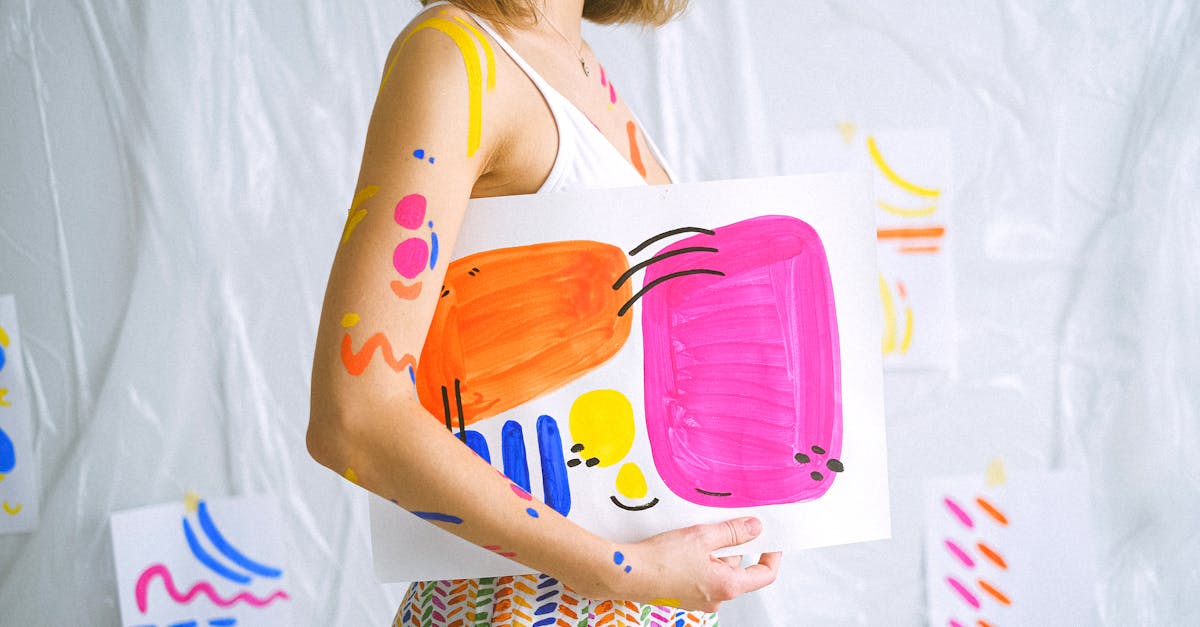
Organic and Hand-Drawn Elements
As AI-generated design has become more prevalent, there has been a corresponding surge in demand for elements that feel unmistakably human. Organic shapes, hand-drawn illustrations, custom icons with visible brushwork, and irregular forms that break the precision of digital grids are all gaining prominence in 2026. This is not nostalgia — it is a strategic response to a landscape where machine-generated polish is abundant and human imperfection is scarce.
Hand-drawn elements serve a specific communicative function. They signal authenticity, approachability, and creative investment. A website that features custom illustrations with visible line weight variation, slightly imperfect curves, and hand-crafted texture communicates something different from a site that uses stock vectors or AI-generated imagery — even if the content is identical. The craft is the message.
The technical execution has evolved. Designers working with hand-drawn elements in 2026 are often creating initial artwork by hand — pen on paper, brush on canvas, stylus on tablet — and then digitizing it with careful attention to preserving the analog qualities. SVG format allows these illustrations to scale without losing their hand-crafted character, and animation libraries can add subtle movement — a gentle wobble, a slow rotation, a hand-drawn line that appears to draw itself — without undermining the organic feel.
Organic shapes are also appearing as structural elements rather than decorative additions. Blob-shaped content containers, curved section dividers, and irregular grid cells that break the rectangular norm are all expressions of this trend. The influence of hand lettering is visible in custom logotypes and headline treatments that incorporate letterforms drawn rather than typeset, adding personality that no font file can replicate.
Retro and Nostalgia
The cyclical nature of design trends means that every era eventually becomes a reference point. In 2026, two retro periods are exerting particular influence on web design: the Y2K era and the early web of the 1990s.
The Y2K aesthetic — characterized by metallic textures, reflective surfaces, futuristic optimism, and a distinctive color palette of chrome, translucent blue, and neon accents — has been reinterpreted for contemporary interfaces. The revival is selective rather than literal. Designers are borrowing the optimistic futurism and material language of the Y2K period without reproducing its specific visual artifacts. Gradient meshes that reference the iridescent quality of early-2000s graphics, interface chrome that nods to Aqua-era skeuomorphism, and type treatments that echo the techno-optimism of millennium-era branding all appear in current work.
The 1990s web aesthetic is receiving a different treatment. Here, the reference is more explicitly playful — visible site counters (now ironic rather than functional), tiled backgrounds, deliberately crude pixel art, and navigation structures that mimic the early web’s lack of established conventions. This retro strain is most common on personal sites, indie projects, and creative portfolios, where the informality of the reference matches the informality of the context.
Pixelated elements deserve specific mention. Pixel art — graphics rendered at deliberately low resolution with visible square pixels — has crossed from gaming into web design as a stylistic choice. Pixel-art icons, illustrations, and even type treatments appear on sites that are otherwise modern in their construction, creating a visual contrast between contemporary code and retro-referenced visuals. The pixelated aesthetic communicates craft, intentionality, and a connection to digital history that resonates with audiences who grew up with early computing.
What distinguishes the retro trend in 2026 from simple imitation is the layer of self-awareness. These designs reference the past without pretending to inhabit it. They use modern performance optimization, responsive techniques, and accessibility standards while wearing the visual language of a previous era. The nostalgia is aesthetic, not structural.
Putting It All Together
The web design trends of 2026 are not a checklist to be implemented wholesale. They are currents — some complementary, some contradictory — flowing through the broader discipline of digital design. A single project might combine bento grid layouts with oversized typography while ignoring 3D elements entirely. Another might lean heavily into neobrutalism and dark mode while avoiding retro references. The skill is in selection: understanding which trends serve a specific project’s goals and audience, and which are better left for other contexts.
Several through-lines connect these disparate trends. The tension between AI efficiency and human expression runs through nearly every development. The growing non-negotiability of accessibility touches all of them. And the willingness to be visually distinctive — to reject the safe middle ground of generic modern design — unites movements as different as neobrutalism and organic illustration.
For designers and teams evaluating these trends, the practical advice remains consistent: adopt what solves a real problem for your users, execute it with craft and intention, and let the trend serve the work rather than the other way around.
Frequently Asked Questions
What are the biggest web design trends in 2026?
The most significant web design trends in 2026 include AI-influenced design workflows, the maturation of neobrutalism as a mainstream aesthetic, dark-mode-first design, oversized and variable font typography, bento grid layouts, 3D and dimensional elements, microinteractions used for communication rather than decoration, organic and hand-drawn elements, and retro-inspired aesthetics drawing from Y2K and 1990s web culture. Accessibility-first design has also moved from aspiration to standard practice across the industry.
Is minimalism dead in web design?
Minimalism is not dead, but it has evolved. The stripped-back, content-sparse minimalism that defined much of the 2010s has given way to approaches that balance visual richness with clarity. Trends like bento grids, oversized typography, and dark-mode design are minimal in their restraint — they avoid clutter and respect whitespace — but they are not afraid of visual impact. The current design landscape values intentionality over simplicity for its own sake. A design can be bold, colorful, and typographically expressive while still maintaining the clarity and focus that minimalism championed.
How do I keep up with web design trends?
The most effective approach is to combine regular observation with selective experimentation. Follow design-focused publications and portfolio platforms where leading practitioners share current work. Study the design systems of companies known for pushing boundaries. Rebuild small components or sections using new techniques you encounter — this hands-on practice reveals the practical constraints and opportunities that reading alone cannot. But resist the urge to track every micro-trend. Focus on understanding the underlying principles — accessibility, performance, communication, user respect — and the specific aesthetic movements will be easier to evaluate and adopt as they emerge.
Should I follow every web design trend?
No. Trends are tools, not mandates. A web design trend is worth adopting when it solves a genuine problem for your users, aligns with your brand’s identity, and can be executed with sufficient craft to feel intentional rather than imitative. Applying every current trend to a single project produces visual incoherence, and chasing trends that do not serve your audience wastes time and budget. The better approach is to understand the full landscape of current trends, identify the two or three that genuinely align with your project’s needs, and execute those well. A thoughtfully designed site that ignores every trend will always outperform a trend-saturated site that lacks coherence and purpose.


