Graffiti Fonts: Street Art Typefaces for Bold Design
Graffiti fonts bring the raw energy of street art into digital design. These typefaces draw from decades of urban lettering culture, translating the irregular strokes, aggressive angles, and dripping paint effects of wall writing into usable type. Whether you are designing a concert poster, building a streetwear brand, or adding edge to a social media campaign, graffiti typefaces deliver visual impact that cleaner, more conventional fonts simply cannot match.
The appeal of street art fonts extends well beyond nostalgia. The visual language of graffiti has become a permanent fixture in mainstream design, influencing everything from sneaker packaging to album covers to energy drink labels. Urban fonts carry connotations of authenticity, rebellion, and creative freedom that resonate across demographics, which is why designers keep returning to them year after year. This guide covers the history, styles, and best graffiti fonts available today, along with practical advice for using them effectively in your own work. If you are new to typography or exploring different graphic design styles, graffiti lettering is one of the most visually distinctive categories you will encounter.
What Are Graffiti Fonts
Graffiti fonts are typefaces inspired by the lettering styles found in street art, tagging, and urban wall writing. They borrow their visual DNA from the hand-painted, hand-sprayed, and hand-scratched letterforms that have covered urban surfaces since the early 1970s. Unlike traditional typefaces that aim for uniformity and legibility, graffiti fonts embrace irregularity as a feature rather than a flaw.
The characteristics that define a graffiti typeface include exaggerated letter structures with aggressive angles and sharp extensions, dripping or splattered paint effects that simulate spray cans and markers, layered fills with outlines and shadows that reference the depth techniques used in wall pieces, interlocking letter connections where characters overlap and weave into each other, and a raw, unpolished energy that communicates spontaneity even when meticulously designed.
What makes graffiti fonts distinct from other display typefaces is their cultural origin. These are not abstract stylistic exercises. Each subcategory of graffiti lettering, from quick tags to elaborate wildstyle pieces, emerged from a specific practice within street art culture. The best graffiti fonts capture not just the visual appearance but the gestural quality of spray-painted letters, the speed of a tag, or the architectural complexity of a wildstyle composition. Born from a subculture that operated outside sanctioned design, graffiti lettering has been adopted by mainstream visual culture in ways that would have been unimaginable to the writers who created it.
History and Cultural Context
The story of graffiti as a lettering tradition begins in the late 1960s and early 1970s in New York City. Writers like TAKI 183 and CORNBREAD pioneered the practice of tagging, writing their names across city surfaces as a form of identity and territorial marking. By the mid-1970s, the practice had migrated to the New York subway system, where writers used the trains as moving canvases that could carry their names across the entire city.
The subway era produced a rapid evolution in lettering complexity. Simple tags gave way to throw-ups, which gave way to elaborate pieces with multiple colors, outlines, fills, and backgrounds. Competition among writers drove innovation. Each new style had to outdo what came before, pushing letterforms into increasingly complex and abstract territory. Wildstyle, the most intricate form of graffiti lettering, emerged during this period as writers like SEEN, DONDI, and ZEPHYR created pieces so complex they bordered on illegibility to anyone outside the culture.
Futura 2000 brought graffiti aesthetics into the gallery world during the early 1980s, exhibiting alongside figures from the downtown New York art scene. Jean-Michel Basquiat, whose work incorporated graffiti-influenced lettering and raw text, crossed from street art into the fine art establishment, achieving commercial and critical recognition that helped reframe graffiti as a legitimate art form. Keith Haring similarly bridged the gap between subway art and gallery walls.
The parallel rise of hip-hop culture in the late 1970s and 1980s cemented the visual connection between graffiti lettering and music. Album covers, flyers, and music videos adopted graffiti aesthetics as the default visual language of hip-hop. This association persists today, and hip hop fonts remain one of the most searched categories of display type. Graffiti’s influence extended beyond music into fashion, skateboarding, and youth culture at large, creating a visual vocabulary that designers continue to draw from across industries.
Styles of Graffiti Lettering
Graffiti is not a single style but a family of related lettering approaches, each with its own rules, history, and visual characteristics. Understanding these subcategories is essential for choosing the right graffiti font for a specific project.
Tag Style
Tags are the most basic and most common form of graffiti lettering. A tag is a stylized signature, the writer’s name rendered quickly in a single color using a marker or spray can. Tag-style fonts capture the gestural, flowing quality of these signatures. The letterforms are typically connected or semi-connected, with exaggerated flourishes, underlines, and sharp angles. Speed is the defining quality. Tag fonts look like they were written fast, with confident strokes that do not hesitate or backtrack. They are effective in design contexts that call for authenticity and rawness without the visual complexity of more elaborate graffiti styles.
Throw-Up
Throw-ups sit between tags and full pieces in terms of complexity. They are typically rendered in bubble letters with a two-color scheme: one color for the fill and another for the outline. The name refers to the speed of execution. Writers “throw up” these pieces quickly to cover maximum surface area. Throw-up fonts feature rounded, inflated letterforms with thick outlines. They share some visual DNA with bubble fonts, but with a rougher, more spontaneous quality that reflects their street origins. The style works well for designs that need to feel energetic and urban without overwhelming the viewer with detail.
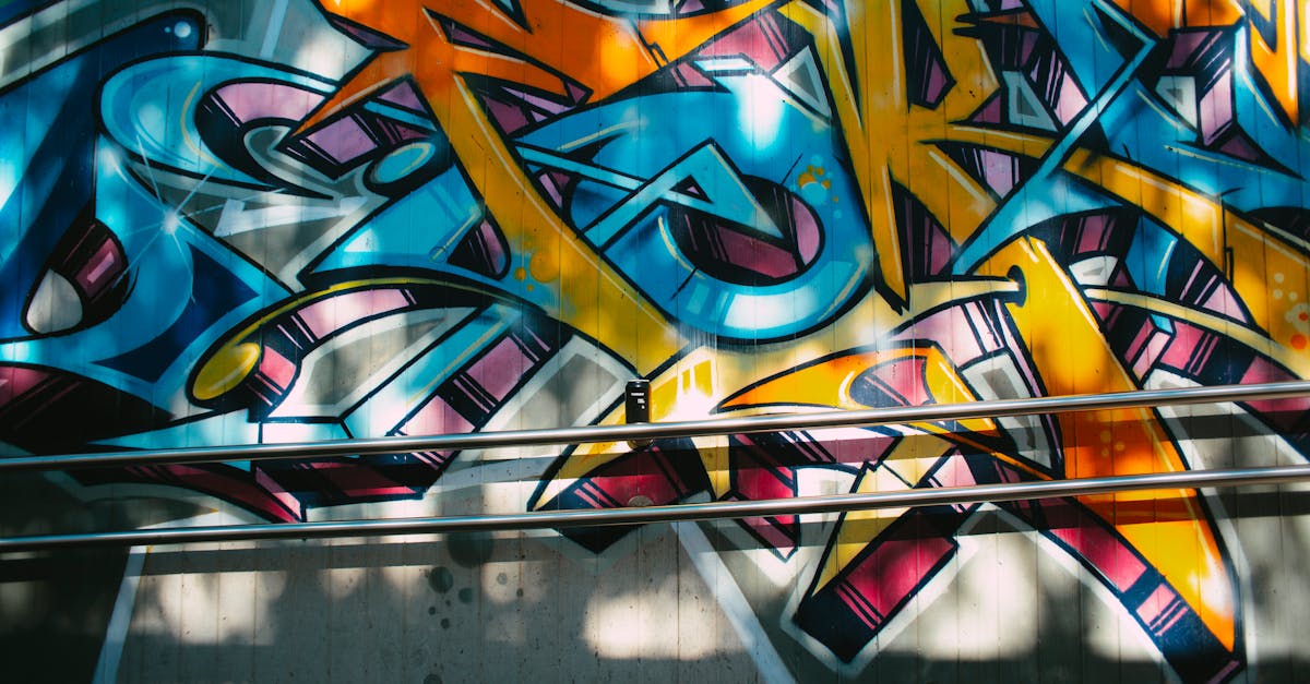
Wildstyle
Wildstyle represents the pinnacle of graffiti lettering complexity. The letters interlock, overlap, and weave into each other, often incorporating arrows, connections, stars, and decorative elements that make the text nearly impossible to read for the uninitiated. Wildstyle fonts attempt to capture this complexity in a usable typeface, which is inherently challenging. The best wildstyle fonts balance visual intricacy with enough legibility to function as display type. They are suited to projects where visual impact and artistic expression matter more than instant readability, such as album art, poster design, and streetwear graphics.
Blockbuster
Blockbuster or block-style graffiti uses large, simple, blocky letterforms designed to cover maximum area. The letters are typically squared-off, wide, and filled with a single color or simple pattern. The goal is visibility and coverage rather than complexity. Blockbuster fonts translate this approach into typefaces with heavy, architectural letterforms that command attention through sheer size and weight. They work well for headlines, banners, and any context where you need large-scale visual dominance.
Stencil Graffiti
Stencil graffiti uses pre-cut templates to create repeatable images and text on walls. The technique gained global visibility through the work of Banksy, whose stenciled pieces combined street art with social commentary. Stencil fonts incorporate the characteristic breaks in letter strokes where the stencil bridges hold the template together. While stencil fonts are a broader category that includes military and industrial typefaces, stencil graffiti fonts specifically combine the stencil technique with the rough, urban quality of street art. They tend to be more legible than other graffiti styles, making them a practical choice for projects that need urban edge without sacrificing readability.
Best Graffiti Fonts
The following graffiti fonts represent a range of styles, from aggressive tag lettering to detailed wildstyle compositions. The selection includes both free and premium options, so you can find something regardless of budget.
Bombing
Bombing is a bold, aggressive graffiti typeface that channels the urgency of illegal wall writing. The letterforms lean forward with a sense of motion, and the strokes taper and swell in ways that mimic the pressure dynamics of a spray can. The font includes alternate characters and stylistic ligatures that help avoid the overly uniform look that can undermine digital graffiti type.
Best for: Music event posters, streetwear graphics, skateboard deck designs, social media with an urban edge.
Price: Premium; available on Creative Market and similar marketplaces.
Most Wazted
Most Wazted delivers a dripping, distressed graffiti aesthetic with letterforms that look like they were sprayed in a hurry on a rough surface. The paint-drip effects on the descenders and baselines give the font a visceral, tactile quality. It works best in dark, high-contrast color schemes where the aggressive styling reads clearly.
Best for: Horror-themed graphics, punk and metal music visuals, edgy brand campaigns, apparel design.
Price: Premium; available from font marketplaces.
Graffiti Treat
Graffiti Treat takes a friendlier approach to the graffiti aesthetic. The letters are rounded and playful, with enough street art character to read as graffiti without the aggressive edge of harder styles. The font includes a full set of uppercase and lowercase characters with consistent styling throughout. It bridges the gap between graffiti and more commercial display type.
Best for: Youth-oriented branding, casual dining and food truck graphics, children’s event posters, social media content.
Price: Free for personal use; commercial license available.
Streetbrush
Streetbrush mimics the effect of a wide brush marker dragged quickly across a surface. The strokes are thick and varied, with visible texture from the brush bristles rendered into the typeface design. It sits at the crossover point between graffiti and brush lettering, making it versatile enough for projects that need urban energy without full graffiti styling.
Best for: Brand identities with urban character, fitness and athletic branding, motivational posters, apparel.
Price: Premium; available on Creative Market and Envato Elements.
Wildstyle
Named directly after the graffiti tradition it references, Wildstyle is one of the more ambitious digital graffiti typefaces available. The letterforms interlock and overlap with arrows and extensions that reference classic New York subway pieces. Legibility is limited by design, which means this font works best as a graphic element rather than functional text. Use it sparingly and at large sizes.
Best for: Album artwork, poster design, graphic tees, wall murals, visual branding elements where art takes priority over readability.
Price: Premium; available from specialty font distributors.
Urban Jungle
Urban Jungle is a thick, heavy graffiti font with a slightly three-dimensional quality that gives it presence at any size. The letterforms are blocky and forceful, drawing from the blockbuster tradition of graffiti where coverage and visibility are the primary goals. The font includes both clean and distressed versions, giving you flexibility to dial the roughness up or down depending on the project.
Best for: Energy drink branding, action sports graphics, event promotions, bold social media headlines.
Price: Free for personal use; commercial license required for brand work.
Rumble Brave
Rumble Brave offers a more refined take on graffiti lettering. The letterforms are clearly rooted in street art, with angular cuts, sharp edges, and a forward lean that suggests movement, but the overall design is cleaner and more controlled than raw graffiti type. This makes it one of the more readable options in the graffiti font category, suitable for projects where you need the urban aesthetic to be legible at a glance.
Best for: Gaming graphics, sports branding, YouTube thumbnails, headline type for urban-themed publications.
Price: Premium; available from Creative Market and font distributors.
Hustle
Hustle is a spray paint font that captures the raw, unfiltered quality of aerosol lettering. The edges are rough and uneven, with visible overspray and drip marks baked into the character designs. The effect is convincingly analog, making Hustle a strong choice for projects that need to feel genuinely street-level rather than digitally polished.
Best for: Authentic urban branding, documentary title cards, protest and activism graphics, raw editorial design.
Price: Premium; available from font marketplaces and Envato Elements.
Throwback
Throwback references the bubble throw-up style of 1980s and early 1990s graffiti. The letters are rounded and inflated with thick outlines, capturing the feel of quick two-color wall pieces. The nostalgic quality makes it particularly effective for retro-themed projects and designs that reference old-school hip-hop visual culture.
Best for: Retro hip-hop projects, 90s-themed branding, nostalgic event graphics, vintage streetwear labels.
Price: Free for personal use; commercial license available.
Using Graffiti Fonts in Design
Graffiti fonts are display typefaces. That distinction is not just a suggestion; it is a hard constraint. Setting body text in a graffiti font will produce something unreadable and visually exhausting. Use graffiti type for headlines, titles, logos, and short text blocks where the visual impact of the letterforms is the point. For everything else, pair with a clean display font or body typeface that provides the legibility your readers need.
The most natural contexts for graffiti fonts include streetwear and fashion design, where urban lettering is a core part of the visual language. Music-related projects, particularly in hip-hop, punk, and electronic genres, lean heavily on spray paint fonts and tag-style lettering. Event posters and flyers for concerts, street festivals, and underground culture events benefit from the energy that graffiti type brings. Product categories like energy drinks, skateboarding, and action sports have long adopted graffiti aesthetics for their packaging and advertising. Youth marketing campaigns across industries use graffiti fonts to signal authenticity and rebellion.
Social media graphics are another strong context for graffiti type. The bold, high-contrast nature of graffiti lettering translates well to small screens and fast-scrolling feeds. Instagram story text, YouTube thumbnails, and TikTok cover images all benefit from the attention-grabbing quality of well-chosen urban fonts. Keep the text short, the contrast high, and the background simple to let the typeface do its work.
Graffiti Fonts in Branding
Using graffiti fonts in brand identity requires careful judgment. The urban aesthetic works naturally for certain industries and audiences: action sports brands, independent music labels, street fashion lines, skate shops, and urban fitness brands all have legitimate reasons to use graffiti lettering in their visual identity. In these contexts, the typeface reinforces the brand’s cultural positioning and signals alignment with the communities it serves.
Where graffiti fonts become problematic is when they are used by brands with no authentic connection to urban culture. A luxury financial services firm using a spray paint font for a marketing campaign risks appearing tone-deaf. A suburban chain restaurant adopting graffiti lettering to seem edgy will likely come across as inauthentic. The question to ask is whether the graffiti aesthetic reflects the brand’s actual identity and audience, or whether it is being used as a superficial shorthand for “cool.”
Cultural sensitivity matters. Graffiti emerged from marginalized urban communities, particularly Black and Latino neighborhoods in New York City. Using graffiti aesthetics in branding without acknowledging or supporting those communities raises valid concerns about appropriation. The line between appreciation and appropriation is not always clear, but designers should approach graffiti-influenced branding with awareness of its origins and respect for the culture that created it. When building a brand identity that draws on urban visual language, consider the broader context of your logo type and whether the aesthetic choice reflects genuine alignment with the culture you are referencing.
Pairing Graffiti Fonts
The key to pairing graffiti fonts effectively is contrast. Graffiti typefaces are loud, textured, and visually dense. Their ideal partners are clean, modern, and restrained. The interplay between raw and refined creates visual tension that is more interesting than either element alone.
Modern sans-serif fonts are the most reliable pairing partners for graffiti type. Typefaces like Helvetica, Inter, or Roboto provide a neutral, legible foundation that lets the graffiti headline command attention without competing for it. The sans-serif handles body text, navigation, and supporting information while the graffiti font handles the moment of impact.
Geometric sans-serifs like Futura or Montserrat work particularly well because their precise, constructed forms create maximum contrast with the organic irregularity of graffiti lettering. The more structured and predictable the body font, the more the graffiti headline stands out.
Avoid pairing graffiti fonts with other decorative or display typefaces. Two attention-seeking fonts in the same layout will compete rather than complement. Similarly, script and handwritten fonts are a poor match because they operate in the same territory of hand-crafted irregularity without providing the contrast graffiti type needs. Stick to the formula of one graffiti font for impact, one clean font for everything else.
Creating Custom Graffiti Lettering
While pre-made graffiti fonts serve many projects well, custom hand lettering in a graffiti style offers something no off-the-shelf font can: uniqueness. Custom graffiti lettering is particularly valuable for brand identities, album art, and apparel design where a one-of-a-kind look matters.
Start with traditional tools. Thick markers such as Pilot Jumbo or Montana markers are the classic instruments for tag and throw-up style lettering. For piece-style work, sketch the letter structures in pencil first, then refine with markers or paint pens. Studying the work of established graffiti writers is essential for understanding the structural logic behind different styles. The letter connections, the balance between positive and negative space, and the flow of a composition are skills that develop through observation and practice.
Spray paint offers the most authentic graffiti aesthetic but is the hardest medium to control. Working on large surfaces with actual spray cans, then photographing or scanning the results, produces textures and effects that digital tools struggle to replicate. Montana, Ironlak, and Molotow are widely used brands among graffiti artists, each offering different cap sizes and paint properties that affect the final look.
For digital work, brush sets in Procreate, Adobe Fresco, and Photoshop can simulate spray paint and marker effects on a tablet. The advantage of digital tools is the ability to undo, layer, and iterate quickly. The disadvantage is that digital graffiti often looks too clean. Adding noise, texture overlays, and deliberate imperfections helps bridge the gap between digital creation and street-level authenticity.
Once you have created hand-drawn graffiti lettering, vectorizing the artwork in Adobe Illustrator or a comparable tool converts it into a scalable format suitable for print, apparel, and signage. Use the Image Trace function as a starting point, then manually refine the vector paths to preserve the energy of the original hand-drawn work. Automated tracing tends to smooth out the rough edges that give graffiti lettering its character, so expect to spend time on manual cleanup.
Frequently Asked Questions
Are graffiti fonts free to use commercially?
It depends on the specific font. Some graffiti fonts are free for personal use but require a paid license for commercial projects. Others are fully free under open-source licenses, and many premium graffiti fonts are sold through marketplaces like Creative Market, MyFonts, and Envato Elements. Always check the license terms before using any font in commercial work, particularly for client projects and products for sale.
Can I use a graffiti font for a logo?
You can, but consider whether a pre-made font is the right choice for a logo that needs to be unique to your brand. Many streetwear and music brands use graffiti-style logos, but the strongest examples tend to be custom lettering rather than off-the-shelf fonts. If you use a graffiti font for a logo, modify the letterforms enough to create something distinctive. A font that any other brand can also purchase will not give you the uniqueness a logo requires.
What is the difference between graffiti fonts and urban fonts?
Urban fonts is a broader category that includes any typeface with a street or city aesthetic. Graffiti fonts are a subset of urban fonts, specifically referencing the lettering styles of street art and tagging culture. Urban fonts might also include stencil typefaces, distressed industrial lettering, and other styles associated with city environments that do not directly reference graffiti traditions.
How do I make text look like graffiti without using a graffiti font?
You can achieve a graffiti-inspired look through hand lettering, using actual markers or spray paint and then scanning or photographing the results. Digitally, brush tools in Procreate or Photoshop can simulate spray paint effects when combined with appropriate textures and overlays. Adding drip effects, rough edges, and layered outlines to existing bold typefaces can also push standard fonts toward a graffiti aesthetic, though the result will lack the authentic structural logic of true graffiti lettering.


