iPhone Font: San Francisco and iOS Typography Explained
The iPhone font is one of the most viewed typefaces on the planet. Every text message, notification, app label, and settings menu on hundreds of millions of iPhones uses the same typeface — yet most people could not name it. The font you see on every modern iPhone is San Francisco, a custom typeface designed entirely by Apple and introduced in 2015. It replaced Helvetica Neue, which itself had replaced the original Helvetica that shipped with the first iPhone in 2007.
Understanding the iPhone’s typography matters whether you are an iOS developer, a designer building for Apple platforms, or simply curious about why the text on your phone looks the way it does. This guide covers the full story — from the original iPhone’s font choices to the San Francisco family’s technical details, licensing restrictions, and alternatives for non-Apple projects.
What Font Does the iPhone Use?
Every iPhone running iOS 9 or later uses San Francisco as its system font. Specifically, the variant used across iOS is called SF Pro. Apple designed San Francisco internally with a single goal: to create a typeface that performs perfectly on the company’s range of screen sizes, from the Apple Watch to the iPad Pro.
SF Pro is a neo-grotesque sans-serif, placing it in the same broad category as Helvetica and Arial. But unlike those typefaces, San Francisco was designed from scratch for digital screens rather than adapted from a print-era original. Every curve, every stroke width, and every spacing decision was made with pixel rendering in mind.
When Apple introduced San Francisco at WWDC 2015, it unified the typography across all Apple platforms. macOS, iOS, watchOS, and tvOS all adopted the same type family, giving the entire ecosystem a consistent visual language. Before San Francisco, Apple used different fonts on different platforms — Lucida Grande on macOS, Helvetica Neue on iOS — creating subtle but noticeable inconsistencies.
History of iPhone Fonts
The iPhone’s typographic history can be divided into three distinct eras, each reflecting Apple’s evolving understanding of screen typography and the technical capabilities of its hardware.
2007-2012: Helvetica
When Steve Jobs introduced the original iPhone in January 2007, the device used Helvetica as its system font. This was a natural choice for Apple at the time. Helvetica was already the world’s most recognized sans-serif, and Jobs had a well-documented affinity for the typeface. The early iPhone’s relatively low screen resolution (320 x 480 pixels on the original model) meant that a well-known, highly legible typeface was a safe and effective choice.
However, Helvetica was never designed for screens. Max Miedinger created it in 1957 for Swiss print design, and its tight apertures and uniform stroke widths — qualities that give it a clean, professional appearance in print — actually work against readability at small sizes on digital displays.
2013-2014: Helvetica Neue
With iOS 7 in 2013, Apple introduced a radical visual redesign under Jony Ive’s direction. The skeuomorphic textures and drop shadows were stripped away in favour of flat design, bright colours, and thin typography. As part of this overhaul, Apple switched from Helvetica to Helvetica Neue, specifically using the Ultra Light weight for many UI elements.
The move to Helvetica Neue Ultra Light drew significant criticism. While the thin letterforms looked elegant in marketing materials and on high-resolution Retina displays, they proved difficult to read for many users — particularly those with visual impairments, those using older devices, and anyone reading in bright sunlight. Apple partially addressed this in iOS 7.1 by making the default weight slightly heavier, but the fundamental limitations of Helvetica Neue on small screens remained.
2015-Present: San Francisco
Apple first revealed San Francisco on the original Apple Watch in 2014, then rolled it out across iOS, macOS, and tvOS with iOS 9 and OS X El Capitan in 2015. The switch was driven by practical necessity. Apple’s product line had expanded to include screens ranging from 38mm watch faces to 27-inch desktop monitors, and no existing typeface — including Helvetica Neue — could perform optimally across that full range.
San Francisco was Apple’s first proprietary system font since the original bitmap-era Chicago and charcoal typefaces of the classic Mac OS. Designing it in-house gave Apple complete control over how text renders across its ecosystem, without licensing dependencies on external foundries.
San Francisco Font Family
San Francisco is not a single font but a comprehensive type system with multiple subfamilies, each optimized for different contexts. Understanding the structure of the family is essential for anyone designing or developing for Apple platforms.
SF Pro Display
SF Pro Display is optimized for text set at 20 points and above. It features tighter letter spacing, thinner stroke widths, and more refined details compared to the text variant. These characteristics look crisp and elegant at headline sizes where individual letterforms are large enough for the eye to appreciate subtle details. SF Pro Display is what you see in large headings, titles, and promotional text throughout iOS. Its font weight range spans from Ultralight to Black, giving designers substantial flexibility for establishing visual hierarchy.
SF Pro Text
SF Pro Text is designed for body copy and smaller UI elements — anything below 20 points. Compared to SF Pro Display, it has wider letter spacing, slightly heavier stroke weights, and more open apertures. These adjustments compensate for the reduced legibility that naturally occurs at small sizes. The difference between Display and Text variants is subtle when viewed side by side, but switching between them at the wrong size creates a noticeable loss in readability.
SF Compact
SF Compact was designed specifically for the Apple Watch, where the extremely small screen demands maximum efficiency from every glyph. Its letterforms are more geometrically compact than SF Pro, with flattened sides on round characters like “o,” “e,” and “c.” This flattening reduces the horizontal space each character occupies without sacrificing legibility, allowing more text to fit on the watch’s limited display. SF Compact is also used in some iOS contexts, such as certain complications and widgets.
SF Mono
SF Mono is Apple’s monospaced variant, designed for code editors, terminal applications, and any context where characters need to align in columns. It ships with Xcode and Terminal on macOS and shares the same design DNA as the rest of the San Francisco family. SF Mono competes with dedicated coding fonts like JetBrains Mono and Fira Code, offering a clean, legible option that feels native to the Apple ecosystem.
What Makes San Francisco Special
Several technical features distinguish San Francisco from other system fonts and from the Helvetica family it replaced. These are not marketing features — they are engineering decisions that directly affect how text looks and reads on Apple devices.
Dynamic Optical Sizing
The most significant technical feature of San Francisco is its automatic optical sizing. On Apple platforms, the system automatically selects the appropriate variant — Display or Text — based on the point size being rendered. Developers and designers do not need to manually switch between variants. When you specify the system font in iOS, the operating system handles the transition seamlessly. This behaviour draws on a centuries-old typographic principle: letterforms that work at large sizes need different proportions than letterforms that work at small sizes. Understanding this concept is fundamental to typography anatomy.
Designed for Screens, Not Adapted
Unlike Helvetica, which was born in the print era, or Roboto, which has been through several major redesigns, San Francisco was conceived from day one as a screen typeface. Apple’s type team could make decisions that would be impractical or undesirable in a print typeface — such as the wider letter spacing in SF Pro Text or the flat-sided curves in SF Compact — because the font would never need to work in print contexts.
Variable Font Technology
San Francisco is available as a variable font, meaning a single font file contains the full range of weights and optical sizes as a continuous spectrum rather than as fixed instances. This reduces file sizes (one variable font file replaces dozens of static files) and allows the system to interpolate precise weight values for specific contexts. The variable format also enables smooth animated transitions between weights, which Apple uses in certain interface interactions.
DIN-Inspired Numerals
San Francisco’s numerals draw influence from DIN 1451, the German industrial standard typeface known for its supremely legible numbers. The digits in San Francisco are designed to be distinguishable from one another at a glance — particularly important on a device where you constantly read time, dates, percentages, counts, and other numerical data. The “6” and “9,” the “3” and “8,” and the “1” and “7” are all carefully differentiated to avoid misreading, even at small sizes or during quick scanning.
Can You Use San Francisco in Your Designs?
This is one of the most frequently misunderstood aspects of the San Francisco font. The short answer: it depends entirely on what you are designing.
Apple Platform Development: Yes
If you are building apps, websites, or content for Apple platforms, you can use San Francisco freely. Apple provides the fonts for download on its developer website at no cost. San Francisco is the expected default for iOS, macOS, watchOS, and tvOS applications, and Apple’s Human Interface Guidelines strongly recommend using it as the primary typeface in apps.
Non-Apple Projects: No
San Francisco’s licence restricts its use to Apple platforms. You cannot embed San Francisco in an Android app, use it on a Windows application, include it in a brand identity, or set it as a web font on a general-purpose website. The licence is clear: San Francisco is for developing on Apple platforms only. Using it outside that context violates Apple’s terms.
Where to Download
Apple distributes San Francisco through its official developer resources at developer.apple.com/fonts. The download includes SF Pro, SF Compact, SF Mono, and the related New York serif family. You need an Apple ID to access the download, but you do not need a paid developer account.
Alternatives for Non-Apple Projects
If you need a typeface with a similar aesthetic for cross-platform or non-Apple work, the best option is Inter. Designed by Rasmus Andersson as an open-source project, Inter shares many of San Francisco’s screen-first design principles — tall x-height, open apertures, tabular figures — while being freely available under the SIL Open Font License for any project.
For web development, the system-ui CSS font stack is another practical approach. By specifying font-family: system-ui, your website will automatically use San Francisco on Apple devices, Segoe UI on Windows, and Roboto on Android — giving each user the native font they are already accustomed to, with no font files to download.
Fonts Similar to San Francisco
Whether you need an alternative due to licensing or simply want to explore typefaces with a comparable feel, several sans-serif fonts occupy similar territory to San Francisco.
- Inter: The closest open-source equivalent. Slightly more humanist in character than San Francisco, with even wider apertures and a comprehensive set of OpenType features. Free for all uses.
- Roboto: Google’s system font for Android and Material Design. Roboto has a somewhat more geometric structure than San Francisco and has been redesigned several times since its 2011 introduction. Free and open source.
- Segoe UI: Microsoft’s system font for Windows. Similar in purpose to San Francisco — a humanist sans-serif designed for screen interfaces — but with noticeably different proportions and slightly more personality in its curves.
- Noto Sans: Google’s pan-language typeface project, designed to cover every character in the Unicode standard. Less refined than San Francisco for pure UI work but unmatched in language coverage. Free and open source.
Each of these typefaces shares San Francisco’s fundamental goal — legible, clean text on digital screens — but differs in the specific compromises and priorities its designers chose to make.
San Francisco in iOS Design
San Francisco is deeply integrated into iOS in ways that go beyond simply being the default typeface. Apple has built an entire typographic system around it that adapts to user preferences and accessibility needs.
Dynamic Type
Dynamic Type is Apple’s system for letting users control their preferred text size across all apps. When a user adjusts the text size slider in Settings, every app that supports Dynamic Type will scale its text accordingly — and San Francisco is designed to remain legible and well-proportioned across the full range of Dynamic Type sizes, from the smallest accessibility setting to the largest. The font’s optical sizing automatically adjusts as Dynamic Type scales text up or down.
Accessibility Features
iOS offers a Bold Text setting that increases the weight of all system text. San Francisco’s comprehensive weight range (from Ultralight to Black) means the system can shift every text element to a heavier weight without breaking layouts or creating visual inconsistencies. The font also supports Apple’s accessibility features for dyslexia and low vision, maintaining its core legibility even under the visual transformations these features apply.
Adapting to Context
iOS uses different tracking (letter spacing) values for San Francisco depending on the context. Smaller text gets wider tracking for legibility; larger text gets tighter tracking for visual refinement. This tracking table is built into the system font rendering pipeline, meaning developers who use the system font get these optimisations automatically. Overriding the system font with a custom typeface means losing these automatic adjustments — one reason Apple discourages replacing San Francisco unless a brand’s design language specifically demands it.
Frequently Asked Questions
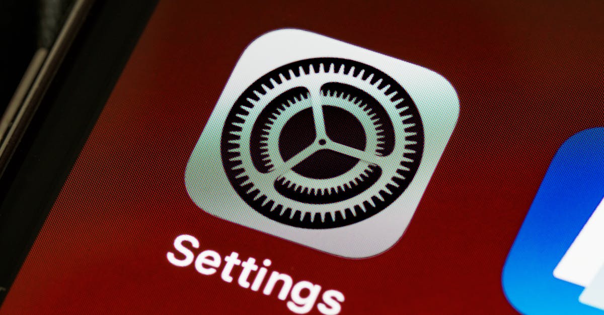
What font does iPhone use?
Every iPhone running iOS 9 or later uses San Francisco (SF Pro) as its system font. Apple designed San Francisco in-house and introduced it in 2015 to replace Helvetica Neue. It appears across the entire iOS interface — in app labels, notifications, settings menus, and all native applications.
Is San Francisco free?
San Francisco is free to download from Apple’s developer website and free to use in apps and designs for Apple platforms (iOS, macOS, watchOS, tvOS). However, it is not free to use for non-Apple projects. The licence restricts usage to development and design work targeting Apple’s operating systems.
Can I use San Francisco on Android?
No. Apple’s licensing terms prohibit using San Francisco on non-Apple platforms, including Android. If you need a similar typeface for Android development, consider using Inter or Roboto, both of which are free, open source, and optimised for screen interfaces.
What font did iPhone use before San Francisco?
Before San Francisco, the iPhone used Helvetica Neue (iOS 7 and iOS 8) and Helvetica (iOS 1 through iOS 6). Apple switched away from the Helvetica family because it was originally designed for print and did not perform optimally across the growing range of Apple device screen sizes, from the Apple Watch to large iPads.


