Blue Color Palette: Shades & Combinations for Design
A blue color palette remains the most universally trusted color choice in design, and understanding how to build one effectively can elevate any project from ordinary to authoritative. Blue is the world’s most popular favorite color across cultures and demographics, which gives designers a reliable foundation for broad appeal. Constructing a balanced blue color scheme requires an understanding of color harmony principles and how blue relates to other hues on the color wheel, where it sits as a primary color with vast range in both warm and cool directions.
What Defines the Blue Color Family
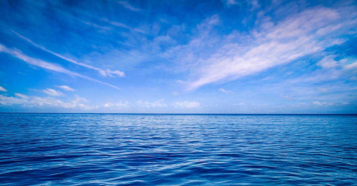
Blue spans an extraordinary range of moods and associations. At its lightest, powder blue and sky blue evoke openness, calm, and clarity. At its darkest, navy and midnight blue convey authority, depth, and formality. This range makes the blue color family one of the most adaptable in any designer’s toolkit.
Psychologically, blue is associated with trust, stability, intelligence, and serenity. These associations are not arbitrary; they stem from universal experiences with blue skies and clean water, which signal safety and calm across cultures. The psychology of blue explains why it dominates in corporate branding, healthcare design, and financial services, where trustworthiness is the primary message.
Visually, blue is a receding color. It appears to move away from the viewer, which makes it excellent for backgrounds and spatial design. Unlike red, which advances and demands immediate attention, blue creates depth and allows foreground elements to stand out naturally. This optical quality makes blue particularly valuable in layered compositions and interface design.
The blue family includes warm blues that lean toward violet, such as periwinkle and indigo, and cool blues that lean toward green, such as teal and cerulean. Recognizing this warm-cool spectrum within blue itself is essential for building palettes that feel intentional rather than randomly assembled.
Building a Palette with Blue
Start with a primary blue that anchors your project’s mood. A bright cobalt (#0047AB) feels confident and contemporary. A dusty blue (#6699CC) reads as relaxed and approachable. A deep navy (#1B2A4A) communicates formality and heritage. Your primary blue determines the personality of the entire palette.
For complementary contrast, blue’s opposite on the color wheel is orange. A complementary pairing of blue and orange creates maximum visual energy, which is why sports teams and action-oriented brands often use this combination. For a subtler approach, pair blue with warm amber or peach tones, which offer contrast without the full intensity of pure orange.
Analogous blue palettes combine blue with its neighbors: greens and violets. An analogous scheme moving from teal through blue to lavender creates a flowing, harmonious feel that works beautifully in wellness branding, travel design, and editorial layouts. These combinations feel natural because they mirror the gradients found in water, sky, and twilight.
Neutrals play a critical role in blue palettes. Warm neutrals like sand, cream, and tan provide grounding warmth that prevents blue from feeling cold or clinical. Cool neutrals like silver and slate extend the blue mood. White paired with blue creates a crisp, nautical or medical aesthetic, while charcoal with blue feels corporate and polished.
Blue in Graphic Design
In editorial design, blue serves as a reliable workhorse color. It provides enough visual interest to break up text-heavy pages without competing with imagery. Magazine designers frequently use blue for pull quotes, section headers, and informational graphics because it reads as authoritative without being aggressive.
Packaging design uses blue strategically across product categories. In the beverage industry, blue signals freshness and purity, which is why water brands overwhelmingly choose blue packaging. In technology, blue packaging communicates innovation and reliability. In personal care, lighter blues suggest cleanliness and gentle formulations. Review our graphic design examples for more applications of color in packaging and print.
Blue gradients have become a defining aesthetic in modern graphic design. A gradient from electric blue to deep violet creates a digital, futuristic feel popular in tech marketing and app interfaces. These gradients add dimension to flat design without the complexity of full illustration, making them efficient and visually striking.
In data visualization and infographics, blue is the default choice for good reason. It remains legible across a wide range of tints and shades, allowing designers to create meaningful value hierarchies within a single-hue palette. Sequential blue scales from light to dark can represent data intensity without introducing the confusion of multiple hues.
Blue in Branding
Blue dominates corporate branding more than any other color. Technology companies, financial institutions, healthcare providers, and professional services firms all gravitate toward blue because it immediately communicates competence and trustworthiness. This prevalence is both blue’s strength and its challenge: standing out in a sea of blue logos requires careful shade selection and distinctive design.
When building a brand strategy around blue, differentiation comes from choosing the right shade. A bright cerulean positions a brand as modern and accessible. A medium royal blue feels established and professional. A dark midnight blue suggests premium quality and exclusivity. The specific shade tells a more nuanced story than simply choosing blue as a category.
Industries where blue branding thrives include finance and banking, technology and software, healthcare and pharmaceuticals, aerospace and aviation, insurance, consulting, and social media platforms. Blue is less common in food and beverage branding because it is rarely found in natural foods and can suppress appetite, though it works well for water, mint, and blueberry products.
Pairing blue with a distinctive secondary color helps brands stand out. Blue with bright yellow creates an optimistic, approachable identity. Blue with green suggests environmental awareness. Blue with coral or salmon adds warmth and humanity to an otherwise corporate palette.
Blue in Web and UI Design
Blue is the most used color in digital interface design, and its dominance is well-earned. Blue links became the web’s default convention in the earliest browsers, establishing a connection between blue and interactivity that persists today. Users instinctively recognize blue text as clickable, which gives blue UI elements a built-in usability advantage.
For backgrounds, light blues and blue-grays create comfortable reading environments that reduce eye strain during extended screen time. Dark blue backgrounds work well for dashboards and data-heavy interfaces, providing depth while maintaining sufficient contrast with light text. Navy or dark slate blue backgrounds feel more sophisticated than pure black while maintaining readability.
Blue call-to-action buttons perform reliably across industries, though they may not create the same urgency as red or orange buttons. Blue CTAs communicate safety and trustworthiness, making them ideal for sign-up flows, account creation, and financial transactions where users need reassurance. For e-commerce checkout flows, blue reduces anxiety and increases completion rates.
Accessibility with blue is generally favorable. Most shades of blue provide adequate contrast against white backgrounds, and blue is distinguishable by the vast majority of people with color vision deficiencies. However, very light blues on white backgrounds can fall below minimum contrast ratios, and blue-on-blue combinations should be tested carefully. Ensure text meets the 4.5:1 contrast ratio standard for body copy and 3:1 for large text.
Sample Blue Color Palettes
Warm Harbor Palette
This palette leans toward warm, approachable blues with golden accents. The primary shade is Steel Blue (#4682B4), a friendly mid-tone blue with a hint of gray warmth. It pairs with Sandy Tan (#D2B48C) for earthy grounding, Cream White (#FFF8E7) for soft backgrounds, and Dark Slate (#2F4F4F) for contrast. This combination suits coastal brands, hospitality businesses, and lifestyle products seeking warmth within blue’s trustworthy framework.
Cool Arctic Palette
Leaning fully into blue’s cooler side, this palette feels crisp and modern. The anchor is Cerulean (#007BA7), a vivid, slightly green-leaning blue that feels fresh and contemporary. It combines with Ice Blue (#A5F2F3) for lightness, Pure White (#FFFFFF) for clinical clarity, and Midnight (#191970) for dramatic depth. This scheme works for technology brands, healthcare companies, and SaaS products that prioritize clean professionalism.
Muted Dusk Palette
For understated elegance, this desaturated palette builds around Cadet Blue (#5F9EA0), a muted teal-blue that feels calm without being cold. It pairs with Dusty Rose (#DCAE96) for a surprising but harmonious contrast, Linen (#FAF0E6) for warmth, and Graphite (#383838) for structure. Interior design firms, boutique hotels, and editorial publishers will find this palette quietly sophisticated.
Bold Electric Palette
When impact is paramount, this high-saturation palette centers on Electric Blue (#0066FF), an unmistakable, screen-optimized blue. Paired with Bright Coral (#FF6F61) for energetic contrast, Off-White (#F8F8F8) for balance, and Onyx (#353839) for grounding, this scheme commands attention in digital marketing, event promotion, and brand launches where boldness is the objective.
Frequently Asked Questions
What colors pair well with blue in design?
Blue pairs effectively with warm neutrals like sand, cream, and tan for a grounded, approachable look. For contrast, orange and coral are blue’s complementary opposites and create vibrant energy. White and blue together feel clean and nautical. Gold and blue communicate luxury and heritage. Gray and blue deliver a polished, corporate aesthetic. Green-blue analogous combinations feel natural and calming.
How do I choose between light blue and dark blue for my project?
Light blues work best when the goal is approachability, openness, or calm. They suit wellness brands, children’s products, and casual digital interfaces. Dark blues are better for communicating authority, sophistication, and trust. They excel in financial branding, luxury markets, and professional services. Consider your audience’s expectations and the emotional response you want to trigger when selecting your primary blue shade.
Why is blue so popular in corporate branding?
Blue’s popularity in corporate branding stems from its universal associations with trust, competence, and stability. Research consistently shows that blue is the world’s most preferred color regardless of age, gender, or cultural background. It also translates well across print and digital media, maintains legibility at various sizes, and avoids the strong cultural or political connotations that colors like red or green can carry in certain markets.
Can blue work for food and restaurant branding?
Blue is generally considered an appetite suppressant, so it is less common in food branding. However, it can work effectively for seafood restaurants, water and beverage brands, health food companies emphasizing purity, and frozen food products where blue signals freshness and coldness. The key is pairing blue with warmer accent colors and food photography that counteracts blue’s cooling effect.


