Outline Fonts: Hollow Typefaces for Modern Design
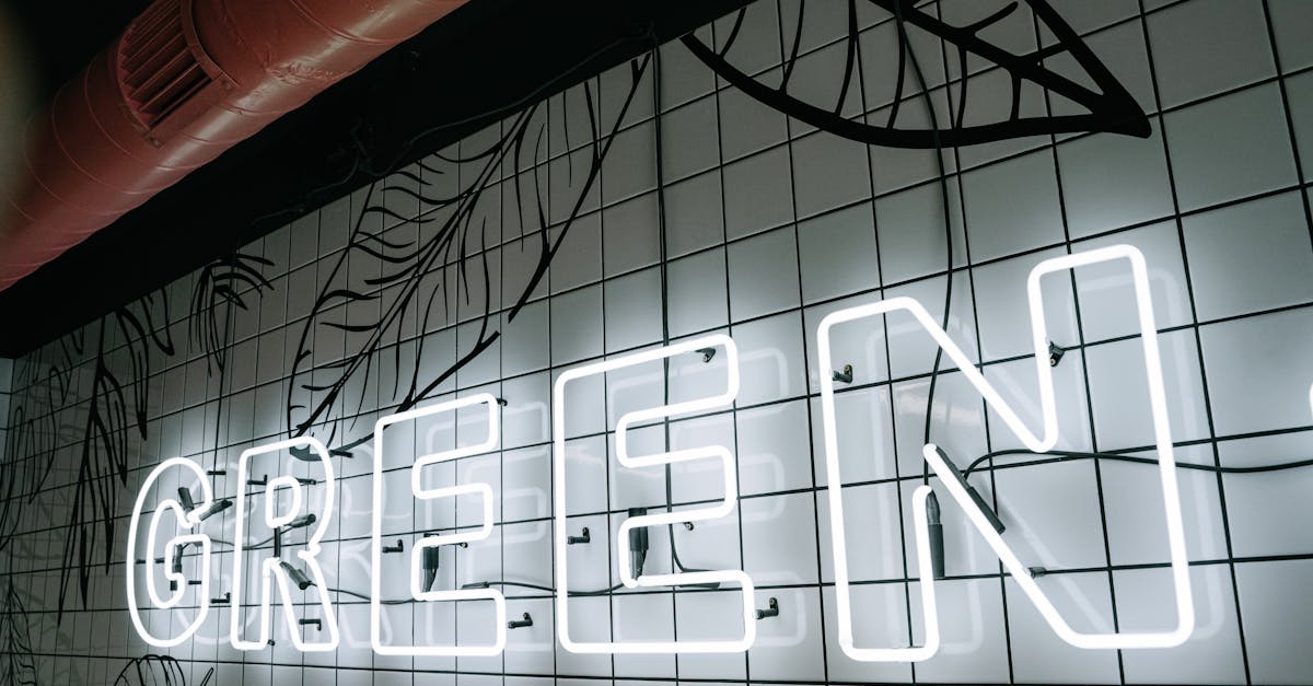
Outline fonts are typefaces where each letterform is defined by its outer stroke or border only, with the interior left empty or transparent. Instead of solid, filled characters, you see the skeletal contour of each letter, a visual approach that creates an immediate sense of lightness, sophistication, and graphic restraint. In a landscape where bold, heavy type dominates headlines, outline typefaces offer the opposite: presence through absence.
The appeal of hollow fonts has grown steadily in editorial design, fashion branding, and web design over the past decade. Their open interiors allow background imagery, textures, and colors to show through, making them inherently versatile for layered compositions. They can whisper where solid type shouts, or they can command attention at massive scale where the stroke itself becomes the visual statement. Understanding how to use outline typefaces effectively, and which ones to reach for, is an essential part of working with typography in modern design.
This guide covers the best outline fonts available today, explains where and how to use them, walks through layering techniques that unlock their full potential, and addresses the technical considerations for using stroke-only type on the web.
What Are Outline Fonts
An outline font, sometimes called a hollow font, open font, or stroke font, is a typeface in which the characters are rendered as empty shapes defined only by their contours. Where a standard font fills the interior of each letter with solid color, an outline typeface leaves that interior transparent, showing only the border that traces the letter’s shape. The result is a letterform that feels lighter, more graphic, and more architecturally exposed than its solid counterpart.
The concept is older than digital design. Display type in the nineteenth and early twentieth centuries frequently included outline variants, cut in wood or cast in metal, for use in posters, playbills, and advertising where the visual novelty of a hollow letter could attract attention. Sign painters routinely rendered outline letters by hand, often as the first step before filling them with color. The stroke-only approach has always been part of the typographic toolkit.
What changed is context. In contemporary design, outline typefaces are no longer novelty display choices. They have become a staple of fashion editorials, luxury branding, minimalist web design, and large-format environmental graphics. The rise of layered typographic compositions, where multiple type treatments overlap and interact, has given hollow fonts a central role that their nineteenth-century predecessors never occupied.
Technically, outline fonts come in two forms. Some are purpose-built typefaces where the designer has drawn each character as an outlined shape, controlling stroke width, corner treatment, and overall proportion specifically for the hollow rendering. Others are outline variants of existing solid typefaces, where the original design has been adapted by removing the fill and retaining the contour. Both approaches have their merits, but purpose-built outline typefaces tend to perform better because their designers have optimized stroke weight and spacing for the open format.
Best Outline Fonts for Modern Design
The following outline fonts represent the strongest options available across different stylistic categories. Some are dedicated outline designs; others are outline variants of well-known typeface families. For each, we describe the visual character, note the best use cases, and indicate whether the font is free or commercial.
Abril Fatface Outline
Abril Fatface is a high-contrast display serif with dramatic thick-thin stroke variation, and its outline variant preserves that drama in skeletal form. The outlined version reveals the elegant architecture of the letterforms, with sweeping curves and sharp serifs reduced to their contour lines. The high contrast means the outline is not uniform: thick strokes become wide borders while thin strokes become delicate lines, creating a rhythm within each character that many simpler outline fonts lack.
Abril Fatface is available through Google Fonts as a solid typeface. The outline effect can be achieved through CSS techniques or by using modified versions available from various font resources. Its Didone heritage makes it a natural fit for fashion, editorial, and luxury contexts where the outlined treatment amplifies the already refined character of the design.
Best for: Fashion editorials, magazine covers, luxury branding, oversized display headlines.
Bebas Neue Outline
Bebas Neue is one of the most widely used condensed sans-serifs in modern design, and its outline variant strips the bold, industrial character down to pure geometry. The tall, narrow proportions and uniform stroke width of the original translate into an outline that feels architectural and precise. Because Bebas Neue’s strokes are already uniform, the outline version has a consistent border weight that reads cleanly even at moderate sizes.
Bebas Neue is available for free through Google Fonts and other platforms, and several outline versions have been created by the type community. The condensed proportions make the outline variant particularly effective for stacking words vertically or fitting long headlines into narrow spaces. It is a workhorse display font whose outline form extends its range considerably.
Best for: Poster design, film titles, athletic branding, architectural graphics, stacked headline compositions.
Playfair Display Outline
Playfair Display is a transitional serif designed for display use, with high stroke contrast and refined detailing. Its outline variant emphasizes the contrast between thick and thin elements, creating a letterform that feels calligraphic and ornamental even without its fill. The outlined serifs and ball terminals become decorative line elements in their own right, giving the font an almost illustrative quality.
Available through Google Fonts in its solid form, Playfair Display can be rendered as an outline through CSS or design software. The outline treatment works especially well at large sizes where the fine details of the thin strokes remain visible. At smaller sizes, the thin portions of the outline can become difficult to read, so this is strictly a large-format choice.
Best for: Wedding invitations, editorial headlines, book covers, elegant display compositions.
Montserrat Outline
Montserrat is a geometric sans-serif that has become ubiquitous in web and brand design. Its outline variant takes the clean, approachable character of the original and gives it an airy, graphic quality. The uniform stroke weight and geometric construction of Montserrat mean the outline version has a consistent, even border that reads well across a wide range of sizes.
Montserrat’s extensive weight range, from Thin to Black, creates different outline effects depending on which weight you start from. A Montserrat Black outline has thick, bold contours that command attention, while a Montserrat Light outline produces delicate, hairline borders. This flexibility within a single family makes it one of the most versatile choices for outline typography. The font is free on Google Fonts.
Best for: Web design headers, brand identity, social media graphics, clean modern layouts.
Oswald Outline
Oswald is a condensed sans-serif reworking of the classic grotesque style, optimized for digital screens. Its outline variant maintains the strong vertical emphasis and slightly narrow proportions that make Oswald effective for headlines. The outlined version feels more urban and editorial than geometric alternatives like Montserrat, carrying a directness that suits news, sports, and bold editorial contexts.
Oswald is freely available through Google Fonts and is one of the most popular web fonts in use. Its outline form is particularly effective when used at large scale alongside the solid version, creating a visual hierarchy through fill versus stroke rather than size alone.
Best for: News and editorial design, sports graphics, urban branding, headline hierarchies using solid and outline combinations.
Big Shoulders Display
Big Shoulders Display is a condensed, industrial sans-serif inspired by the bold signage and lettering traditions of Chicago. Its wide, flat strokes and squared proportions give it a muscular character that translates powerfully into outline form. The outlined version retains the assertive presence of the original while adding a graphic openness that works well in layered compositions.
Available for free on Google Fonts, Big Shoulders Display comes in a full range of weights. The heavier weights produce outline forms with thick, confident borders, while the lighter weights create more delicate open letterforms. Its distinctly American industrial character makes it a strong choice for projects that need outline type with personality and grit rather than refinement.
Best for: Event posters, urban branding, industrial design contexts, large-format environmental graphics.
Audiowide
Audiowide is a wide, rounded display font with a futuristic, technological feel. Its outline variant transforms the solid, streamlined letterforms into open, circuit-like shapes that feel like technical diagrams or heads-up display graphics. The generous width of the characters means the outlined version has plenty of visual presence even without its fill.
Audiowide is available for free through Google Fonts. Its single-weight design means there is only one outline thickness to work with, but that thickness is well-balanced for display use. The futuristic character makes it a natural complement to futuristic font collections, and the outlined version extends its range into more experimental, layered territory.
Best for: Technology branding, sci-fi design, gaming interfaces, futuristic editorial layouts.
Baloo 2 Outline
Baloo 2 is a rounded, friendly sans-serif with a slightly playful character. Its outline variant softens the already approachable design further, creating hollow letterforms with smooth, curved borders. Unlike the sharp-edged outlines of condensed sans-serifs, Baloo 2’s outline feels warm and inviting, making it suitable for contexts where outline type needs to be friendly rather than imposing.
Available on Google Fonts, Baloo 2 supports multiple scripts and comes in several weights. The outline treatment works best at larger display sizes, where the rounded character is clearly visible. At text sizes, the soft contours can blur together and reduce legibility.
Best for: Children’s design, casual branding, friendly display headlines, packaging with a warm tone.
Poppins Outline
Poppins is a geometric sans-serif with circular letterforms and an open, modern feel. Its outline form emphasizes the geometric perfection of the design, with each character reduced to crisp, even-weight contour lines. The perfectly round counters in letters like “o,” “p,” and “d” become clean circles, giving the outlined version a diagrammatic precision that feels contemporary and minimal.
Poppins is one of the most popular fonts on Google Fonts, offering nine weights from Thin to Black. This weight range creates significant variation in outline character: Poppins Black outlines are bold graphic statements, while Poppins Thin outlines are gossamer-light structures. The font’s wide availability and clean geometry make it one of the safest choices for outline typography in professional web and brand design.
Best for: Tech branding, SaaS product design, minimalist web layouts, modern editorial compositions.
Free Outline Fonts
Many of the best outline fonts are available at no cost, largely because they are created by applying outline treatments to free typefaces from Google Fonts and similar platforms. Here is how to access outline type without spending anything.
The most direct approach is to use any Google Font and apply an outline effect in your design software. Adobe Illustrator, Figma, Sketch, and Canva all allow you to set a stroke on text while removing the fill, effectively converting any solid typeface into an outline version. This method gives you access to the entire Google Fonts library as outline type, which is an enormous resource.
For web use, the CSS -webkit-text-stroke property and SVG text rendering (covered in detail below) let you create outline effects directly in the browser. This means any web font you can load, including all Google Fonts, can be displayed as an outline typeface on your site.
Dedicated free outline fonts also exist. Font repositories like Font Squirrel, DaFont, and 1001 Fonts host hundreds of purpose-built outline typefaces available for free personal use, with many offering commercial licenses as well. Purpose-built outline fonts typically have better-optimized stroke weights and spacing than software-generated outlines, so they are worth seeking out for important projects.
The key limitation of free outline fonts is that they may lack the refined spacing, extensive character sets, and optical size adjustments of commercial offerings. For professional work at large scale, investing in a well-crafted commercial outline typeface can make a meaningful difference.
Using Outline Fonts in Design
Outline fonts operate differently from solid typefaces, and using them effectively requires understanding their unique strengths and constraints. The following approaches represent the most successful applications of hollow type in contemporary design.
Headlines and Display Text
The primary territory for outline fonts is large-scale headline and display text. At big sizes, the stroke-only rendering creates a dramatic visual effect that draws the eye without the visual weight of solid type. This makes outline headlines effective as a secondary element in a typographic hierarchy, providing scale and presence while allowing a smaller, solid-set element to carry the primary emphasis.
Outline headlines are particularly effective in magazine layouts, website hero sections, and poster design, where the hollow letterforms can interact with imagery, color fields, or other typographic elements behind them. The transparency of the letter interiors makes them inherently more integrated with their surroundings than solid type, which sits on top of its background rather than interacting with it.
Layered Compositions with Solid Type
One of the most powerful uses of outline fonts is in combination with their solid counterparts. Setting the same word or phrase in both solid and outline versions, offset or overlapping, creates a dimensional, dynamic composition that neither version achieves alone. This technique is a staple of contemporary editorial design, fashion branding, and event graphics.
The layered approach works because the outline version provides structure and scale while the solid version provides weight and emphasis. The two treatments read as related but distinct, creating a visual rhythm that feels intentional and considered rather than repetitive.
Oversized Display
Outline fonts thrive at extreme scale. When a solid font is set at very large sizes, it can overwhelm a layout, filling the frame with dense color and creating a heavy, aggressive tone. The same letterform set as an outline at the same size feels lighter and more open, allowing the design to breathe even when the type is enormous. This makes outline type the preferred choice for oversized typographic treatments in window displays, environmental graphics, and full-bleed web layouts.
Fashion and Editorial Design
The fashion and editorial industries have adopted outline type as a core visual tool. The hollow letterforms convey sophistication and restraint, qualities that align with the aesthetic values of luxury fashion brands and high-end publications. Outline type over full-bleed photography is a recurring motif in fashion magazines, lookbooks, and campaign imagery, where the transparent interiors allow the photography to remain the primary visual while the type adds structure and information.
For designers working in these fields, a strong collection of display fonts that includes outline variants is essential. The ability to switch between solid and outline treatments of the same typeface gives you flexibility to adapt the tone of a composition without changing the typographic system.
Layering Techniques for Outline Typography
Layering is where outline fonts move from simple design elements to sophisticated compositional tools. The following techniques represent established approaches that produce reliable results.
Outline Over Solid
The most common layering technique places an outline version of a word directly over or slightly offset from its solid counterpart. When the two are perfectly aligned, the outline appears to trace the solid text, creating a subtle dimensional effect. When offset horizontally, vertically, or both, the two versions create a shadow or echo effect that adds depth to the composition.
The color relationship between the outline and solid layers is critical. High-contrast combinations (white outline over black solid, or vice versa) produce bold, graphic results. Low-contrast combinations (light gray outline over dark gray solid) create softer, more nuanced effects. Using different colors for each layer, such as an outline in one brand color over solid text in another, can integrate this technique into a broader color system.
Outline with Fill Color
Rather than leaving the interior of outline letters transparent, filling them with a contrasting color creates a two-tone effect that combines the graphic clarity of an outline with the visual weight of solid type. This technique is common in retro and vintage-inspired design, where multicolor lettering is a defining characteristic.
The fill color can be a flat tone, a gradient, or even a pattern or image. When the fill is a photographic image masked inside the outline letterforms, the result is a text-as-window effect that merges typography and imagery. This approach requires design software with masking capabilities or CSS clip-path techniques for web implementation.
Offset Outlines for Depth
Multiple outline layers, each slightly offset from the others, create a stacked, three-dimensional effect. Two or three outlines in different colors or opacities, displaced by a few pixels in a consistent direction, produce a simple but effective depth illusion. This technique references screen-printing and risograph aesthetics, where slight misregistration between color layers creates visual texture.
The offset approach works best with fonts that have clean, consistent stroke weights. Condensed sans-serifs like Bebas Neue and geometric designs like Montserrat produce the cleanest results because their uniform strokes maintain consistent spacing between the layered outlines. High-contrast serif outlines can become visually confused when layered, because the thin strokes of one layer may overlap with the thick strokes of another.
Pairing Outline Fonts with Other Typefaces
Outline fonts, by their nature, work best in combination with other type treatments rather than on their own. A layout set entirely in outline type would lack visual anchor points and hierarchy. The key to successful font pairing with outline typefaces is contrast: the outline font provides graphic texture and scale, while its companion provides weight, readability, or stylistic counterpoint.
The simplest pairing is an outline display font with a solid version of the same typeface at a different size. This creates immediate cohesion because the letterforms share the same DNA. Montserrat Outline as a headline paired with Montserrat Regular as body text is a clean, reliable combination that works across contexts.
For more visual tension, pair an outline serif with a solid sans-serif, or vice versa. An Abril Fatface Outline headline paired with a clean sans-serif body font like Inter or Source Sans Pro creates a composition with clear hierarchy and stylistic range. The ornamental quality of the outlined serif contrasts with the functional clarity of the solid sans-serif, giving the layout both personality and readability.
Avoid pairing two different outline fonts in the same composition. The visual effect of outlined text is distinctive enough that doubling it creates confusion rather than complexity. One outline treatment per layout is generally the right limit, with solid type handling all other roles.
Weight contrast matters especially with outline pairings. Because outline fonts are inherently lighter in visual weight than solid fonts, pairing them with medium or bold companion fonts helps maintain balance. A delicate outline headline paired with a light-weight body font can make the entire layout feel insubstantial.
Outline Fonts in Web Design
Using outline type on the web requires specific technical approaches. Unlike print design, where outline fonts can be used as standard font files, web implementation often involves CSS properties or SVG rendering to achieve the hollow effect.
CSS Text-Stroke
The most direct method for creating outline text on the web is the CSS -webkit-text-stroke property, used in combination with a transparent or background-matching text fill. The basic implementation looks like this:
.outline-text {
  -webkit-text-stroke: 2px #000000;
  -webkit-text-fill-color: transparent;
  color: transparent;
}
This approach works in all modern browsers, including Chrome, Firefox, Safari, and Edge. The -webkit-text-stroke property accepts a width value and a color, while -webkit-text-fill-color: transparent removes the solid fill. The fallback color: transparent ensures the text does not render as solid in browsers that do not support the webkit properties.
The limitation of CSS text-stroke is control. The stroke is applied uniformly around the text, and you cannot vary the stroke width within a single character or apply the stroke only to certain parts of the letterform. For high-contrast typefaces where thin and thick strokes differ significantly, the uniform CSS stroke can distort the intended character of the design. The stroke also expands outward from the letter contour by default, which can slightly alter letter spacing and overall proportions.
SVG Text Approach
For greater control, rendering text as SVG provides access to SVG’s stroke and fill properties, which are more flexible than CSS text-stroke. SVG text elements can be styled with precise stroke widths, stroke colors, and fill treatments, and they support features like stroke-dasharray for dashed or dotted outlines.
<svg viewBox="0 0 600 100">
  <text x="10" y="70"
    font-family="Montserrat, sans-serif"
    font-size="72"
    fill="none"
    stroke="#000000"
    stroke-width="1.5">
    Outline Text
  </text>
</svg>
SVG text remains selectable and accessible when implemented correctly, and it scales cleanly to any size because SVG is vector-based. The trade-off is that SVG text is more complex to implement than CSS text-stroke, and managing responsive behavior requires additional consideration. For critical display text where precise control of the outline rendering matters, SVG is the superior approach.
Performance and Accessibility Considerations
Outline text presents specific accessibility challenges. Thin outlines on small text can be difficult to read for users with visual impairments, so outline treatments should be reserved for large display text where the stroke is clearly visible. Always ensure sufficient contrast between the outline color and the background, following WCAG guidelines for text contrast ratios.
From a performance perspective, CSS text-stroke is lightweight and adds negligible overhead. SVG text is slightly heavier but still efficient for display-scale use. Neither approach requires additional font files beyond what you would load for the solid version of the typeface, which is a significant advantage over using dedicated outline font files that add to page weight.
Frequently Asked Questions
What is the difference between an outline font and a regular font with a stroke applied?
A purpose-built outline font has been designed from the start with the hollow rendering in mind. The designer has optimized stroke weight, letter spacing, and overall proportions specifically for the outlined form. A regular font with a stroke applied through software is a solid typeface that has been modified after the fact. The stroke is applied uniformly and can distort the intended proportions of the design, particularly in high-contrast typefaces where thick and thin strokes differ significantly. Purpose-built outline fonts generally produce cleaner, more refined results.
Can outline fonts be used for body text?
Outline fonts are not suitable for body text. The hollow rendering reduces the visual weight and contrast of each character, making extended reading fatiguing and difficult. At small text sizes, the stroke lines of outline fonts can become thin enough to blur or disappear entirely, destroying legibility. Reserve outline type for headlines, display text, logos, and other large-scale applications where readability over long passages is not required.
How do I create an outline version of any font in CSS?
Use the CSS -webkit-text-stroke property combined with a transparent fill. Set -webkit-text-stroke to your desired width and color, then set -webkit-text-fill-color: transparent and color: transparent as a fallback. This works with any web font loaded on your page, including all Google Fonts. Adjust the stroke width relative to the font size; a stroke of 1-2 pixels works well for most display sizes, while larger type may benefit from a thicker stroke.
Which outline fonts are free to use commercially?
All fonts available through Google Fonts are free for both personal and commercial use under the SIL Open Font License. This includes Montserrat, Bebas Neue, Playfair Display, Oswald, Poppins, Big Shoulders Display, Audiowide, and Baloo 2, all of which work well as outline typefaces when rendered through CSS or design software. Additionally, many outline-specific fonts on Font Squirrel and other repositories are released under open licenses. Always verify the specific license terms before using any font in a commercial project.


