Red Color Palette: Bold & Energetic Design Palettes
A red color palette commands attention unlike any other color family in design. Red sits at the longest wavelength of visible light, making it one of the first colors the human eye perceives. Whether you are designing a brand identity, building a website, or crafting packaging, red delivers urgency, warmth, and confidence in a single stroke. Understanding how to build a balanced red color scheme requires a grasp of color harmony principles and a working knowledge of the color wheel, both of which inform how red interacts with neighboring and opposing hues.
What Defines the Red Color Family
Red occupies a unique position in design because it carries strong physiological and psychological weight. Studies have shown that viewing red can increase heart rate and stimulate appetite, which is precisely why the food and hospitality industries lean on it so heavily. Culturally, red holds dual meanings: in Western contexts it signals danger, love, and celebration, while in East Asian traditions it represents luck, prosperity, and joy.
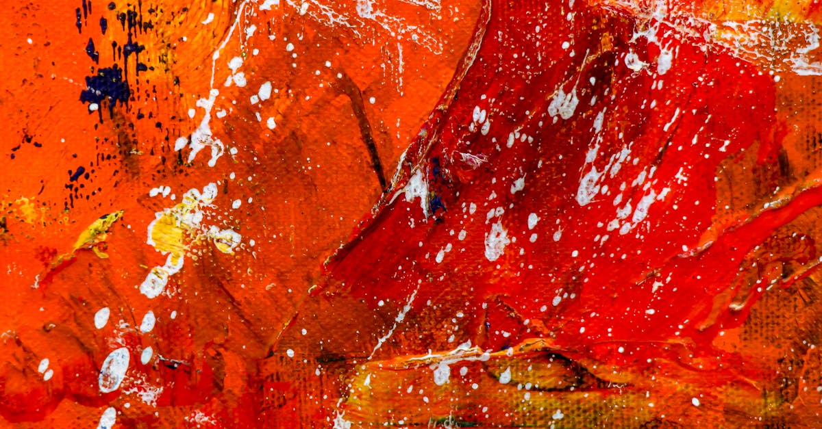
The visual qualities of red range from warm, orange-leaning scarlets to cool, blue-leaning crimsons. This breadth means a red design palette can feel entirely different depending on which end of the spectrum you choose. A warm vermillion feels energetic and playful, while a deep burgundy communicates sophistication and restraint. The psychology behind red makes it one of the most versatile yet demanding colors to work with, because even small shifts in saturation or value change the emotional message dramatically.
Pure red (#FF0000) is rarely used on its own in professional design. Instead, designers work with modified reds that introduce undertones of orange, pink, or violet. These modifications soften the intensity and make red easier to pair with other colors in a cohesive palette.
Building a Palette with Red
When constructing a red color scheme, start by selecting a primary red that matches the mood of your project. A tomato red (#E74C3C) works well for energetic, consumer-facing brands, while a merlot (#73343A) suits luxury or editorial contexts. From your primary red, build outward.
For complementary accents, look directly across the color wheel to greens and teals. A pairing of crimson red with forest green creates striking contrast grounded in natural associations. If you want a gentler combination, consider analogous pairings by combining red with warm oranges and deep pinks. Analogous red palettes feel cohesive and flowing, ideal for editorial layouts and lifestyle branding.
To add contrast without relying on complementary opposites, introduce neutrals. Charcoal gray, warm cream, and off-white all allow red to remain the focal point without visual competition. A dark navy can also serve as a sophisticated anchor, letting red pop without the intensity of a full complementary pairing.
Consider value range carefully. Pair a saturated red with lighter tints like blush or rose for breathing room, and add a darker shade such as oxblood or maroon for depth. This three-tier approach of light tint, core hue, and dark shade gives your palette enough range for complex layouts.
Red in Graphic Design
In editorial design, red functions as a power accent. Magazine covers frequently use red typography against black-and-white photography because it creates an unmistakable focal point. The contrast ratio between red and neutral backgrounds makes headlines impossible to ignore, which is why publications from Time to The Economist rely on red in their mastheads.
Packaging design leverages red to signal boldness and flavor. Think of the instant recognition of a red soda can or the premium feel of a burgundy wine label. Red packaging stands out on shelves, and when combined with metallic gold or matte black finishes, it communicates both energy and quality. For more examples of effective color use in visual communication, explore our collection of graphic design examples.
In poster and print design, red gradients have become a popular technique. A gradient moving from cherry red to deep magenta adds dimension and modernity to flat design layouts. Red also works exceptionally well in duotone treatments, where a red-and-black duotone photograph feels both classic and contemporary.
Red in Branding
Red is one of the most popular colors in corporate branding, and for good reason. It conveys energy, passion, and action, which are qualities that appeal to a wide range of industries. Fast food, automotive, entertainment, and technology companies all draw from the red color palette to position themselves as bold and dynamic.
For brands targeting younger demographics or action-oriented audiences, a bright, saturated red communicates excitement and urgency. Retail and e-commerce brands use red in sale signage and call-to-action buttons because it triggers impulse responses. For premium or heritage brands, deeper reds like garnet or claret suggest tradition and craftsmanship without losing the warmth that red provides.
When developing a brand strategy around red, consider how it will function across touchpoints. A red that looks vibrant on screen may print differently on paper, so always test your chosen shades across media. Red also carries strong cultural associations, so international brands should research how their specific shade will be received in target markets.
Industries that benefit most from red branding include food and beverage, sports and fitness, entertainment, automotive, and retail. Industries that typically avoid red include healthcare and finance, where it can inadvertently signal danger or financial loss.
Red in Web and UI Design
In digital interfaces, red demands careful handling. It is the universal color for errors and warnings, so using it as a primary brand color in UI requires clear visual differentiation between decorative red elements and functional red alerts. One effective approach is to use a slightly different shade for error states than for brand elements, ensuring users do not confuse a branded red header with a system warning.
Red call-to-action buttons consistently perform well in conversion testing. The contrast red creates against most background colors makes buttons highly visible, and the psychological urgency red conveys encourages clicks. However, red CTAs work best against neutral or cool-toned backgrounds. Placing a red button on an orange or warm-toned page reduces its impact.
For accessibility, red presents specific challenges. Approximately eight percent of men experience red-green color deficiency, meaning red-only indicators can be invisible to a significant portion of users. Always pair red with secondary indicators such as icons, underlines, or text labels. When using red text, ensure a contrast ratio of at least 4.5:1 against the background. Deep reds on white backgrounds typically meet this threshold, but bright reds on gray backgrounds often fall short.
Red backgrounds can work in web design when used sparingly, such as for hero sections or promotional banners. Full-page red backgrounds are fatiguing to read against, so limit them to short-form content and use white or light text with generous spacing.
Sample Red Color Palettes
Warm Ember Palette
This palette draws from the warmest end of the red spectrum, leaning toward orange undertones. The primary shade is Vermillion (#E34234), a lively red-orange that radiates energy. It pairs with Burnt Sienna (#E97451) for warmth, Cream (#FFFDD0) for breathing room, and Espresso (#3C1414) for grounding contrast. This combination suits food brands, outdoor adventure companies, and lifestyle publications that want to feel approachable and spirited.
Cool Crimson Palette
Shifting to the blue side of red, this palette feels more refined and dramatic. The anchor is Crimson (#DC143C), a cool, clear red with pink undertones. It sits alongside Slate Blue (#6A5ACD) for unexpected contrast, Pearl White (#F0EAD6) for elegance, and Charcoal (#36454F) for structure. This scheme works well for fashion brands, performing arts organizations, and editorial projects that demand sophistication.
Muted Heritage Palette
For projects that need warmth without intensity, this desaturated palette centers on Brick Red (#CB4154), a muted, earthy red. It combines with Sage (#B2AC88) for natural balance, Parchment (#F1E9D2) for softness, and Dark Walnut (#544034) for depth. Heritage brands, artisan products, and interior design firms will find this palette both timeless and inviting.
Bold Power Palette
When maximum impact is the goal, this high-contrast palette delivers. It leads with Ferrari Red (#FF2800), a fully saturated, attention-commanding red. Paired with Jet Black (#0A0A0A) for drama, Pure White (#FFFFFF) for clarity, and Gunmetal (#2A3439) for modern edge, this scheme is built for sports brands, tech launches, and event marketing where boldness is non-negotiable.
Frequently Asked Questions
What colors go best with red in a design palette?
Red pairs most effectively with neutrals like black, white, gray, and cream for clean contrast. For more dynamic combinations, navy blue and forest green offer strong complementary energy. Analogous pairings with coral, orange, and blush pink create warm, cohesive palettes. Gold and red together communicate luxury and celebration, making them popular in premium branding and holiday design.
How do I use red in design without it feeling overwhelming?
Limit red to accent roles, using it for headlines, buttons, or small graphic elements rather than large background areas. Surround red with generous white space or neutral tones to let it breathe. Using muted or desaturated reds like terracotta or dusty rose achieves warmth without visual aggression. The 60-30-10 rule works well: use a neutral for sixty percent of the design, a secondary color for thirty percent, and red for the remaining ten percent.
Is red a good color for website design?
Red works well in web design when applied strategically. It excels in CTAs, promotional banners, and brand accent elements. Avoid using saturated red as a full-page background color, as it causes eye fatigue during extended reading. Always test red elements for accessibility, ensuring sufficient contrast ratios and pairing red indicators with non-color cues for users with color vision deficiencies.
What industries commonly use red in their branding?
Food and beverage brands use red to stimulate appetite and convey flavor. Retail and e-commerce companies leverage red for urgency and sale promotions. Automotive brands choose red for speed and performance associations. Entertainment and media companies use red for excitement and energy. Sports organizations adopt red for passion and competitive spirit. Each industry selects different shades to align red with their specific brand personality.


