Bronze vs Copper vs Brass: Color Differences in Design
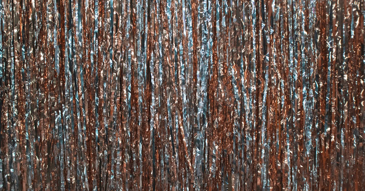
Copper, bronze, and brass are three of the most popular metallic warm tones in design, but telling them apart can be tricky. Copper is a reddish-orange metallic (hex ~#B87333), bronze is a darker brown-gold (hex ~#CD7F32), and brass is a bright yellow-gold (hex ~#B5A642). Each carries a distinct warmth and personality that affects how it reads in branding, packaging, web design, and print. Understanding the bronze vs copper vs brass color differences helps designers choose the right metallic tone for any project.
This article covers each color in depth, compares them side by side, and provides practical guidance for using metallic colors in graphic design.
Copper: The Red-Orange Metal
Copper gets its name from the metal itself, which has been used by humans for over 10,000 years. The color is defined by a warm, reddish-orange hue that distinguishes it immediately from the yellower tones of bronze and brass. In its polished state, copper has a bright, pinkish-orange glow. As it ages and oxidizes, it transitions through darker browns before eventually developing its famous green patina.
The standard hex code for copper is #B87333, which translates to an RGB value of (184, 115, 51). This produces a warm, medium-dark tone that sits firmly in the orange-brown family.
Copper in Design and Culture
Copper communicates warmth, craftsmanship, and authenticity. It has become especially popular in modern industrial design, where it evokes handmade quality and rustic sophistication. In branding, copper tones work well for artisanal food brands, craft breweries, boutique hotels, and lifestyle companies that want to project approachable luxury.
In color psychology, copper’s reddish warmth triggers associations similar to orange and brown — energy, earthiness, and reliability. It pairs naturally with dark greens, charcoal, and cream within an earth tone palette.
Bronze: The Dark Gold
Bronze is a darker, more muted metallic tone that blends brown and gold. Named after the copper-tin alloy used since antiquity, bronze has a rich, aged quality that sets it apart from the brighter tones of copper and brass. The standard hex code is #CD7F32, with an RGB value of (205, 127, 50), producing a warm brown with golden undertones.
Bronze in Design and Culture
Bronze carries strong associations with tradition, achievement, and heritage. Think bronze medals, bronze statues, and bronze plaques — all connected to recognition and permanence. In branding, bronze conveys established credibility and timelessness. It is a popular choice for law firms, heritage brands, museums, and luxury goods companies that want to communicate history and substance.
Bronze also works effectively in graphic design as a warm neutral accent. It is dark enough to provide contrast against light backgrounds while retaining the warmth and richness that a standard brown often lacks.
Brass: The Yellow-Gold
Brass is the brightest and most yellow of the three metallic tones. Named after the copper-zinc alloy, brass has a warm, golden appearance that can range from a muted olive-gold to a bright, almost lemony metallic yellow. The standard hex code is #B5A642, with an RGB value of (181, 166, 66), producing a warm yellow-green-gold tone that reads as lively and bold.
Brass in Design and Culture
Brass evokes mid-century modern design, vintage glamour, and polished sophistication. It is a dominant accent in interior design trends and has crossed over into graphic design as a way to add warmth and personality to visual identities. Brass tones work particularly well for hospitality brands, cocktail bars, fashion labels, and any brand aiming for a retro-luxe aesthetic.
Because of its yellow lean, brass can sometimes read as gold in certain design contexts, especially at smaller sizes or on screen. Designers who want to distinguish brass from gold should lean into its greenish undertone and slightly muted character.
Key Differences
Here is how copper vs bronze vs brass compare across the most important attributes:
- Dominant hue: Copper is reddish-orange; bronze is brown-gold; brass is yellow-gold.
- Warmth type: Copper is warm-red; bronze is warm-brown; brass is warm-yellow.
- Hex codes: Copper is #B87333; bronze is #CD7F32; brass is #B5A642.
- Brightness: Brass is the brightest; copper is medium; bronze is the darkest.
- Mood: Copper feels artisanal and earthy; bronze feels traditional and prestigious; brass feels bold and glamorous.
- Best for: Copper suits rustic and craft brands; bronze suits heritage and luxury brands; brass suits modern and retro-inspired brands.
Hex Codes and Design Use
In digital design, metallic colors lose the reflective quality of real metals, so it is important to choose hex codes carefully and support them with gradients, textures, or highlights when a metallic effect is needed. Here are the core values:
- Copper: #B87333 (RGB: 184, 115, 51)
- Bronze: #CD7F32 (RGB: 205, 127, 50)
- Brass: #B5A642 (RGB: 181, 166, 66)
For print design in CMYK, metallic inks or foil stamping are often necessary to achieve a true metallic finish. Standard CMYK printing can approximate these colors but will not replicate the reflective quality. Discuss special finishes with your printer early in the design process.
Metallic Colors in Digital Design
Reproducing the look of metal on screen requires more than a flat hex color. Designers commonly use several techniques to simulate metallic surfaces in digital work:
- Gradients: A gradient from a lighter tint to a darker shade of the same metallic tone creates a sense of reflective curvature. For copper, try transitioning from #D4956B to #8B4C26.
- Texture overlays: Subtle noise or brushed-metal textures layered over the base color add realism and depth.
- Highlights and shadows: Adding a small, bright highlight and a deeper shadow to metallic elements mimics the way light interacts with metal surfaces.
- Selective use: Metallic accents have the most impact when used sparingly — for logos, icons, borders, or key typography — against a matte background.
All three metallic tones pair well with dark backgrounds like charcoal, navy, and deep forest green. They also work against warm neutrals, making them natural fits for earth tone color palettes.
Frequently Asked Questions
What is the main difference between copper and bronze color?
Copper is more red-orange, while bronze is more brown-gold. Copper (#B87333) has a clear reddish warmth, whereas bronze (#CD7F32) is darker with a golden-brown quality. In design, copper feels more energetic and bronze feels more traditional.
Is brass the same as gold in design?
No. Brass (#B5A642) has a greenish-yellow undertone and a slightly muted quality that distinguishes it from gold (#FFD700), which is brighter and more purely yellow. Brass reads as vintage and sophisticated, while gold reads as luxurious and celebratory.
Can I use copper, bronze, and brass together?
It is possible but requires careful handling. All three are warm metallics, and using them together can create visual confusion if the distinctions are not clear. If you combine them, assign each a specific role — for example, copper for icons, bronze for headings, and brass for borders — and ensure enough contrast between them.
How do I make metallic colors look realistic on screen?
Use gradients, subtle texture overlays, and highlights rather than flat hex fills. A gradient that transitions from light to dark within the same metallic family simulates reflective surfaces effectively. Pairing the metallic element with a dark, matte background increases the sense of depth and shine.


