Gold vs Yellow: What’s the Difference in Design?
Yellow and gold are related warm colors that serve very different purposes in design. Yellow is a pure primary color — bright, saturated, and energetic (hex ~#FFFF00). Gold is a deeper, warmer variation with brown and orange undertones that give it a metallic, luxurious quality (hex ~#FFD700). While they share the same general hue family, the difference between gold and yellow in design is significant: yellow grabs attention and radiates optimism, while gold signals prestige and sophistication. Choosing the right one can define the entire tone of a brand or project.
This guide covers both colors in detail, compares their properties and psychological associations, and provides practical advice for using each in graphic design and branding.
Yellow: The Primary Color
Yellow is one of the three primary colors in both the traditional (RYB) and additive (RGB) color models. It is the most luminous color in the visible spectrum and the first color the human eye notices, which is why it is used universally for caution signs, taxis, and attention-grabbing highlights. The standard hex code for pure yellow is #FFFF00, with an RGB value of (255, 255, 0) — maximum red and green with no blue.
Yellow in Design and Culture
In color psychology, yellow is associated with happiness, optimism, energy, and warmth. It stimulates mental activity and generates a sense of cheerfulness. Brands like McDonald’s, IKEA, and Snapchat use yellow to project accessibility, friendliness, and youthful energy.
However, yellow is also one of the hardest colors to use well in design. Pure yellow on white is nearly invisible, and large blocks of saturated yellow can cause eye fatigue. Successful use of yellow often involves muting it slightly, pairing it with high-contrast backgrounds like black or navy, or using it as a targeted accent rather than a dominant color. Understanding how yellow interacts with complementary colors is key to deploying it effectively.
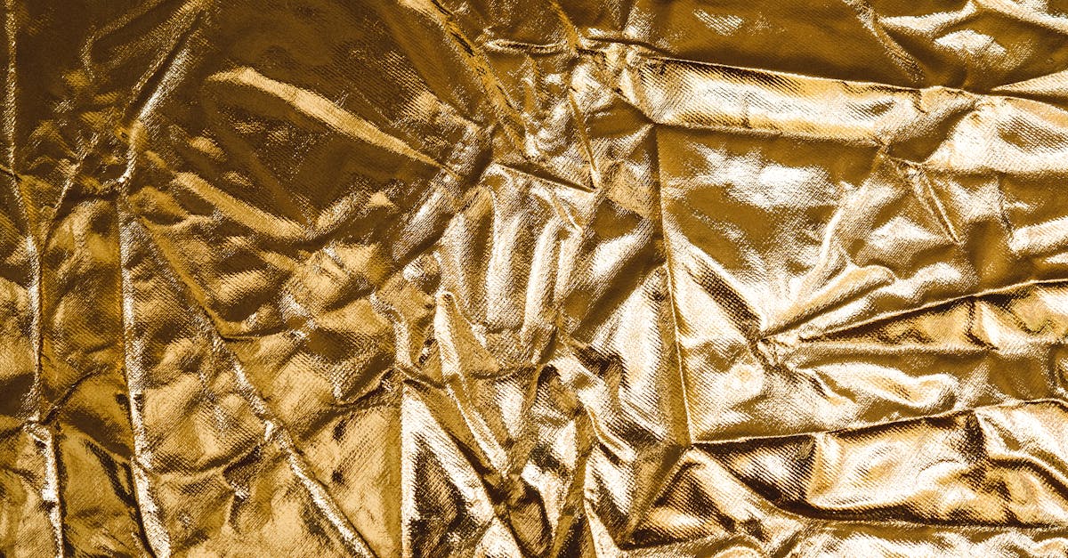
Gold: The Metallic Warm Tone
Gold is not a primary color but a complex warm tone that blends yellow with brown and orange undertones. It takes its name from the precious metal, and that connection to real gold dominates how the color is perceived. The standard hex code for gold is #FFD700, with an RGB value of (255, 215, 0). Compared to pure yellow, gold is noticeably darker, warmer, and less harsh.
Gold in Design and Culture
Gold carries some of the strongest psychological associations of any color. It represents wealth, success, luxury, prestige, and achievement. Gold medals, gold credit cards, gold-embossed stationery — the connection between this color and premium value is deeply embedded across cultures.
In brand identity, gold is a powerful tool for communicating exclusivity and high quality. It appears prominently in luxury fashion (Versace, Dolce and Gabbana), premium spirits, fine jewelry, and high-end financial services. Gold accents on packaging, business cards, and websites immediately elevate the perceived value of a product or service.
Unlike yellow, gold does not grab attention through brightness. Instead, it draws the eye through warmth and richness, creating a sense of quality that invites closer inspection rather than demanding immediate notice.
Key Differences
Here is a clear comparison of gold vs yellow across the most important design attributes:
- Hue character: Yellow is a pure primary color; gold is a warm, complex tone with brown and orange undertones.
- Hex codes: Yellow is #FFFF00; gold is #FFD700.
- Brightness: Yellow is the brightest; gold is darker and more subdued.
- Saturation feel: Yellow feels electric and energetic; gold feels rich and warm.
- Mood: Yellow communicates optimism, energy, and youth; gold communicates luxury, prestige, and tradition.
- Readability: Yellow is difficult to read on light backgrounds; gold has better readability due to its darker value.
Hex Codes and Design Use
The hex code difference between yellow (#FFFF00) and gold (#FFD700) is found primarily in the blue and green channels. Yellow has maximum green (255) and no blue, while gold reduces green to 215, creating a warmer, more orange-shifted result. This shift is what gives gold its distinctive depth.
Beyond the standard hex values, designers often work with a range of gold and yellow variations:
- Bright gold: #FFD700 — the standard, versatile gold.
- Dark gold: #B8860B — richer and more bronze-like, suited for text and accents on dark backgrounds.
- Pale gold: #ECD540 — a lighter, less intense gold for backgrounds and large areas.
- Lemon yellow: #FFF44F — a slightly muted yellow that is more comfortable to look at than pure #FFFF00.
- Amber: #FFBF00 — a deep yellow-orange that bridges the gap between yellow and gold.
In the CMYK color model for print, neither color has a metallic quality — they will print as flat warm tones. For a true gold effect in print, metallic gold ink (such as Pantone 871 C) or gold foil stamping is necessary. This is a common consideration in luxury packaging and stationery design.
Psychological Associations
The psychological gap between gold and yellow is wider than the visual gap. Here is how they compare in terms of perception and emotion:
- Yellow triggers feelings of happiness, curiosity, and alertness. It is associated with sunshine, playfulness, and approachable energy. It can also signal caution or urgency in certain contexts.
- Gold triggers feelings of admiration, aspiration, and trust. It is associated with achievement, wisdom, and enduring value. Gold rarely signals urgency — it invites contemplation and admiration instead.
These differences make yellow and gold suitable for very different brand personalities. A children’s toy brand and a luxury watch brand may both use warm tones, but yellow suits the former and gold suits the latter. Mixing them up would send the wrong message entirely.
When to Use Each in Branding
Here are practical guidelines for choosing between gold and yellow in design:
- Fast food and casual brands: Yellow works well for brands that want to appear friendly, affordable, and energetic. Its high visibility makes it effective for signage and packaging that needs to be noticed quickly.
- Luxury and premium brands: Gold is the standard for brands that want to communicate quality, exclusivity, and prestige. Use it in brand identity elements like logos, packaging accents, and premium tier designations.
- Tech and startups: Yellow accents can add energy and modernity to digital interfaces. Gold is less common in tech but can work for fintech and premium subscription tiers.
- Event and celebration design: Gold dominates in awards, anniversaries, and milestone celebrations. Yellow works for casual events, festivals, and promotions.
- Web design: Use yellow sparingly as a highlight or call-to-action color. Use gold for header accents, hover effects, and premium section styling. Both benefit from being paired with strong color harmonies to avoid appearing flat or overwhelming.
Frequently Asked Questions
Is gold just a shade of yellow?
Technically, gold falls within the yellow hue family, but it is far more complex than a simple shade of yellow. Gold includes brown and orange undertones that yellow lacks, and its psychological associations — luxury, prestige, tradition — are fundamentally different from yellow’s associations with energy and optimism.
Can I use gold and yellow together in a design?
Yes, but with intention. Gold and yellow are close enough in hue that they can blur together if not given clear roles. Use yellow for attention-grabbing elements and gold for premium accents. Ensure sufficient contrast between them by choosing a darker gold and a lighter or brighter yellow.
What is the best background color for gold text?
Dark backgrounds work best. Black, navy, charcoal, and deep forest green all make gold text pop and enhance its metallic, luxurious quality. Avoid pairing gold text with light backgrounds, where it can appear muddy or hard to read.
How do I make gold look metallic on screen?
Apply a gradient from a lighter gold (#FFED8A) to a darker gold (#B8860B) and add a concentrated highlight to simulate reflected light. Subtle texture overlays that mimic brushed or polished metal further enhance the effect. Keep the surrounding design matte and dark to maximize the metallic contrast.


