Maroon vs Burgundy: What’s the Difference?
Maroon and burgundy are two of the most commonly confused colors in the dark red family. Both are rich, deep, and sophisticated — but they are not the same. The difference between maroon and burgundy comes down to their secondary undertones. Maroon is a dark brownish-red, while burgundy is a dark purplish-red. That single distinction — brown versus purple — changes their visual character, their mood, and how they work in design.
Understanding maroon vs burgundy matters for designers, brand strategists, and anyone who works with color professionally. Choosing the wrong dark red can shift a design from earthy and grounded to luxurious and refined, or vice versa. Both colors have their strengths, but they are not interchangeable.
Maroon: The Brown-Red
Maroon takes its name from the French word marron, meaning chestnut. This etymology is a perfect clue to the color’s character: maroon has the warm, earthy quality of chestnut brown blended with deep red. The standard hex code for maroon is #800000, which is pure dark red with no blue component — it sits squarely at the intersection of red and brown.
In RGB terms, maroon is R:128, G:0, B:0. The absence of blue keeps it firmly in warm territory, and the reduced red intensity (128 out of 255) gives it depth without brightness. Maroon is also an official HTML/CSS named color, so color: maroon; works in any browser and resolves to #800000.
In color psychology, maroon carries associations with stability, warmth, and resilience. It feels grounded and traditional. It lacks the regal quality of burgundy but replaces it with something more approachable and earthy. Maroon is a common choice for educational institutions, sports teams, and brands that want to project reliability and heritage.
Maroon in Design and Culture
Maroon has deep roots in institutional branding. Numerous universities — including Texas A&M, the University of Chicago, and Virginia Tech — use maroon as a primary brand color. Many professional and amateur sports teams rely on maroon to convey toughness and tradition.
In interior design, maroon works well in spaces that need warmth and richness without formality. It pairs naturally with other warm tones: tan, gold, burnt orange, olive green, and cream. It connects beautifully to earth tone palettes, adding depth while maintaining a natural, organic feel.
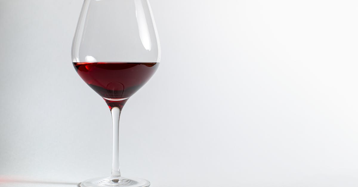
Burgundy: The Purple-Red
Burgundy gets its name from the Burgundy wine region in eastern France, and the color mirrors the deep, complex hue of the region’s famous red wines. Burgundy is a dark red with a noticeable purple or violet undertone, which gives it a cooler, more luxurious character than maroon.
The most commonly cited hex code for burgundy is #800020, which translates to R:128, G:0, B:32. That blue component — small but significant — is what separates burgundy from maroon and pushes it toward the purple side of the red color palette. Some interpretations of burgundy go even further toward purple, with hex values like #6D0A2E or #722F37.
Burgundy’s psychological associations lean toward luxury, sophistication, and power. It is the color of fine wine, velvet upholstery, and high-end fashion. Where maroon says “reliable,” burgundy says “refined.” This makes it a popular choice for luxury brands, premium packaging, fine dining, and fashion houses that want to project elegance without resorting to black or gold.
Burgundy in Design and Culture
Burgundy has strong associations with the wine and food industry for obvious reasons, but its reach extends much further. In fashion, burgundy is considered a fall and winter staple — it appears in everything from suits and dresses to accessories and cosmetics. It carries a timeless quality that keeps it from feeling trendy or seasonal.
In graphic design and branding, burgundy communicates a premium positioning. It is often paired with gold, cream, or navy to create classic, luxurious palettes. Brands in hospitality, fine dining, legal services, and luxury goods frequently use burgundy as a primary or accent color.
Key Differences
Here is a clear breakdown of the maroon vs burgundy color distinction:
- Undertone: Maroon has brown/warm undertones. Burgundy has purple/cool undertones.
- Hex codes: Maroon is #800000 (no blue). Burgundy is #800020 (some blue).
- Named after: Maroon comes from the French word for chestnut. Burgundy comes from the French wine region.
- Mood: Maroon feels earthy, stable, and traditional. Burgundy feels luxurious, sophisticated, and refined.
- Temperature: Maroon reads as warmer. Burgundy reads as slightly cooler due to the purple undertone.
- CSS support: Maroon is a named CSS color (#800000). Burgundy is not a named CSS color and must be specified by hex code.
When the two colors are placed side by side, the difference becomes clear. Maroon looks like it has been mixed with brown, while burgundy looks like it has been mixed with purple. Both are dark and rich, but they pull the eye in different directions.
Hex Codes and Design Use
Here are the key hex values for maroon, burgundy, and related dark reds:
- Maroon: #800000
- Burgundy: #800020
- Dark Burgundy: #6D0A2E
- Wine: #722F37
- Oxblood: #4A0000
- Crimson: #DC143C
- Dark Red (CSS): #8B0000
In professional design work, always specify the exact hex code rather than relying on color names. “Burgundy” can mean different things to different people, but #800020 is unambiguous. This precision is essential for maintaining consistency across brand identity systems, especially when multiple designers or vendors are involved.
When to Use Each in Design
Choosing between maroon and burgundy depends on the message you want to communicate and the palette context.
Choose Maroon When You Want:
- An earthy, grounded, traditional feeling
- Warmth and approachability in a dark color
- Compatibility with earth tones, warm neutrals, and autumnal palettes
- A strong institutional or heritage identity
- A color that works well alongside warm browns, deep greens, and gold
Choose Burgundy When You Want:
- A luxurious, sophisticated, premium feeling
- Coolness and refinement in a dark red
- Compatibility with jewel tones, cool neutrals, and formal palettes
- A fashion-forward or high-end brand presence
- A color that works well alongside navy, silver, cream, and deep plum
Both maroon and burgundy are excellent choices for monochromatic color schemes built around dark reds. A monochromatic palette starting with maroon would include lighter, warmer variations like rosewood and terra cotta. A burgundy monochromatic palette would shift toward plum, mauve, and dusty rose.
Understanding warm vs cool colors is the fastest way to see why these two shades feel so different despite both being dark reds. That blue undertone in burgundy changes everything — it shifts the color’s temperature, its pairings, and its emotional impact.
Frequently Asked Questions
Is burgundy darker than maroon?
Not necessarily. At their standard hex values, maroon (#800000) and burgundy (#800020) are very similar in darkness. The perception that burgundy is darker often comes from its cooler undertone, which can make it appear deeper. In practice, both colors exist across a range of lightness levels, and specific shades may vary.
Is maroon a warm or cool color?
Maroon is a warm color. It is essentially a dark, desaturated red with brown undertones and no blue component in its standard form. It sits firmly on the warm side of the color wheel. Burgundy, by contrast, has a slight cool lean due to its purple undertone.
Can maroon and burgundy be used together?
Yes, but it requires careful handling. Because both are dark reds of similar value, placing them side by side can create a muddy, low-contrast result. To use them together effectively, give one a dominant role and use the other sparingly as an accent. Adding strong contrast with lighter neutrals — cream, gold, or white — helps both colors read clearly.
What colors pair well with both maroon and burgundy?
Both colors pair well with cream, white, gold, and black. For maroon specifically, add warm companions like olive, burnt sienna, and tan. For burgundy, lean toward cooler partners like navy, silver, charcoal, and blush pink. Both work beautifully as accent colors in neutral color palettes when you want to introduce richness without overwhelming a design.


