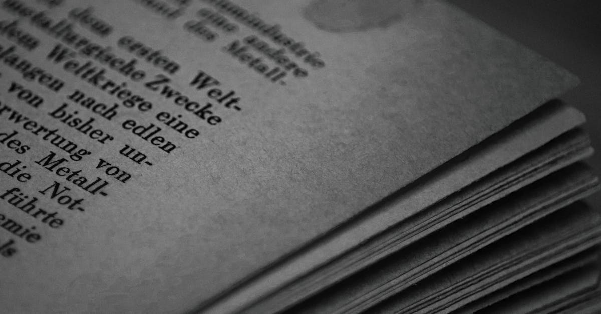
Widows vs Orphans in Typography
Widows and orphans are two of the most common typographic problems in long-form text — and two of the most commonly confused terms in typography. Both refer to stray lines of a paragraph that end up isolated from the rest of their text block, either at the top or bottom of a page or column. They create awkward visual breaks, disrupt reading flow, and make otherwise polished layouts look careless. This guide explains the difference between widows and orphans, why they matter, and how to fix them in both print and web contexts.
What Are Widows?
In the most widely accepted traditional definition, a widow is the last line of a paragraph that appears alone at the top of a new page or column. The rest of the paragraph sits on the previous page, and this single orphaned line — often just a word or short phrase — carries over to the next page by itself.
Widows are considered particularly problematic because they appear at the top of a fresh page or column, where readers expect a clean start. Instead, they encounter a lone fragment that belongs to content they have already moved past. This creates a weak opening to the new page and a sense of visual imbalance.
Examples of Widows
Imagine a five-line paragraph at the bottom of a page. The first four lines fit on the current page, but the fifth line — perhaps just the word “conclusion.” — spills over to the top of the next page. That single line sitting alone at the top is a widow.
Widows are especially noticeable when the stray line is very short: a single word, a hyphenated word fragment, or a brief phrase. A longer last line that happens to fall at the top of a new page is technically still a widow, but it is far less visually distracting.
What Are Orphans?
In the traditional definition, an orphan is the first line of a paragraph that appears alone at the bottom of a page or column. The paragraph begins on one page, but only its first line fits before the page break, with the remaining lines continuing on the next page.
Orphans are problematic because they leave a single line dangling at the bottom of a page with no continuation in sight. The reader starts a new thought, immediately hits a page break, and must turn the page to continue. This fragments the reading experience and makes the paragraph feel disconnected from itself.
Examples of Orphans
Picture a page where the text fills almost to the bottom margin. A new paragraph begins, and its first line fits on the page, but there is no room for the second line. That single opening line stranded at the bottom is an orphan. The reader absorbs one line, turns the page, and finds the rest of the paragraph waiting — a jarring interruption to the flow.
A Note on Conflicting Definitions
It is important to acknowledge that the definitions of widows and orphans are not universally agreed upon. The definitions above — widow at the top, orphan at the bottom — represent the most traditional usage favored by many typographers and style guides. However, some respected sources reverse these definitions or define them differently.
Some authorities define a widow as any short last line of a paragraph (regardless of page breaks) and an orphan as any stranded line at a page break. Others use “orphan” for the line at the top and “widow” for the line at the bottom. The Chicago Manual of Style, for example, uses definitions that differ from some British typographic traditions.
The confusion is longstanding and unlikely to be resolved. The practical takeaway: always clarify definitions when discussing widows and orphans with collaborators, and focus on the underlying principle — stray isolated lines at page or column breaks are bad typography — rather than getting bogged down in which term applies to which position.
Why Widows and Orphans Matter
Widows and orphans are not just aesthetic preferences — they affect the quality and professionalism of any typeset document. Here is why experienced typographers take them seriously.
Reading Flow
Good typography is invisible — it lets readers absorb content without being distracted by the presentation. Widows and orphans break this invisibility. A stray line at the top or bottom of a page momentarily pulls the reader out of the text and draws attention to the layout itself. In long-form reading, these small disruptions accumulate and degrade the overall experience.
Visual Balance
Pages and columns look best when text fills them in a balanced, even manner. A widow at the top of a page leaves a large gap of white space below (since the rest of the page begins with a new paragraph or section). An orphan at the bottom creates an abrupt ending that makes the page feel incomplete. Both undermine the visual rhythm that makes well-typeset text pleasant to read.
Professional Standards
In book design, magazine layout, and any professional publishing context, eliminating widows and orphans is considered a baseline requirement. Their presence signals carelessness — or worse, automation without human oversight. No professionally typeset book should contain them, and their absence is one of the markers that distinguish quality publishing from amateur layout work.
How to Fix Widows and Orphans
There is no single magic fix for widows and orphans. Resolving them requires a combination of techniques, applied with judgment. Here are the most common approaches, ranked roughly from least to most disruptive.
Adjust Tracking
Slightly tightening or loosening the tracking (letter spacing) across a paragraph can pull a line back or push a line forward, eliminating the stray line. The key word is “slightly” — adjustments should be imperceptible to the reader. A change of -10 to +10 units of tracking across a paragraph is typically invisible but can be enough to reflow text.
Edit the Text
Sometimes the cleanest fix is to add or remove a word or two. In editorial contexts where you have control over the copy, a minor text edit is often the most elegant solution. This is common in book typesetting, where typesetters work with editors to resolve layout problems without compromising the writing.
Adjust Leading
Small changes to the leading (line spacing) on a page can allow one more or one fewer line to fit, resolving the stray line. Like tracking adjustments, leading changes should be subtle enough that readers do not notice them.
Adjust Page Breaks
Forcing a page break one line earlier or later can resolve the issue by moving more of the paragraph to one side of the break. In print layout software, this is often the most direct fix: simply adjust where the break falls.
Use Non-Breaking Spaces
Inserting non-breaking spaces between the last few words of a paragraph prevents them from being separated across lines. This can pull a short widow back to the previous page by keeping the last words together with the preceding line, creating a slightly longer last-but-one line that eliminates the stray fragment.
CSS Controls for Widows and Orphans
CSS provides two properties specifically designed to address widows and orphans in paged media (print stylesheets and paginated web layouts). These properties have been part of the CSS specification since CSS 2.1.
The widows Property
The CSS widows property specifies the minimum number of lines of a paragraph that must appear at the top of a page or column. If fewer lines would appear, the browser moves the entire paragraph (or enough lines) to the next page.
p { widows: 3; }
This rule ensures that at least three lines of any paragraph appear at the top of a new page. If only one or two lines would spill over, the browser adjusts the break point to move more lines across.
The orphans Property
The CSS orphans property specifies the minimum number of lines of a paragraph that must remain at the bottom of a page or column before a break. If fewer lines would remain, the browser moves the entire paragraph to the next page.
p { orphans: 3; }
This ensures at least three lines of a paragraph stay at the bottom of a page before any break occurs.
Browser Support and Limitations
The widows and orphans properties are well-supported in print stylesheets across modern browsers. However, their behavior in screen-based multi-column layouts is less consistent. Chrome and other Chromium-based browsers handle them in multi-column contexts, but support varies. For web typography, these properties are most reliable when used in @media print stylesheets.
It is also worth noting that CSS widow and orphan controls work at the page/column break level only. They do not address the broader aesthetic concern of short last lines in paragraphs (sometimes called “runt lines”), which is a separate issue that CSS cannot currently solve automatically.
Widows and Orphans in Print vs. Web
The significance of widows and orphans differs between print and web contexts, and it is worth understanding why.
In print, widows and orphans are a serious concern because page breaks are fixed. Once a book or magazine is printed, every reader sees the same layout. A widow at the top of page 47 is visible to every single person who reads the book. This permanence makes eliminating widows and orphans essential in professional print production.
Web
On the web, content reflows dynamically based on screen size, font settings, and browser rendering. A “page” in the web sense is a continuous scroll, not a fixed frame. This means traditional widows and orphans — defined by page breaks — are largely irrelevant for standard web content. However, they become relevant in web-based multi-column layouts and in print stylesheets for web pages. Additionally, the aesthetic principle behind avoiding widows and orphans — not leaving awkward short lines — still applies to web paragraphs in a general sense.
Frequently Asked Questions
Which is worse, a widow or an orphan?
Most typographers consider widows worse than orphans. A widow at the top of a new page is more visually disruptive because it occupies prominent space where the reader expects fresh content. An orphan at the bottom of a page is less noticeable because it is at the end of a visual unit the reader is about to leave. However, both should be eliminated in professional work.
How do I remember which is which?
One popular mnemonic: “An orphan is left behind” (at the bottom of the page, left behind when the rest of the paragraph moves on) and “a widow is left alone at the top” (alone at the top of the new page, separated from the paragraph below). Another approach: orphans are at the start (bottom), widows are at the end (top) — matching the lifecycle implied by their names.
Do widows and orphans matter in web design?
For standard scrolling web pages, traditional widows and orphans are not a concern because there are no fixed page breaks. However, they matter in CSS multi-column layouts, in print stylesheets, and in any web-based paginated content. The broader principle of avoiding awkward short lines at the ends of paragraphs also applies to web text aesthetics.
Can InDesign fix widows and orphans automatically?
Adobe InDesign offers Keep Options (in the Paragraph panel) that let you specify how many lines must stay together at the start or end of a paragraph. Setting “Keep First” to 2 and “Keep Last” to 2 prevents most widows and orphans. However, these automatic controls sometimes create other layout problems (like uneven page lengths), so manual review and adjustment are still necessary for professional results.
Final Thoughts
Widows and orphans are small typographic details with an outsized impact on the quality of a layout. They signal the difference between text that has been carefully composed and text that has been poured into a template and left alone. Whether you are designing a book, laying out a magazine, or building a print stylesheet for a website, understanding how to identify and fix these stray lines is a fundamental part of typographic craft.
Remember: the terminology may be debated, but the principle is universal. Isolated lines at page and column breaks are a problem. Fix them, and your layouts will look noticeably more polished and professional.


