Champagne vs Gold: What’s the Difference?
Champagne vs gold is a comparison that comes up constantly in wedding planning, luxury branding, packaging design, and interior decorating. Both are warm, elegant hues that evoke sophistication and celebration, but they serve very different roles. Champagne (~#F7E7CE) is a pale, soft yellow-beige with a warm, understated glow — quiet luxury at its finest. Gold (~#FFD700) is a rich, deeply saturated warm yellow that radiates boldness and opulence. Understanding the difference between champagne and gold colors ensures you pick the right tone for the mood and message of your project.
Champagne: The Soft Warm Neutral
Champagne is named after the famous French sparkling wine, whose pale golden-beige bubbles gave rise to the color name. As a color, champagne is a very light, warm neutral that sits between yellow, beige, and peach. It has just enough warmth to feel inviting without the intensity or saturation of a true yellow or gold.
The typical hex code for champagne is #F7E7CE, with RGB values of (247, 231, 206). All three values are high, which means the color is very light, and the gentle gradient from red to green to blue gives it a warm, peachy-beige quality. It is essentially a tinted white — warm, soft, and luminous.
Champagne feels subtle, refined, and romantic. It is the color of candlelight on linen, of morning sunlight through sheer curtains. In color psychology, champagne shares some of gold’s associations with luxury and celebration but expresses them in a whisper rather than a shout. It conveys understated elegance and timeless taste.
Champagne in Design and Fashion
Champagne is one of the most popular colors in wedding design — bridesmaid dresses, invitations, table settings, and floral arrangements frequently feature champagne tones. In fashion, champagne silk, satin, and chiffon are perennial red-carpet favorites because the color flatters most skin tones and photographs beautifully.
In graphic design and branding, champagne works as a warm alternative to white or cream backgrounds. It adds a touch of sophistication without competing with other design elements. Champagne pairs effortlessly with other neutral colors like ivory, taupe, and soft gray, as well as with deeper accent tones like burgundy, navy, and forest green.
Gold: The Rich Metallic Warm
Gold is named after the precious metal that has been a symbol of wealth, power, and divine favor across virtually every culture in human history. As a color, gold is a deep, saturated warm yellow that evokes the gleam of the metal itself.
The standard web hex for gold is #FFD700, with RGB values of (255, 215, 0). Maximum red paired with high green and zero blue produces a rich, warm yellow that is bold and luminous. Unlike champagne, gold has significant saturation and visual weight — it demands attention.
Gold communicates wealth, achievement, prestige, and warmth. It is the color of trophies, medals, crowns, and luxury packaging. Gold carries millennia of cultural significance and instantly elevates any design context. As explored in the gold vs yellow comparison, gold distinguishes itself from plain yellow through its deeper tone and metallic associations.
Gold in Branding and Design
Gold is a powerhouse in luxury branding. Perfume houses, jewelry brands, hotels, financial institutions, and premium food and beverage companies all rely on gold to signal quality and exclusivity. In packaging, gold foil stamping and gold-toned ink are classic techniques for conveying premium value.
In graphic design, gold works as a striking accent against dark backgrounds — black and gold is one of the most iconic luxury color combinations in existence. Gold also pairs beautifully with deep jewel tones like emerald, sapphire blue, and ruby for an opulent, regal palette. Against white, gold feels clean and modern; against cream or champagne, it feels warm and harmonious.
Key Differences Between Champagne and Gold
- Saturation: Champagne is very low saturation, almost neutral; gold is highly saturated and vivid.
- Lightness: Champagne is a very light, pale tone; gold is a medium-dark, rich tone.
- Mood: Champagne is subtle, romantic, and quiet; gold is bold, prestigious, and commanding.
- Role in design: Champagne serves as a background or base color; gold serves as an accent or feature color.
- Warmth: Both are warm, but champagne’s warmth is gentle and diffused, while gold’s warmth is intense and concentrated.
- Origin: Champagne is named after sparkling wine; gold is named after the precious metal.
Hex Codes and Design Use
- Champagne: #F7E7CE | RGB (247, 231, 206) — pale, soft yellow-beige
- Gold: #FFD700 | RGB (255, 215, 0) — rich, saturated warm yellow
- Pale Gold: #EEE8AA | RGB (238, 232, 170) — a lighter, softer gold
- Dark Champagne: #C2A97D | RGB (194, 169, 125) — a deeper, more amber champagne
- Old Gold: #CFB53B | RGB (207, 181, 59) — a vintage, antique gold variant
When working with these colors, keep the CMYK vs RGB distinction in mind. Gold is particularly tricky in print — the standard CMYK process cannot reproduce a true metallic sheen. For printed materials, consider using a metallic Pantone spot color or gold foil to capture the reflective quality of real gold. Champagne, being a near-neutral, translates to print much more predictably.
When to Use Each in Design
Choose champagne when:
- You want an elegant, warm background that is softer than white
- Your project involves weddings, romantic branding, or feminine aesthetics
- You need a warm neutral that pairs with almost any accent color
- You prefer understated luxury over bold opulence
Choose gold when:
- You want a bold accent that instantly communicates luxury and prestige
- Your project involves premium packaging, awards, or high-end branding
- You are building a palette with deep, rich backgrounds like black, navy, or burgundy
- You want maximum visual impact and warmth in a metallic tone
Combining Champagne and Gold
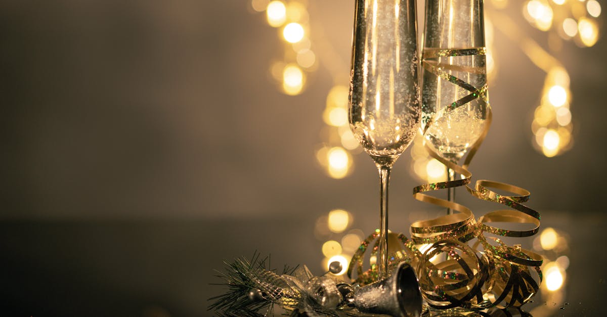
Champagne and gold work beautifully together. The soft, pale champagne provides an ideal base for gold accents to shine against. This pairing is a staple in wedding stationery, luxury packaging, and high-end hotel interiors. Use champagne for large areas — backgrounds, card stock, textiles — and gold for details — typography, borders, icons, and embellishments. The combination feels cohesive because both are warm tones, but the contrast in saturation and lightness creates visual depth and elegance.
Add a third element like earth tones for warmth, deep green for richness, or soft blush for romance to complete the palette.
Frequently Asked Questions
Is champagne a shade of gold?
Not exactly. Champagne is closer to beige or off-white than to gold. While both are warm, champagne is extremely low in saturation and very light, placing it in the neutral family. Gold is a saturated, vivid warm yellow. You might think of champagne as a very distant, pale relative of gold — sharing the same warm family but occupying a completely different position on the lightness and saturation scales.
What is the difference between champagne and ivory?
Champagne has a slightly warmer, more yellow-peach undertone than ivory. Ivory is a cooler off-white that leans faintly yellow. Champagne reads as warmer and slightly more colorful than ivory, though both serve as elegant warm neutrals.
Can gold be used as a primary brand color?
Gold works best as an accent rather than a primary color. Used in large areas, it can feel overwhelming or garish. The most effective luxury brands use gold sparingly — in logos, borders, and key details — against a neutral or dark background. This approach maximizes gold’s impact and maintains a sense of brand sophistication.
What colors complement champagne and gold?
Champagne pairs beautifully with blush, sage green, dusty blue, burgundy, and charcoal. Gold complements navy, black, emerald, deep purple, and white. Together, champagne and gold are complemented by deep jewel tones and crisp neutrals that provide contrast and anchor the warmth.


