Color Grading vs Color Correction: What’s the Difference?
Color correction fixes technical problems. Color grading creates a mood. That is the fundamental difference, but in practice the two processes are deeply connected and often confused. Color correction adjusts white balance, exposure, and contrast to make footage or images look accurate and consistent. Color grading takes that corrected baseline and applies a creative look, the teal-and-orange of a blockbuster, the desaturated cool tones of a thriller, or the warm golden palette of a lifestyle brand.
Both processes matter for photography, video production, and graphic design, and understanding when each applies will make your work more polished, more intentional, and easier to deliver on deadline.
What Is Color Correction?
Color correction is the technical stage of post-production where you make an image or video clip look the way the scene actually appeared to the human eye. It is about accuracy, consistency, and removing problems introduced by the camera, lighting conditions, or environment.
What Color Correction Fixes
- White balance: Neutralizing unwanted color casts so whites look white and skin tones look natural. A shot under fluorescent lighting might have a green tint; correction removes it.
- Exposure: Adjusting brightness so shadows are not crushed and highlights are not blown out. The goal is to use the full tonal range without clipping.
- Contrast: Setting the relationship between the darkest and lightest parts of the image so the scene has appropriate depth and separation.
- Saturation balance: Ensuring colors are neither oversaturated nor washed out, matching what the eye would see in person.
- Shot-to-shot consistency: In video, different clips from different cameras, angles, or times of day need to look like they belong together. Correction brings them into alignment.
The Goal of Correction
The end result of color correction is a neutral, accurate image. It should look natural and true to life. Think of it as preparing a clean canvas. You would not paint on a stained surface, and you should not grade on uncorrected footage. Understanding how color harmony works helps you recognize when a correction has brought tones into proper balance.
What Is Color Grading?
Color grading is the creative stage where you shape the emotional tone and visual style of your work. Once the footage or images are corrected and technically sound, grading pushes them in an intentional aesthetic direction.
What Color Grading Does
- Sets mood: Warm golden tones suggest nostalgia, comfort, or romance. Cool blue-green tones suggest tension, isolation, or technology. The palette choices tie directly to color psychology.
- Creates visual identity: A consistent color grade across a film, a YouTube channel, or a brand’s photography becomes part of its recognizable style.
- Directs attention: Selective grading can desaturate the background and warm the subject, subtly pulling the viewer’s eye.
- Supports narrative: In film, different acts or timelines can have distinct color grades. Flashbacks might be warmer or more faded. Future sequences might be colder and more clinical.
The Goal of Grading
The end result of color grading is an image that communicates a feeling beyond what the raw scene conveys. Grading is subjective and artistic. There is no single “correct” grade the way there is a correct white balance. The grade serves the story, the brand, or the creative vision.
Key Differences Between Color Correction and Color Grading
The difference between color grading and color correction runs deeper than “technical versus creative.” Here is how they compare across the dimensions that matter in a professional workflow.
Purpose
Correction fixes problems and establishes accuracy. Grading creates style and communicates emotion. Correction answers “what did this actually look like?” Grading answers “what do I want this to feel like?”
Objectivity
Correction is largely objective. A properly corrected image has accurate white balance, full tonal range, and natural color. Two experienced colorists correcting the same clip should arrive at similar results. Grading is subjective. Two colorists grading the same clip for “cinematic warmth” might produce noticeably different outcomes, both valid.
Scope of Change
Correction makes relatively subtle adjustments, nudging values to where they should be. Grading can make dramatic changes, shifting entire color palettes, crushing blacks, tinting shadows, or desaturating everything except one hue.
Order in the Pipeline
Correction always comes first. Grading a clip that has not been corrected is like seasoning a dish that has not been cooked. The base needs to be right before you add style on top. Attempting to grade uncorrected footage leads to inconsistency, because the creative adjustments will interact unpredictably with underlying color casts and exposure errors.
The Workflow Order
In any professional color pipeline, whether for a feature film, a YouTube video, or a photography project, the stages follow a logical sequence.
Step 1: Import and Organize
Bring your footage or images into your editing or color application. Organize by scene, shoot, or lighting setup so you can batch-correct efficiently.
Step 2: Primary Color Correction
Adjust global settings, white balance, exposure, contrast, and overall saturation, to create a neutral, balanced starting point. Use waveforms, vectorscopes, and histograms as objective guides rather than relying solely on how the image looks on your screen.
Step 3: Secondary Color Correction
Target specific elements that still need fixing after the primary pass. This might mean isolating skin tones to remove a remaining cast, pulling down a hot highlight in a window, or matching the green of foliage between two shots taken at different times.
Step 4: Shot Matching
Ensure that all clips in a sequence look consistent. A conversation scene shot from two angles should have identical color balance and exposure on both sides. This step is crucial for professional-looking video.
Step 5: Creative Color Grading
With everything corrected and matched, apply your creative grade. This might involve adding a LUT (lookup table) as a starting point, then refining it. Adjust shadow, midtone, and highlight colors independently. Push the palette toward the mood you want. This is where your understanding of warm versus cool color relationships becomes a creative tool.
Step 6: Final Review and Export
Review the graded work on a calibrated monitor. Check for consistency across the full piece. Export in the appropriate color space and bit depth for your delivery format.
Tools for Color Correction and Color Grading
Most professional tools handle both correction and grading within the same application, but they offer distinct features for each stage.
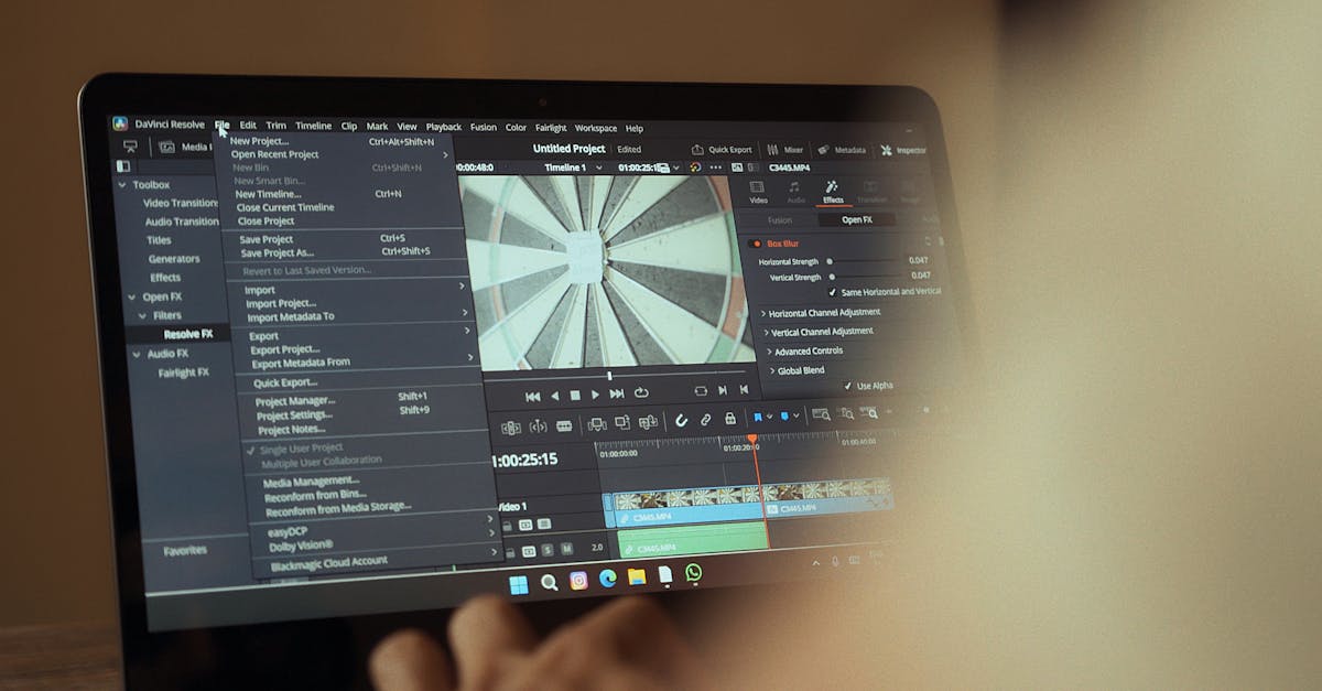
DaVinci Resolve
The industry standard for color work in video. Its node-based color pipeline lets you separate correction nodes from grading nodes cleanly. The free version handles most professional needs. Its scopes, curves, and color wheels are built for precision at both stages.
Adobe Lightroom
Primarily a photography tool, Lightroom excels at correction with its white balance, exposure, and tone curve controls. Its color grading panel, which allows separate adjustments to shadows, midtones, and highlights, provides solid creative grading for still images.
Adobe Premiere Pro
Premiere’s Lumetri Color panel handles both correction and grading for video editors who do not need a dedicated color application. It is not as powerful as DaVinci Resolve for complex grading, but it is more than adequate for most content.
Capture One
Favored by commercial and fashion photographers for its color editing precision. Its color editor tool allows targeted correction by hue range, and its output recipes handle grading with layers and adjustments. The ability to apply and manage design principles consistently across a shoot makes it valuable for brand work.
Frequently Asked Questions
Can you color grade without color correcting first?
You can, but you should not. Grading uncorrected footage means you are building a creative look on top of technical flaws. Color casts, exposure inconsistencies, and mismatched shots will undermine the grade and create problems that are harder to fix later. Always correct first, then grade.
Is color correction necessary for every photo or video?
In practice, yes. Even well-exposed footage from a high-end camera benefits from minor correction. White balance may be slightly off, contrast might need a small bump, and individual shots in a sequence almost always need matching. The only exception might be a camera with an extremely accurate built-in color profile shooting in perfectly controlled studio lighting, and even then, a quick check is prudent.
Do I need expensive software for color grading?
No. DaVinci Resolve’s free version is a world-class color grading tool used on major film and television productions. For photography, Adobe Lightroom’s color grading features are included in the standard subscription. The bottleneck is skill, not software. A calibrated monitor matters more than the application you use.
What is a LUT and how does it relate to grading?
A LUT, or lookup table, is a preset that maps input color values to output color values. It is essentially a color grade packaged as a file that you can apply to footage instantly. LUTs are useful as creative starting points, but they rarely work perfectly without adjustments because they do not account for the specific exposure and color characteristics of your footage. Professional colorists use LUTs as a foundation and then refine them shot by shot.


