Ecru vs Cream vs White: What’s the Difference?
White, cream, and ecru sit close together on the spectrum, but they are not interchangeable. White is the pure, cool baseline with no warmth. Cream is a warm white with a subtle yellow undertone. Ecru is warmer still, a beige-toned neutral named after the color of unbleached linen. Choosing the wrong one can make a design feel sterile when it should feel inviting, or muddy when it should feel clean.
If you have ever debated between “white” and “off-white” for a website background, a wedding invitation, or a print layout, this comparison will help you pick with precision. These three neutrals also pair differently with other tones in an earth tone palette or a broader neutral color palette.
White: The Pure Baseline
White in digital design is #FFFFFF, the maximum value across all three RGB channels. It carries no hue, no warmth, and no undertone. It is the absence of color in the additive model, representing full brightness.
White is clinical, modern, and high-contrast. It is the default background of nearly every website, document, and app interface. Against dark text, it provides maximum readability. In print, pure white paper stock is the brightest option available.
When White Works Best
- Minimalist, modern, or tech-forward design where clean contrast is the priority
- UI and web design where readability and accessibility demand a bright background
- Photography backdrops for product shots that need a clinical, distraction-free look
- Any context where warmth or texture would feel out of place
Limitations of Pure White
Pure white can feel harsh. On a large screen, #FFFFFF backgrounds cause eye fatigue over long reading sessions, which is why many apps now default to a very faint warm or cool gray. In print, bright white stock can make warm brand colors look jarring by contrast. And in interiors and textiles, pure white rarely exists naturally, so it can read as artificial.
Cream: The Warm White
Cream is a white with a soft yellow undertone. Its hex value typically falls around #FFFDD0, though cream can range slightly depending on the context. In HSL terms, it sits at a very high lightness with low saturation and a warm yellow hue.
The name comes from dairy cream, and the color carries that same suggestion of richness and softness. Cream is warmer than white but still light enough to function as a background neutral. It reads as elegant and approachable without feeling heavy.
When Cream Works Best
- Wedding and event stationery where white feels too cold
- Brand palettes for luxury, lifestyle, or food-related businesses
- Website backgrounds that need warmth without sacrificing readability
- Print projects on cream or natural paper stocks
Cream pairs especially well with the spectrum of ivory and off-white tones in layered neutral palettes. It also works beautifully alongside muted golds, soft greens, and dusty rose tones.
Ecru: The Linen Tone
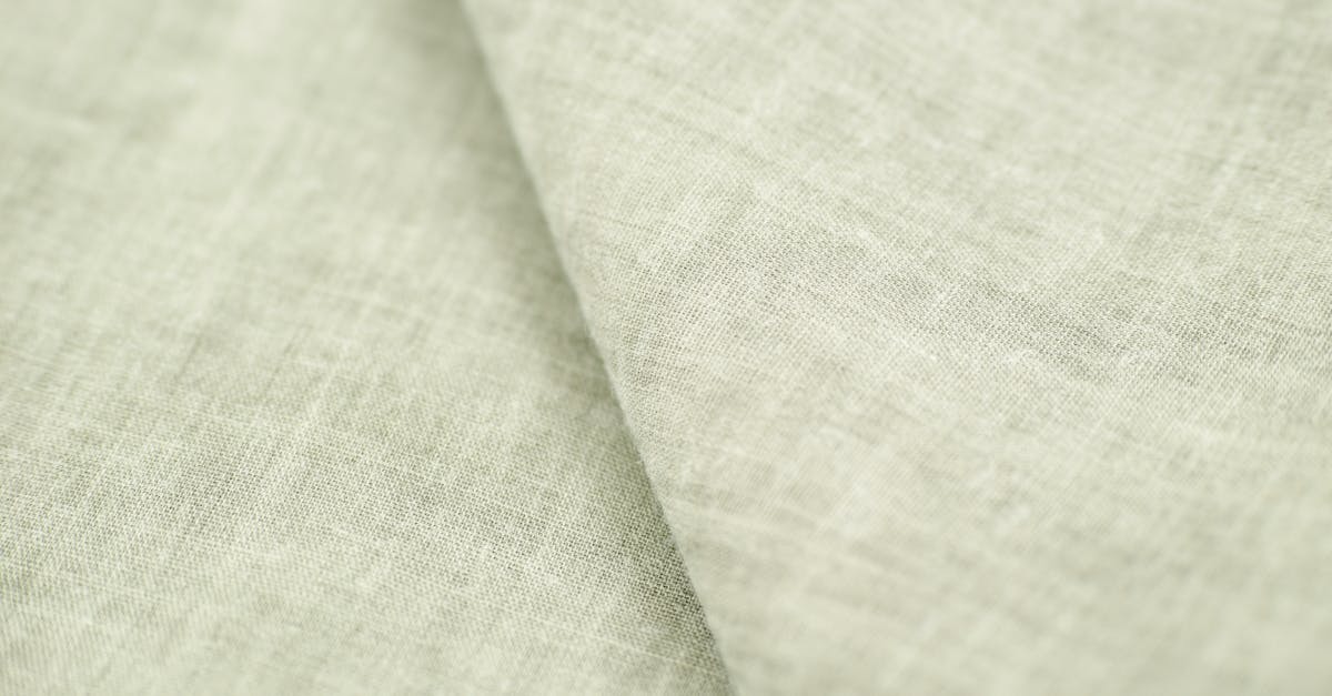
Ecru takes its name from the French word for “raw” or “unbleached,” referring to the natural color of linen and cotton before processing. Its hex value is approximately #C2B280, placing it significantly darker and warmer than both white and cream. Ecru is a true warm neutral, closer to beige or tan than to white.
Where cream is still recognizably a “white,” ecru has crossed into its own territory. It has noticeable warmth, visible depth, and an organic quality that evokes natural materials. In fashion and textiles, ecru is a staple color for linen garments, canvas bags, and unbleached fabrics.
When Ecru Works Best
- Organic, artisanal, or nature-inspired brand identities
- Textile and fashion design where a natural, undyed look is the goal
- Print designs on uncoated, kraft, or natural paper stocks where the paper itself is ecru-toned
- Interior design palettes that lean into earthy warmth
Key Differences at a Glance
The three colors differ across warmth, lightness, and appropriate use cases.
- White (#FFFFFF): No undertone, maximum brightness, cool and clean. Best for modern, minimal, and high-contrast design.
- Cream (#FFFDD0): Yellow undertone, very high brightness, soft and warm. Best for elegant, inviting design that still needs a light background.
- Ecru (#C2B280): Yellow-brown undertone, medium brightness, warm and organic. Best for natural, earthy, and textured design.
The lightness gap is significant. White and cream are both in the very high lightness range and can function as background colors. Ecru is noticeably darker, sitting in the mid-tone range, and works better as an accent, a paper stock color, or a secondary neutral rather than a primary background on screens.
Hex Codes and Design Use
Here are practical hex codes for each color along with common variations designers use.
- Pure white: #FFFFFF
- Soft white (slightly warm): #FAFAF5
- Cream: #FFFDD0
- Light cream: #FFF8E7
- Ecru: #C2B280
- Light ecru: #D4C9A8
In CSS, you might use cream or a warm white for a background-color to reduce the harshness of pure white while maintaining readability. Ecru works well as a border color, a card background in a dark-mode context, or a text color against a dark surface. All three interact differently with the rest of your palette, so testing against your brand colors, especially vibrant ones, is essential. Keeping core design principles like contrast and hierarchy in mind will guide you toward the right choice.
When to Use Each
Use White When…
You need maximum contrast, a modern or clinical feel, or full compatibility with standard screen rendering. White is the safe, universal choice for responsive web design, app interfaces, and any layout where content clarity is the top priority.
Use Cream When…
You want warmth without losing the lightness of a near-white background. Cream is ideal for brands that want to feel approachable, luxurious, or traditional. It softens the overall design without competing with foreground content.
Use Ecru When…
Your design leans into natural materials, organic textures, or earthy aesthetics. Ecru signals authenticity and craftsmanship. It works best when paired with other warm neutrals, deep greens, terracotta, or muted tones found in a well-built earth tone palette.
Frequently Asked Questions
Is ecru the same as beige?
They are close but not identical. Ecru is specifically the color of unbleached natural fiber, which tends to have a yellow-tan quality. Beige is a broader category that can lean more gray or pink depending on the specific shade. Ecru is always warm and slightly golden, while beige can skew cooler.
Can I use cream as a website background instead of white?
Yes, and many designers do. A very light cream like #FFF8E7 or #FAFAF2 adds warmth and reduces eye strain compared to pure white. Just check your text contrast ratios to ensure accessibility, especially for body text. WCAG guidelines require a minimum contrast ratio of 4.5:1 for normal text.
What paper stock matches cream or ecru?
For cream, look for “natural white” or “warm white” paper stocks. These are slightly off-white with a yellow tint. For ecru, “natural” or “kraft” stocks are the closest match, though kraft tends to be darker and more brown. If exact color matching matters, always request printed swatches from your paper vendor before committing to a full print run.
How do I choose between cream and ecru for a brand palette?
It depends on your brand positioning. Cream works for brands that want to feel premium but approachable, like bakeries, wedding planners, and skincare lines. Ecru suits brands that want to feel artisanal, natural, and grounded, like pottery studios, linen clothing lines, and organic food companies. If your palette already includes other neutral tones, test how cream and ecru each sit alongside them before deciding.


