Flat Design vs Skeuomorphism: What’s the Difference?
Few debates in digital design history have been as heated — or as consequential — as the one between flat design and skeuomorphism. Skeuomorphism is a design approach that mimics the appearance of real-world objects, using textures, gradients, shadows, and three-dimensional effects to make digital interfaces look and feel like their physical counterparts. Flat design strips all of that away, favoring clean two-dimensional graphics, solid colors, simple typography, and the complete absence of decorative realism.
The tension between these two philosophies shaped the visual identity of an entire computing era. Apple’s pre-2013 iOS was the poster child for skeuomorphism, with its leather-stitched calendar headers and glossy glass shelves. Microsoft’s Metro design language and Apple’s iOS 7 redesign ushered in the flat design revolution. Today, the pendulum has settled somewhere in between, with approaches like Material Design and neumorphism borrowing selectively from both traditions.
Understanding the flat design vs skeuomorphism debate is not just a history lesson. It reveals fundamental principles about how users interact with interfaces, how aesthetics influence usability, and how design trends evolve in response to technology and culture.
What Is Skeuomorphism?
Skeuomorphism in digital design refers to the practice of making interface elements resemble their real-world counterparts. The term derives from the Greek words “skeuos” (tool or vessel) and “morphe” (form), and it describes any design element that retains ornamental features from an older form even when they are no longer functionally necessary.
In the physical world, skeuomorphism is everywhere. Vinyl-patterned linoleum mimics hardwood floors. Electric cars produce artificial engine sounds. Digital camera apps still use a shutter-click sound effect. In interface design, the concept was taken to elaborate extremes during the late 2000s and early 2010s.
Skeuomorphism in Practice
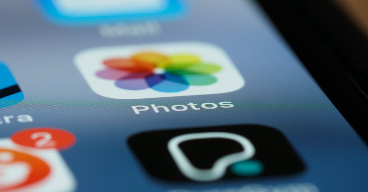
Apple’s iOS, from its original 2007 release through iOS 6, was the most famous showcase of skeuomorphic design. The Notes app looked like a yellow legal pad, complete with torn paper edges and a leather header strip. The Compass app featured a realistic rendered compass with metallic reflections. Game Center displayed a felt poker table texture. The Bookshelf app showed wooden shelves with realistic lighting.
These design choices were not arbitrary. When smartphones were new, most users had no mental model for interacting with a touch screen. Skeuomorphic design leveraged existing knowledge — everyone knows how to flip a page, slide a switch, or press a button — to make unfamiliar technology feel approachable. The realistic visual cues acted as affordances, signaling what each element did and how it could be interacted with.
The Philosophy Behind Skeuomorphism
Skeuomorphism is grounded in the idea that interfaces should be intuitive by borrowing from the physical world. If a digital button looks three-dimensional and pressable, users understand they can tap it. If a digital notebook looks like a real notebook, users understand they can write in it. The design communicates function through visual metaphor.
Proponents argued that this approach reduced the learning curve for new users, created emotional warmth and tactile satisfaction, and demonstrated craftsmanship through rich visual detail. Each texture, shadow, and reflection was painstakingly rendered, and the best skeuomorphic interfaces had a visual richness that flat design would later be criticized for lacking.
What Is Flat Design?
Flat design is a visual style characterized by two-dimensional elements, solid colors, clean typography, minimal ornamentation, and the deliberate absence of photorealistic effects like gradients, shadows, textures, and three-dimensional illusions. It treats the screen as what it is — a flat, light-emitting surface — rather than trying to simulate depth and materiality.
Flat Design in Practice
Microsoft was arguably the first major technology company to embrace flat design at scale. Its Metro design language, introduced with Windows Phone 7 in 2010 and expanded with Windows 8 in 2012, used bold solid-color tiles, clean sans-serif typography (Segoe UI), and generous white space. The interface was striking in its confidence — no gradients, no shadows, no textures, just pure color and type.
Apple’s iOS 7, released in June 2013 under the design leadership of Jony Ive, marked the tipping point. Overnight, the world’s most popular mobile operating system shed its leather textures and glossy buttons in favor of thin lines, translucent layers, bright gradients (still flat, just colorful), and a system font that prioritized readability over personality. The shift was so dramatic that it effectively ended skeuomorphism as a mainstream design approach.
The Philosophy Behind Flat Design
Flat design’s proponents argued that by the early 2010s, users no longer needed real-world metaphors to understand digital interfaces. Touchscreens had been mainstream for years. Everyone understood how to tap a button, swipe a screen, or navigate a menu. The training wheels of skeuomorphism had served their purpose and were now just visual clutter that slowed down interfaces and distracted from content.
Flat design aligned with several other principles gaining traction in design culture: content-first thinking, where visual chrome should not compete with the actual information; performance optimization, since flat graphics are simpler to render and lighter to load; and scalability across devices, since a flat icon scales cleanly to any resolution while a textured skeuomorphic element might need to be redrawn for each size.
The Historical Shift
The transition from skeuomorphism vs flat design was not merely an aesthetic preference — it was a cultural shift driven by several converging forces.
Technology Matured, Users Adapted
By 2012, smartphones had been mainstream for five years. An entire generation had grown up with touch interfaces. The metaphors that once made smartphones accessible — the physical-looking button, the realistic page turn — were no longer necessary for comprehension. Users did not need a button to look three-dimensional to know they could tap it. Flat design acknowledged this evolved literacy.
Screen Technology Changed
The proliferation of high-resolution “Retina” displays and the emergence of responsive design created practical pressures. Flat graphics rendered crisply at any resolution and scaled effortlessly across screen sizes. Complex skeuomorphic textures required high-resolution assets for each element, increasing file sizes and development complexity. As designers needed to support phones, tablets, laptops, and desktops from a single codebase, the simplicity of flat design was not just aesthetically appealing — it was practical.
A Backlash Against Excess
Design trends often move in pendulum swings, and skeuomorphism had arguably swung too far. Apple’s Game Center poker felt and Find My Friends faux-leather were widely mocked by designers as gratuitous decoration that served no functional purpose. The leather stitching on the Calendar app did not help anyone schedule meetings. There was a growing feeling that skeuomorphism had become self-indulgent — designers showing off rendering skills at the expense of usability and clarity.
Flat Design’s Own Backlash
The shift to flat design was not without its problems. Early flat interfaces were criticized for poor usability. When everything is flat, how do you distinguish a tappable button from a static label? Without shadows, borders, or dimensional cues, affordance suffered. Users sometimes could not tell what was interactive and what was not. The “mystery meat navigation” problem — where clickable elements were indistinguishable from decorative ones — became a legitimate concern, particularly for accessibility.
Key Differences Between Flat Design and Skeuomorphism
Visual Treatment
The most obvious difference is surface-level. Skeuomorphism uses gradients, textures, shadows, highlights, and three-dimensional effects to create the illusion of physical materials and depth. Flat design uses solid colors, simple shapes, uniform line weights, and no simulated depth. Skeuomorphic design is visually dense and detailed; flat design is visually minimal and clean.
Affordance and Usability
Skeuomorphism provides strong affordances through visual metaphor. A button that looks raised and three-dimensional clearly communicates “press me.” A slider that looks like a physical knob communicates “drag me.” Flat design relies more on conventions, spatial relationships, and color to communicate interactivity. A flat rectangle might be a button if it has a contrasting color, centered text, and sits in an expected position — but the cues are more subtle.
Performance and Scalability
Flat design has clear advantages in technical performance. Flat graphics use less memory, load faster, and render cleanly at any resolution. They are easier to implement in CSS without relying on image assets. Skeuomorphic elements often require raster images for textures and detailed rendering, which increase page weight and can look blurry on unexpected screen sizes.
Design and Development Efficiency
Flat interfaces are generally faster to design and easier to maintain. Creating a consistent design system is more straightforward when elements are defined by a limited palette of colors, shapes, and typography rules. Skeuomorphic interfaces require more detailed production work — each element’s texture, lighting, and material quality must be individually crafted, and maintaining visual consistency across a large interface is more labor-intensive.
Emotional and Aesthetic Qualities
Skeuomorphism creates warmth, familiarity, and a sense of craft. The best skeuomorphic interfaces feel tangible and inviting. Flat design creates clarity, modernity, and a sense of efficiency. The best flat interfaces feel sophisticated and focused. Neither emotional quality is inherently superior — the right choice depends on the product’s personality, audience, and goals, as explored in discussions around UX vs UI design.
Where Design Is Now: Beyond the Binary
The flat design vs skeuomorphic design debate has largely resolved itself — not with a clear winner, but with a synthesis. Today’s dominant design approaches borrow from both traditions.
Material Design
Google’s Material Design, introduced in 2014, is the most prominent example of this synthesis. It uses flat visual elements — solid colors, clean type, simple icons — but layers them in a virtual three-dimensional space with consistent elevation shadows. A card that floats above the background casts a subtle shadow, creating depth without mimicking a physical material. Material Design’s system of elevation, motion, and layering restored the affordance that pure flat design had sacrificed, while maintaining the cleanliness and scalability that made flat design appealing.
Semi-Flat Design
The broader industry settled on what is sometimes called “semi-flat” or “flat 2.0” design. This approach uses predominantly flat visual elements but strategically reintroduces subtle shadows, gentle gradients, and slight dimensional cues where they improve usability. Buttons might have a barely perceptible shadow to distinguish them from the background. Cards might use a faint border or elevation effect. The ornamentation is minimal and functional rather than decorative.
Neumorphism
A more recent development, neumorphism (or “soft UI”) creates a middle ground by using soft, inset shadows to make elements look like they are extruded from or pressed into the background surface. The effect is subtle and modern — more restrained than skeuomorphism but more dimensional than flat design. While visually striking, neumorphism has faced criticism for poor contrast and accessibility issues, and it remains more of a stylistic experiment than a mainstream approach.
The Return of Texture and Dimension
Current design styles and web design trends show a continued reintroduction of elements that pure flat design had rejected. Glassmorphism uses frosted-glass transparency effects. 3D illustrations and rendered objects appear in marketing sites. Grain textures overlay flat color fields. These elements are used with restraint and purpose, not as attempts to mimic physical objects, but as aesthetic choices that add visual interest and depth to otherwise flat foundations.
What This History Teaches Designers
The skeuomorphism-to-flat-design arc offers several enduring lessons. First, design trends are not permanent. What feels fresh and modern today will eventually feel dated. Building design skills around principles — hierarchy, contrast, consistency, usability — rather than trends ensures longevity in the field. Second, usability should never be sacrificed for aesthetics. Both skeuomorphism at its worst (unnecessary ornamentation) and flat design at its worst (invisible affordances) suffered when visual style took priority over user experience.
Third, synthesis is usually smarter than extremism. The best contemporary interfaces take what worked from both approaches — the clarity and efficiency of flat design, the affordance and warmth of dimensional cues — and combine them thoughtfully. Dogmatic adherence to either pure flat or pure skeuomorphism produces worse results than a pragmatic blend.
Frequently Asked Questions
Is skeuomorphism dead?
Skeuomorphism as a dominant design philosophy is over — you will not see mainstream operating systems return to leather textures and glossy buttons. But skeuomorphic elements persist where they serve a purpose. Music production software still uses realistic knob and fader interfaces because musicians find them intuitive. Some note-taking apps use paper textures to create a specific mood. And the subtle dimensional cues in Material Design and semi-flat design are, technically, mild forms of skeuomorphism. The extreme version is dead; the principle of using real-world references to improve usability lives on.
Is flat design better for accessibility?
Not inherently. Flat design can actually harm accessibility when interactive elements lack sufficient visual distinction from non-interactive ones. A flat button with no border, shadow, or dimensional treatment may be invisible to users with low vision or cognitive disabilities. Good accessible design — whether flat, dimensional, or anywhere in between — ensures sufficient color contrast, clear visual hierarchy, and obvious interactive affordances. The style matters less than the rigor of the implementation.
Should I use flat design or skeuomorphism for my project?
For most digital products in 2026, the answer is neither extreme. Use a modern semi-flat approach with clean visual foundations and strategic use of shadows, elevation, and subtle depth cues where they improve usability. If your audience is highly technical and design-literate, you can lean flatter. If your product targets older or less tech-savvy users, slightly stronger affordance cues may help. Let usability testing and your brand’s personality guide the balance rather than ideological commitment to one approach.
What comes after flat design?
Current trends suggest a continued evolution toward richer, more expressive interfaces that retain flat design’s structural clarity while adding visual personality. AI-generated graphics, dynamic theming that adapts to user preferences, and spatial computing interfaces (AR/VR) are all pushing design beyond the flat-vs-skeuomorphic binary entirely. The next major shift in interface aesthetics is more likely to come from a new input paradigm — like spatial computing — than from another swing of the flat/realistic pendulum.
The story of flat design vs skeuomorphism is ultimately a story about how design adapts to technology, user behavior, and cultural taste. Both approaches contributed essential ideas to modern interface design, and understanding their strengths and weaknesses makes you a more thoughtful, versatile designer.


