Scarlet vs Crimson vs Red: What’s the Difference?
Scarlet vs crimson is a comparison that confuses even experienced designers, and adding pure red to the mix makes things even more interesting. All three are red-family colors, but they differ in undertone, intensity, and emotional impact. Red (#FF0000) is the pure primary with no bias. Scarlet (~#FF2400) is a warm, orange-leaning red that feels fiery and energetic. Crimson (~#DC143C) is a cool, blue-leaning red that feels deep and dramatic. Knowing the difference between scarlet, crimson, and red will help you choose the right shade for any project.
Red: The Primary Color
Red is one of the three primary colors in both the additive (RGB) and subtractive (RYB) color models. In its purest digital form, red is #FF0000 — maximum red light, no green, no blue. It is the baseline from which all other reds are measured.
Pure red is bold, direct, and unambiguous. In color psychology, it is linked to passion, urgency, danger, love, and energy. It is the color of stop signs, fire engines, and hearts. Virtually every culture recognizes red as an attention-grabbing, emotionally charged color.
In design, pure red is powerful but demanding. It is one of the hardest colors to use in large quantities because it can feel aggressive or overwhelming. Most designers gravitate toward variants of red — like scarlet or crimson — to add nuance and sophistication to their red color palettes.
Scarlet: The Orange-Red
Scarlet is a brilliant red with a distinct warm, orange undertone. Its hex code sits around #FF2400, meaning it contains maximum red with a small amount of green added to push it toward orange, and no blue. The result is a fiery, radiant red that feels hotter and more energetic than pure red.
The word “scarlet” has deep historical roots. Scarlet dyes were among the most expensive and coveted in the ancient and medieval world, produced from kermes insects and later from cochineal. The color became associated with power, wealth, and status — cardinals of the Catholic Church wear scarlet robes, and British soldiers were famously known as “redcoats” for their scarlet uniforms.
Scarlet in Design
Scarlet is an excellent choice when you want red’s energy but with added warmth and dynamism. It works particularly well in designs meant to convey excitement, action, and enthusiasm. Sports teams, entertainment brands, and food companies frequently use scarlet or scarlet-adjacent reds because the orange undertone feels inviting and appetizing rather than alarming.
As a warm color, scarlet pairs naturally with other warm hues like gold, amber, and cream. It also creates striking contrast against cool colors like navy, teal, or forest green.
Crimson: The Blue-Red
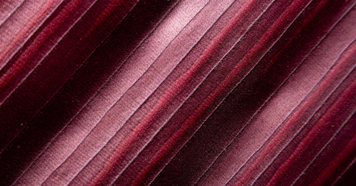
Crimson is a deep, rich red with a cool, blue undertone. Its typical hex code is #DC143C, placing it darker and cooler than pure red. The blue component gives crimson a sense of depth and seriousness that scarlet lacks.
The word “crimson” derives from the Old Spanish “cremesín,” which traces back to the Arabic “qirmiz,” referring to the kermes insect used to produce a deep red dye. Over centuries, crimson became associated with royalty, academia, and solemn occasions. Harvard University’s official color is crimson, and the term appears frequently in literature and heraldry.
Crimson in Design
Crimson brings gravitas and elegance to a design. It reads as more mature and refined than scarlet, making it ideal for brands that want to project authority, tradition, or luxury. Wine labels, law firms, universities, and heritage brands frequently employ crimson tones.
Because of its blue undertone, crimson works beautifully alongside other cool colors — deep blues, plums, and cool grays. It also creates a stunning combination with metallics like silver and pewter, leaning into its regal associations.
Key Differences
Here is how the three reds compare across the most important dimensions:
- Undertone: Red is neutral. Scarlet is warm (orange undertone). Crimson is cool (blue undertone).
- Brightness: Scarlet is the brightest and most vivid. Red is bold and direct. Crimson is deeper and slightly darker.
- Mood: Red is urgent and powerful. Scarlet is fiery and energetic. Crimson is dramatic and sophisticated.
- Temperature: Scarlet reads as the warmest of the three, and crimson reads as the coolest.
- Common associations: Red = danger, love, stop. Scarlet = passion, fire, vitality. Crimson = royalty, academia, depth.
Hex Codes and Design Use
- Red: #FF0000 | RGB (255, 0, 0) — the pure primary red
- Scarlet: #FF2400 | RGB (255, 36, 0) — warm, orange-biased red
- Crimson: #DC143C | RGB (220, 20, 60) — cool, blue-biased deep red
All three work as dominant or accent colors depending on the design context. In a color harmony framework, you might use pure red for a call-to-action button, scarlet for an energetic hero section, or crimson for an elegant header. Mixing these reds in the same palette creates a rich, layered red scheme that avoids monotony.
When to Use Each
Choose pure red when:
- You need maximum impact and immediate recognition (alerts, CTAs, sale banners)
- Your design requires a clean, unbiased red that reads universally
- You are working within a design system that calls for a standard primary red
Choose scarlet when:
- You want warmth, energy, and approachability
- The project involves food, sports, entertainment, or action-oriented content
- You are building a warm color palette with oranges, golds, and yellows
Choose crimson when:
- You want depth, elegance, and a sense of tradition
- The project involves luxury, academia, wine, or heritage brands
- You are pairing red with cool tones like navy, plum, or silver
Frequently Asked Questions
Is scarlet more orange than red?
Scarlet has a noticeable orange undertone, but it is still firmly in the red family. Think of it as red that has been warmed up by a touch of orange — it is not orange itself, but it leans that direction compared to pure red or crimson.
Is crimson the same as dark red?
Not exactly. While crimson is darker than pure red, its defining feature is the blue undertone rather than simple darkness. A dark red could be warm or neutral; crimson is specifically a cool-leaning deep red. Other dark reds, like maroon and burgundy, have different undertones entirely.
Can I use scarlet and crimson together?
Yes, and this can be very effective. Scarlet and crimson represent the warm and cool ends of the red spectrum, so pairing them creates visual richness and depth. Use crimson for backgrounds or text and scarlet for accents or highlights.
Which red is best for a logo?
It depends on your brand positioning. Pure red is classic and universally recognized. Scarlet works for brands that want to feel energetic and warm. Crimson suits brands aiming for prestige and tradition. Test each option in context before committing.


