Teal vs Turquoise: What’s the Difference?
Teal vs turquoise is one of the most common color mix-ups in design and everyday conversation. Both are beautiful blue-green colors that sit in the cyan family, but they differ in depth, brightness, and mood. Teal is a darker, more subdued blue-green with a stronger blue lean, while turquoise is a lighter, brighter blue-green that feels more vibrant and tropical. Understanding the difference between teal and turquoise can help you make smarter choices in graphic design, interior decorating, fashion, and branding.
Teal: The Deep Blue-Green
Teal gets its name from the common teal, a freshwater duck whose head features a distinctive dark blue-green stripe running from the eye to the back of the neck. As a color, teal is a medium to dark cyan that blends blue and green in roughly equal measure, though it tends to lean slightly more toward blue.
The standard hex code for teal is #008080, which is also one of the original 16 named web colors defined in HTML. In the color wheel, teal sits firmly in the cyan range, positioned between blue and green. Its RGB values are (0, 128, 128), meaning it contains no red and equal parts green and blue at a moderate intensity.
Teal carries a sense of sophistication and calm. It is deep enough to serve as a grounding color in design palettes, yet it retains enough vibrancy to avoid feeling dull. In color psychology, teal is often associated with clarity of thought, open communication, and emotional balance. It shares the trustworthiness of blue with the renewal and freshness of green.
Teal in Design and Fashion
Teal is a popular choice in corporate branding because it feels professional without being as conventional as navy or standard blue. It works well as a primary brand color or as an accent against neutral backgrounds. In fashion, teal is a go-to jewel tone that flatters a wide range of skin tones, and it appears frequently in autumn and winter collections where richer, deeper hues dominate.
Turquoise: The Bright Blue-Green
Turquoise takes its name from the turquoise gemstone, a semi-precious mineral prized for thousands of years by cultures across the globe, from ancient Egyptians to Native Americans. The stone ranges from sky blue to green-blue, and the color named after it captures that bright, eye-catching quality.
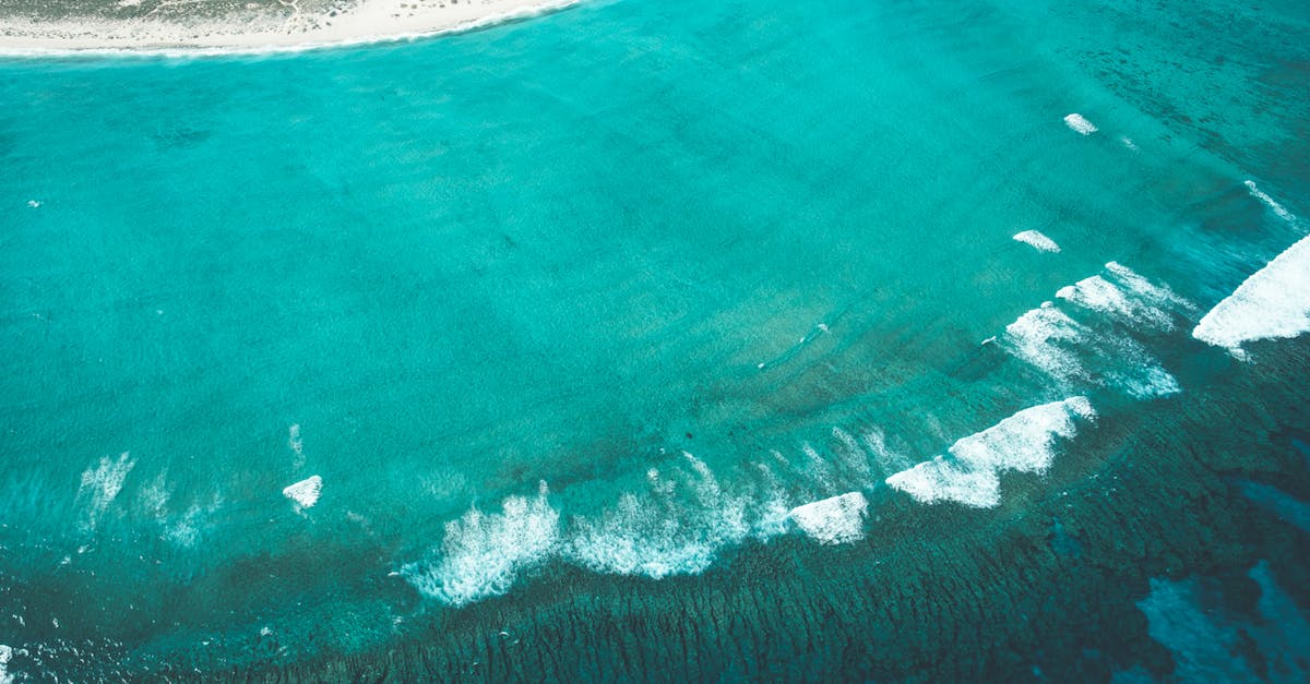
The standard web hex code for turquoise is #40E0D0, with RGB values of (64, 224, 208). Compared to teal, turquoise is significantly lighter and more saturated. It reads as a vivid, cheerful blue-green that immediately evokes tropical water, clear skies, and gemstones.
Turquoise is considered one of the most universally appealing colors. It combines the calming properties of blue with the invigorating energy of green, resulting in a hue that feels simultaneously relaxing and uplifting. In color psychology, turquoise is linked to creativity, emotional balance, and good luck.
Turquoise in Design and Fashion
Turquoise is a staple of summer palettes, bohemian aesthetics, and tropical-themed designs. It pairs beautifully with warm colors like coral, orange, and gold to create lively, energetic compositions. In jewelry design, turquoise is iconic in Southwestern and boho styles. In graphic design, it serves as an excellent accent color that draws attention without overwhelming the viewer.
Key Differences Between Teal and Turquoise
While both colors belong to the cyan family, the differences are clear once you see them side by side:
- Darkness: Teal is a medium-dark color; turquoise is light and bright.
- Saturation: Teal is more muted and subdued; turquoise is more vivid and saturated.
- Blue vs. green balance: Teal leans slightly more blue; turquoise balances blue and green more evenly with a slight green lean.
- Mood: Teal feels sophisticated, calm, and grounded; turquoise feels fresh, energetic, and playful.
- Origin: Teal is named after a duck; turquoise is named after a gemstone.
- Seasonal association: Teal skews autumn and winter; turquoise skews spring and summer.
Hex Codes and Design Use
Here is a quick reference comparing the two colors:
- Teal: #008080 | RGB (0, 128, 128) | A deep, balanced blue-green
- Turquoise: #40E0D0 | RGB (64, 224, 208) | A bright, vivid blue-green
In complementary color schemes, teal pairs naturally with warm tones like coral or burnt orange, while turquoise works brilliantly alongside warm reds and deep golds. Both can be used effectively in analogous palettes alongside other blues and greens.
When working in print, keep in mind that both colors fall in the cyan-heavy range, which translates well to CMYK printing. However, the brighter turquoise may lose some of its vibrancy in print compared to screen, so always check proofs.
When to Use Each
Choosing between teal and turquoise depends on the mood and context of your project:
Choose teal when you want:
- A refined, professional look for corporate branding or websites
- A jewel-tone accent in a rich, sophisticated palette
- A calming but confident color for healthcare, wellness, or finance brands
- A versatile dark accent that works in both light and dark design schemes
Choose turquoise when you want:
- A bright, attention-grabbing accent for summer campaigns or tropical themes
- A youthful, creative feel for lifestyle brands or social media graphics
- A playful contrast paired with warm colors like coral or orange
- A gemstone-inspired element in jewelry, fashion, or luxury packaging
Frequently Asked Questions
Is teal darker than turquoise?
Yes. Teal is a medium-dark blue-green, while turquoise is a light, bright blue-green. When placed side by side, teal appears noticeably deeper and more subdued compared to the vivid, eye-catching turquoise.
Are teal and turquoise the same color family?
Both teal and turquoise belong to the cyan family on the color wheel, which sits between blue and green. They are related hues, but they differ in lightness, saturation, and the precise balance of blue to green.
Can I use teal and turquoise together in a design?
Absolutely. Pairing teal and turquoise creates a tonal, layered look within the same color family, similar to a monochromatic color scheme. Use teal as the darker, grounding element and turquoise as the lighter accent for contrast and visual interest.
What colors pair well with teal and turquoise?
Teal pairs well with coral, warm gold, cream, and charcoal. Turquoise looks stunning with bright coral, tangerine, hot pink, and sandy neutrals. Both colors work beautifully with white and soft gray backgrounds.


