Calligraphy Letters for Beginners: A Complete Guide
Learning to write beautiful calligraphy letters is one of the most rewarding creative skills you can develop. Calligraphy, the art of decorative handwriting, transforms ordinary letters into expressive works of art through deliberate strokes, controlled pressure, and thoughtful spacing. Whether you want to address wedding envelopes, create hand-lettered art prints, or simply improve your handwriting, this guide will take you from absolute beginner to confident calligrapher.
This is not a surface-level overview. We will cover the major calligraphy styles, the essential tools you need, fundamental stroke techniques, a complete beginner calligraphy alphabet walkthrough, common mistakes and how to fix them, and a clear path for advancing your skills over time.
What Is Calligraphy?
At its simplest, calligraphy is the art of forming beautiful letters. The word comes from the Greek “kallos” (beauty) and “graphein” (to write). But what is calligraphy in practice? It is a discipline that combines artistic expression with technical precision. Unlike casual handwriting, where speed and convenience are priorities, calligraphy prioritizes the visual form of each letter.
Calligraphy is distinct from lettering and typography, though the three are related. Typography involves arranging pre-designed typefaces. Lettering is the art of drawing letters, usually with pencils, brushes, or digital tools, where letters are built up through multiple strokes and corrections. Calligraphy is writing: each letter is formed in real-time with deliberate strokes that cannot be undone, which gives calligraphic work its characteristic energy and flow.
Calligraphy traditions exist in virtually every literate culture. Western calligraphy, which this guide focuses on, uses the Latin alphabet and has a rich history spanning from Roman inscriptions through medieval manuscripts to contemporary pointed pen work. Eastern calligraphy traditions, including Chinese, Japanese, and Arabic calligraphy, have their own equally deep histories and techniques.
Major Calligraphy Styles for Beginners
Before picking up a pen, it helps to understand the major styles of calligraphy letters so you can choose where to begin.
Italic Calligraphy
Italic calligraphy is widely recommended as the best starting point for beginners. Developed during the Italian Renaissance, Italic uses a broad-edge nib held at a consistent angle (usually around 45 degrees). The letterforms are slightly slanted, rhythmic, and elegant without being overly complex. Italic teaches you the fundamentals of nib angle, consistent spacing, and letter proportions in a forgiving, beautiful script.
Italic letters are characterized by their branching arches (the way strokes flow naturally from the stem of letters like “n,” “m,” and “h”), a moderate forward slant of about 5 to 10 degrees, and a consistent pen angle that produces thick and thin strokes automatically as you change stroke direction.
Copperplate Calligraphy
Copperplate, also called English Roundhand, is the elegant, flowing script most people picture when they think of calligraphy. It uses a flexible pointed nib rather than a broad-edge nib. The thick-thin variation in Copperplate comes from pressure: you press harder on downstrokes to splay the nib tines and produce thick lines, and release pressure on upstrokes for thin hairlines.
Copperplate is more challenging than Italic for beginners because controlling pressure requires significant practice. However, many learners are so drawn to its beauty that they start here despite the steeper learning curve. The letterforms are based on ovals, with a consistent 55-degree slant and carefully controlled swell strokes.
Gothic (Blackletter) Calligraphy
Gothic or Blackletter calligraphy is the dense, angular style seen in medieval manuscripts, old newspaper mastheads, and heavy metal logos. It uses a broad-edge nib held at a steep angle (around 40 to 45 degrees) to create letters built from straight, angular strokes. The overall texture of Gothic text is dark and dense, with minimal spacing between letters.
Gothic calligraphy has several sub-styles, including Textura (the most angular and formal), Rotunda (a rounder, softer variant popular in southern Europe), Fraktur (a German variant with distinctive forked ascenders), and Bastarda (a more cursive, informal version). For beginners interested in Gothic, Textura is usually the recommended starting point.
Modern Calligraphy
Modern calligraphy is a broad term for contemporary pointed pen styles that break the strict rules of traditional scripts like Copperplate. Modern calligraphers use flexible pointed nibs or brush pens to create letterforms that are more expressive, irregular, and personal than historical scripts.
The appeal of modern calligraphy is its creative freedom. Letters can bounce above and below the baseline, connections between letters can be exaggerated or omitted, and personal style is encouraged. However, learning traditional fundamentals first gives you a stronger foundation for breaking the rules effectively.
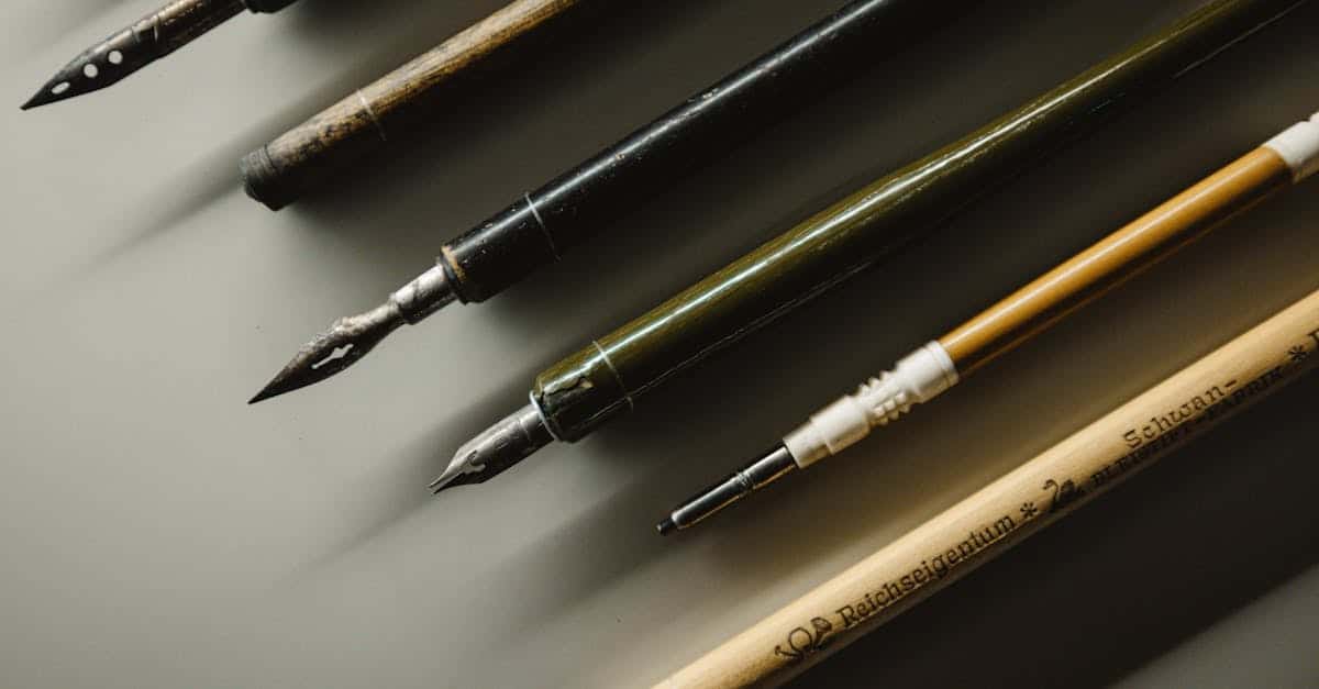
Essential Calligraphy Tools and Materials
You do not need to spend a fortune to start learning calligraphy letters. Here is what you need, organized from essential to nice-to-have.
Pens and Nibs
For broad-edge calligraphy (Italic, Gothic): Start with a Pilot Parallel Pen, which is an affordable, cartridge-fed calligraphy pen that produces excellent results straight out of the box. The 3.8mm size is ideal for beginners. If you prefer a traditional dip pen setup, a Speedball C-series nib (C-2 or C-3) paired with a standard straight holder is a reliable starting point.
For pointed pen calligraphy (Copperplate, Modern): Begin with a Nikko G nib, which is moderately flexible and very durable, making it forgiving for beginners. Pair it with a straight pen holder (for modern calligraphy) or an oblique pen holder (for Copperplate, which benefits from the angled approach). The Speedball oblique holder is an affordable starter option.
For brush pen calligraphy: Tombow Dual Brush Pens and Pentel Fude Touch Sign Pens are popular entry-level choices. They are convenient, require no ink mixing, and let you practice pressure-based thick-thin variation without managing a dip pen setup.
Ink
For dip pen calligraphy, Sumi ink and Higgins Eternal are two reliable, beginner-friendly options. Sumi ink is deeply black and flows smoothly but is not waterproof when dry. Higgins Eternal is waterproof when dry and works well on most papers. Avoid India ink in dip pens, as many India ink formulations contain shellac that can clog and damage nibs.
For brush pens, the ink is built into the pen, so there is nothing additional to buy.
Paper
Paper quality matters more than most beginners realize. Inexpensive printer paper is too absorbent and will cause ink to bleed and feather, making clean letterforms impossible. For practice, Rhodia pads and HP Premium LaserJet paper are affordable options with smooth surfaces that prevent feathering. For finished work, look for cotton rag papers or papers specifically marketed for calligraphy and ink work.
Laser printer paper works well because it has a smooth, coated surface. Inkjet paper, by contrast, is designed to absorb ink and will cause bleed-through with dip pen work.
Additional Supplies
- Guidelines: Printed guideline sheets that you place under your practice paper. You can generate custom guidelines at sites like Calligrapher.com or use pre-made templates.
- Light pad: A thin LED light pad placed under your paper makes printed guidelines visible through even medium-weight paper.
- Water cup and paper towels: For cleaning nibs between ink dips and at the end of practice sessions.
- Nib cleaner or old toothbrush: Dried ink buildup on nibs affects ink flow and must be cleaned regularly.
- Ruler and pencil: For drawing guidelines directly on practice paper.
Basic Strokes: The Foundation of Calligraphy Letters
Every calligraphy letter is built from a small set of fundamental strokes. Mastering these strokes before attempting full letters is the single most important step for beginners. Think of it like learning scales before playing songs on a musical instrument.
Broad-Edge Pen Basic Strokes
With a broad-edge pen, the thick-thin variation happens automatically based on the direction of your stroke relative to the nib angle. Hold the nib at a consistent 45-degree angle and practice these strokes:
Downstroke: Pull the pen straight down. At 45 degrees, this produces a medium-width stroke. Keep the pressure consistent and the movement controlled.
Horizontal stroke: Pull the pen from left to right. This produces a medium-width line similar to the downstroke at 45 degrees.
Diagonal thin stroke: Pull the pen from upper-left to lower-right. This aligns with the nib edge and produces the thinnest possible line.
Diagonal thick stroke: Pull the pen from upper-right to lower-left. This moves perpendicular to the nib edge and produces the thickest possible line.
The “O” shape: Starting at the 11 o’clock position, draw a counter-clockwise oval. The thick-thin transition should happen naturally as the stroke direction changes relative to the nib angle. The thickest parts should be at roughly 7 o’clock and 1 o’clock positions.
Branching arches: Starting at the top of a downstroke, curve outward and then back down to form an arch. This is the foundational movement for letters like “n,” “m,” “h,” and “u” in Italic calligraphy.
Pointed Pen Basic Strokes
With a pointed pen, the thick-thin variation comes from pressure. Light pressure keeps the tines together for a thin hairline. Increased pressure splays the tines apart for a thicker stroke.
Hairline upstroke: Using very light pressure, pull the pen upward at a 55-degree angle. The line should be as thin as possible.
Full pressure downstroke: Apply firm, even pressure as you pull straight down. The line should be at its maximum width throughout the stroke, with consistent edges.
Swell stroke (underturn): Start with full pressure at the top, pull down, and gradually release pressure as you curve at the bottom and transition into an upstroke. This is the basic “u” shape movement.
Overturn stroke: Start with light pressure on an upstroke, curve over the top, and gradually apply pressure as you transition into a downstroke. This is the basic arch movement.
Oval: A combination of pressure-applied curves forming a closed oval shape. Start thin at the top, thicken on the left side downstroke, thin at the bottom, and thicken again on the right side. This forms the basis of letters like “o,” “a,” “d,” “g,” and “q.”
Compound curve: An “S” shape that transitions from a pressured downstroke to a hairline upstroke and back to a pressured downstroke. This is one of the most challenging basic strokes and forms the foundation of letters like “s” and connections between letters.
Calligraphy Letters: A Beginner Alphabet Walkthrough
We will walk through a simplified Italic lowercase alphabet, which is the best starting script for most beginners. These calligraphy letters use a broad-edge pen at a 45-degree angle with a slight forward slant.
Letter Groups by Shape
Rather than learning the alphabet from A to Z, calligraphy is best learned in groups of letters that share structural similarities.
Group 1: The straight-stroke letters (i, l, t)
Start with the simplest letters. The “i” is a single downstroke with a dot. The “l” is a taller downstroke that begins at the ascender line. The “t” is a downstroke that extends slightly above the waist line, crossed with a short horizontal stroke. These three letters teach you consistent stroke weight, even spacing, and baseline alignment.
Group 2: The arch letters (n, m, h, r, b, p, k)
These letters use the branching arch stroke. The “n” starts with a downstroke, then a branching arch that flows into a second downstroke. The key is making the arch spring naturally from the first stroke about two-thirds of the way up. The “m” adds a second arch. The “h” starts from the ascender line. The “r” is an incomplete arch. Practice the branching movement repeatedly before attempting these letters.
Group 3: The round letters (o, c, e, d, g, q)
These letters are built on the oval shape. The “o” is a full oval. The “c” is an open oval, stopping before the closure. The “e” adds a horizontal stroke inside the curve. The “d” adds an ascender to the oval. The “g” and “q” add descenders. Getting the “o” right is critical because its shape determines the consistency of every round letter in your alphabet.
Group 4: The diagonal letters (v, w, x, y, z)
Diagonal letters require careful attention to the interplay between thin upstrokes and thick downstrokes. The “v” is a thin diagonal stroke followed by a thick diagonal stroke. The “w” doubles this pattern. The “x” crosses two diagonal strokes. The “y” adds a descending curve. The “z” is built from horizontal strokes connected by a thick diagonal.
Group 5: The special letters (a, s, f, g, j, u)
Some letters do not fit neatly into the groups above. The “a” combines a round form with a straight stroke. The “s” requires a compound curve that challenges beginners. The “f” has both an ascender and a descender in many Italic styles. Practice these individually, giving extra attention to the “s,” which is often the last letter beginners feel confident with.
Uppercase Calligraphy Letters
Uppercase (capital) calligraphy letters are typically taller than the lowercase ascenders and use more decorative strokes. In Italic calligraphy, capitals are based on Roman capital letter proportions but written with the same broad-edge nib at approximately 45 degrees.
A few key principles for uppercase calligraphy letters:
- Capital letters should be slightly shorter than the full ascender height of your lowercase letters.
- Keep them simple at first. Ornate swashed capitals are beautiful but come after you have mastered the basic forms.
- Pay attention to the width proportions: letters like M and W are wider, while letters like E, F, and L are narrower.
- The entry stroke (the first stroke of each capital) sets the tone, so practice beginning each letter with confidence.
Common Calligraphy Mistakes and How to Fix Them
Inconsistent Letter Slant
If your letters lean at different angles, use a guideline sheet with slant lines printed at your target angle (5 to 10 degrees for Italic, 55 degrees for Copperplate). Place it under your practice paper so the slant lines are visible as a reference for every stroke.
Shaky Strokes
Shaky lines usually come from drawing with your fingers instead of moving your whole arm. Calligraphy strokes should originate from your shoulder and forearm, not your wrist or fingers. Your fingers hold the pen steady while your arm provides the movement. Practice large, sweeping strokes on newsprint to develop this muscle memory.
Inconsistent Stroke Weight
For broad-edge calligraphy, inconsistent thick-thin variation means your nib angle is drifting. Consciously reset to your target angle (45 degrees for Italic) before every stroke until maintaining the angle becomes automatic. For pointed pen work, inconsistent weight means your pressure control needs more practice. Dedicate entire sessions to just the basic pressure exercises.
Poor Spacing
Spacing in calligraphy is about visual evenness, not mathematical uniformity. The space between two straight strokes (like “n” and “i”) should be wider than the space between a straight stroke and a curved stroke (like “n” and “o”), which should be wider than the space between two curved strokes (like “o” and “c”). The goal is to create even “color,” meaning the density of dark ink and white space feels consistent across a line of text.
Ink Flow Problems
New nibs often have a thin coating of manufacturing oil that repels ink. Before first use, clean new nibs with soapy water or briefly pass them through a flame to burn off the coating. During use, if ink stops flowing, dip the nib a bit deeper. If ink floods and creates blobs, you are dipping too deep or the ink is too thin.
Practice Progression: Advancing Your Calligraphy Letters
Week 1-2: Basic Strokes
Spend the first two weeks exclusively on basic strokes. Fill pages with downstrokes, arches, ovals, and pressure exercises. This feels tedious, but it builds the muscle memory that makes letter formation feel natural later. Aim for at least 20 minutes of practice daily.
Week 3-4: Letter Groups
Introduce letters in the groups described above, starting with the simplest straight-stroke letters and progressing to the more complex forms. Write each letter repeatedly in rows, focusing on consistency between repetitions rather than speed.
Week 5-6: Words and Connections
Begin writing short words, paying attention to letter spacing and connections. Start with simple words that use the letters you are most confident with, then gradually introduce more challenging letter combinations. Writing the same word repeatedly helps you identify spacing and connection issues.
Week 7-8: Sentences and Compositions
Progress to writing full sentences and short paragraphs. This introduces line spacing and the challenge of maintaining consistency across multiple lines. Start planning simple compositions: a quote, a name, or a short poem centered on a page.
Beyond: Style Development
After two months of consistent practice, you will have a solid foundation in your chosen script. From here, you can explore variations: different nib sizes, flourishing, color, and mixing styles. Many calligraphers also learn multiple scripts, using Italic as a foundation before exploring Copperplate or Gothic. Consider joining online calligraphy communities on Instagram or Reddit where you can share work, receive feedback, and find inspiration.
Digital Resources for Learning Calligraphy Letters
While calligraphy is fundamentally a hands-on skill, digital resources can accelerate your learning.
Printable guide sheets are available from many calligraphy educators. These sheets provide pre-printed guidelines with the correct proportions, slant angles, and letter exemplars for specific scripts.
Video tutorials on YouTube are invaluable because you can see exactly how a skilled calligrapher holds the pen, applies pressure, and forms each stroke. Watching in slow motion is especially helpful for understanding the movements.
iPad calligraphy using apps like Procreate with pressure-sensitive brushes provides a convenient way to practice letter formation without managing ink and paper. While it does not replace the feel of a real nib on paper, digital practice is a useful supplement, especially for exploring composition and layout.
For those interested in the typographic side of calligraphy, exploring fonts inspired by calligraphic lettering can provide inspiration. Resources like Fontshare [LINK: /fontshare/] offer beautifully designed typefaces that draw on calligraphic traditions.
Frequently Asked Questions
What is the easiest calligraphy style for beginners?
Italic calligraphy is generally considered the easiest style for beginners. It uses a broad-edge nib at a consistent 45-degree angle, and the thick-thin variation happens automatically based on stroke direction. The letterforms are logical, the tools are forgiving, and the results look elegant even at an early skill level. Modern brush calligraphy with brush pens is another accessible starting point since it requires less equipment setup than dip pen work.
How long does it take to learn calligraphy letters?
With consistent daily practice of 20 to 30 minutes, most beginners can produce attractive individual letters within two to four weeks and confident words and short phrases within six to eight weeks. Developing a truly polished, personal style takes months to years of ongoing practice. Calligraphy is a skill where the learning never really stops; even experienced calligraphers continue refining their letterforms and exploring new techniques.
What tools do I need to start learning calligraphy?
At minimum, you need a calligraphy pen and smooth paper. For broad-edge calligraphy, a Pilot Parallel Pen (3.8mm) and a Rhodia pad are an excellent, affordable starting kit. For pointed pen calligraphy, a Nikko G nib, a straight pen holder, a bottle of Sumi ink, and smooth laser printer paper will get you started for under twenty dollars. Printed guideline sheets placed under your practice paper help maintain consistent letter proportions.
What is the difference between calligraphy and lettering?
Calligraphy is writing: letters are formed in real-time with continuous strokes using a pen or brush, and the result has the natural rhythm and slight imperfections of a hand-written process. Lettering is drawing: letters are constructed through multiple strokes, often sketched in pencil first and refined over multiple passes. Lettering allows for corrections and adjustments that calligraphy does not. Both are valid art forms, and many artists practice both.
Can I learn calligraphy left-handed?
Absolutely. Left-handed calligraphers may need to adjust their approach slightly. For broad-edge calligraphy, many left-handed writers find success using an underwriting position (writing with the hand below the line of text) or using left-oblique nibs designed for left-handed use. For pointed pen calligraphy, left-handed oblique pen holders are available that angle the nib correctly. Many accomplished calligraphers are left-handed, so do not let hand dominance discourage you from learning.


