What Font Does Stones Throw Use?
If you are searching for the stones throw font, you want the bold wordmark of Stones Throw Records — the influential Los Angeles independent label founded by Peanut Butter Wolf, home to J Dilla, Madlib, MF DOOM collaborations, and a beloved hip-hop and crate-digging catalog. The honest answer up front: that logo is custom-drawn brand lettering, not a released font, so there is no file called “Stones Throw” to install. The mark is bold and characterful, with the kind of confident, slightly vintage feel that suits a label rooted in vinyl culture and soulful sampling. This guide breaks down what the wordmark actually is, why it leans bold, and which free fonts get you closest without copying the trademark.
What font is the Stones Throw logo?
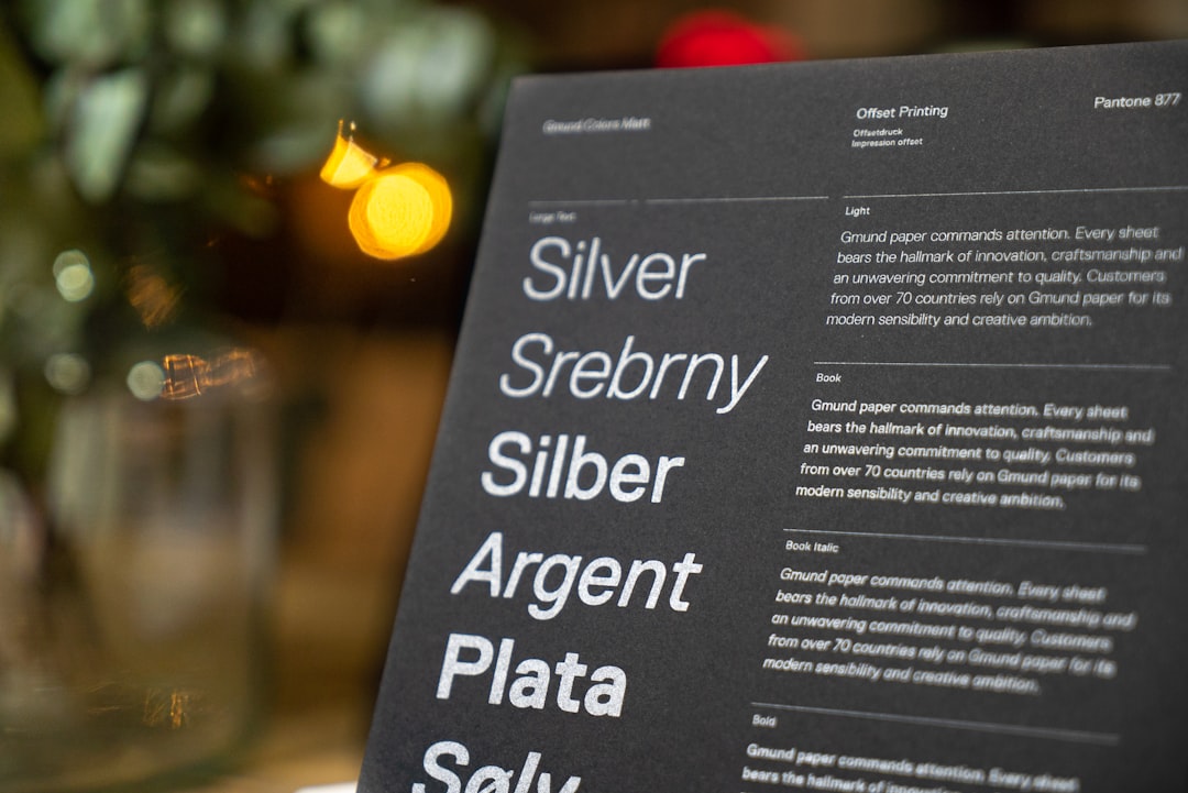
The Stones Throw logo is best read as custom, bold lettering rather than a font you can grab off a shelf. The mark uses strong, confident letterforms with solid weight and a character that nods to vintage record-label and crate-digging aesthetics. The forms read as punchy and grounded rather than slick or generic, giving the name a memorable presence on a record sleeve or a tour poster. That bold, slightly retro quality is the whole point: it feels rooted in vinyl culture rather than corporate or cold.
Because the wordmark was drawn and spaced specifically for the brand, treat any precise font attribution as an informed observation, not a confirmed spec. What we can say is that it sits in the bold display family with a vintage lean rather than being any one downloadable file. If it were a plain stock typeface, the personality and balance would not hold together the way the mark does. The honest framing: treat the Stones Throw wordmark as custom bold lettering, not a confirmed commercial font.
What typeface does Stones Throw use in its branding?
Across record sleeves, merch, advertising, and the label’s website, Stones Throw keeps its bold custom wordmark while pairing it with clean, legible sans faces for supporting material — release info, tracklists, store copy, and body text. The logo carries the personality; the functional type stays quiet so the whole design reads clearly. This split between a characterful mark and neutral supporting type is standard for labels with a deep, art-driven catalog.
So if you want to mirror the full identity, you need two decisions: one bold display face for the logo-style headline, and one calm, well-spaced sans for paragraphs and labels. Setting body copy in a heavy display weight is the most common mistake people make when chasing this bold, vintage-leaning look. For more brand breakdowns, see our famous brand fonts hub.
Free fonts that look like the Stones Throw font
No free font will match the wordmark exactly, but several capture its bold, vintage-leaning spirit well enough for a poster, a mockup, or a fan project. Bold names below are free alternatives you can search for and license accordingly.
| Use case | Stones Throw uses | Free alternative |
|---|---|---|
| Logo / wordmark feel | Bold vintage display | Alfa Slab One or Archivo Black |
| Headline / display | Heavy characterful sans | Anton or Oswald |
| Body / supporting | Clean readable sans | Inter or Work Sans |
Alfa Slab One is a strong starting point: it is a free, bold slab serif with a grounded, vintage character that shares the wordmark’s rooted, crate-digging feel. Scale it and tune the spacing to match. Archivo Black gives a cleaner, more commanding tone if you want display punch without slabs, while Anton delivers condensed, poster-ready weight. Pair any of these with Inter or Work Sans for body copy. The goal is bold, characterful warmth, so let the weight and a touch of vintage flavor carry the look. For related label marks, compare the cleaner Domino font and the heavier Sub Pop font breakdowns.
Why does Stones Throw use this kind of type?
A bold, vintage-leaning style does real branding work for a hip-hop and crate-digging label. Strong, characterful letterforms read as confident, soulful, and rooted in record culture — exactly the tone for a label built on vinyl sampling, deep crates, and a strong creative identity. A thin or sterile face would feel disconnected from that world; the bold wordmark feels grounded and authentic, which fits the label’s reputation for music with depth and history.
There is a practical argument too. A bold mark stays legible at any size, from a sticker to a festival banner, and sits well next to the striking, often art-led artwork the label’s records carry. Because each release has its own look, the consistent strong logo gives the catalog a recognizable anchor without competing with each cover. That balance of personality and flexibility is exactly why labels favor a confident, characterful wordmark.
Can I use the Stones Throw font for my own project?
You can recreate the style, but not the actual logo. The Stones Throw name and wordmark are protected brand assets owned by the label, so copying them for merch, a business, or anything implying affiliation is off-limits — a trademark issue, not just a font one. Even a “Stones Throw font” file you find online is at best an unofficial recreation and is not licensed for commercial use.
What you can do is use a legitimately licensed free font like the options above to build your own original bold wordmark with a similar mood. Before shipping anything commercial, confirm the license on whatever font you pick — our font licensing guide covers desktop, web, and embedding rights so you stay safe.
Frequently Asked Questions
Is the Stones Throw font free to download?
No. The Stones Throw logo is custom brand lettering, not a released font, so there is no official free download. Any file labeled “Stones Throw font” online is an unofficial recreation. Use a free font like Alfa Slab One or Archivo Black for a similar bold look, and check its license before any commercial use.
What font is closest to the Stones Throw logo?
A bold, vintage-leaning display face comes closest. Alfa Slab One and Archivo Black, both free, capture the strong, grounded letterforms of the wordmark, while Anton adds condensed punch. None is identical, since the logo is custom-drawn, but with the right spacing they get convincingly close for posters and fan projects.
Is the Stones Throw logo a font or custom lettering?
Treat it as custom lettering, not a stock typeface. The label has never published a public type spec for download, so the exact origin is unconfirmed — an informed observation, not a documented fact. The safest description is bespoke bold brand lettering drawn specifically for Stones Throw Records.
Can I use a Stones Throw-style font commercially?
You can use a free look-alike font commercially if its license allows, but you cannot reproduce the trademarked Stones Throw wordmark on products you sell. Style your own text in a free bold display font instead of copying the brand mark, and verify both the font license and trademark rules first.


