Didot Font: Elegance in Typography
The Didot font represents one of the most dramatic and elegant developments in the history of Western typography. Created by Firmin Didot in the late eighteenth century in Paris, this typeface defined what we now call the Didone classification — a style characterized by extreme contrast between thick and thin strokes, razor-sharp unbracketed serifs, and an unwavering vertical stress. For over two centuries, the Didot font has been the typographic voice of luxury, fashion, and cultural authority, gracing the mastheads of the world’s most iconic magazines and the identities of the most prestigious brands.
Understanding Didot means understanding a pivotal moment in type history: the shift from old-style and transitional forms to the radically modern letterforms of the late Enlightenment. This review traces Didot’s journey from eighteenth-century French printing to twenty-first-century fashion editorials, examining what makes it endure and when its extreme aesthetics become a liability.
The History of Didot Font and the Didot Printing Dynasty
The story of Didot is inseparable from the story of the family that created it. The Didot dynasty was one of the most influential families in French printing history, spanning several generations and shaping nearly every aspect of the book arts in France.
The Didot Family
Francois Didot founded the family printing business in 1713. His sons, Francois-Ambroise and Pierre-Francois, expanded the enterprise into type founding and paper manufacturing. Francois-Ambroise Didot developed the Didot point system — the typographic measurement standard still used in continental Europe — and created typefaces that began to push beyond the transitional style of his contemporaries.
But it was Francois-Ambroise’s son, Firmin Didot (1764–1836), who created the typeface we now know as Didot. Working in the 1780s and 1790s, Firmin pushed the contrast between thick and thin strokes to its extreme, producing letterforms that were as much about visual drama as they were about readability. His types reflected the neoclassical aesthetic of the era — rational, precise, and boldly geometric — and they were a radical departure from the warmer, more calligraphic forms that had dominated European typography for centuries.
The Enlightenment Context
Didot’s type did not emerge in a vacuum. The late eighteenth century was the age of the Enlightenment, a period that prized reason, clarity, and the systematic organization of knowledge. In typography, this manifested as a movement toward greater regularity and mathematical precision in letterforms. The printing press was no longer just a tool for reproducing text; it was an instrument of intellectual and aesthetic refinement.
Advances in paper production (smoother, whiter sheets) and printing technology (more precise presses with greater pressure control) made it possible to reproduce the extreme hairlines that define Didot’s style. Earlier printing technology would have crushed those delicate strokes. Didot’s types were, in a very real sense, enabled by the industrial progress of the age.
The French Revolution and its aftermath also played a role. Didot types were used for official government documents and the monumental publications of the Napoleonic era, cementing their association with authority and grandeur. The Didot foundry printed editions of Virgil, Horace, and Racine that remain among the most beautiful books ever produced in France.
Design Characteristics of the Didot Font
The Didot font is the archetype of the Didone classification — a term coined by twentieth-century type historians by combining “Didot” and “Bodoni,” the two most prominent typefaces in this style. The defining characteristics are unmistakable:
Extreme Thick-Thin Contrast
The most striking feature of Didot is the dramatic difference between thick and thin strokes within each letter. Vertical strokes are bold and substantial. Horizontal strokes, connectors, and serifs are reduced to hairlines — strokes so fine they barely register at small sizes. This contrast creates a dazzling visual rhythm on the page, particularly in display settings where the interplay of weight can be fully appreciated.
Unbracketed Hairline Serifs
Unlike transitional serifs (Baskerville, for instance) that feature gradual brackets connecting the serif to the main stroke, Didot’s serifs attach at right angles with no transition. These are pure geometric elements — flat, thin, and precise. They give the letterforms a crystalline quality that is both beautiful and unforgiving. Any imprecision in reproduction is immediately visible.
Vertical Stress
In old-style typefaces, the axis of thick-thin contrast is tilted, reflecting the angle of a calligrapher’s pen. In Didot, the stress is perfectly vertical. The thickest parts of round letters like “o” fall at the exact sides of the letterform, while the thinnest parts align precisely at top and bottom. This vertical emphasis contributes to Didot’s rational, constructed appearance.
Ball Terminals
Letters with curved terminals — the “a,” “c,” “f,” “r,” and “y” — feature ball-shaped endings that add a touch of elegance and visual punctuation. These circular forms echo the geometric precision of the overall design and provide subtle points of interest within the text.
Overall Impression
Reading Didot at display sizes is an experience of visual luxury. The rhythmic alternation of heavy verticals and gossamer horizontals creates a shimmering, high-contrast texture that no other classification of type can match. It is authoritative without being aggressive, elegant without being fussy, and modern despite being over two centuries old.
Didot Font vs. Bodoni: The Great Comparison
No discussion of Didot is complete without addressing its Italian counterpart, Giambattista Bodoni’s eponymous typeface. The two are often mentioned in the same breath, and for good reason — they share the Didone classification and were developed during the same period. But meaningful differences separate them.
Bodoni, created in Parma, Italy, tends to be slightly warmer in character. Its stroke contrast, while still extreme, is marginally less severe than Didot’s. Bodoni’s letterforms often feel rounder and more generous, with a touch more personality in their curves. The serifs are similarly unbracketed but sometimes carry a slightly heavier weight. [LINK: /bodoni-font/]
Didot is the colder, more austere of the two. Its hairlines are thinner, its geometry more rigid, its overall impression more calculated. If Bodoni is an Italian aria — passionate and full-voiced — Didot is a French sonata — precise, intellectual, and restrained.
In practice, the choice between them often comes down to tone. Bodoni feels more approachable and is generally easier to use across a range of contexts. Didot demands more restraint and is most effective when deployed with confidence in fashion, luxury, and editorial contexts where its severity is an asset rather than a limitation.
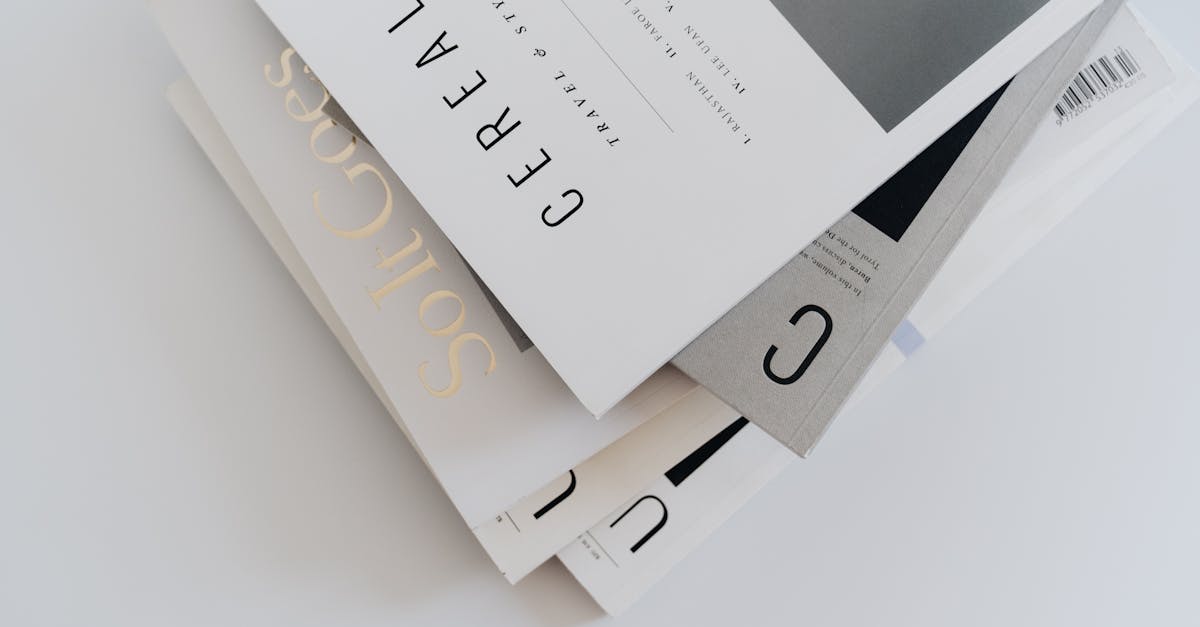
The Didot Font in Fashion and Editorial Design
If any typeface can claim to own the fashion industry, it is Didot. The association between high-contrast Didone serifs and luxury fashion is so strong that it has become almost impossible to separate the two in the public imagination.
Magazine Mastheads
Vogue, the most influential fashion magazine in the world, has used Didone-style typography as a defining element of its visual identity for decades. The extreme contrast and elegant proportions of Didot and Bodoni variants perfectly embody the magazine’s aspirational aesthetic — refined, authoritative, and unmistakably luxurious.
Harper’s Bazaar, Vogue’s chief rival, also relies on Didone typography in its editorial design, reinforcing the classification’s dominance in the fashion publishing world.
Broadcast and Corporate Identity
The CBS television network’s wordmark, designed by William Golden in the 1950s, uses a Didone-style typeface that evokes the same qualities of authority and sophistication. The logo has remained remarkably consistent for over half a century — a testament to the timeless quality of the Didone aesthetic.
Fashion Houses and Luxury Brands
Numerous fashion houses and luxury brands have adopted Didone typefaces for their logotypes and brand identities. The extreme contrast and classical proportions signal heritage, craftsmanship, and exclusivity — precisely the values that luxury brands seek to communicate. When a brand wants to say “we are serious about quality and taste,” Didot delivers that message with remarkable efficiency.
Modern Digital Versions of the Didot Font
Several digital interpretations of Didot are available, each with its own strengths and character:
Linotype Didot
Linotype’s digital Didot is one of the most widely available commercial versions. It is a faithful interpretation of the historical design, offering a range of styles suitable for editorial and display use. The Linotype version is the one most people encounter when they select “Didot” from a font menu, and it performs well for headlines, titles, and other display applications.
HTF Didot by Hoefler & Co.
Jonathan Hoefler’s HTF Didot is widely regarded as the finest digital interpretation of the Didot style. Rather than digitizing a single historical source, Hoefler created a family of Didots based on extensive research into the original punches and specimens, offering multiple optical sizes that restore the subtle weight variations that Firmin Didot built into his types for different text sizes. The result is a family of extraordinary refinement that captures the spirit of the original while meeting the demands of contemporary design. HTF Didot is a premium commercial typeface available through typography.com.
Theano Didot
For designers working on a budget, Theano Didot offers a free, open-source alternative. Designed by Alexey Kryukov, it is a competent interpretation of the Didone style, though it lacks the refinement and range of the commercial versions. It is available in a single weight, which limits its utility, but for basic display use — a headline, a title, a pull quote — it can serve admirably.
GFS Didot
The Greek Font Society’s GFS Didot is another free option with excellent Greek character support, reflecting the Didot family’s historical connection to Greek typography. Firmin Didot himself cut Greek types for the French government, and this digital revival honors that legacy.
Best Didot Font Pairings
Pairing Didot successfully requires a delicate hand. Its extreme personality dominates any composition, so companion typefaces need to be understated enough to let Didot shine without competing for attention.
Didot + Futura
This is the classic fashion-magazine pairing. Futura’s geometric simplicity provides a clean, modern counterpoint to Didot’s drama. Use Didot for headlines and Futura for body text, captions, and supporting elements. The pairing balances historical elegance with twentieth-century modernism. [LINK: /futura-font/]
Didot + Gill Sans
Gill Sans offers a more humanist alternative to Futura, with slightly warmer letterforms and a more organic rhythm. Paired with Didot, it creates a sophisticated combination that feels less stark than the Didot-Futura pairing while maintaining a strong sense of refinement.
Didot + Avenir
Adrian Frutiger’s Avenir is a geometric sans serif with exceptional legibility and quiet elegance. As a body typeface alongside Didot headings, it provides excellent readability without drawing attention away from the serif’s visual impact. This pairing works well for editorial design, lookbooks, and luxury brand collateral.
Didot + Proxima Nova
For digital contexts, Proxima Nova’s screen-optimized forms make it a practical partner for Didot. The combination translates the classic fashion-editorial aesthetic to web design, though designers should be cautious about Didot’s hairlines at small screen sizes. [LINK: /proxima-nova-font/]
Alternatives to the Didot Font
If Didot’s extreme contrast is too severe for your project — or if you need a typeface with better performance at smaller sizes — several alternatives offer related aesthetics with different trade-offs:
Bodoni: The most obvious alternative. Marginally warmer and more versatile, Bodoni is available in numerous digital versions, including free options like Bodoni Moda on Google Fonts. [LINK: /bodoni-font/]
Noe Display: Schick Toikka’s Noe Display captures the drama of Didone types with a more contemporary sensibility. Its contrast is high but not as extreme as Didot, making it more forgiving in digital contexts. [LINK: /noe-display-font/]
Baskerville: For designers who want elegance without the extreme contrast, Baskerville offers a transitional serif with moderate thick-thin variation, bracketed serifs, and excellent readability across sizes. It is the sophisticated choice when Didot would be too dramatic. [LINK: /baskerville-font/]
Playfair Display: A free Google Fonts option inspired by the Didone tradition. Playfair Display adapts the high-contrast aesthetic for screen use, with slightly sturdier hairlines that survive better at smaller sizes. It lacks Didot’s extreme refinement but compensates with practical usability. [LINK: /playfair-display-font/]
Cormorant Garamond: While technically a Garamond revival, Cormorant’s elegant proportions and refined curves can scratch a similar aesthetic itch as Didot in certain display contexts, with the advantage of being a free, open-source font with extensive weight coverage.
Accessibility and Practical Considerations for the Didot Font
Didot’s greatest strength — its extreme thick-thin contrast — is also its most significant limitation. Those hairline strokes create real accessibility and usability challenges that designers must address.
Small Size Legibility
At body text sizes (roughly 9–14pt in print, 14–18px on screen), Didot’s hairlines can become invisible or break apart, especially on low-resolution displays, when printed on textured paper, or when viewed by readers with visual impairments. This is not a body text typeface. It is a display typeface that performs best at 24pt and above.
Screen Rendering
Web browsers and operating systems render thin strokes inconsistently. On high-resolution Retina displays, Didot’s hairlines can look stunning. On standard-resolution monitors, they may appear fuzzy, uneven, or simply disappear. Any web design that uses Didot must be tested across multiple screen types and resolutions.
Color and Contrast
Didot requires high contrast between text and background to remain legible. Black on white (or near-white) is the safest combination. Reversed out of a dark background, the hairlines can glow or bleed, depending on the rendering context. Colored text against colored backgrounds should be approached with extreme caution.
Print Reproduction
In print, Didot demands high-quality paper and precise press calibration. Rough or absorbent paper stocks will cause hairlines to feather and fill, destroying the contrast that defines the typeface. Didot is a typeface for coated stock and premium printing — not for newsprint or everyday laser printing.
Frequently Asked Questions
Is the Didot font free to use?
It depends on the version. Premium digital interpretations like HTF Didot from Hoefler & Co. and Linotype Didot require commercial licenses. Free alternatives exist, including Theano Didot and GFS Didot, which are open-source typefaces that capture the Didone aesthetic. These free versions are more limited in terms of weights and features but can work well for display use in personal and commercial projects.
What is the difference between a Didot font and a Bodoni font?
Both Didot and Bodoni belong to the Didone classification and share extreme thick-thin contrast, vertical stress, and unbracketed serifs. The key differences are subtle: Didot, originating in France, tends to be slightly more austere and rigid, with thinner hairlines and a cooler overall character. Bodoni, from Italy, is generally a touch warmer, with slightly more generous curves and marginally heavier thin strokes. The choice between them often comes down to tone and context.
Can you use Didot font for body text?
Didot is not recommended for body text. Its extreme thin-thick contrast means that hairline strokes can become illegible at small sizes, particularly on screen. Didot performs best as a display typeface — for headlines, titles, pull quotes, and other large-scale applications where its dramatic contrast can be fully appreciated. For body text in a similar style family, consider a transitional serif like Baskerville, which offers elegance with significantly better small-size readability.
Why is Didot associated with fashion magazines?
Didot’s association with fashion began in the mid-twentieth century when publications like Vogue and Harper’s Bazaar adopted Didone-style serifs for their mastheads and editorial typography. The extreme contrast and refined proportions of Didot communicate luxury, authority, and sophistication — values that align perfectly with the fashion industry’s brand identity. Over decades of consistent use, the association has become self-reinforcing: we associate Didone types with fashion because fashion publications use them, and fashion publications use them because they signal elegance and prestige.
What typefaces pair well with Didot?
Didot pairs best with simple, understated sans serifs that don’t compete with its drama. Futura, Gill Sans, and Avenir are classic pairings. The principle is contrast through restraint — the companion typeface should be quiet and legible, allowing Didot to serve as the visual focal point. Avoid pairing Didot with other high-contrast or decorative typefaces, as the combination will feel cluttered and competing.


