Recoleta Font: Review & Pairing Guide
The Recoleta font is a warm, retro-inspired serif that has become one of the most recognizable typefaces in contemporary branding and digital design. Designed by Jorge Cisterna and released by the Chilean foundry Latinotype, Recoleta channels the soft, rounded energy of 1970s display typography while delivering the weight range, language support, and technical refinement that modern designers need. Its ball terminals, rounded serifs, and organic curves recall the spirit of Cooper Black, but Recoleta is more refined, more versatile, and better suited to the full range of contemporary design applications. Whether you have seen it on Mailchimp’s former branding, Bumble’s dating app, or dozens of direct-to-consumer brands, you have encountered one of the decade’s most influential typefaces.
Recoleta Font: Quick Facts
- Designer: Jorge Cisterna
- Foundry: Latinotype
- Release Year: 2018
- Classification: Retro / Soft Serif
- Weights: Thin, Light, Regular, Medium, Semibold, Bold, Black
- Best For: Branding, display, packaging, lifestyle, editorial headlines
- Price: Available on MyFonts and Adobe Fonts
- Notable Users: Mailchimp (former branding), Bumble
History and Origin of the Recoleta Font
The Recoleta font was created by Jorge Cisterna at Latinotype, a Chilean type foundry that has built a reputation for producing commercially successful, trend-aware typefaces. Latinotype’s catalog includes dozens of popular families, but Recoleta stands out as their most culturally impactful release.
Cisterna designed Recoleta as a modern interpretation of the soft serif style that dominated display typography in the 1960s and 1970s. The primary historical reference point is Cooper Black, Oswald Bruce Cooper’s 1922 design that became synonymous with the visual culture of the 1970s through its widespread use in advertising, record albums, and signage. Cooper Black’s ultra-bold weight, rounded forms, and ball terminals gave it a friendly, almost edible quality that appealed to the counterculture and mainstream alike.
But Cooper Black, for all its charm, has significant limitations as a design tool. It exists in essentially one weight (Black), its proportions are quirky and sometimes awkward, and its digital versions vary in quality. Cisterna saw an opportunity to capture Cooper Black’s warmth and personality while creating a fully functional, multi-weight type family that could work across the full range of modern design applications.
The result was Recoleta, released in 2018. The name refers to the Recoleta neighborhood in Buenos Aires, known for its eclectic blend of classical architecture and bohemian culture, a fitting reference for a typeface that blends retro inspiration with contemporary design.
Recoleta’s timing was perfect. By 2018, the pendulum of design trends had swung away from the austere minimalism of the early 2010s toward warmer, more expressive visual identities. Brands were embracing personality, nostalgia, and emotional warmth, and Recoleta offered all three in a polished, ready-to-use package.
Design Characteristics of the Recoleta Font
Understanding what makes the Recoleta font work requires examining its key design features and how they differ from its retro predecessors.
Soft, Rounded Terminals
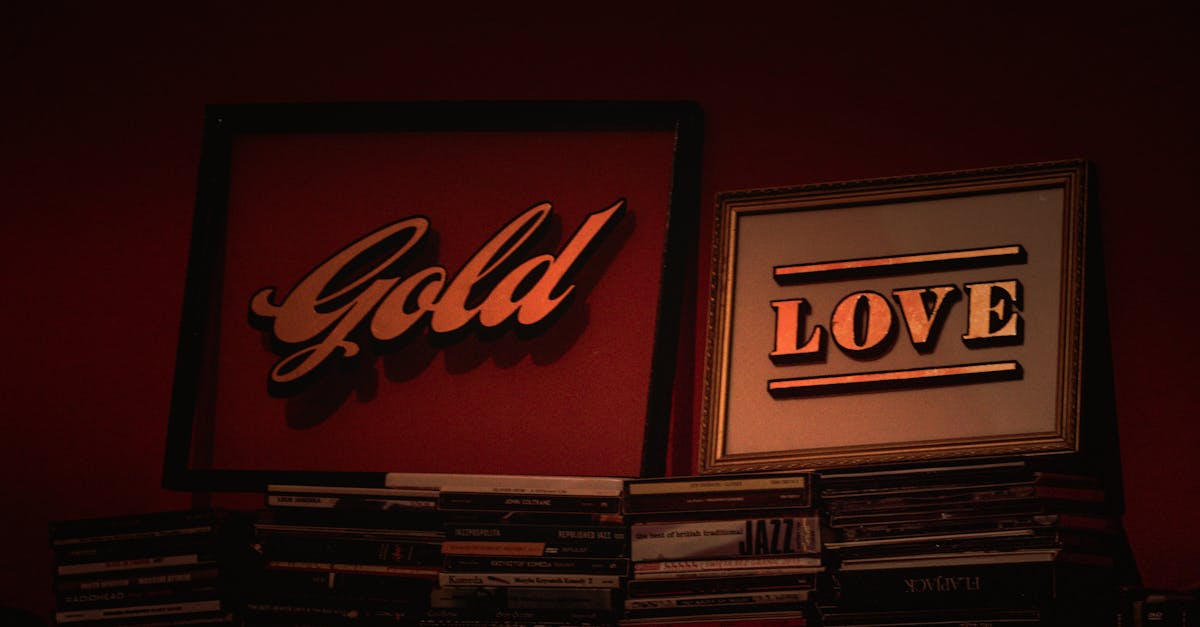
Recoleta’s most distinctive feature is its terminals. Where traditional serifs have sharp, angular terminals, Recoleta’s are soft and rounded. The ends of strokes curve gently into ball-like forms that give each letterform a tactile, almost three-dimensional quality. These ball terminals are present throughout the alphabet, appearing on the “a”, “c”, “e”, “f”, “g”, “j”, “r”, “s”, “y”, and other characters. They are the primary source of the typeface’s warmth and personality.
Organic Curves
Every curve in Recoleta feels organic rather than constructed. The bowls of the “b”, “d”, “p”, and “q” are not geometric circles or ovals but gently flowing forms that feel hand-drawn. The “S” has a relaxed, sinuous shape. The “O” is subtly asymmetric, with weight distribution that varies slightly to create a lively, natural feel. These organic qualities prevent the typeface from feeling mechanical despite its careful construction.
Moderate Contrast
Recoleta has moderate stroke contrast, with visible but not dramatic differences between thick and thin strokes. This level of contrast is important for maintaining readability across the weight range while still giving the lighter weights enough character to be interesting at display sizes. In the heavier weights, the contrast naturally increases, giving Bold and Black their characteristic punch.
Low-Waisted Proportions
Several of Recoleta’s capital letters, particularly the “B”, “E”, “R”, and “S”, feature slightly low-waisted proportions where the crossbar or center element sits below the geometric center. This gives the capitals a grounded, stable quality that contributes to the typeface’s overall warmth and friendliness.
Weight Range
One of Recoleta’s greatest advantages over Cooper Black is its comprehensive weight range, from Thin through Black. The lighter weights (Thin, Light) are elegant and delicate, suitable for large display use where their refined details can be appreciated. The middle weights (Regular, Medium, Semibold) are versatile for subheadings, pull quotes, and short text passages. And the heavier weights (Bold, Black) deliver the full retro impact that makes the typeface so popular for headlines and branding.
Available Weights and Styles in the Recoleta Font Family
The Recoleta font family includes the following weights:
- Recoleta Thin
- Recoleta Light
- Recoleta Regular
- Recoleta Medium
- Recoleta Semibold
- Recoleta Bold
- Recoleta Black
Notably, Recoleta does not include italic variants. This is a deliberate design choice that reflects the typeface’s intended use as a display and headline face rather than a text workhorse. For body text, designers typically pair Recoleta with a separate font that includes italics for emphasis.
A variant called Recoleta Alt exists with alternative characters for certain letterforms, providing additional options for branding and logotype work where character-level differentiation matters.
Recoleta vs. Cooper Black: A Critical Comparison
Because the Recoleta font draws so directly from the Cooper Black tradition, this comparison is essential for understanding what Recoleta brings to the table.
Weight Versatility
Cooper Black is essentially a single-weight typeface. While Cooper comes in a few styles (including Cooper Light and Cooper Italic), the Black weight is the one everyone knows and uses. Recoleta offers seven weights from Thin to Black, allowing designers to create complete hierarchical systems within a single family. This alone makes Recoleta dramatically more versatile.
Refinement
Cooper Black has a chunky, sometimes rough quality that is part of its charm but can feel heavy-handed in refined contexts. Recoleta smooths these rougher edges while retaining the warmth. Its curves are more consistent, its proportions are more balanced, and its overall feel is more polished. This makes Recoleta appropriate for premium branding contexts where Cooper Black might feel too casual.
Readability
Recoleta’s lighter weights (Thin through Medium) offer significantly better readability than anything in the Cooper family. This extends the retro soft-serif aesthetic beyond headlines and logos into subheadings, pull quotes, and short text passages.
Digital Optimization
As a typeface designed in the digital era, Recoleta benefits from modern production standards. Its curves are cleaner, its spacing is more consistent, and it renders better on screen than most digitized versions of Cooper Black.
Famous Uses of the Recoleta Font
Mailchimp
Perhaps the most prominent use of Recoleta was in Mailchimp’s brand refresh around 2018-2019. The email marketing platform used Recoleta as a key part of its new visual identity, appearing in headlines, marketing materials, and advertising. Mailchimp’s use of Recoleta helped bring the typeface to mainstream awareness and cemented its association with friendly, approachable branding. Mailchimp has since evolved its visual identity, but the Recoleta era remains one of the company’s most recognizable design periods.
Bumble
The dating app Bumble has used Recoleta in its branding, where the typeface’s warmth and friendliness align with the app’s brand values of kindness and authenticity. In the context of a dating platform, Recoleta’s soft, approachable character helps create a welcoming visual tone.
Direct-to-Consumer Brands
Recoleta has been widely adopted by DTC brands across categories including food and beverage, wellness, beauty, and lifestyle. Its retro warmth communicates authenticity and personality, qualities that DTC brands rely on to differentiate themselves from larger, more impersonal competitors.
Social Media and Content Design
Recoleta has become popular in social media graphics, Instagram branding, and content design. Its bold weights create eye-catching headlines in the small, scrollable formats that define social media, while its warm personality stands out against the clean, sans-serif-dominated aesthetic of most platforms.
Best Recoleta Font Pairings
The Recoleta font pairs best with clean, modern sans-serifs that provide contrast to its retro warmth without competing for attention.
Recoleta + Poppins
Poppins is a geometric sans-serif with rounded, friendly forms that complement Recoleta’s warmth without clashing. The combination is lively and approachable, working well for lifestyle brands, food companies, and any context that values friendliness. Use Recoleta for headlines and Poppins for body text and UI elements. [LINK: /poppins-font/]
Recoleta + Gilroy
Radomir Tinkov’s Gilroy is a modern geometric sans-serif that provides clean, contemporary contrast to Recoleta’s retro character. This pairing bridges vintage and modern aesthetics effectively and works particularly well for branding and packaging design.
Recoleta + Helvetica Now
Monotype’s Helvetica Now, the 2019 revision of the world’s most famous sans-serif, provides neutral, reliable contrast to Recoleta’s expressiveness. This pairing works well for brands that want personality in their headlines but clean professionalism in their body text and navigation. The contrast between Recoleta’s warmth and Helvetica Now’s neutrality is particularly effective. [LINK: /helvetica-now-font/]
Recoleta + Aktiv Grotesk
Dalton Maag’s Aktiv Grotesk is a versatile grotesque sans-serif that serves as an excellent workhorse alongside Recoleta’s display personality. The pairing is clean and professional while retaining personality through the Recoleta headlines.
Recoleta + Proxima Nova
Mark Simonson’s Proxima Nova provides a clean, neutral foundation for Recoleta headlines. The combination has been popular in web design because both typefaces are widely available through Adobe Fonts. Proxima Nova’s geometric-humanist balance complements Recoleta well. [LINK: /proxima-nova-font/]
Recoleta + DM Sans
DM Sans is a free geometric sans-serif from Google Fonts that pairs naturally with Recoleta. Its clean, open letterforms provide readable body text that does not fight with Recoleta’s decorative headlines. This combination is budget-friendly and works well for web projects.
Recoleta + Work Sans
Wei Huang’s Work Sans is another free Google Font that creates effective contrast with Recoleta. Its slightly grotesque character and generous spacing make it comfortable for body text, and its weight range provides good flexibility. [LINK: /work-sans-font/]
Recoleta + Graphik
For a more premium pairing, Commercial Type’s Graphik provides sophisticated, neutral sans-serif contrast to Recoleta. This combination elevates Recoleta’s retro warmth with Graphik’s refined contemporary character. [LINK: /graphik-font/]
Where to Get the Recoleta Font
MyFonts
Recoleta is available for purchase on MyFonts with desktop, web, app, and ePub licensing options. Individual styles are affordably priced, and the complete family offers a significant discount. MyFonts provides a try-before-you-buy feature that lets you preview Recoleta with your own text.
Adobe Fonts
Recoleta is available through Adobe Fonts as part of any Creative Cloud subscription. This is often the most practical option for designers who already use Adobe products, as it covers both desktop and web use at no additional cost beyond the subscription fee.
Latinotype Direct
You can also purchase Recoleta directly from Latinotype’s website. The foundry occasionally offers promotions and bundles that include Recoleta alongside their other popular families.
Creative Market
Recoleta appears on Creative Market as well, sometimes in bundles with other Latinotype faces. Check for bundle deals that can make the full family more affordable.
Recoleta Font Alternatives
If you love the Recoleta font aesthetic but need something different, these alternatives offer similar warmth and retro character:
Cooper Hewitt (Free)
Cooper Hewitt is a contemporary sans-serif designed for the Cooper Hewitt, Smithsonian Design Museum. While it is a sans-serif rather than a serif, its rounded, friendly forms share some of Recoleta’s warmth. It is available for free and works well for display and branding. Note that despite the name, it is not related to Cooper Black.
Blacker
Zetafonts’ Blacker is a high-contrast serif with dramatic personality. While its design language is different from Recoleta’s (more Didone-influenced than 1970s-inspired), it occupies a similar space as a display serif with strong personality. It is available in Text and Display optical sizes.
Recoleta Alt
If you want to stay within the Recoleta family but need variation, Recoleta Alt provides alternative characters that can give a different feel to logotypes and headlines while maintaining the same fundamental design language.
Fraunces (Free)
Fraunces is a free, open-source “old style” typeface with a playful, expressive character that overlaps with Recoleta’s territory. Its variable font version allows for extensive customization of weight, optical size, and “wonk” (playfulness), making it a versatile free alternative.
Cabinet Grotesk
For a sans-serif alternative that captures Recoleta’s retro warmth, Cabinet Grotesk by INT Works has rounded, friendly forms with 1970s energy. It provides a different texture while working in similar contexts.
GT Super
Grilli Type’s GT Super is a serif with soft, rounded forms and ball terminals that shares Recoleta’s warm, retro spirit. It is more refined and expensive, but it represents a premium alternative for brands that want the same aesthetic with a different execution.
Recoleta Font Use Cases
Brand Identity and Logotypes
Recoleta’s heavier weights (Bold, Black) are particularly effective for wordmark logotypes and brand headlines. The soft, rounded forms create memorable, friendly brand marks that stand out against the sea of geometric sans-serif logos. Its lighter weights provide supporting options for subbrands and secondary brand elements.
Packaging Design
The tactile, almost physical quality of Recoleta makes it a natural fit for packaging design. It works particularly well for food and beverage products, beauty products, and lifestyle goods where warmth and approachability are key brand values.
Social Media and Digital Marketing
Recoleta’s bold weights are highly effective for social media graphics, email headers, and digital advertising. Its distinctive personality helps content stand out in crowded feeds, and its legibility at small sizes means it remains readable even on mobile devices.
Editorial Headlines
In editorial contexts, Recoleta makes striking headlines that pair well with clean sans-serif body text. It is particularly effective for lifestyle, food, travel, and culture publications where warmth and personality are desirable.
Event and Exhibition Design
Recoleta’s retro character makes it popular for event branding, festival materials, and exhibition design. Its ability to convey a festive, celebratory mood while remaining typographically sound is a key advantage.
Frequently Asked Questions
Is the Recoleta font free to use?
Recoleta is not free. It is a commercial typeface by Latinotype. However, it is accessible through Adobe Fonts with any Creative Cloud subscription, making it effectively free for existing Adobe users. Individual style licenses can also be purchased through MyFonts at affordable prices. Free alternatives with a similar retro warmth include Fraunces (available on Google Fonts) and Cooper Hewitt (available from the Smithsonian).
Does Recoleta have italic styles?
No, Recoleta does not include italic variants. This is a deliberate design decision reflecting its primary use as a display and headline typeface. For contexts where italic emphasis is needed, designers typically pair Recoleta with a sans-serif font that includes a full complement of roman and italic styles. This limitation is worth considering when planning your typographic system.
What is the difference between Recoleta and Cooper Black?
Recoleta draws clear inspiration from Cooper Black’s warm, rounded aesthetic but modernizes and extends it significantly. Key differences include: Recoleta offers seven weights (Thin through Black) versus Cooper Black’s single weight; Recoleta’s proportions are more refined and balanced; Recoleta has more consistent curves and better digital optimization; and Recoleta works across a wider range of contexts and sizes. Think of Recoleta as what Cooper Black would look like if redesigned for the 2020s with a full family in mind.
What fonts pair well with Recoleta?
Recoleta pairs best with clean, modern sans-serifs that provide contrast without competing for attention. Top recommendations include Poppins and DM Sans (free options), Helvetica Now and Aktiv Grotesk (premium options), and Proxima Nova or Graphik (widely available premium options). The key is to use the sans-serif for body text and supporting elements while letting Recoleta handle headlines and display text.
Is Recoleta appropriate for body text?
Recoleta is primarily a display typeface and works best at larger sizes. While its Regular and Medium weights can handle short passages of text (pull quotes, introductory paragraphs, captions), it is not ideal for extended body copy. Its lack of italic variants, its decorative terminals, and its relatively low x-height all work against sustained readability. For body text, pair Recoleta headlines with a dedicated text face.


