Calligraphy vs Lettering: What’s the Difference?
Calligraphy and hand lettering both produce beautiful handmade letterforms, but they are fundamentally different disciplines. Calligraphy is the art of writing — each letter is formed in a single, deliberate stroke executed in real time. Lettering is the art of drawing letters — each letterform is carefully constructed, refined, and revised until it is exactly right. The confusion between the two is understandable, since both result in expressive, handcrafted text. But the processes, tools, mindsets, and applications differ significantly.
Understanding the difference between calligraphy and lettering matters whether you are choosing which skill to learn, commissioning custom text for a project, or simply wanting to appreciate these art forms more deeply. This guide explains what each discipline involves, how they differ, and when to use each one.
What Is Calligraphy?
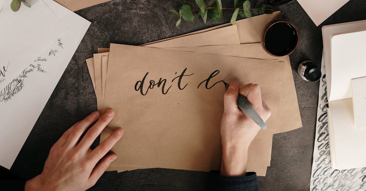
Calligraphy comes from the Greek words kallos (beauty) and graphein (to write). It is, literally, beautiful writing. The calligrapher uses a specialized tool — a broad-edge nib, pointed pen, brush, or reed — to write letters in a flowing, continuous motion. Each letter is produced as it is written, with thick and thin strokes created by the natural behavior of the tool responding to pressure, angle, and speed.
The defining characteristic of calligraphy is that it is a writing process. Letters are formed in real time, and the beauty comes from the rhythm, consistency, and skill of the writer. A calligrapher does not go back and fill in or reshape strokes. What the pen produces in the moment is the final result. This gives calligraphy its distinctive vitality and organic quality — and also makes it unforgiving. Mistakes cannot be erased or corrected without starting over.
Traditional calligraphic styles include Copperplate, Spencerian, italic, uncial, and blackletter, each with specific stroke patterns and tool requirements. Modern calligraphy relaxes many classical rules while retaining the fundamental writing-based approach, allowing for more personal expression and contemporary aesthetics.
The Role of the Tool
In calligraphy, the tool is inseparable from the outcome. A broad-edge nib creates thick and thin strokes based on the angle at which it meets the paper. A pointed nib responds to pressure — light pressure produces thin hairlines, heavy pressure opens the tines for thick swells. A brush pen responds to both pressure and speed. The calligrapher does not draw thick lines and thin lines independently; the tool creates them as a natural consequence of the writing motion. This tool-dependent quality is central to what makes calligraphy distinct.
What Is Hand Lettering?
Hand lettering is the art of drawing, illustrating, or constructing letterforms. Unlike calligraphy, lettering treats each letter as a small piece of artwork to be designed, sketched, refined, and finalized. The letterer might pencil a rough layout, adjust proportions, add decorative elements, ink the final version, and then clean up imperfections. The process is iterative and forgiving.
Lettering is fundamentally a drawing and design process. The letterer has complete freedom over the style, construction, and embellishment of each letterform. Letters can be built up from multiple strokes, filled with patterns, given three-dimensional effects, combined with illustrations, or shaped into custom compositions. There are no rules about how a stroke must be made because the final visual result is what matters, not the process of execution.
This design freedom means that hand lettering can mimic almost any style — including calligraphic styles. A skilled letterer can draw letters that look as if they were written with a broad-edge pen, even though they were constructed stroke by stroke with a pencil and ink. This ability to simulate other styles is part of what blurs the line between lettering vs calligraphy in the public eye.
Key Differences
The core distinction between calligraphy vs hand lettering is process. Calligraphy is writing; lettering is drawing. Everything else follows from this fundamental difference.
Calligraphy happens in real time. The letter is complete as it is written. Lettering is iterative. The letter evolves through multiple stages of sketching and refinement. Calligraphy is tool-dependent — the pen, nib, or brush directly shapes the letterforms. Lettering is tool-independent — you can use any drawing instrument because you are constructing the forms yourself. Calligraphy favors consistency and rhythm across a body of text. Lettering favors customization and uniqueness within a specific composition.
Speed differs too. A calligrapher can produce a finished piece relatively quickly once the style is mastered, because the writing process is continuous. A letterer typically works more slowly, investing time in sketching, adjusting, and perfecting each element. However, the letterer gains the advantage of total creative control and the ability to fix mistakes at any stage.
Mindset and Approach
Calligraphy demands a performer’s mindset. Like a musician playing a piece in real time, the calligrapher must commit to each stroke and maintain flow throughout the work. Practice builds muscle memory and consistency. Lettering demands a designer’s mindset. Like an architect refining a blueprint, the letterer plans, evaluates, and adjusts until the composition is right. Both require significant skill, but the skills are different in nature.
Tools and Techniques
Calligraphy tools are specialized for writing. Pointed nibs such as the Nikko G or Hunt 101 are used for Copperplate and modern calligraphy styles. Broad-edge nibs such as the Pilot Parallel or Brause nibs are used for italic, uncial, and blackletter scripts. Brush pens like the Pentel Fude or Tombow Dual Brush offer a more accessible entry point. Each tool produces characteristic stroke qualities that define the calligraphic style. Our comprehensive guide to calligraphy and lettering covers these tools in more detail.
Lettering tools are more varied and less specialized. Pencils are used for initial sketching. Fine-tip pens, brush pens, markers, or even paint can be used for the final rendering. Digital lettering uses a tablet and stylus with software like Procreate or Adobe Illustrator. Because the letterer is drawing rather than writing, virtually any mark-making tool can work. The tool does not define the style — the artist does.
When to Use Each
Calligraphy excels when the beauty of the writing process itself is the point. Wedding invitations, formal certificates, envelope addressing, place cards, and decorative quotations are classic calligraphy applications. The organic warmth and elegant rhythm of written letterforms bring a sense of occasion and personal touch that printed text cannot replicate.
Hand lettering excels when custom, highly designed letterforms are needed. Logo designs, book covers, packaging, murals, posters, t-shirt graphics, and social media artwork are typical lettering applications. The ability to customize every detail — adjusting weight, adding texture, integrating illustration, and crafting unique compositions — makes lettering ideal for design projects where the letterforms must serve a specific visual concept.
There is also significant overlap. Many artists practice both disciplines, and many projects benefit from combining calligraphic elements with lettering techniques. A wedding suite might feature calligraphed names alongside hand-lettered decorative elements. A branding project might reference calligraphic styles through carefully drawn letterforms. The disciplines are complementary, not competing.
Frequently Asked Questions
Is calligraphy harder to learn than hand lettering?
They present different challenges. Calligraphy requires developing muscle memory and control for real-time execution, which can feel frustrating early on because mistakes are visible immediately. Hand lettering allows for sketching and erasing, which feels more forgiving for beginners, but achieving professional-quality lettering requires strong design sense and significant practice. Neither is inherently harder — they simply demand different skills.
Can hand lettering look like calligraphy?
Yes. A skilled letterer can draw letterforms that closely resemble calligraphic writing. This is sometimes called “faux calligraphy” — constructing the thick and thin strokes of a calligraphic style by drawing outlines and filling them in rather than writing them with a specialized nib. The visual result can be very convincing, though a trained eye may notice subtle differences in stroke consistency and natural flow.
Which should I learn first?
If you are drawn to elegant, flowing writing and want to develop a meditative, skill-based practice, start with calligraphy. If you are more interested in design, customization, and creating artwork with letters, start with lettering. Many practitioners eventually explore both, as the skills reinforce each other. Learning calligraphy deepens your understanding of letterform anatomy, while learning lettering expands your creative versatility.
Do professional designers need to know both?
Not necessarily, but understanding both disciplines is valuable. Knowing how calligraphy works helps a designer appreciate letterform structure and stroke logic. Knowing lettering enables custom type solutions for branding, packaging, and editorial work. Most professional lettering artists have at least a working knowledge of calligraphy, and many calligraphers incorporate design thinking from the lettering world into their practice.


