Pantone vs CMYK: Color Systems Explained
Understanding Pantone vs CMYK is essential for anyone involved in print design, brand management, or product development. These are fundamentally different approaches to reproducing color on physical materials. CMYK is a four-color process that mixes cyan, magenta, yellow, and black inks to approximate a wide range of colors. Pantone (also called PMS, or the Pantone Matching System) uses pre-mixed spot color inks to achieve exact, consistent color reproduction. The Pantone vs CMYK difference affects everything from how your brand colors appear on a business card to how much your print run costs.
Neither system is universally better. Each serves different needs, and professional designers regularly use both, sometimes even in the same project. Knowing when to specify Pantone and when CMYK is sufficient can save your clients significant money while ensuring their colors look exactly right where it matters most.
What Is CMYK?
CMYK stands for Cyan, Magenta, Yellow, and Key (Black). It is a subtractive color model used in four-color process printing, which is the standard method for producing full-color printed materials like magazines, brochures, posters, and packaging.
In CMYK printing, four separate ink plates are used. Each plate lays down one of the four ink colors in a pattern of tiny dots (called a halftone screen) at different angles. When printed on top of each other, these overlapping dot patterns blend visually to create the appearance of a full spectrum of colors. Your eye perceives the mixed dots as a continuous tone image.
How CMYK Mixing Works
Each CMYK ink value ranges from 0% to 100%. A bright red, for example, might be achieved with 0% cyan, 100% magenta, 100% yellow, and 0% black. A deep navy blue might use 100% cyan, 80% magenta, 0% yellow, and 40% black. By varying the percentage of each ink, CMYK can produce thousands of perceptible color variations.
However, CMYK has inherent limitations. Because it relies on mixing just four inks, certain colors are difficult or impossible to reproduce accurately. Vivid oranges, bright purples, and intense greens often appear muted or shifted in CMYK because the four process inks cannot combine to reach those saturations. Metallic, neon, and fluorescent colors are completely outside the CMYK gamut. To learn more about how CMYK relates to screen colors, see our guide on CMYK vs RGB.
CMYK in Practice
CMYK is the default for most commercial printing because it is cost-effective. A single press run uses four ink stations regardless of how many colors appear in your design. Whether you are printing a photograph with millions of color variations or a simple two-color layout, the cost of ink and press setup remains essentially the same.
Digital printing (laser and inkjet) also uses CMYK as its base model, though some professional printers add extra ink channels (light cyan, light magenta, orange, green) to expand the color gamut. The fundamental process, however, is the same: mixing a small number of base inks to approximate a broad range of colors.
What Is the Pantone Matching System?
The Pantone Matching System (PMS) is a proprietary color standardization system created by Pantone LLC in 1963. Unlike CMYK, which mixes four inks on press to approximate colors, Pantone colors are pre-mixed inks. Each Pantone color is a specific ink formula with defined ratios of base pigments. When a printer uses Pantone 185 C (a specific bright red), they mix or purchase that exact ink. The color is not created through halftone dot mixing. It is printed as a solid, continuous layer of that specific ink.
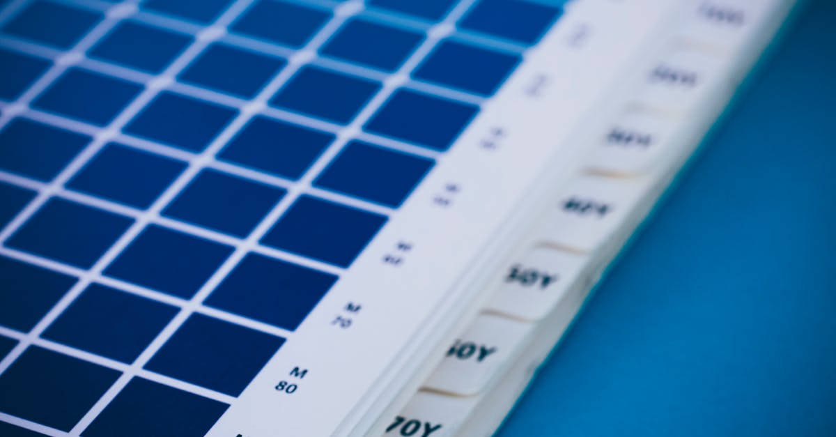
The Pantone system defines over 2,100 spot colors for print, each identified by a unique number and suffix (C for coated paper, U for uncoated, M for matte). These colors are catalogued in physical swatch books that designers and printers reference to select and verify colors. The physical swatch book is essential because screen displays cannot accurately represent all Pantone colors.
Why Pantone Exists
Pantone solves a critical problem in color communication. Before standardized color systems, a designer in New York and a printer in Tokyo had no reliable way to agree on exactly what “brand red” looked like. The designer might send a color sample, but different paper stocks, inks, and press conditions would produce different results.
With Pantone, the designer specifies “Pantone 185 C” and the printer mixes ink to that exact formula. The result is consistent whether the job is printed in New York, Tokyo, or anywhere else in the world. This consistency is why virtually every major brand defines its primary colors using Pantone references. It is a cornerstone of professional brand identity management.
Pantone Beyond Print
Pantone has expanded far beyond print inks. The company now offers color systems for fashion and textiles (Pantone Fashion, Home + Interiors), plastics, coatings, and digital applications. This cross-industry standardization means a brand can specify the exact same color for their printed materials, fabric products, plastic packaging, and painted surfaces.
Key Differences Between Pantone and CMYK
The CMYK vs Pantone distinction touches every aspect of color reproduction, from accuracy to cost.
Color Accuracy and Consistency
Pantone delivers exact, repeatable color. The same Pantone ink formula produces the same color every time, across different printers, paper stocks, and production runs. CMYK colors are approximate. Variations in ink density, dot gain, paper absorption, and press calibration mean that the same CMYK values can look noticeably different from one print run to the next or from one printer to another.
For a one-off poster, CMYK variation is rarely a problem. For a global brand that needs its signature red to look identical on every business card, brochure, and packaging sleeve printed across multiple countries, Pantone’s consistency is essential.
Color Gamut
Pantone’s pre-mixed inks can achieve colors that CMYK physically cannot reproduce. Vivid oranges, bright purples, specific teals, and other highly saturated or unusual hues are available as Pantone spot colors but fall outside the CMYK gamut. If your brand color is a vibrant orange that looks muddy in CMYK, Pantone is the solution.
Pantone also offers metallic, pastel, and neon ink formulations that have no CMYK equivalent whatsoever. If you need metallic gold or fluorescent green, spot color is your only option in traditional print.
Cost
This is where CMYK has a significant advantage. CMYK uses only four inks for every job, so there is no additional cost for using more colors in your design. A photograph with thousands of color variations costs the same to print as a two-color graphic.
Pantone vs CMYK printing costs differ because each Pantone color requires its own ink station on the press. Adding one spot color to a CMYK job means running five ink stations instead of four, which increases setup time, ink cost, and waste. Two spot colors mean six stations. Spot color printing is more expensive, and the cost increases with each additional Pantone ink used.
For large print runs, the per-unit cost increase is relatively small. For short runs, the added setup cost can be significant. This cost/quality tradeoff is central to the Pantone vs CMYK decision.
Solid Coverage
Pantone spot colors print as a solid, continuous layer of ink. CMYK builds colors from a halftone dot pattern. For large areas of solid color, like a colored background or a bold logo mark, spot color produces a denser, smoother, more vibrant result. CMYK halftone patterns can appear slightly grainy or uneven in large solid areas, especially in lighter colors where the dot pattern becomes visible.
Special Effects
Spot colors enable printing effects that CMYK cannot achieve. Metallic inks, varnishes, fluorescent colors, and opaque white (for printing on colored or transparent substrates) are all spot color applications. Premium packaging design frequently uses spot colors for these special finishes.
When to Use Pantone
Pantone spot colors are worth the extra cost in several specific situations.
Brand color consistency. If your brand guidelines specify exact colors that must remain consistent across all printed materials, Pantone is the only reliable method. This is especially important for brands with signature colors that fall outside the CMYK gamut. Consider the Tiffany blue, Coca-Cola red, or UPS brown. These brands use Pantone specifications to ensure their iconic colors are reproduced accurately worldwide.
Simple, color-critical designs. A business card with a logo in two specific brand colors is an ideal Pantone application. The setup cost is modest (two ink stations instead of four), and the color accuracy is superior to CMYK. Letterheads, envelopes, and other corporate stationery often use one or two spot colors for this reason.
Metallic and special finishes. Metallic gold, silver, copper, and other special effects require spot color inks. If your design includes metallic elements, you need Pantone or another spot color system.
Large solid color areas. Backgrounds, bars, and other large areas of flat color look more vibrant and consistent when printed with spot color inks rather than CMYK halftones.
Color-critical industries. Fashion, cosmetics, food packaging, and pharmaceutical labeling often require Pantone accuracy because color directly affects consumer perception and regulatory compliance.
When CMYK Is Enough
CMYK is the practical choice for the majority of print jobs.
Full-color photography. Photographs are inherently CMYK content. They are continuous-tone images made up of millions of color variations. Spot colors are irrelevant for photographic reproduction.
Multi-color designs. If your design uses more than three or four colors, CMYK is almost certainly more cost-effective. A colorful brochure with photographs, illustrations, and varied typography would require dozens of spot colors to reproduce, which is impractical and prohibitively expensive.
Digital and short-run printing. Digital presses (laser and inkjet) use CMYK-based systems and cannot typically print Pantone spot colors directly. They simulate Pantone colors using CMYK, which means you lose the consistency advantage. For digitally printed materials, specifying Pantone adds no real benefit unless the print provider has expanded gamut technology.
Budget-conscious projects. When color accuracy is important but not critical to the level Pantone provides, CMYK with careful press calibration delivers excellent results at lower cost. Most flyers, catalogs, and marketing materials look great in CMYK.
Using Both Together
Many professional print projects combine CMYK and Pantone. This is called “CMYK plus spot” or “4+1” (four process colors plus one spot color), “4+2” for two spot colors, and so on.
A typical example is a brochure that uses full-color photography (CMYK) alongside a brand logo that must be an exact Pantone color. The photographs are printed in four-color process while the logo is printed with a dedicated spot color ink station. This gives you the best of both worlds: cost-effective photographic reproduction and exact brand color accuracy.
Another common combination uses CMYK for the full-color content and a spot metallic or varnish for a premium finish on specific elements like a logo or headline. This hybrid approach is standard in high-end packaging design and corporate marketing materials.
In your design software, you manage this by assigning CMYK values to photographic and general color elements while assigning Pantone swatches to brand-critical elements. Your design application will generate the appropriate separations for each ink channel.
Converting Between Pantone and CMYK
Every Pantone color has a recommended CMYK equivalent, published in Pantone’s bridge guides. However, “equivalent” is a generous term. Many Pantone colors lose vibrancy, shift hue, or appear duller when converted to CMYK because they fall partially or entirely outside the CMYK gamut.
Pantone provides “bridge” swatch books that show each Pantone color alongside its closest CMYK simulation, printed side by side. These are invaluable for managing client expectations. Before committing to a brand color, show the client both the true Pantone swatch and its CMYK approximation so they understand the difference.
In design software like Illustrator and InDesign, you can assign Pantone colors and view their CMYK simulations on screen. But remember that screen displays use RGB, not CMYK or Pantone, so on-screen previews are always approximations. Physical printed proofs remain the only reliable way to evaluate color.
Frequently Asked Questions
Is Pantone more accurate than CMYK?
Yes. Pantone uses pre-mixed inks that produce the same exact color every time, regardless of printer or press conditions. CMYK approximates colors through halftone dot mixing, which introduces variability. For brand-critical colors, Pantone delivers measurably higher accuracy and consistency.
Why is Pantone printing more expensive?
Each Pantone color requires its own ink station on the press, which means additional setup time, a dedicated ink supply, and an extra printing plate. A standard CMYK job uses four stations. Adding one Pantone color increases that to five. More ink stations mean higher setup costs, more waste during make-ready, and longer production times. These costs scale with each additional spot color.
Can digital printers use Pantone colors?
Most digital printers simulate Pantone colors using their CMYK (or CMYK+) ink sets rather than using actual Pantone spot inks. Some advanced digital presses include expanded gamut technology with additional ink channels (orange, green, violet) that can more closely approximate Pantone colors. However, true Pantone spot color accuracy in digital printing remains limited compared to offset printing with actual Pantone inks.
Do I need Pantone for my brand?
It depends on your requirements. If your brand colors must be exactly consistent across all printed materials, especially if they include vivid hues outside the CMYK gamut, then defining Pantone colors in your brand guidelines is advisable. If your brand primarily appears on digital screens and uses colors that reproduce well in CMYK, Pantone specification may be unnecessary. Many small businesses use CMYK-only printing with excellent results.


