What Font Does Fabletics Use?
If you are trying to match the fabletics font for a slide deck, an infographic, or a styled design project, you have probably found there is no single off-the-shelf typeface that matches it exactly. To be clear up front, this is Fabletics, the women’s activewear brand — the membership-driven, direct-to-consumer label co-founded by Kate Hudson and known for its leggings, sports bras, and matching sets. The short version: the Fabletics wordmark is custom-drawn brand lettering with a bold, modern character, not a released font, so there is no public file called “Fabletics” to install. This guide breaks down what the wordmark actually is, why it leans bold, and which free fonts get you closest without touching the trademark.
What font is the Fabletics logo?
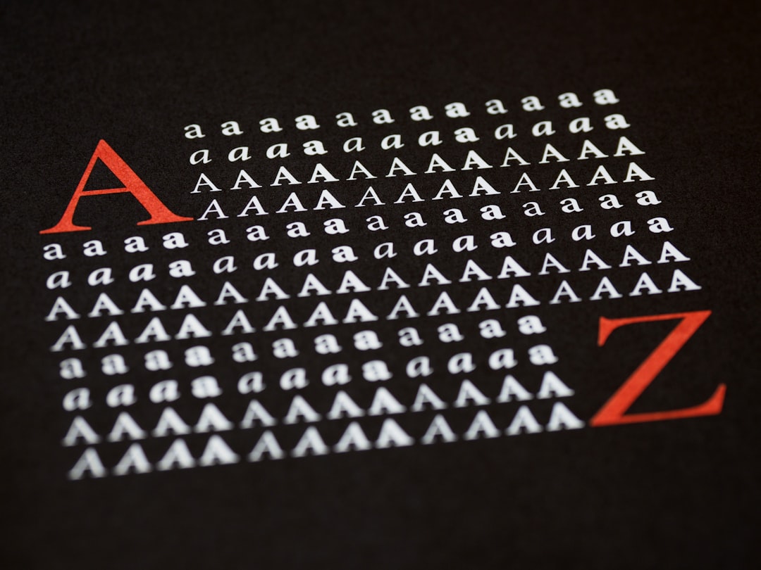
The Fabletics logo is a wordmark set in bold, modern lettering with clean strokes, even proportions, and a confident, accessible character that signals energy, value, and approachable activewear. The letters read as solid and grounded rather than delicate or decorative, giving the name a strong, current presence that fits a brand built around affordable, on-trend gym apparel. The wordmark sits firmly in the bold modern category — lettering that reads as capable and friendly rather than ornate or fussy. The grounded forms keep the focus on the brand’s promise of accessible, stylish performance wear.
Because this is bespoke artwork tied to the brand’s identity, no major foundry sells it as a retail typeface, and the company has not published a public type spec for general download. Anyone claiming a precise source font should be read skeptically. The honest framing: treat the Fabletics wordmark as custom bold modern lettering, not a confirmed commercial font. Any file labeled “Fabletics font” online is a fan recreation or a look-alike, and any specific match — even one that appears reminiscent of a clean geometric sans — is an informed observation, not a confirmed spec.
What typeface does Fabletics use in branding?
Beyond the primary wordmark, Fabletics’ website, app, packaging, and campaigns lean on clean geometric sans-serifs for headlines and readable supporting type for body copy. The supporting type is chosen for a bold, legible, contemporary tone rather than a single signature face, and it shifts subtly across campaigns, app screens, hangtags, and digital versus print.
- Primary wordmark: custom bold modern lettering anchoring the logo, the packaging, and communications.
- Supporting type: clean geometric sans-serifs for headlines, body copy, and small print.
- Tone: bold, modern, and accessible — the typography signals energy, value, and approachable confidence.
The brand’s identity lives in that bold wordmark; everything around it stays clean and uncluttered to keep the look confident across a legging waistband, an app screen, or a campaign banner. For more brand-by-brand breakdowns, see our roundup of famous brand fonts.
Free fonts that look like the Fabletics font
You cannot legally lift the trademarked wordmark, but you can capture its bold, modern vibe with free, openly licensed fonts. The table pairs each part of the look with a free alternative you can actually download and use under its own license.
| Use case | Fabletics uses | Free alternative |
|---|---|---|
| Logo / wordmark feel | Bold modern sans | Archivo Black or Montserrat |
| Headline / display | Heavy display sans | Oswald or Anton |
| Body / supporting | Readable clean sans | Inter or Work Sans |
Archivo Black is a strong starting point: it is a free, heavy sans with solid, confident strokes and a clean, grounded presence that shares the Fabletics sense of bold, modern lettering. To push it closer, set the wordmark with tight, even spacing and sturdy weight, keeping the proportions upright and athletic. If you want a more geometric flavor, Montserrat in its bolder weights brings clean, modern character, while Oswald and Anton deliver bold headlines with a strong display edge. Pair any of these with the versatile sans Inter or Work Sans for body copy and small print. The goal is bold, modern confidence, so let the solid, even forms carry the look.
Why does Fabletics use this kind of type?
A bold modern style does specific brand work. Solid, clean letters read as energetic, confident, and dependable — exactly the tone for a brand that wants members to feel motivated and good value rather than intimidated or priced out. Where a delicate or ornate face would feel out of step, the bold wordmark feels grounded and current, which fits a brand positioned around accessible, on-trend activewear. The clean forms signal an upbeat, get-moving ethos without ornament.
There is also a practical argument. A bold wordmark stays legible at any size, from a small woven label to a large campaign banner, and survives the varied contexts of print, web, app, and signage. The bold style keeps the focus on energy and value, and the consistency of the wordmark compounds the brand’s recognition. The bold framing also signals confidence and approachability without a paragraph of brand copy.
Compare this with other women’s activewear brands and you will notice related strategies. The bold shapewear-rooted wordmark of the Spanx logo leans into a similar confident punch, while the clean styling of the Athleta logo pushes toward a calmer, more refined mood — both useful contrasts to the bold modern Fabletics look.
Can I use the Fabletics font for my own project?
For the actual logo: no. The Fabletics wordmark is part of a registered trademark and the brand’s protected identity. Copying it, or using a near-identical recreation in a way that suggests affiliation, can create legal exposure — this is about trademark, not just fonts. Even if someone posts a “Fabletics font” file online, that file is at best an unofficial recreation and is not licensed for commercial use.
What you can do is use a legitimately licensed free font (like the options above) to build your own original wordmark with a similar bold, modern mood. That keeps you on solid ground. Before you ship anything commercial, confirm the license on whatever font you pick — our font licensing guide walks through desktop, web, and embedding rights so you do not get caught out.
Frequently Asked Questions
Is the Fabletics font free to download?
No. The Fabletics wordmark is custom bold modern brand lettering, not a released font, so there is no official free download. Any file labeled “Fabletics font” online is an unofficial recreation. Use a free font like Archivo Black or Montserrat to get a similar look legally, and check its license first.
What font is closest to the Fabletics logo?
A bold, modern sans comes closest. Archivo Black and Montserrat, both free on Google Fonts, capture the confident, energetic feel of the wordmark. Set them with tight, even spacing and solid weight for the nearest match — without copying the trademarked activewear wordmark in commercial work.
Is the Fabletics logo a real typeface?
Treat it as custom lettering, not a commercial typeface. The company has never published a public type specification for download, so the exact origin is unconfirmed — an informed observation, not a documented fact. The safest description is bespoke bold modern brand lettering for the Fabletics wordmark.
Can I use a Fabletics-style font commercially?
You can use a free look-alike font commercially if its license allows it, but you cannot reproduce the trademarked Fabletics logo or wordmark on products or services you sell. Style your own text in a free bold sans instead of copying the brand mark, and check both the font license and trademark rules first.