Wayfinding Design: Principles and Examples
Wayfinding design is the discipline of helping people move through a space without getting lost — and the best of it is invisible, because you never have to stop and think. It is far more than hanging arrows; it is a system of decisions about routing, hierarchy, typography, and color that work together from the moment someone arrives. This guide covers the core principles and the patterns that make them work.
Wayfinding is a specialized branch of the broader practice covered in our complete guide to signage design — start there for legibility math and materials, then come back here for the system-level thinking.
What wayfinding design solves
A good wayfinding system answers four questions for a visitor, in order: Where am I? Where can I go? How do I get there? Am I still on the right path? Hospitals, airports, campuses, museums, and transit hubs all live or die by how clearly they answer these. When wayfinding fails, people miss appointments, crowd information desks, and feel anxious — the cost is real even though the signs look “fine.”
The four types of wayfinding signs
Almost every system is built from four functional sign types working as a family:
- Identification signs — confirm arrival: “Terminal B,” “Radiology,” “Gallery 4.”
- Directional signs — point the way with arrows and destinations at decision points.
- Orientation signs — maps and directories that show the whole space and “you are here.”
- Regulatory signs — rules and safety: “No entry,” “Staff only,” exits.
Principle 1: Design around decision points
A decision point is any place a person must choose a direction — an intersection, an elevator lobby, a fork in a corridor. Effective wayfinding places directional signs at every decision point and nowhere they aren’t needed. Over-signing is as harmful as under-signing: too many messages create noise and people stop reading. Walk the actual route, note where you’d hesitate, and sign exactly those spots.
Principle 2: Build a strict information hierarchy
At any given sign, the visitor should grasp the most important message first. Establish a hierarchy and apply it everywhere:
- Primary destinations (largest type, top of the sign).
- Secondary destinations.
- Supporting detail (floor numbers, amenities).
Keep each directional sign to a manageable number of destinations — roughly five to seven lines is a practical ceiling before a sign becomes a wall of text. Group destinations by direction, and keep arrow placement consistent (for example, arrows always to the left of the destination they govern).
Principle 3: Choose type built for distance and angle
Wayfinding typography must read while you walk, from an angle, often in poor light. This is why the field gravitates to a small canon of typefaces:
- Frutiger — designed by Adrian Frutiger specifically for the signage of Charles de Gaulle Airport, and still the gold standard for legibility at distance. Paid (Monotype).
- DIN 1451 — the German road and industrial standard; geometric and unambiguous. FF DIN is the common commercial cut.
- Clearview — engineered to improve highway sign legibility under glare, with a tall, open lowercase.
- Transport — the UK road typeface, a research benchmark for mixed-case reading.
Use mixed case, not all caps, for destination names — research consistently shows mixed case reads faster because word shapes are more distinct. Reserve all caps for short labels. For deeper guidance on weights and pairing, see our font pairing guide.
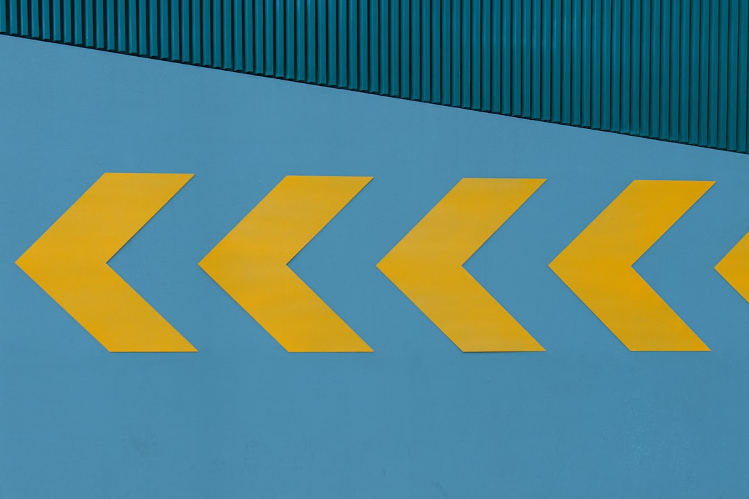
Principle 4: Use color and icons as a redundant layer
Color coding (the “red zone,” “blue line”) and pictograms speed recognition and serve people who don’t read the local language — but they must be redundant, never the sole carrier of meaning. Roughly 1 in 12 men has some form of color vision deficiency, so color always pairs with text or a clear icon. Standardize on a recognized pictogram set (such as the AIGA/DOT symbols) rather than drawing your own from scratch.
| Layer | Role | Caution |
|---|---|---|
| Text | Precise destination | Must be legible at distance |
| Arrows | Direction | Consistent placement and angle set |
| Color | Fast zone recognition | Never the only cue |
| Pictograms | Language-independent meaning | Use standard sets |
Principle 5: Be relentlessly consistent
Consistency is what lets a visitor learn the system in the first few signs and trust it for the rest of the journey. Lock down a single typeface family, a fixed grid and margin, a defined arrow library, consistent mounting heights, and a stable color palette — then never deviate. The moment a directory looks different from the directional signs, the visitor’s mental model breaks.
Accessibility in wayfinding
Wayfinding must work for everyone. Apply ADA principles throughout: high non-glare contrast, tactile and Braille characters on permanent identification signs, mounting at 48–60 inches to the baseline of tactile text, and clear, simple sans-serif type. Place “you are here” maps oriented to the viewer’s actual facing direction (heading-up), not always north-up, which dramatically reduces confusion.
Real-world examples to study
- Airports — the original proving ground; CDG’s Frutiger system set the template for high-volume, multilingual environments.
- Transit maps — the London Underground diagram shows how abstraction (straight lines, fixed angles) can beat geographic accuracy for navigation.
- Hospitals — among the hardest wayfinding problems; the best use zone color plus plain-language destination names over medical jargon.
Wayfinding shares DNA with other large-format environmental work. If your project involves a freestanding storefront marker, our storefront sign design guide covers identification at the street, and for temporary navigational graphics on an exhibition floor, see trade show booth design.
How to test a wayfinding system before installation
Even an expertly designed system can fail in the real space, so test before you commit to fabrication. Two low-cost methods catch most problems:
- The first-timer walk-through. Recruit someone who has never visited, give them a destination, and follow silently. Every hesitation marks a missing or unclear sign. This single exercise reveals more than any committee review.
- Full-size mockups in place. Print directional signs at actual size, tape them at the intended locations and heights, and read them from the real approach distance and lighting. Type that looked fine on screen often proves too small or too tight at the wall.
Document the final system in a sign manual — typeface, sizes, colors, arrow library, and placement rules — so future additions stay consistent years later, even when a different team handles them.
Frequently Asked Questions
What is wayfinding design?
Wayfinding design is the practice of helping people navigate a physical space through a coordinated system of identification, directional, orientation, and regulatory signs. It combines routing logic, information hierarchy, legible typography, color coding, and pictograms so visitors can confidently answer where they are and how to reach their destination without confusion.
What is a decision point in wayfinding?
A decision point is any location where a person must choose which way to go — an intersection, elevator lobby, or corridor fork. Effective wayfinding places directional signs at every decision point and avoids signing places where no choice exists, preventing both confusion and visual clutter that makes people stop reading.
Should wayfinding signs use uppercase or mixed case?
Use mixed case for destination names. Research consistently shows mixed case reads faster at distance because word shapes (ascenders and descenders) are more distinctive than uniform capital blocks. Reserve all caps for short labels and warnings, where the shorter length offsets the slower reading speed.
What typeface is best for wayfinding?
Frutiger is the benchmark, designed expressly for airport signage with open apertures and high legibility at distance and angle. DIN 1451, Clearview, and Transport are also proven choices. All share large x-heights, open counters, and unambiguous letterforms; avoid thin weights, condensed widths, and decorative typefaces for navigation.