Storefront Sign Design: Tips for Small Businesses
Your storefront sign design is the cheapest, hardest-working piece of marketing you own — it sells to every person who walks or drives past, around the clock, for years. Yet small businesses routinely under-invest in it or treat it as an afterthought. This guide covers the practical decisions, from sign type and letter size to permits, so your sign pulls in customers instead of getting overlooked.
Storefront signs are one application of the broader principles in our complete guide to signage design; this article focuses on what matters when you’re a small business owner making the call.
Start with the job the sign has to do
A storefront sign does three things: it makes you findable, it tells passersby what you sell, and it reinforces your brand. Before designing, answer two questions: How far away do people first see the storefront (from a moving car, across a plaza, from the opposite sidewalk)? And does your business name alone explain what you do? “Riverside Dental” is self-explanatory; “Lumen & Co.” needs a tagline or supporting line so people know to come in.
Choose the right type of storefront sign
| Sign type | What it is | Relative cost | Best for |
|---|---|---|---|
| Channel letters | Individual fabricated 3D letters, usually LED-lit | $$$ | High-visibility, illuminated branding |
| Dibond / ACM fascia sign | Flat printed or cut panel on the building face | $$ | Clean, durable, budget-friendly |
| Lightbox / cabinet sign | Illuminated box with a printed face | $$ | Night visibility, even glow |
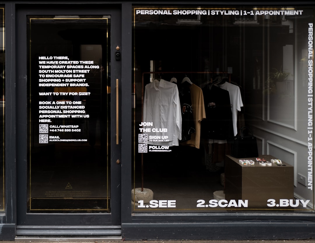
| Window vinyl / gold leaf | Cut or printed graphics on glass | $ | Hours, services, accent branding |
| Blade / projecting sign | Perpendicular sign for foot traffic | $$ | Pedestrian streets where fascia is hard to see head-on |
| A-frame / sandwich board | Portable sidewalk sign | $ | Daily specials, temporary messaging |
Most storefronts combine two or three: a primary fascia or channel-letter sign for identity, window vinyl for details, and often a blade sign or A-frame for foot traffic.
Size the letters for the street, not the desk
The most common mistake is a sign that looks great in a mockup and disappears from the road. Use the cap-height rule: roughly 1 inch of capital-letter height for every 25 feet of viewing distance for comfortable reading. A storefront read from across a four-lane road (about 100 feet) needs letters around 4 inches tall at minimum — and bigger is usually better for a business name. Check your lease and local code for a maximum sign size before you commit.
Typography and contrast that read fast
- Limit to one or two typefaces. A clean sans-serif for the name plus a simple supporting face is plenty.
- Favor legible, open letterforms. Faces like DIN or other open grotesques read well at distance; save thin scripts and decorative display fonts for small accents, not the main name.
- Maximize contrast. Dark letters on a light field (or vice versa) read from much farther than a low-contrast combo.
- Keep it short. Your name and at most one descriptor. A sign is not a paragraph.
If you’re choosing brand fonts for the first time, our font pairing guide walks through combining a display and text face that hold up everywhere from a sign to a business card.
Match the sign to your brand
The sign should look like it belongs to the same business as your logo, packaging, and website — same colors, same typeface, same personality. Inconsistency reads as amateur and erodes trust. Pull your exact brand colors as Pantone references so the fabricator can match them precisely across materials; CMYK and RGB will shift. A coherent brand also makes every other touchpoint cheaper to produce because you’re reusing the same system.
Lighting: do you need it?
If you’re open after dark or want presence at night, illumination matters. Options, from highest impact to lowest:
- Front-lit channel letters — letters glow from the face; classic retail look.
- Halo / reverse-lit letters — light spills behind the letters onto the wall; upscale, subtle.
- Lightbox cabinet — even, bright, lower cost than channel letters.
- External spotlighting — gooseneck lamps on a flat sign; budget-friendly and charming.
Don’t skip the permit
Almost every municipality regulates storefront signs — size, height, illumination, projection over the sidewalk, and sometimes historic-district aesthetics. Before fabrication:
- Check your local sign code and your lease (landlords often have their own sign criteria).
- Confirm whether your sign needs a permit and, for electrical signs, an electrical inspection.
- A reputable local sign company will usually handle permitting for you — ask before signing.
Penalties for an unpermitted sign can mean fines and forced removal, so this step protects your investment.
Budget-smart tips for small businesses
- Spend on the primary sign, save on secondary. Invest in the fascia or channel letters; use affordable window vinyl and A-frames for the rest.
- Choose Dibond for flat exterior signs — it’s weatherproof, lightweight, and far cheaper than channel letters while looking professional.
- Get vector artwork you own. A clean Illustrator file lets any shop produce or reprint your sign without redesign fees.
- Buy quality vinyl for windows (cast vinyl like 3M) so it doesn’t curl or fade within a year.
Your storefront is one channel of a moving advertising system — if you also brand a delivery vehicle, the same logo and palette carry over; see our vehicle wrap design guide. And if you have a large blank exterior wall, a painted mural can become a destination of its own.
Working with a sign company
Unless you have production experience, hire a local sign company for fabrication and installation — but come prepared so you stay in control of the outcome:
- Bring vector artwork and brand colors (logo as a clean Illustrator file, Pantone references) so the shop reproduces your brand exactly rather than redrawing it.
- Ask for a scaled proof or rendering on a photo of your actual storefront before fabrication, so you can judge size and placement in context.
- Get the quote itemized — design, materials, fabrication, permitting, and installation are separate line items, and you want to know what you’re paying for.
- Confirm warranty and lifespan on materials and illumination; a cheap sign that fades in two years is the more expensive choice.
Maintenance keeps a sign selling
A faded, cracked, or half-lit sign actively damages your brand — it signals neglect to every passerby. Build simple upkeep into your routine: clean the face periodically, replace failed LEDs or lamps promptly so the sign never sits partly dark, and refresh sun-faded vinyl before it peels. For exterior signs, check mounting hardware after storms. Treating the sign as a living marketing asset, not a one-time purchase, protects the return on what is often a small business’s most valuable advertisement.
Frequently Asked Questions
How big should my storefront sign letters be?
Apply the cap-height rule: about one inch of capital-letter height per 25 feet of viewing distance for comfortable reading. A storefront read from across a road roughly 100 feet away needs letters at least 4 inches tall, and larger is usually better. Check your lease and local sign code for maximum allowed sizes first.
Do I need a permit for a storefront sign?
Almost always, yes. Most municipalities regulate sign size, height, illumination, and sidewalk projection, and historic districts add aesthetic rules. Check your local sign code and lease before fabrication; electrical signs also need an electrical inspection. A reputable sign company will often handle the permitting process on your behalf.
What is the most cost-effective storefront sign?
A flat Dibond (aluminum composite) fascia sign offers the best value — it is weatherproof, lightweight, durable, and far cheaper than illuminated channel letters while still looking professional. Pair it with affordable cast-vinyl window graphics for hours and services, and an A-frame for daily specials, to cover all bases on a budget.
What font should I use for a storefront sign?
Use a clean, open sans-serif for the business name so it reads at distance, such as DIN or a similar grotesque, and limit yourself to one or two typefaces total. Reserve thin scripts and decorative display fonts for small accents. Most importantly, maximize contrast between the lettering and background.