Bakery Branding: Sweet and Memorable
Bakery branding sells a feeling before it sells a croissant: warmth, comfort, and the sense that someone made this by hand this morning. That feeling has to come through in the logo, the soft palette, the script on the window, and the box your cake travels home in. Get the identity soft and inviting without tipping into twee, and a bakery becomes the place people choose for birthdays, Sunday mornings, and the small daily treat.
This guide covers the visual system and the touchpoints that matter most for bakeries and pastry shops. For the full hospitality framework, start with our restaurant branding guide, then use this article for the bakery-specific dials.
The Bakery Feeling: Soft and Homemade
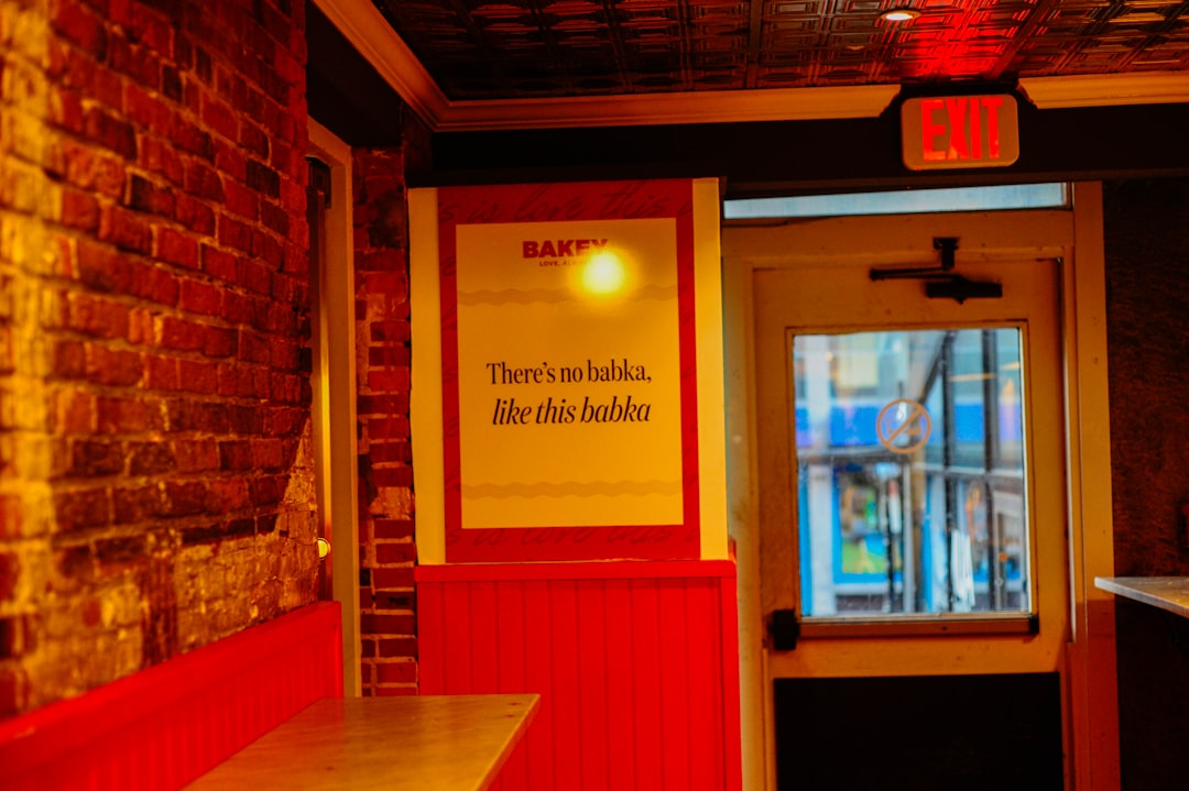
The dominant register for bakeries is soft, warm, and handmade — it signals care, freshness, and a little indulgence. That said, the spectrum runs wide: a classic neighborhood bakery leans nostalgic and cozy, an artisan sourdough operation leans rustic and earthy, and a modern patisserie leans clean and elegant with pastel restraint. Decide where you sit before choosing type and color, because “homemade cottage” and “minimalist French patisserie” pull the same elements in very different directions.
Typography: Where Script Earns Its Place
Bakeries are one of the few categories where a script or hand-lettered face genuinely belongs — it reads as personal, handmade, and warm, exactly the brand promise. Use the script for the logo and a headline or two, then pair it with a calm, legible sans or serif for the menu, labels, and signage, because script does not hold up in long lists or small print. A rounded, soft-cornered sans also suits the gentle feeling without the legibility risk. Our font pairing guide covers pairing a decorative script with a workhorse so the system stays readable.
- Script / hand-lettered: the logo and key headlines — personality and warmth.
- Legible workhorse: menu, price labels, packaging copy, website body.
- Rounded sans option: soft and friendly without the readability tradeoffs of script.
Color: Soft Palettes and Gentle Contrast
Bakery palettes lean light and warm: creams, soft pinks, butter yellows, sage, dusty blue, and gentle browns. Low-to-medium contrast reinforces the soft, comforting mood, though a single deeper accent (a berry, a chocolate brown) keeps the palette from going washed out and gives type and packaging something to anchor on. For a rustic artisan bakery, swap pastels for kraft brown, charcoal, and a single warm accent. Specify a Pantone for your main color so your box, bag, and sign all match across suppliers.
The Logo: Inviting and Scalable
A bakery logo usually leads with a warm wordmark, often in script, sometimes with a small, specific mark — a rolling pin, a wheat sheaf, a simple loaf — kept simple enough to stamp. Be careful: bakery icons slide into cliché fast, so abstract the element or skip it in favor of a strong wordmark. Make sure there is a clean one-color version, because so much bakery branding ends up stamped on kraft boxes and bags. For food-mark specifics, see our food logo design guide, and for the build process our logo design process.
Packaging Is the Star
More than almost any food business, a bakery is its packaging — the box carried to a party, the bag on a counter, the cake at the center of a photo. This is where the branding budget earns the most. The good news is that the homemade aesthetic loves inexpensive, honest materials: a custom stamp or sticker on a plain kraft box does more for a bakery than four-color printing would. Tissue, baker’s twine, a printed label, and a window box that shows the pastry off all reinforce the handmade promise.
| Packaging item | Brand carrier | Budget tip |
|---|---|---|
| Pastry box | Stamp or sticker on kraft | A custom stamp beats printed boxes early on |
| Bread bag | Window bag + label | Show the crust; let the product sell |
| Cake box | Logo sticker + twine | Tissue and twine add warmth cheaply |
| Loyalty card | Mark + stamp | Doubles as a branded keepsake |
Signage and the Storefront
A bakery storefront should look as warm as the product, so a script or soft display logo on the sign, a window that shows the cases inside, and an A-frame for the day’s bakes all pull people in. Keep the sign legible — script can get illegible at distance, so use a simplified or bolder variant for the big exterior sign and save the delicate script for closer surfaces. Coordinate awning, window vinyl, and menu board so the frontage reads as one inviting brand. The restaurant branding guide has the full signage checklist.
Menu, Labels, and Display
Bakery “menus” are often case labels and a board, so design a consistent label system in your workhorse type — item name, a short description, price, and any allergen note — that staff can update as the bakes rotate. Keep labels legible inside a lit case where glare is a factor. If you serve coffee and plates alongside, our menu design guide covers full menu layout and pricing.
Tools and Deliverables
Build the bakery logo in vector in Adobe Illustrator so it scales cleanly from a stamp to a storefront sign and exports as the editable, single-color files your packaging suppliers and sign maker need. Use Adobe Photoshop for the photography and any soft texture work that gives your social feed and website their warmth. Canva is genuinely useful for the day-to-day once a designer sets up branded templates with your real fonts and colors locked — daily specials cards, seasonal labels, and social posts that staff can update without breaking the soft, consistent look. The piece that holds it all together is a short brand guideline listing your logo variants, color codes in HEX, RGB, CMYK, and Pantone, your two fonts and where each is used, and a few do/don’t examples so every box, bag, and sign matches across vendors.
Interior, Social, and the Daily Photo
Bakeries are intensely photogenic, and that is a branding channel. Build a consistent photography style — soft natural light, your palette in frame, the same close, warm angle — and use the same logo and name across the website, Google Business Profile, and Instagram. In the room, soft light, visible cases, and staff aprons in your palette extend the brand. If a market stall or mobile cart is in your plans, our food truck design guide covers branding a mobile setup for legibility.
Frequently Asked Questions
What makes good bakery branding?
A warm, handmade feeling carried consistently across logo, type, color, and especially packaging. Script or soft type, a light palette specified for print, and a strong one-color logo for stamping kraft boxes all reinforce the comfort and freshness a bakery sells. Photogenic, consistent touchpoints turn customers into repeat regulars.
What fonts are best for a bakery?
A script or hand-lettered face suits the logo and headlines because it reads as personal and handmade. Pair it with a legible sans or serif for menus, labels, and packaging, since script fails in long lists and small print. A rounded sans is a friendly, more readable alternative for the whole system.
What colors should a bakery use?
Soft, warm tones — creams, soft pinks, butter yellow, sage, gentle browns — with low-to-medium contrast for a comforting mood, plus one deeper accent so the palette does not wash out. A rustic artisan bakery can swap pastels for kraft brown and charcoal. Specify a Pantone for cross-vendor consistency.
How important is packaging for a bakery?
Very — the box and bag travel through neighborhoods and star in photos, so packaging is a primary brand channel. The homemade look also loves cheap, honest materials: a custom stamp or sticker on kraft, plus tissue and twine, often beats expensive four-color printing for both feel and budget.