Bar and Pub Branding: A Practical Guide
Bar branding is mood-setting in visual form. A bar sells an atmosphere — a dive’s grit, a cocktail room’s polish, a brewpub’s heritage — and the identity has to telegraph which one before a guest steps inside. That mood lives in bold or vintage type, a dark and confident palette, a sign that glows after dark, and a drinks menu that reads like the room feels. Get it coherent and the brand does half the work of filling the seats.
A bar is a hospitality brand like any other, so start with the system in our restaurant branding guide, then use this article for the bar- and pub-specific dials.
Find Your Mood First
Bars span a wider tonal range than almost any food category, and the branding follows the mood, not the other way around. A neighborhood dive wants worn, honest, and unfussy; a craft cocktail bar wants exact, moody, and grown-up; a classic pub wants heritage, warmth, and tradition; a brewery taproom wants bold, modern, and energetic. Name your mood in three or four adjectives before choosing type or color, because “gritty dive” and “refined cocktail lounge” pull every later decision in opposite directions.
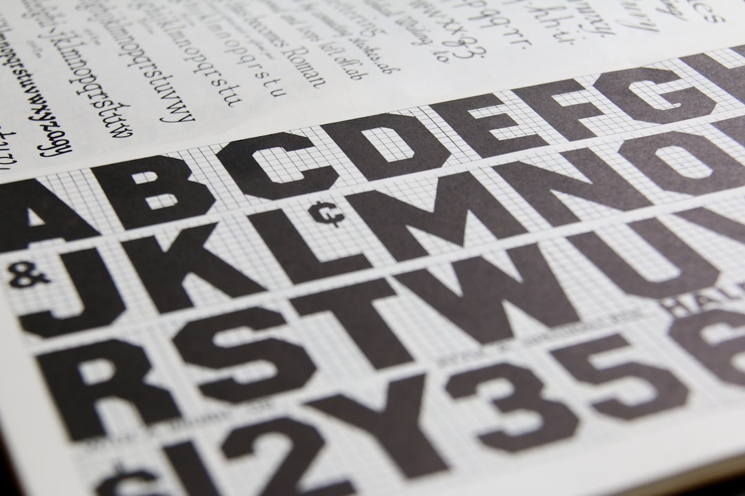
Typography: Bold, Vintage, or Both
Bar typography leans confident and characterful. The most reliable registers:
- Vintage / retro display: reads as established and grown-up — common for pubs, whiskey bars, and heritage brands.
- Blackletter or slab: heavy, traditional, great for breweries and old-world pubs.
- Bold condensed sans: modern, energetic, fits taprooms and lively bars.
- Refined serif: elegant and considered for upscale cocktail rooms.
Whatever you pick for the logo and headlines, pair it with a legible workhorse for the drinks menu and signage, because guests read menus in low, mood-setting light where decorative type fails fast. Our font pairing guide covers pairing a strong display face with a readable body face.
Color: Dark Base, Bright Accent
Bars almost always work off a dark, confident base — charcoal, deep navy, oxblood, forest, or black — because dark reads as moody, premium, and after-hours. The energy comes from a single bright accent: a warm brass or gold for upscale, a hot neon for a livelier room, a muted vintage red or teal for a retro pub. This dark-plus-accent formula also sets up neon and lit signage beautifully. Specify a Pantone for your accent so it stays consistent across your sign, menu, coasters, and merch.
The Logo: Built for Signage and Glass
A bar logo has to live on a sign, often a lit or neon one, and on glassware, coasters, and merch — so design a primary lockup plus a compact mark or monogram and a clean one-color version. Crests, monograms, and vintage-style badges suit the category well and reproduce nicely on coasters and etched glass, but keep detail in check so the mark survives small sizes and single-color etching. For food-and-drink mark specifics, see our food logo design guide, and for the workflow our logo design process.
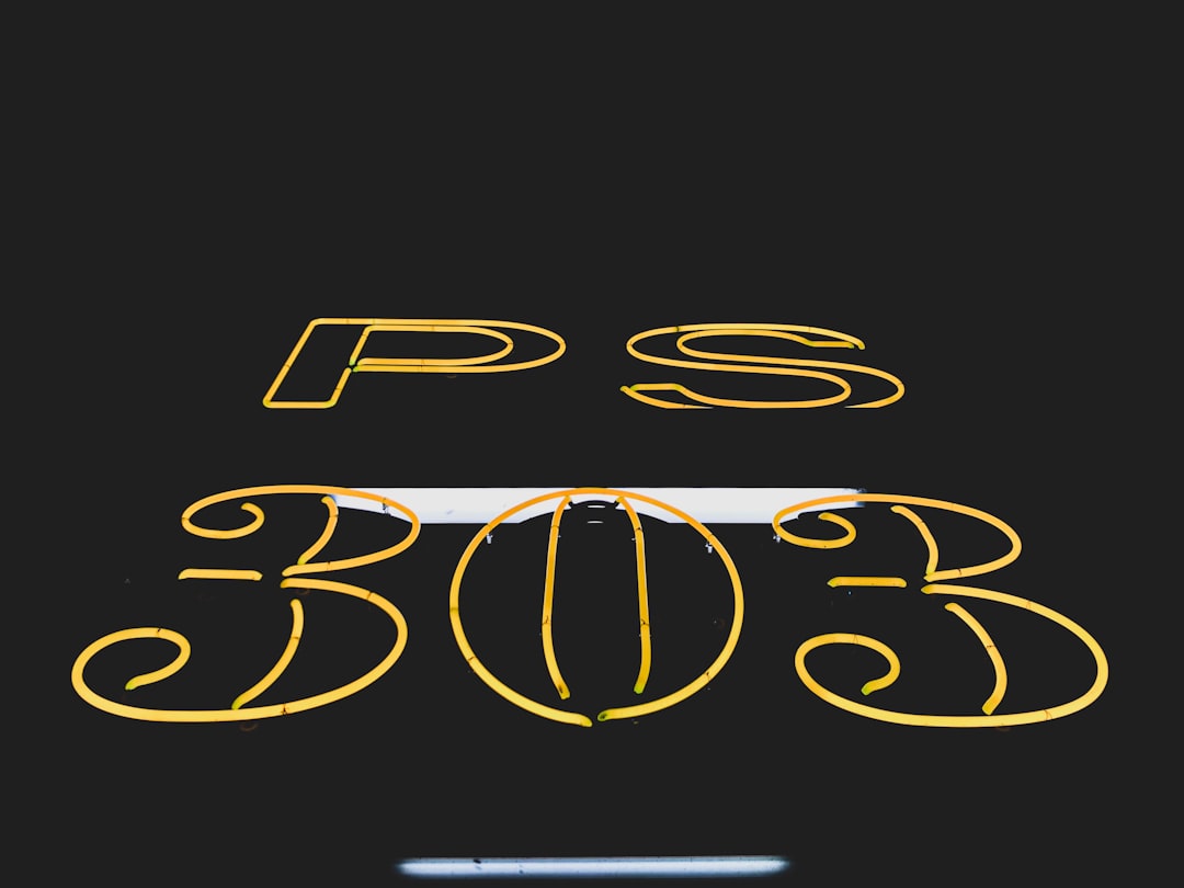
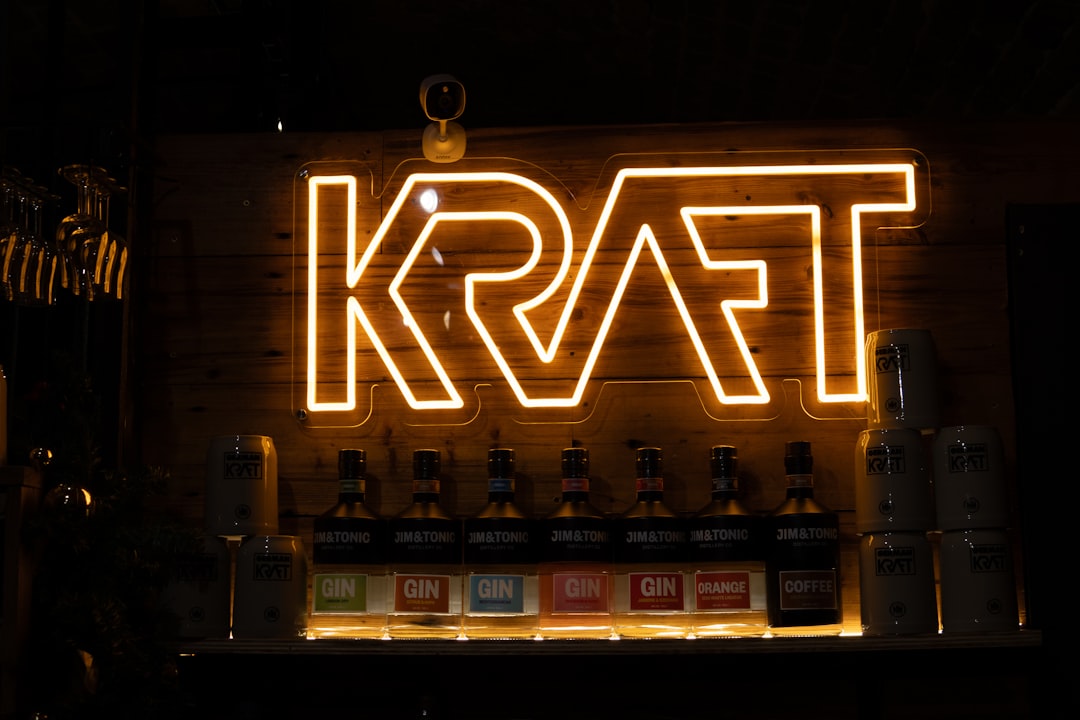
Signage: Where Neon Earns Its Keep
A bar sign works hardest after dark, so plan for night legibility from the start. Neon and lit channel-letter signs are a category signature — they pull people in and photograph beautifully, which doubles as free social marketing. Whether neon, backlit, or a classic painted sign, use a simplified, bold logo variant that reads at distance and at night, and make sure the contrast holds in low light. Coordinate the exterior sign, any interior neon, and the menu board so the whole space reads as one brand. The restaurant branding guide has the full signage checklist.
| Bar type | Type lean | Palette lean | Signage signature |
|---|---|---|---|
| Dive bar | Worn vintage / hand-painted | Dark, faded, one bold accent | Classic neon or painted |
| Cocktail bar | Refined serif / elegant display | Dark base, brass/gold accent | Subtle backlit or etched glass |
| Classic pub | Blackletter / heritage serif | Deep greens, oxblood, gold | Hanging sign, gold leaf |
| Brewery taproom | Bold condensed / modern slab | Saturated, high-contrast | Big channel letters, can art |
The Drinks Menu
The drinks menu is a bar’s most-read piece, and it sets expectations about quality and price. Build clear sections (cocktails, beer, wine, spirits, no/low), give cocktails enough room for a short, enticing description, and keep prices legible without lining them into a tidy comparison column. Match the menu’s type and color to the room’s mood, but keep the body face readable in dim light — that is the constant tension in bar menus. Many bars rotate the list often, so design a template that is easy to update. For full layout and pricing guidance, see our menu design guide.
Glassware, Coasters, and Merch
Bars have unusually good branded-object opportunities. Etched or printed glassware, branded coasters, matchbooks, bottle openers, and tees all carry the mark into the world and onto social feeds, and a strong monogram or badge logo shines on all of them. These are also revenue and loyalty drivers, not just branding — a well-designed coaster or shirt is something guests actually keep. Make sure your one-color logo variant reproduces cleanly on glass etching and small coaster prints.
Interior, Atmosphere, and Social
For a bar, the room is the brand more than any printed piece — lighting, music, materials, and the glow of the signage create the mood the identity promised. Keep staff attire, coasters, menu, and neon all in the same palette and tone. Online, build a consistent low-light photography style and use the same logo and name across the website, Google Business Profile, and Instagram. If a fixed bar is a sibling to a mobile bar or festival setup you run, our food truck design guide covers branding a mobile setup for legibility on the move.
Frequently Asked Questions
What makes good bar branding?
A clear mood carried consistently across type, color, signage, and the room. Bold or vintage type, a dark base with a bright accent, a logo built for lit signage and glassware, and a readable drinks menu in low light all reinforce the atmosphere a bar sells. The interior and neon do as much branding as any printed piece.
What fonts work best for a bar?
Confident, characterful faces: vintage and retro display for heritage and whiskey bars, blackletter or slab for pubs and breweries, bold condensed sans for lively taprooms, and refined serifs for upscale cocktail rooms. Whatever the logo uses, pair it with a legible workhorse for the menu, which guests read in dim light.
What colors should a bar use?
Most bars build on a dark, moody base — charcoal, navy, oxblood, forest, or black — with a single bright accent for energy, like brass and gold for upscale or hot neon for a livelier room. Dark palettes read as premium and after-hours and set up neon and lit signage well. Specify a Pantone for the accent.
Is neon signage worth it for a bar?
Often, yes. A bar’s sign works hardest after dark, and neon or lit channel letters pull people in and photograph beautifully, doubling as free social marketing. If neon is out of budget, a backlit or high-contrast painted sign with a bold, simplified logo variant can still read well at night and on camera.
How is bar branding different from restaurant branding?
The core system is the same, but bars lean harder into mood, darkness, and nightlife. Type runs bolder and more vintage, palettes go dark with a bright accent, signage prioritizes night and neon legibility, and branded glassware and coasters matter more. The room and lighting carry an outsized share of the brand experience.