Dashboard Design: UI and Data Layout
A dashboard answers a question at a glance — or it fails. Strong dashboard design ranks information by importance, lays it out the way people actually scan a screen, and shows only what the viewer needs right now. The hard part is not adding data; it is deciding what to leave off so the data that matters can be seen.
This is the web-design counterpart in our Business Document Design cluster. For the foundations of static reporting, see our pillar on report design for annual and business reports; this guide covers live, interactive dashboards.
Start With the Question the Dashboard Answers
Every good dashboard has a job: “Are we on track to hit the quarter?” “Is the system healthy right now?” “Which campaigns are working?” Define that question before you place a single chart. It tells you which one or two KPIs deserve the top of the screen and which data is supporting detail. A dashboard that tries to answer everything answers nothing — it becomes a wall of charts nobody reads.
KPI Hierarchy: Rank Before You Lay Out
Treat your metrics like a type hierarchy. The one or two numbers that answer the core question get the most visual weight — large type, top placement, prominent position. Secondary metrics support them. Tertiary detail sits lower or behind interaction. A clear KPI hierarchy means a viewer’s eye lands on what matters first, every time. If everything is big and bold, nothing is.
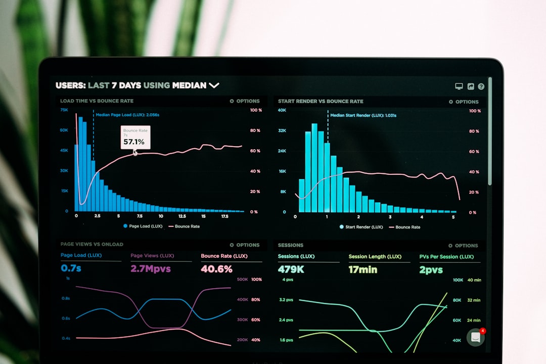
Layout: Cards and the Scan Pattern
Modern dashboards are built from cards — self-contained tiles, each holding one metric or chart. Cards are flexible, responsive, and easy for users to parse one at a time. Arrange them on a grid and place them according to how people scan screens:
- F-pattern for text- and list-heavy dashboards: users scan across the top, then down the left edge. Put the headline KPI top-left.
- Z-pattern for sparser, more visual dashboards: the eye travels top-left to top-right, then diagonally down. Anchor the most important card top-left and the primary action top-right.
Either way, the top-left is prime real estate — put your most important KPI there. Build the card grid on a consistent column system so tiles align and the layout reflows cleanly on smaller screens; our guide to grid systems in graphic design applies directly to screen grids too.
Progressive Disclosure: Show Less, Reveal More
Progressive disclosure is the antidote to dashboard clutter. Show the summary by default; let users drill into detail on demand through filters, expandable cards, hover tooltips, and click-through detail views. A dashboard does not have to show everything at once — it has to show the right thing first and make the rest one interaction away. This keeps the default view calm and fast while still serving power users who need depth.
Data Visualization That Reads Instantly
On a dashboard, charts have a fraction of a second to communicate, so clarity beats cleverness:
- Match the chart to the question — trends over time as lines, comparisons as bars, single key metrics as big-number cards. Our data visualization guide covers the choices.
- Strip everything non-essential — no gridlines, 3D, or redundant legends. Our chart design best practices covers the cleanup.
- Use big-number cards for the headline KPIs, paired with a small trend indicator or sparkline for context.
- Reserve color for meaning. Use a restrained palette and let color signal status (good/warning/bad) or highlight one series — never decorate.
Typography and Sizing for Screens
Dashboards are screen-only, so use screen-first type rules. Body and label text should be at least 14–16px; KPI numbers go much larger to establish hierarchy. A clean UI sans like Inter is ideal — high x-height, excellent legibility at small sizes, and well-designed tabular figures so numbers in tables and metric cards align. Use tabular figures anywhere numbers update or stack so the layout does not jitter as values change.
Format, Responsiveness, and Consistency
Design dashboards for a 16:9 widescreen as the primary canvas, since most are viewed on monitors, but plan how cards reflow to tablet and mobile — a card grid makes this manageable. Keep spacing, card styling, chart styles, and color consistent across the whole dashboard so it reads as one system. Consistent card sizing and padding does more for perceived quality than any single chart.
Accessibility and Contrast
Dashboards are used all day, often in bright rooms, so contrast is critical. Maintain at least 4.5:1 contrast for text and label values, and do not rely on color alone for status — pair red/green with icons or labels so colorblind users can read state. Ensure interactive elements (filters, drill-downs) are keyboard-accessible and clearly labeled. Readable defaults beat a dark, low-contrast theme that looks sleek in a screenshot but strains the eye in daily use.
Tools for Dashboard Design
For business intelligence dashboards on real data, Tableau and Power BI are the standards — strong charting, drill-downs, and live data connections. For designing the UI and prototyping the layout before engineering builds it, Figma is the go-to: design the card grid, KPI hierarchy, and states, then hand off to development. Design the layout and hierarchy first in Figma, then implement the live data in your BI tool or front-end framework so the data does not dictate the design.
Related Guides in This Cluster
Dashboards and static reports share a data-design backbone. For exporting dashboard findings into a polished document, see report design, and for presenting dashboard data to stakeholders, our pitch deck design guide covers slides that make numbers land.
Frequently Asked Questions
What is the best layout for a dashboard?
Build the dashboard from cards arranged on a consistent grid, and place them according to how people scan screens — F-pattern for text-heavy dashboards, Z-pattern for sparser visual ones. Put the single most important KPI in the top-left, the prime real estate, and rank everything else below it by importance.
How many metrics should a dashboard show?
Show only what answers the dashboard’s core question. Lead with one or two headline KPIs given the most visual weight, support them with a handful of secondary metrics, and push deeper detail behind interaction using progressive disclosure. A dashboard crowded with every available metric becomes a wall of charts nobody reads.
What is progressive disclosure in dashboard design?
Progressive disclosure means showing a clean summary by default and revealing detail only on demand — through filters, expandable cards, hover tooltips, and drill-down views. It keeps the default screen calm and fast for everyone while still letting power users reach the depth they need one interaction away.
What font size should dashboard text be?
Use at least 14 to 16 pixels for body and label text, and much larger sizes for headline KPI numbers to establish hierarchy. A clean UI sans like Inter with tabular figures keeps numbers aligned and prevents layout jitter as values update. Maintain at least 4.5:1 contrast for legibility in daily use.
Should dashboards use a dark theme?
Only if it still meets contrast standards. Dark themes look sleek in screenshots but often fail the 4.5:1 contrast minimum, which strains the eye over a full workday. Prioritize readable defaults and never rely on color alone for status; pair red and green indicators with icons or labels for accessibility.