Clinic Signage Design: Wayfinding and Signs
Clinic signage is the silent staff member that greets every patient — and it’s working with people who are anxious, in pain, late, or navigating in a second language. Good medical signage lowers stress and gets patients to the right room without a single question at the front desk. Bad signage creates missed appointments, frustrated visitors, and a brand that feels chaotic. This guide covers the hierarchy, accessibility, and pictogram choices that make clinic wayfinding actually work.
Signage is an extension of your identity, so it should flow directly from your healthcare branding system — same palette, same type, same calm tone. For the underlying craft, our broader signage design guide and wayfinding design resources go deeper on principles that apply across industries.
The Four Types of Wayfinding Signs
Effective wayfinding isn’t one kind of sign — it’s a coordinated system of four working together. Get the mix right and patients are guided continuously from the parking lot to the exam chair.
- Identification signs — name a place: “Radiology,” “Suite 200,” “Restroom.” The most numerous and the workhorses.
- Directional signs — point the way with arrows at decision points (hallway junctions, elevators).
- Orientation signs — “you are here” maps and directories that show the whole picture at entrances and lobbies.
- Regulatory signs — rules and safety: “No entry,” “Mask required,” exits, and emergency information.
Map the patient’s actual journey — entrance, reception, waiting, departments, restrooms, exits — and place signs at every decision point. The test of a good system: a first-time visitor never has to stop and wonder where to go next.
Signage Hierarchy and Legibility
Hierarchy is what lets a stressed patient find the right information in a glance. Establish clear levels: primary destinations large and high-contrast, secondary information smaller, and supporting detail smaller still. Consistency across every sign — same type, same color logic, same arrow style — is what makes the system feel trustworthy.
Legibility rules for medical environments are stricter than retail because the audience skews older and lower-vision:
- Use a clean, high-x-height sans-serif. Inter, Source Sans 3, and Public Sans (all free) are excellent; many transit and hospital systems favor humanist faces for exactly this reason.
- Size text for viewing distance — a common rule of thumb is roughly 1 inch of letter height per 25 feet of viewing distance; go larger for primary signs.
- Maximize contrast: light text on dark or dark on light, meeting or exceeding ADA’s non-glare and contrast guidance.
- Avoid all-caps for long strings and never set critical text in thin weights.
ADA Compliance: Tactile and Braille
In the United States, permanent room and space signs must meet ADA requirements — this is law, not a nicety. Key rules include raised (tactile) characters, contracted Grade 2 Braille, sans-serif or simple serif characters, specific character height and spacing, non-glare finishes, and mounting at a defined height (typically 48–60 inches to the baseline) on the latch side of doors. Note that exact requirements are detailed in the ADA Standards and other regions have their own accessibility codes, so verify the rules for your jurisdiction.
Build ADA compliance into the design from the start. Retrofitting tactile and Braille onto signs designed only to look good is expensive and usually compromises both the aesthetics and the compliance.
Color-Coded Departments
Color coding is one of the most powerful wayfinding tools in larger clinics and hospitals — assign each department or zone a consistent color (Cardiology blue, Pediatrics green, Imaging purple) and carry it through signs, floor graphics, and printed maps. Patients can “follow the green line” without reading every sign.
Two cautions: never rely on color alone (color-blind patients and low light defeat it), so always pair color with text and pictograms; and keep the palette within your brand and tested for contrast. Color coding supports the hierarchy — it doesn’t replace it.
Pictograms for Low-Literacy and Multilingual Patients
Pictograms are essential, not decorative. A clinic serves patients who may not read English — or read at all — well. Universal symbols for restrooms, elevators, exits, pharmacy, radiology, and emergency cross those barriers instantly. Lean on established, recognizable symbol sets (such as the widely used AIGA/DOT symbols and standardized healthcare symbol libraries) rather than inventing your own, and keep them simple, bold, and consistent in style.
- Pair every pictogram with text — the two reinforce each other.
- Maintain one icon style across the whole system; mixed styles read as disorganized.
- Provide multilingual text where the served community needs it.
Materials, Mounting, and Maintenance
Clinic signage takes abuse — cleaning chemicals, frequent updates, high traffic. Choose durable, easy-to-clean, non-glare materials. Plan for change: department names and staff move, so modular or insert-based systems save money over time. Mount at consistent heights and avoid glare from overhead lighting, which can render a perfectly designed sign unreadable.
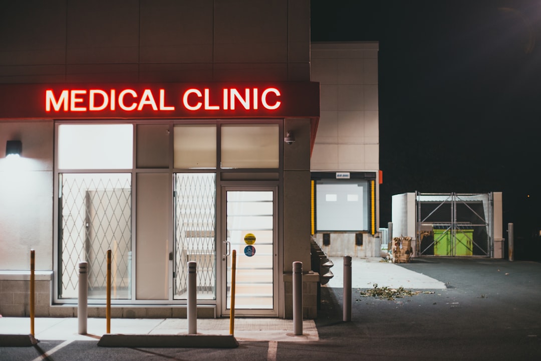
Exterior and Arrival Signage
Wayfinding starts before the patient is inside. Exterior signage — building identification, monument signs, parking and entrance directions — sets the tone and reduces the stress of simply finding the place. A patient who circles a confusing parking lot arrives flustered and late. Make the building name large and high-contrast, mark the correct entrance unambiguously, and direct accessible parking and drop-off clearly. Exterior signs also face weather, distance, and night viewing, so they demand bigger type, durable materials, and often illumination. Treat the journey as beginning at the road, not the lobby.
Testing the System With Real People
The only true test of a wayfinding system is watching unfamiliar people use it. Before finalizing, run informal walk-throughs: give someone who has never visited a destination (“find Radiology”) and watch where they hesitate, backtrack, or ask for help. Those friction points reveal missing decision-point signs, weak hierarchy, or confusing labels far better than any review on a screen. Pay special attention to older adults, non-native speakers, and wheelchair users, since they expose problems an able, fluent designer never notices. Iterate on the cheap (printed mockups, temporary signs) before committing to expensive permanent fabrication. A system validated by real patients is worth far more than one that merely looks polished in a presentation.
Bringing It Together With the Brand
Signage is where the brand becomes architecture. It should feel like the same organization that designed your patient brochures and your logo — consistent type, color, and tone. When a patient walks from your website to your building to your printed handout and everything feels coherent, the brand reads as competent and caring. That coherence is the whole point of a wayfinding system.
Frequently Asked Questions
What font is best for clinic signage?
Clean, high-x-height sans-serifs read best at distance and for low-vision patients. Inter, Source Sans 3, and Public Sans (all free) work well, which is why humanist sans faces dominate hospital and transit systems. Avoid thin weights and long all-caps strings, and size text for viewing distance.
What are the ADA requirements for medical signage?
In the US, permanent room signs need raised tactile characters, Grade 2 Braille, simple character shapes, non-glare finishes, sufficient contrast, and mounting at a defined height (typically 48–60 inches) on the latch side. Exact specs live in the ADA Standards, and other regions have their own codes, so verify locally.
How does color coding help clinic wayfinding?
Assigning each department a consistent color lets patients “follow the blue line” without reading every sign, which speeds navigation in larger facilities. Never rely on color alone, though — pair it with text and pictograms so color-blind patients and those in poor lighting can still find their way.
Why are pictograms important in clinic signage?
Pictograms cross language and literacy barriers instantly, which matters in clinics serving multilingual and low-literacy patients. Use established symbol sets like AIGA/DOT and healthcare libraries rather than inventing icons, keep one consistent style, and always pair each pictogram with text so the two reinforce each other.
What types of wayfinding signs does a clinic need?
Four working together: identification signs that name places, directional signs with arrows at decision points, orientation signs like “you are here” maps and directories, and regulatory signs for rules and safety. Map the patient journey and place signs at every point where someone must choose a direction.