Law Firm Branding: A Complete Guide
Strong law firm branding does one job better than any tagline ever will: it tells a prospective client, before they read a word, that this practice is competent, stable, and worth trusting with a problem that scares them. Legal work is high-stakes and largely invisible until you need it, so the brand has to carry the weight of reassurance. This guide walks through positioning, naming, color, typography, the logo, and every touchpoint a firm actually uses, then closes with the practical and compliance questions partners ask most.
What law firm branding actually is
Branding is not a logo. It is the total impression your firm leaves across every interaction, from the courthouse to the contact form. A law firm identity is the deliberate, consistent system that shapes that impression: name, voice, visual marks, color, type, and the way associates answer the phone. The logo is one expression of it.
For lawyers, the brand has a specific burden. Clients are usually hiring under stress, often comparing two or three firms, and rarely able to judge legal skill directly. They judge proxies instead: how serious the website looks, whether the proposal is polished, whether the office feels established. Coherent branding makes those proxies all point the same direction. The opposite, a mismatched website, a clip-art logo, and a Gmail address, quietly signals risk.
Positioning: decide what the firm stands for
Before any visual decision, settle the strategy. Positioning is the choice of who you serve, what you are known for, and how you differ from the firm down the street. Everything visual flows from it.
- Practice focus: a boutique IP firm and a full-service regional practice should not look the same. Specialists can afford sharper, more distinctive identities; generalists usually lean broad and reassuring.
- Client type: corporate clients respond to authority and precision; consumer practices (family, personal injury, estate) respond to approachability and clarity. The brand tone shifts accordingly.
- Personality: traditional and establishment, or modern challenger? A firm built to disrupt big-law pricing should not dress like a 1920s white-shoe partnership.
Write the positioning down in a sentence before you brief a designer. “We are the go-to startup-counsel firm for seed-to-Series-B founders in the Southeast” produces a very different identity than “a 40-year general practice serving local families.”
Naming a law firm
Most firms are named after partners, which is a constraint and an opportunity. The convention reads as accountable and traditional, exactly the cues legal clients want. The challenge is differentiation: there are a lot of two- and three-surname firms.
- Partner names: “Hartley & Cross” signals heritage and personal accountability. When the name is the brand, the typographic treatment does the heavy lifting.
- Descriptive or coined names: increasingly common with modern firms (“Counsel,” “Ironclad-style” coined marks) and useful when the founders want the brand to outlast any individual.
- Initials: long partner lists often collapse into a lettermark. This is a branding decision, not just shorthand, and it shapes the logo direction below.
Trademark and conflict checks belong in the naming stage too. Before committing to a name or a coined mark, confirm it is available to use and register in the relevant jurisdictions, and that it does not collide with another firm in your market. A name that cannot be protected, or that a competitor already owns, is an expensive mistake to discover after the signage is printed. For firms expecting to grow or merge, choosing a name with room to scale, one that will not feel awkward when a fourth named partner joins or departs, is part of the strategy.
Voice and messaging
Visual identity gets the attention, but a legal brand is also how the firm sounds. Voice is the consistent tone across the website, proposals, bios, and even how the phone is answered, and it should match the positioning exactly. An establishment corporate firm writes with measured precision and restraint; a consumer-facing personal-injury or family practice writes with warmth and plain language, because its clients are anxious and non-expert. The fastest way to undermine a polished visual identity is to pair it with cluttered, jargon-heavy copy that the target client cannot follow.
Three principles travel well across legal voice. First, lead with the client’s problem, not the firm’s history, prospects care about their situation before your founding date. Second, prefer plain language to legalese in marketing materials; save the precision for the documents that require it. Third, keep claims defensible and specific. “We have represented manufacturers in product-liability matters for over twenty years” is both more credible and more compliant than vague superlatives. Attorney bios deserve particular care: they are among the most-visited pages on any firm site and a major trust driver, so they should be concrete about experience without straying into prohibited claims.
Color: the conservative palette and when to break it
Legal palettes are conservative for a reason: color carries connotation, and the connotations clients want from a lawyer are stability, seriousness, and trust. The reliable core for professional services branding runs through deep, low-saturation tones.
- Navy: the default for good reason. It reads as trustworthy, established, and corporate without being cold.
- Charcoal and near-black: authoritative and flexible, pairs with almost anything, and photographs well on signage and print.
- Deep green: a strong alternative that suggests stability and growth, common with firms wanting warmth without leaving the conservative lane.
- Gold or brass accents: used sparingly, these add a premium, heritage feel. Used heavily, they tip into cliche.
When should a firm break convention? When the positioning demands it. A challenger firm targeting tech founders can use a brighter accent, more white space, and a modern palette precisely to signal it is not your grandfather’s law firm. The rule: break the convention on purpose, to make a point about positioning, never by accident. For the full system, treat color as one layer of a documented visual identity design rather than a one-off choice.
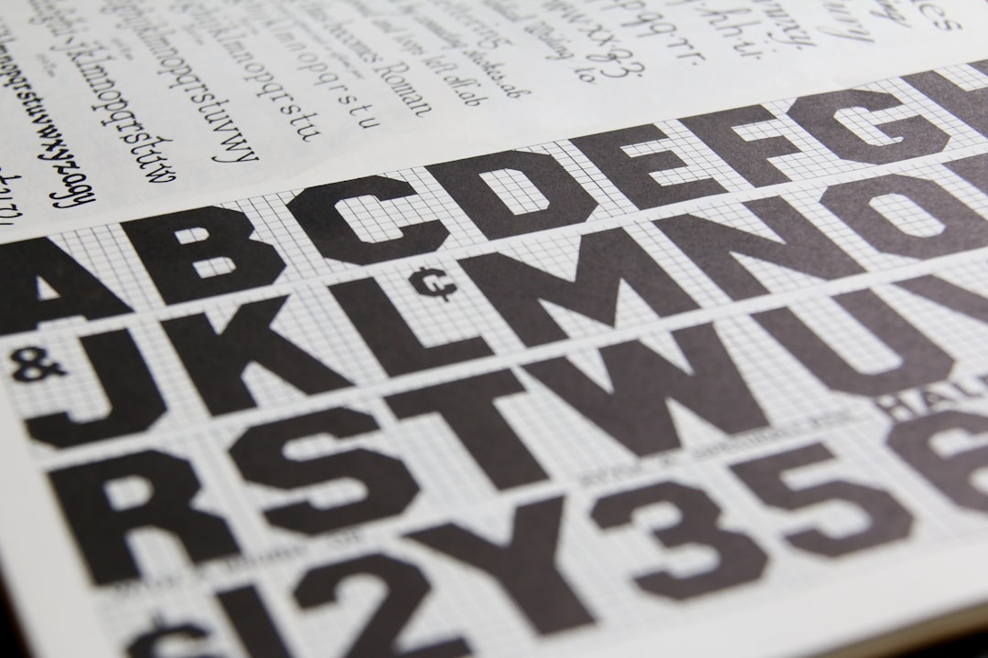
Typography: tradition versus approachability
Type is where a legal brand quietly declares its personality. The choice between serif and sans is essentially a choice between heritage and accessibility.
- Serif typefaces (think transitional and old-style faces) read as traditional, authoritative, and literary, the visual equivalent of a leather-bound statute book. They suit established firms, estate and trust practices, and anyone selling continuity.
- Modern sans-serifs read as clear, efficient, and approachable. They suit challenger firms, in-house-style legal teams, and consumer practices that want to feel less intimidating.
- The common compromise: a serif for the wordmark and headlines (authority) paired with a clean sans for body and UI (legibility). Get the relationship right with a deliberate font pairing guide rather than guessing.
Whatever you choose, restraint wins. One serif and one sans, used consistently, beats a grab-bag of typefaces every time.
The logo and visual marks
Because most firms carry partner names, the logo is usually a wordmark (the name set in a distinctive typeface), a monogram or lettermark (initials), or a restrained combination. Pictorial symbols, scales of justice, columns, gavels, are largely cliche and add little; the strongest legal marks let the name and typography carry the identity. We cover this in depth in our dedicated guide to law firm logo design, and the broader mechanics in our logo design process walkthrough.
| Logo type | Best for | Signal |
|---|---|---|
| Wordmark | Partner-named firms | Accountability, heritage |
| Lettermark / monogram | Long or multi-partner names | Modern, condensed authority |
| Combination mark | Firms wanting a reusable symbol | Flexibility across touchpoints |
Touchpoints: where the brand lives
A legal brand is judged across a predictable set of materials. Each one is a chance to reinforce, or undermine, the impression of competence.
- Letterhead and stationery: still core in law. Engagement letters and opinion letters go out on it, so it must look authoritative. See our letterhead design guide.
- Business cards: handed across the table in person; weight, stock, and restraint matter.
- Proposals and pitch decks: often the deciding document in a competitive engagement.
- Website: the first impression for most prospects; it must load fast, look serious, and make contact effortless.
- Email signatures: the most-sent brand asset in any firm, and the most often neglected.
- Office and signage: for firms with foot traffic, the physical environment is part of the brand.
Related practice-area branding
Law sits within the wider professional-services world, and the same trust-and-authority principles apply across adjacent fields. If you advise or partner with other firms, our companion guides to accounting firm branding, consulting brand design, financial services branding, and insurance branding show how the conservative-palette logic adapts to each.
Regulated-industry and advertising considerations
Legal advertising is regulated, and the rules vary significantly by jurisdiction, so verify locally before you publish. In the United States, attorney advertising is governed by state bar rules modeled loosely on the ABA Model Rules; many states require specific disclaimers, restrict claims of specialization or being “the best,” and regulate testimonials and comparative statements. Other countries impose their own constraints. Practically, this means your brand language and any superlatives should be cleared by someone responsible for compliance at the firm, and you should keep marketing claims defensible. None of this should be read as legal advice; confirm the current rules in every jurisdiction where you advertise.
Rebranding an established firm
Most branding work in law is not a fresh start but a careful evolution, a firm that has grown, merged, added partners, or simply outgrown a dated identity. Rebranding a practice with existing clients and reputation carries real risk: the name and mark are tied to goodwill, referrals, and recognition built over years, so change has to be deliberate rather than cosmetic. The strongest legal rebrands are usually evolutionary, refining the typography, modernizing the palette, and cleaning up the logo while keeping enough continuity that long-standing clients still recognize the firm.
A handful of triggers genuinely justify a rebrand. A merger or major partner change can make the old name inaccurate. A shift in positioning, say, a general practice deciding to specialize, can leave the existing brand sending the wrong signal. And a genuinely dated identity, clip-art logo, cramped 2000s-era website, inconsistent stationery, can be quietly costing the firm credibility with the exact clients it wants. When you do rebrand, plan the rollout: update the highest-visibility touchpoints first (website, signage, email signatures, letterhead), communicate the change to existing clients so it reads as growth rather than instability, and retire the old assets cleanly so the firm never looks half-changed.
Common law firm branding mistakes
- Generic template logos: a stock scales-of-justice mark makes a firm interchangeable with hundreds of others and signals that it cut corners.
- Inconsistency across touchpoints: a sharp website undermined by an off-brand proposal, a clashing email signature, or a Gmail address quietly erodes trust.
- Trend-chasing: legal brands need to last; a fashionable look that dates in three years works against the stability the firm is selling.
- Copy that ignores the audience: dense legalese on a consumer-facing site, or overly casual language on a corporate one, breaks the credibility the visuals worked to build.
- Skipping the guidelines: without a documented system, the brand drifts the moment more than one person is producing materials.
Building the system, not just the logo
The deliverable that actually protects the brand is a short, usable guideline document: logo files and clear-space rules, the color values, the two typefaces and how to pair them, and templates for the touchpoints above. Designers typically build this in Illustrator for the marks and InDesign for the stationery and templates. The goal is consistency the firm can maintain without a designer on call, so that the receptionist’s email signature and the senior partner’s pitch deck still look like the same firm.
Frequently Asked Questions
How much does law firm branding cost?
It ranges widely. A solo practitioner might invest a few thousand for a wordmark, palette, and templates, while a multi-partner firm commissioning a full identity system, website, and guidelines can spend well into five figures. The right budget depends on the firm’s size, growth plans, and how competitive its market is.
Should a law firm use a serif or sans-serif font?
Use a serif when you want to signal tradition, heritage, and authority, common for established and estate-focused firms. Use a modern sans-serif when you want to feel approachable and contemporary, which suits challenger firms and consumer practices. Many firms pair both: a serif for the name and headlines, a sans for body text.
What colors work best for a law firm brand?
Navy, charcoal, and deep green dominate legal branding because they read as trustworthy, stable, and serious, with gold used sparingly for a premium accent. These conservative palettes are reliable. Breaking from them can work, but only deliberately, to signal that a firm is a modern challenger rather than a traditional practice.
Do law firms need a symbol in their logo?
No. Most strong legal logos are wordmarks or monograms that rely on typography rather than a pictorial symbol. Cliched icons like scales, gavels, or columns add little and can date quickly. A distinctive, well-set version of the firm’s name usually communicates authority more effectively than a generic emblem.
Is law firm advertising regulated?
Yes. Attorney advertising is regulated, and rules vary by jurisdiction. Many bars require disclaimers, restrict superlative or specialization claims, and govern testimonials. Always have marketing language reviewed by someone responsible for compliance at the firm and verify the current rules in every jurisdiction where you advertise. This is not legal advice.