Pet Brand Design: A Complete Guide
Pet brand design is the craft of making a pet business feel warm, capable, and worth trusting with someone’s animal. Pet owners buy on emotion first and credentials second, so the brand has to feel like a friend who also clearly knows what it is doing. This guide walks through the full system: strategy, naming, logos, typography, color, packaging, and the local-signage details that turn a name into a business people remember.
Whether you are launching a grooming studio, a vet clinic, a treat company, or a one-person dog-walking service, the same principles apply. The difference is emphasis. Below we cover the shared foundation, then point you to focused guides for each part of the cluster.
What makes pet branding different
Most categories ask a brand to look either friendly or credible. Pet brands have to do both at once. A buyer wants to feel that you genuinely love animals and that you will not mess up the thing they are paying you for, whether that is a haircut, a vaccination, or a bag of food that goes into their dog’s body twice a day.
That dual job shapes every decision. The tone runs warmer than corporate, but the execution still has to be clean and consistent or it reads as amateur. The fastest way to lose a pet customer is to look like a hobby. The second fastest is to look so corporate that you seem to have forgotten there is an animal involved.
- Emotion-led, trust-backed. Lead with warmth in the visuals; back it with proof (reviews, credentials, clear policies) in the content.
- Approachable, not childish. Friendly does not have to mean cartoon. Adults are paying.
- Specific to the animal and the service. A reptile shop and a luxury cat hotel should not look interchangeable.
Start with strategy, not the logo
Before any visual work, get clear on three things. Skipping this is why so many pet brands end up looking like every other paw-print business in town.
- Audience. Premium urban dog owners, budget-conscious multi-pet families, and rural large-animal clients want very different signals. Pick one to lead with.
- Personality. Choose three or four adjectives and commit. “Playful, modern, reassuring” produces a completely different brand than “calm, premium, expert.”
- Positioning. One sentence: who you help, with what, and why you are the better choice. This becomes the filter for every design call.
This strategic layer is the same discipline used in any strong visual identity design project. The pet context just narrows the emotional target.
Naming your pet brand
A good pet-business name is easy to say at a dog park, easy to spell when someone searches for it, and flexible enough to grow. Avoid boxing yourself in with a single species or service if you might expand. “Riverside Paws” survives adding cats and boarding; “Riverside Dog Nails” does not.
- Sound it out. If a name is awkward to say to a stranger, it will not spread by word of mouth, which is how most local pet businesses actually grow.
- Check the obvious traps. Domain availability, local trademark conflicts, and any unfortunate readings when run together as a URL.
- Leave room for a mark. Names with a concrete object or animal inside them are easier to turn into a memorable logo.
Typography for pet brands
Typography carries more of the friendliness than people expect. Rounded letterforms read as soft and approachable; sharp, condensed sans serifs read as efficient and serious. For most pet brands you want warmth without losing legibility on a small sign or a phone screen.
- Quicksand (free, Google Fonts) — geometric with rounded terminals; instantly friendly without being cartoonish. Great for grooming, walking, and daycare brands.
- Nunito (free, Google Fonts) — a rounded sans with a true italic and many weights; flexible enough for a full brand system from logo to website body text.
- Fredoka (free, Google Fonts) — chunky and playful for a logotype, but pair it with a calmer body face so it does not get exhausting.
- Mr Eaves (paid, Adobe/TypeTogether) — a humanist sans with warmth and polish when you want a more premium pet brand.
Pair a characterful display face for the name with a neutral, highly legible body face (such as Inter or Source Sans) for everything else. One personality face is plenty; two fight each other.
Color palettes that feel like pet brands
Color is where the emotional read lands first. Pet brands lean warm and natural, but the exact palette should follow your positioning, not a trend.
| Palette direction | Feeling | Best for |
|---|---|---|
| Warm earth tones (terracotta, sage, cream) | Natural, calm, trustworthy | Premium food, holistic care, boutique grooming |
| Bright primaries + playful accents | Fun, energetic, family-friendly | Daycare, dog walking, toy and treat brands |
| Teal/green + clean white | Fresh, clinical-but-kind | Veterinary, wellness, pet pharmacy |
| Muted pastels | Gentle, premium, soothing | Cat brands, small-animal care, calming products |
Whatever you choose, lock a small palette (one or two brand colors plus neutrals) and use it consistently. Inconsistent color across a sign, a van, and a website is the most common reason a small pet brand looks scattered.
Logo and mascot choices
The logo is where most pet brands reach for clichés. Paw prints, bones, and dog silhouettes are not banned, but they are crowded. If you use one, make it specific, simple, and well-drawn rather than a stock-looking icon dropped next to text.
- Avoid the default paw print. If you must use a paw, integrate it into a letterform or a custom shape so it is not interchangeable with ten competitors.
- Consider a mascot. A friendly animal character builds recognition fast and works beautifully on packaging and signage. See our guide to mascot logo design for how to keep it modern.
- Test it small. A pet logo lives on collars, tags, name badges, and phone screens. If it falls apart below an inch, simplify it.
Whichever route you take, run it through a proper logo design process rather than jumping straight to drawing. The detailed, format-specific advice is in our pet logo design guide.
Applying the brand across every touchpoint
A brand is not a logo; it is the sum of every place a customer sees you. For pet businesses the high-impact touchpoints are physical and local.
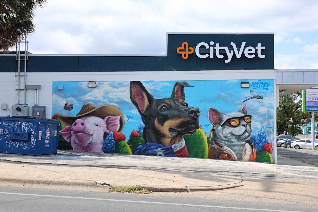
- Signage and storefront. Legible from across a parking lot, friendly up close. This is the heart of pet shop branding.
- Vehicle wraps and business cards. Critical for mobile services. Our dog walking logo design guide covers marks that read on a van and a phone.
- Packaging. For any product brand, the package is the salesperson on the shelf. Specs and label rules are in the pet product packaging guide.
- Clinic and care environments. Trust signals matter most here; see veterinary branding for balancing warmth and credibility.
The cluster: where to go next
This pillar is the map. Each guide below goes deep on one part of building a pet brand:
- Pet Logo Design: Tips and Examples — marks, styles, and how to avoid clichés.
- Veterinary Branding: Trust for Pet Care — friendly plus clinical credibility.
- Pet Shop Branding: Stand Out Locally — signage and shelf presence.
- Pet Product Packaging Design Guide — materials, panels, and shelf legibility.
- Dog Walking Logo Design: Friendly Marks — solo-operator marks for van and card.
Brand voice and messaging
Visuals get the attention, but the words a pet brand uses decide whether people believe it. Voice is where the “warm but capable” balance plays out in sentences. Talk like a knowledgeable friend, not a corporate brochure and not a baby-talking cartoon. The right tone makes a stranger feel comfortable handing you their animal.
- Lead with the pet, not the transaction. “Tired-out, happy dogs” beats “professional dog walking services” because it describes the outcome the owner actually wants.
- Be specific about care. Concrete details (how you handle nervous animals, your safety routine, your credentials) build more trust than adjectives like “passionate” or “premium.”
- Keep one consistent voice. The tone on your sign, your website, and your social posts should sound like the same person. Inconsistent voice reads as inconsistent care.
- Match warmth to stakes. A treat brand can be playful and loose; a surgical clinic should sound calm and reassuring. Higher stakes mean steadier language.
Write down a short voice guide, even just three “we sound like / we never sound like” pairs, and hand it to anyone who writes for the brand. It is the cheapest way to keep messaging coherent as you grow.
Building a simple brand guidelines document
You do not need a fifty-page brand book, but a one-page reference keeps a pet brand consistent across every sign, bag, and post. Consistency is what makes a small business look established and trustworthy, which directly supports the trust pet buyers are looking for.
- Logo lockups and the minimum size and clear space around them.
- Color values (with print and screen specs) so the orange on your van matches the orange on your website.
- Typefaces for headings and body, with where to get them.
- Voice notes and a few do/do-not examples.
- Imagery direction so photos and illustrations feel like one brand.
Keep this document somewhere everyone can reach it, and update it when the brand evolves. It pays for itself the first time someone makes a flyer without asking you which blue to use.
Common mistakes to avoid
- Looking like a hobby. Inconsistent fonts, clip-art icons, and a free-template website signal “not a real business.”
- Over-cute everything. Wall-to-wall cartoon undermines trust for higher-stakes services like veterinary care.
- Generic stock imagery. The same smiling golden retriever appears on a thousand sites. Use real photos of your actual work where you can.
- Ignoring small sizes. A logo that only works on a homepage banner is half a logo.
Frequently Asked Questions
How much does pet brand design cost?
It varies widely. A solo dog walker might spend a few hundred on a clean logo and templates, while a multi-location vet group may invest several thousand in a full identity system. Budget more for anything physical, like signage, vehicle wraps, and packaging, which need print-ready files.
What colors work best for pet brands?
Warm earth tones and natural greens read as calm and trustworthy, while bright primaries suit playful, family-focused services. Teal and clean white work for veterinary and wellness brands. Choose based on your positioning rather than trends, then apply one small palette consistently everywhere.
Should a pet brand use a paw print?
You can, but it is the most overused symbol in the category. If you use a paw, make it specific by integrating it into a letterform or custom shape so it is not interchangeable with competitors. A well-drawn mascot or wordmark often stands out far more.
Do I need a different look for a vet clinic versus a pet shop?
Yes. A vet clinic must balance friendliness with clinical credibility, leaning slightly cleaner and calmer. A pet shop can be more playful and retail-forward, prioritizing local signage and shelf presence. The shared warmth stays; the level of polish and seriousness shifts.
What font style suits a pet business?
Rounded, humanist typefaces read as warm and approachable, which fits most pet brands. Quicksand and Nunito are strong free choices. Pair one characterful display face for the name with a neutral, highly legible body face so the brand stays friendly without becoming hard to read.


